Mix Interiors Brand Identity by Marçal Prats: From a Square Grid Logo to a Custom Typeface
Designer Marçal Prats completely reimagined the brand identity system for Mix Interiors around a foundational square grid, seamlessly expanding the three-letter MIX logo into a full-fledged display typeface.
Starting as flat 2D planes, the MIX logotype hints at three-dimensional depth. The three characters fit neatly within the square grid framework, using angled cuts to create a cool extrusion effect that catches light and casts shadows just like a paper model. Whether presented as layered wireframes or foil-stamped on a magazine cover, the emblem acts like an architectural drawing, shifting fluidly between floor plans and cross-sections. It’s a brilliant reflection of interior design itself: the constant interplay between two-dimensional layout and three-dimensional space.
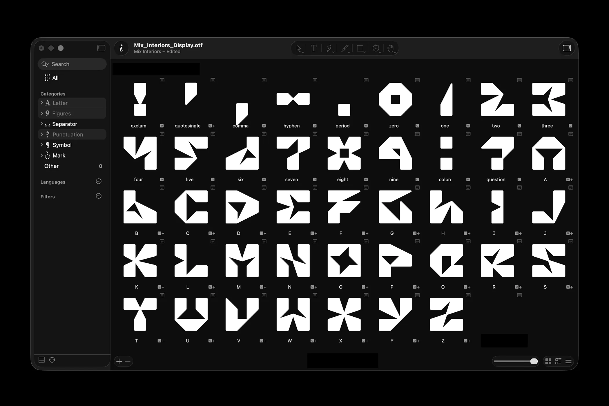
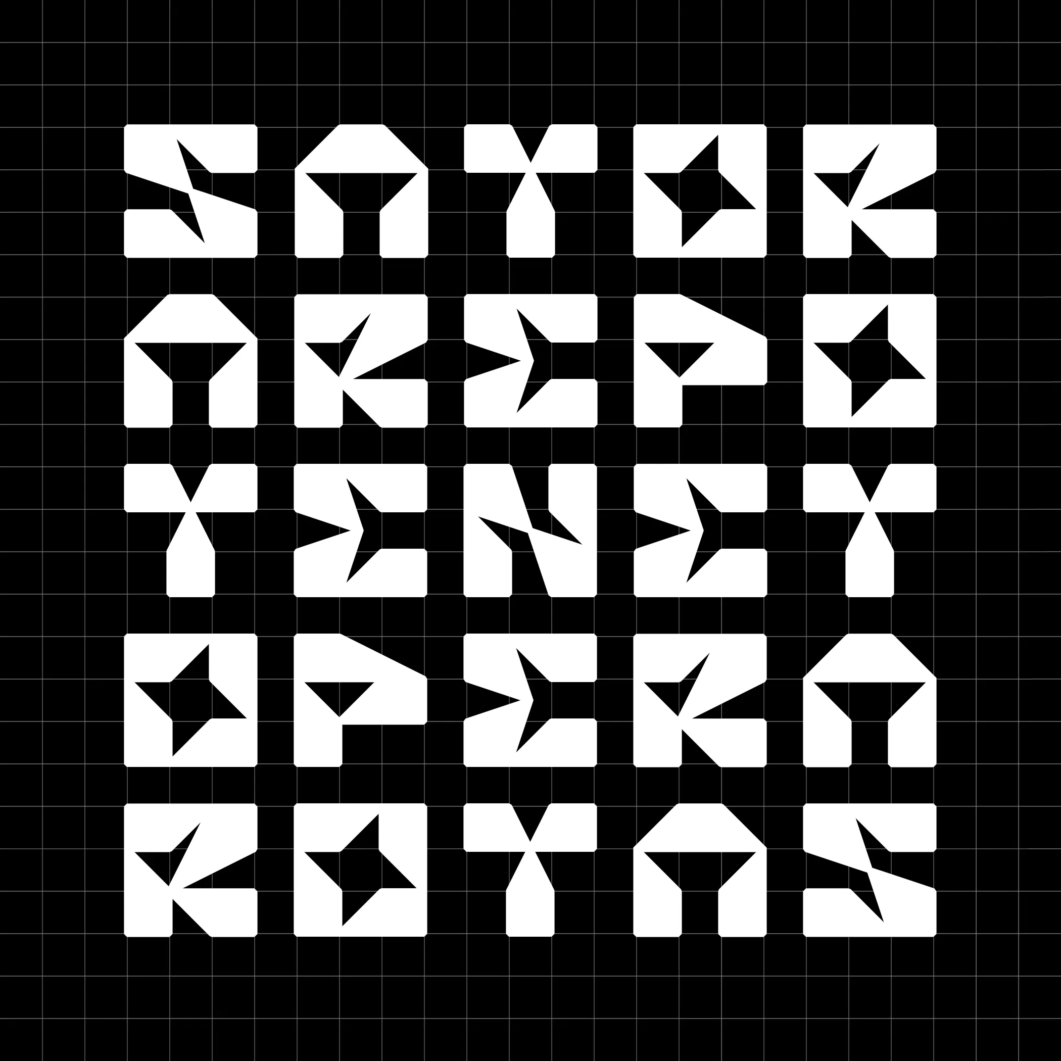
Building on the geometric DNA of the MIX logo, Prats crafted the Mix Interiors Display font, featuring 26 uppercase letters, numbers, and punctuation marks. The type specimen showcases the full character set designed in Glyphs, alongside fun stylistic alternates. The iconic Sator Square word puzzle also gets a bold layout on a high-contrast black-and-white 5×5 grid, where every single letter shares the same extruded 3D look as the original logo.
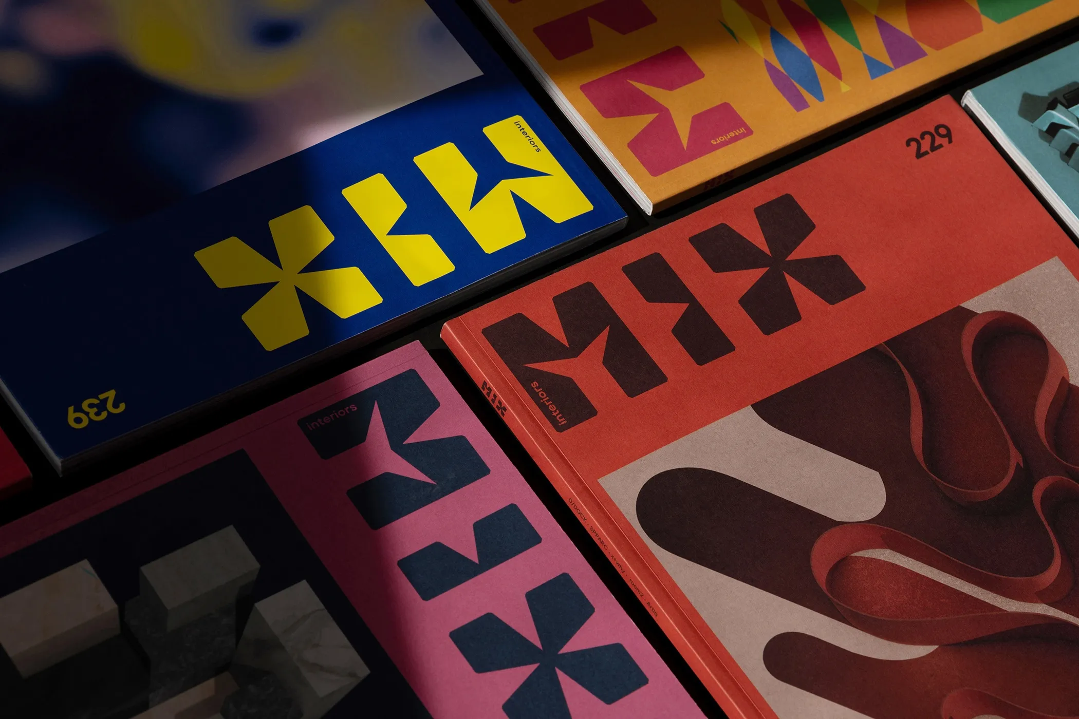
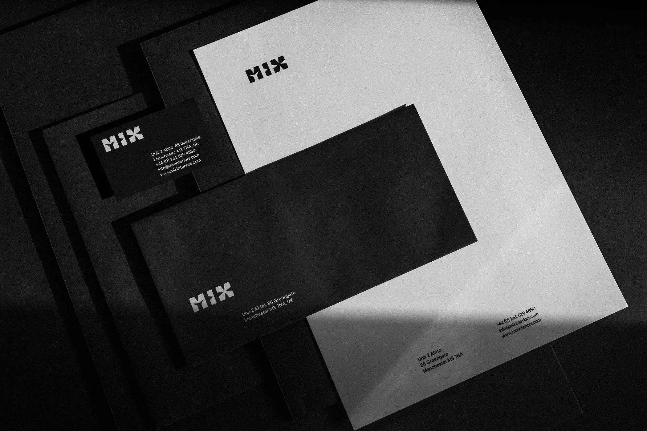
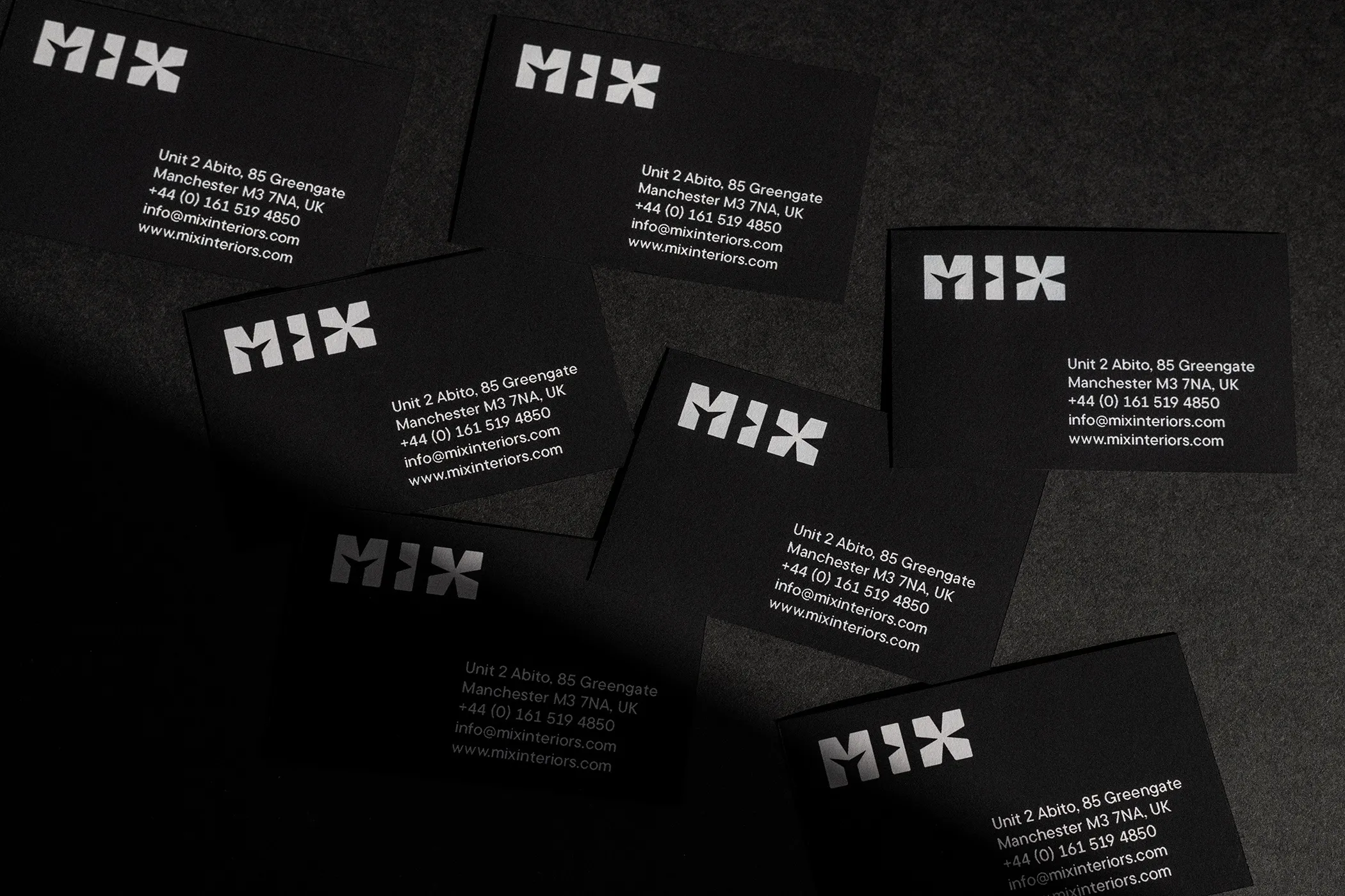
This visual system proves super versatile across real-world touchpoints: crisp black business cards popped with a stark white MIX logo, stationery sets pairing white letterheads with sleek black envelopes, and magazine covers rocking punchy color pairs like yellow and navy, burgundy and orange, or black and pink. For the Mix Awards—the UK’s leading commercial interior design and architecture awards program—the square grid turns into a seamless tiled pattern paired with custom motion branding for each edition. Celebrating their 25th anniversary, motion designer Dave Whyte extruded the grid into an abstract skyline themed “City of the Future,” blending Franco Grignani’s op-art vibe with crisp geometric discipline.
Check out the full case study on www.marcal.net/mix-interiors-awards-branding/.
Bộ nhận diện thương hiệu Mix Interiors của Marçal Prats: Từ logo lưới vuông đến bộ font chữ riêng
Designer Marçal Prats đã tái xây dựng hệ thống nhận diện thương hiệu Mix Interiors dựa trên hệ lưới hình vuông (square grid), sau đó mở rộng logo ba chữ cái MIX thành một bộ font display hoàn chỉnh.
Biểu tượng MIX xuất phát từ các mặt phẳng 2D nhưng lại gợi mở chiều sâu ba chiều. Ba ký tự nằm gọn trong khung lưới vuông với các đường cắt góc tạo hiệu ứng nổi khối (extrusion), giúp chữ đổ bóng và bắt sáng tựa như mô hình giấy. Khi thể hiện dưới dạng khung dây (wireframe) xếp lớp hoặc ép kim trên bìa tạp chí, biểu tượng này hoạt động giống như một bản vẽ kiến trúc, chuyển đổi linh hoạt giữa mặt bằng (plan) và mặt cắt (section). Cách xử lý này phản ánh chính xác bản chất của ngành thiết kế nội thất: sự chuyển dịch liên tục giữa không gian hai chiều và ba chiều.
Từ ngôn ngữ hình học của logo MIX, Prats đã phát triển thành bộ font Mix Interiors Display gồm 26 chữ cái in hoa, các chữ số và dấu câu. Bản type specimen thể hiện trọn bộ ký tự được thiết kế trong phần mềm Glyphs cùng các ký tự thay thế (stylistic alternates). Bên cạnh đó, hình câu đối Sator Square cũng được dàn trang trên lưới 5×5 tương phản trắng đen, nơi mỗi chữ cái đều mang cấu trúc nổi khối đồng bộ với logo gốc.
Hệ thống thị giác này chứng minh tính ứng dụng cao trên nhiều sản phẩm thực tế: danh thiếp màu đen điểm xuyết logo MIX màu trắng, bộ văn phòng phẩm kết hợp giấy tiêu đề trắng với phong bì đen, và bìa tạp chí sử dụng các cặp màu tương phản như vàng – xanh navy, đỏ bọc đô – cam, hoặc đen – hồng. Dành cho Mix Awards – chương trình giải thưởng thiết kế nội thất thương mại và kiến trúc tại Anh – hệ lưới vuông được biến tấu thành hoa văn lặp liền mạch (seamless tiled pattern), đi kèm nhận diện chuyển động riêng cho từng mùa giải. Ở mảng đồ họa kỷ niệm 25 năm, Dave Whyte đã biến đổi hệ lưới thành hình ảnh đường chân trời trừu tượng theo chủ đề “City of the Future”, kết hợp giữa phong cách op-art của Franco Grignani và tính kỷ luật của hình học.
Xem case study đầy đủ từ www.marcal.net/mix-interiors-awards-branding/ trên trang portfolio của tác giả.