Pentagram Breathes Life into De Bijloke’s Brand Identity with Dynamic Sound Waves The De Bijloke music center in Ghent just got a fresh, super dynamic, and adaptable brand identity designed by the team at Pentagram, tailored to fit everything from classical and jazz to modern beats. The centerpiece of this redesign is a ribbon-like swooshing mark that floats like a sound wave in mid-air. Pentagram’s team, led by Marina Willer, drew inspiration from two incredible sources: John Cage’s avant-garde musical notations and the oscilloscope—an analog tool that translates sound signals into visual lines. The logo features fine orbital lines swooping around the “deBijloke” wordmark, shifting colors seamlessly across applications: neon pink on reddish-brown, electric blue on cream, or vibrant red on bluish-gray. Nestled quietly behind the wordmark is a subtly enlarged, faded number that acts as a structural frame to anchor each layout. Built digital-first, this constantly “living” system shifts effortlessly between cozy, intimate settings and grand, large-scale displays without ever losing its signature feel.
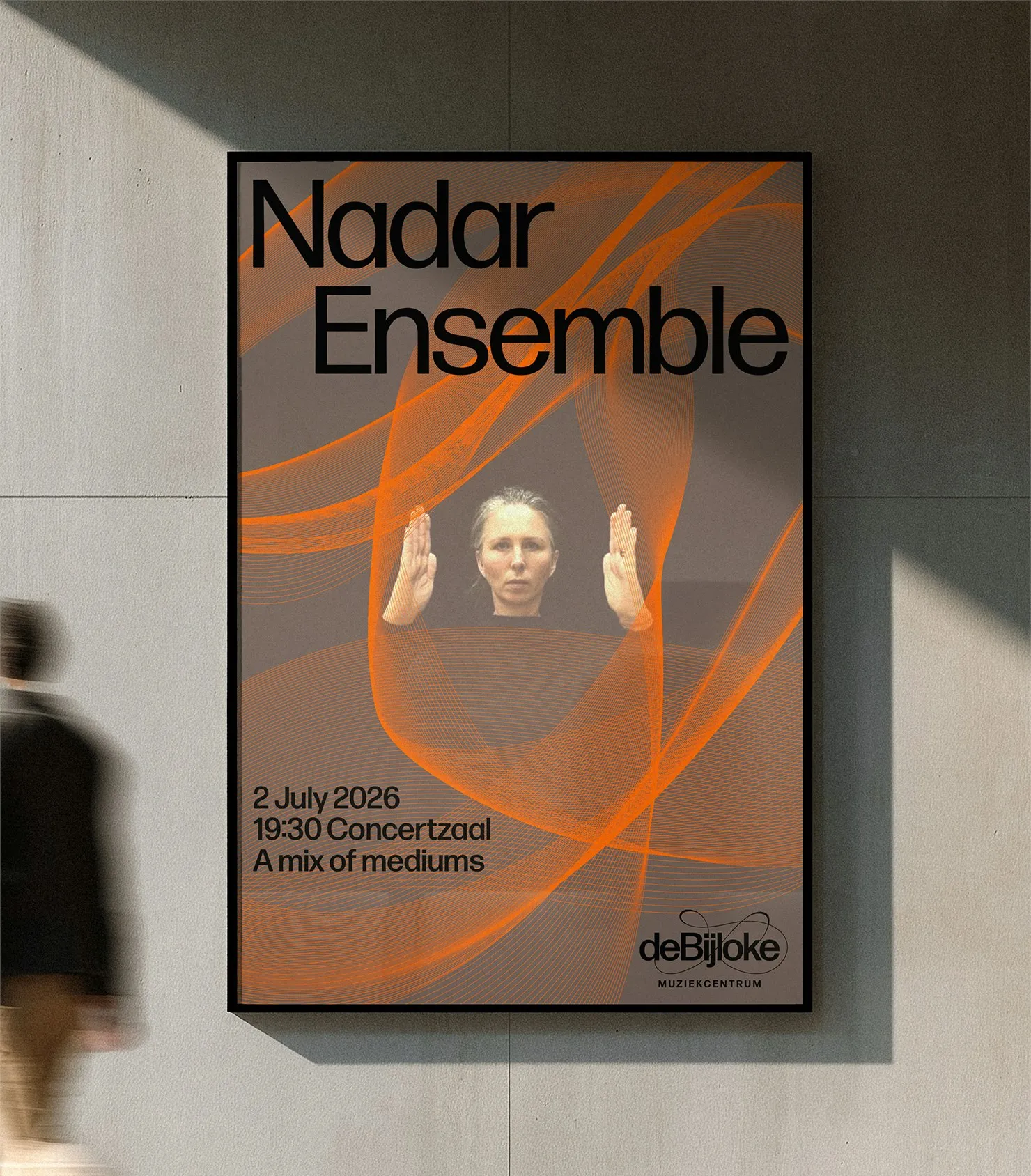
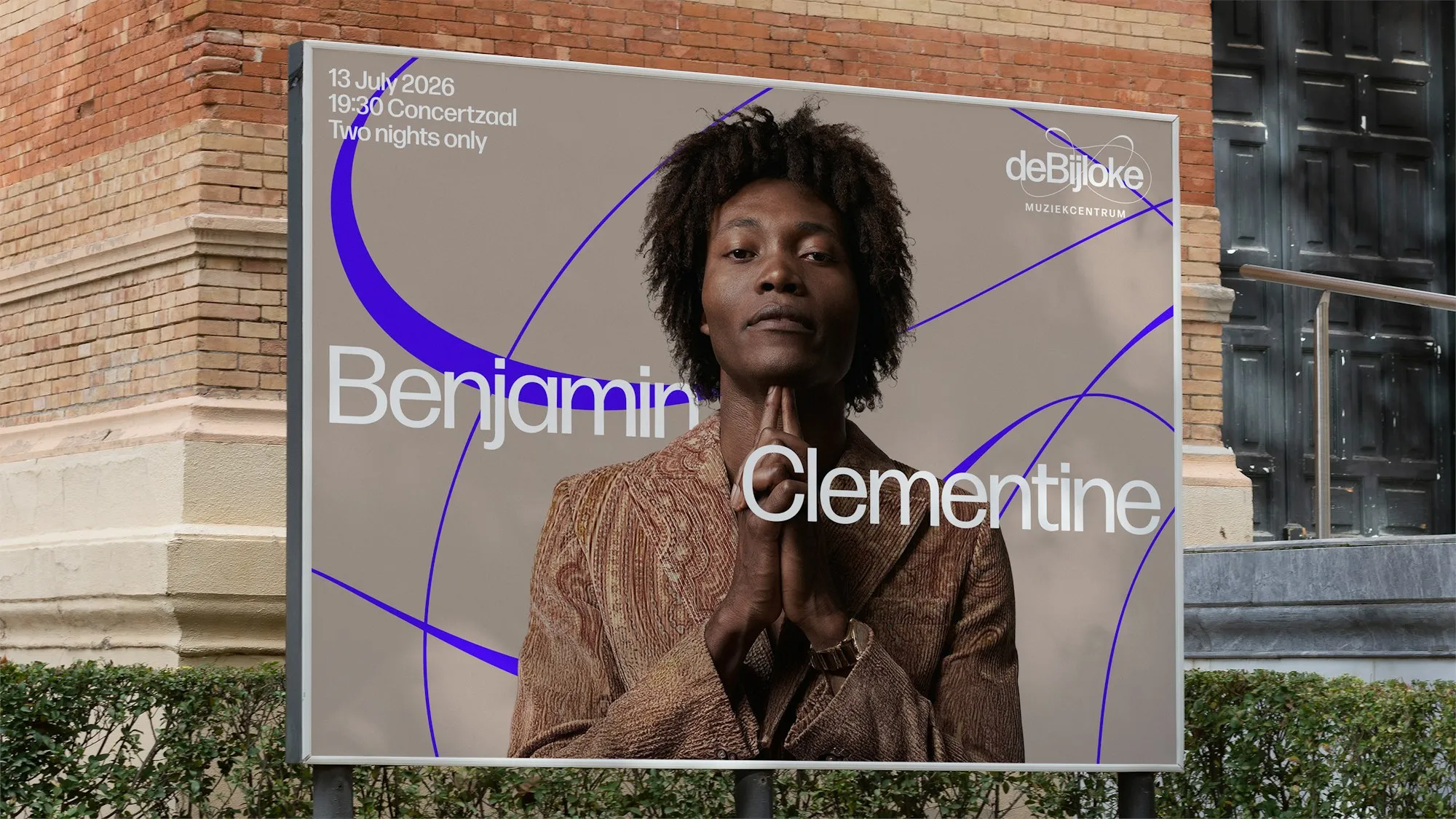
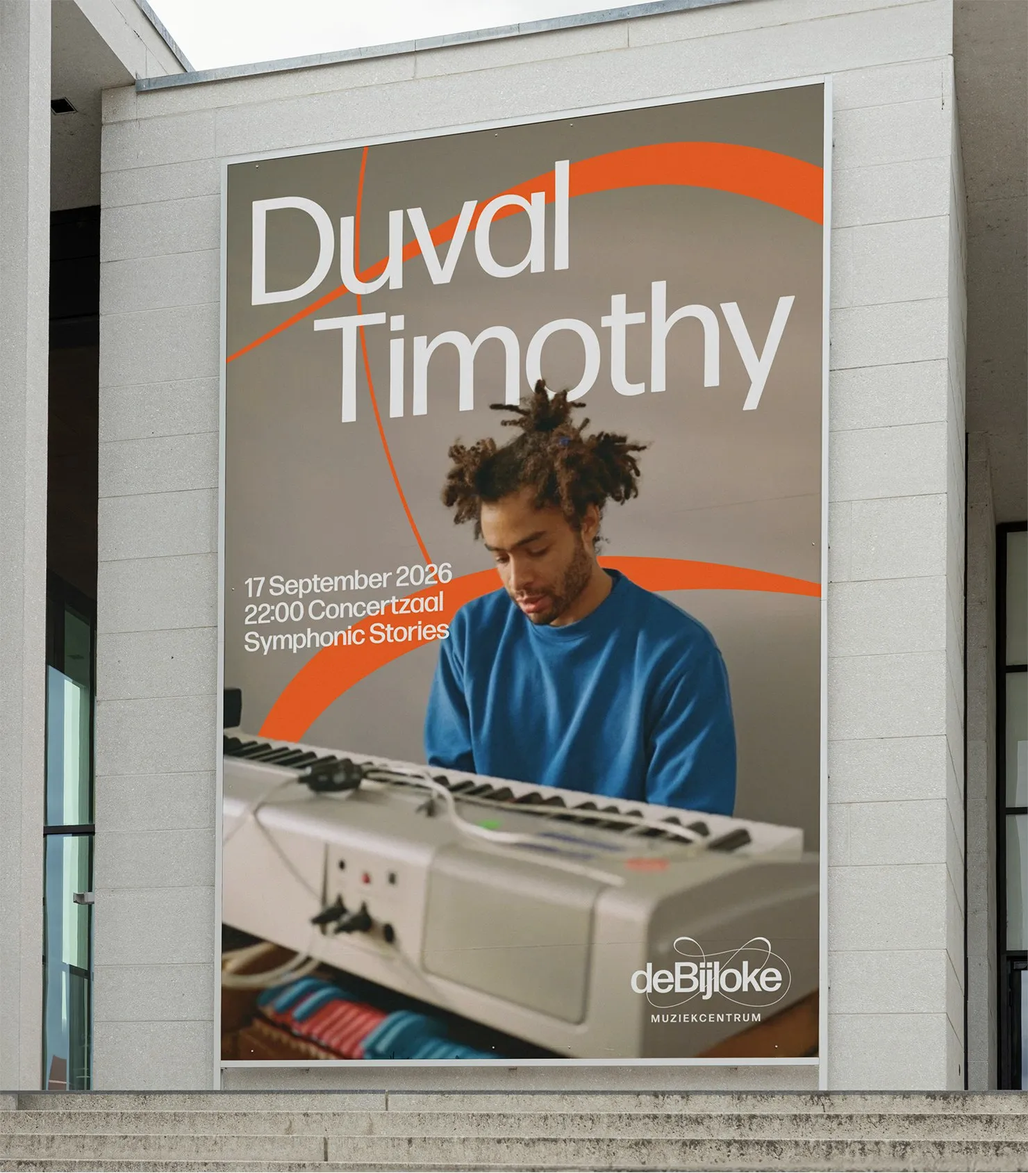
In contrast to the highly expressive logo, the typographic system stays remarkably clean and grounded. Pentagram opted for Forma DJR—a crisp, simple grotesque typeface that beautifully balances out the playful energy of the wave forms. Main headlines make a bold statement: Benjamin Clementine’s billboard showcases the artist’s name in massive cap-height type overlaid on a portrait, while Nadar Ensemble’s poster dominates the top half with group branding right above a burnt-orange sound wave. Secondary details in widely tracked small-caps sit neatly under the wordmark—like “MUZIEKCENTRUM” or “MUZIEKCENTRUM JAZZ”—providing a solid, stable foundation for the brand while letting those orbital paths show off their personality.
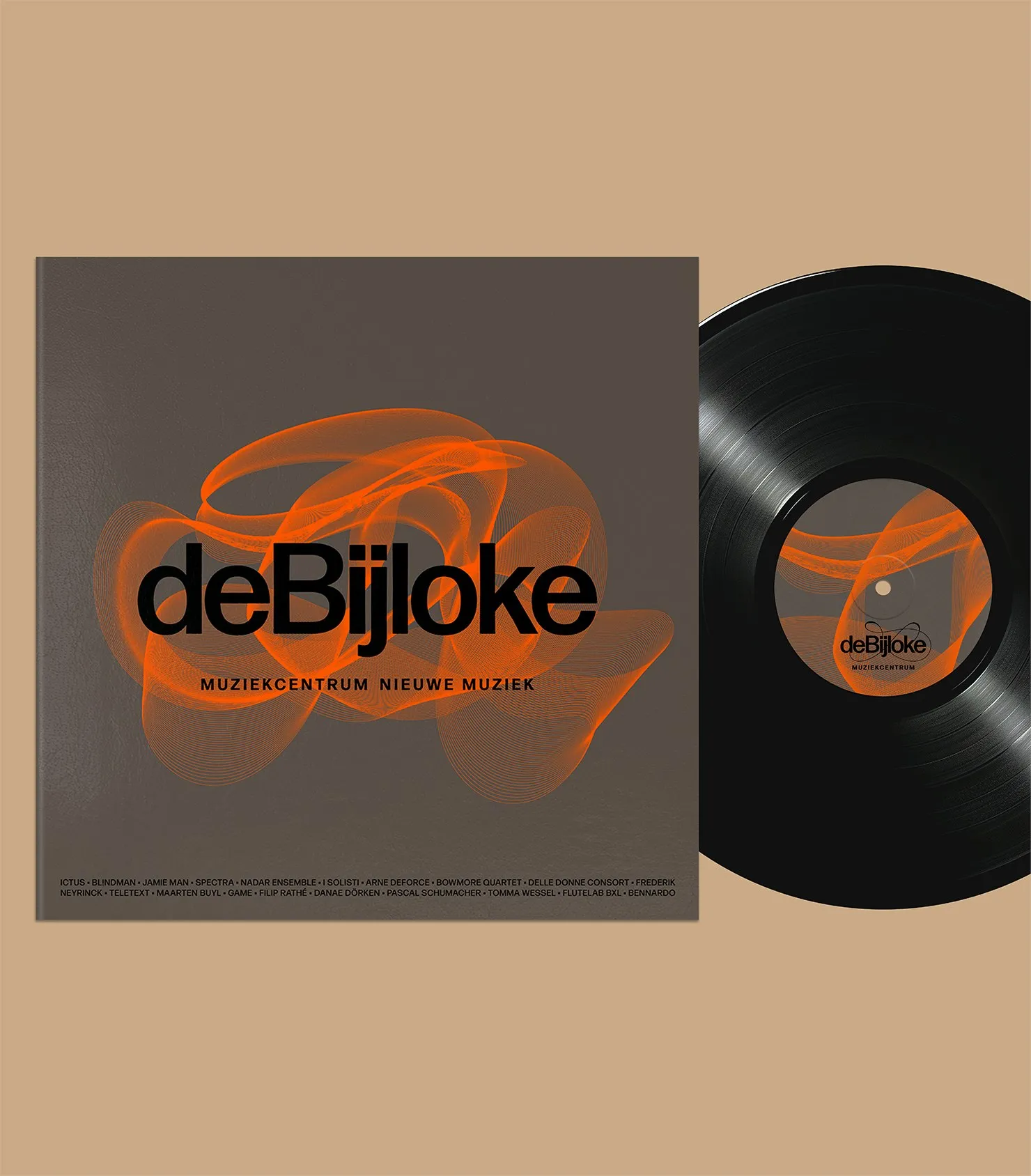
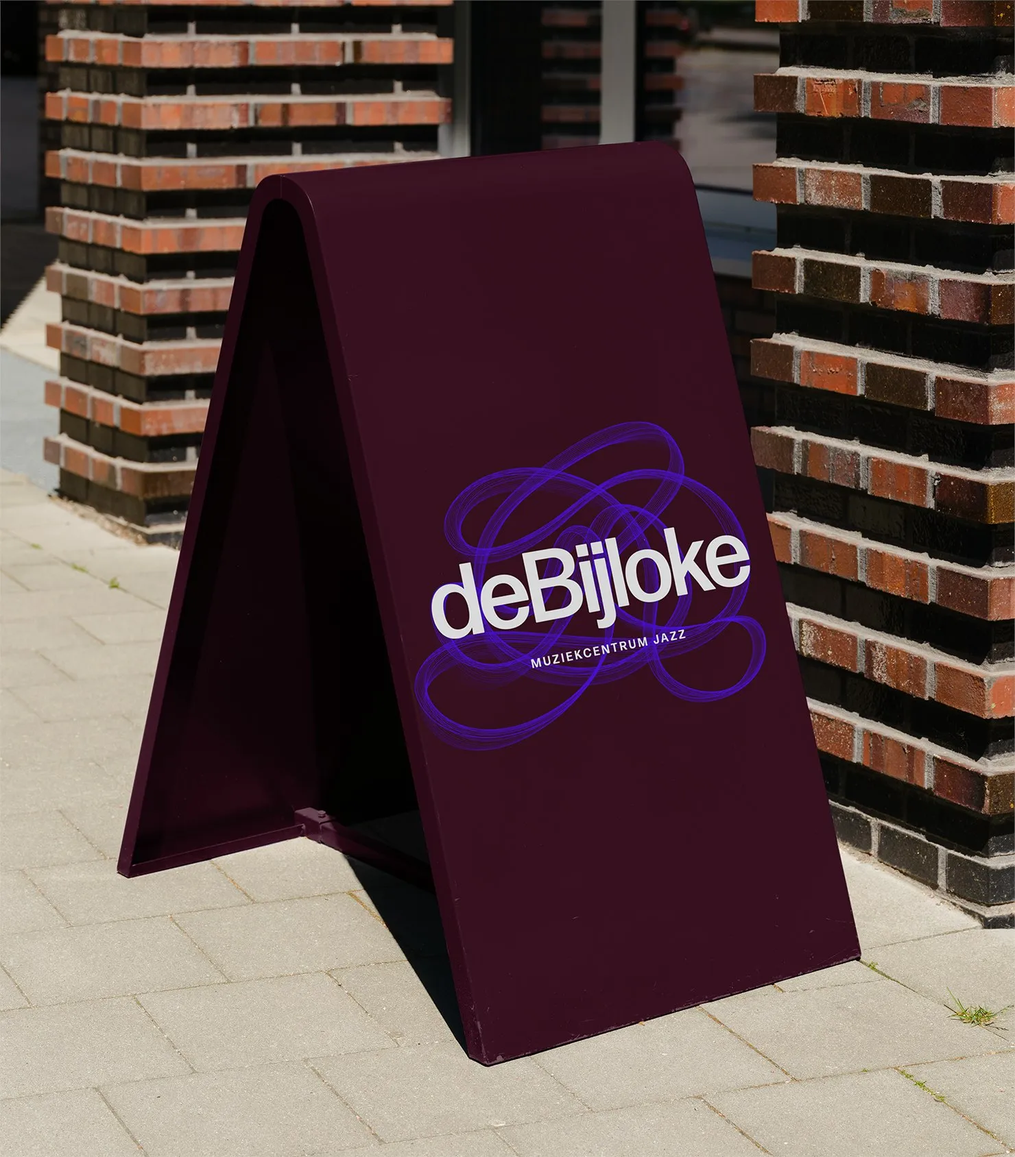
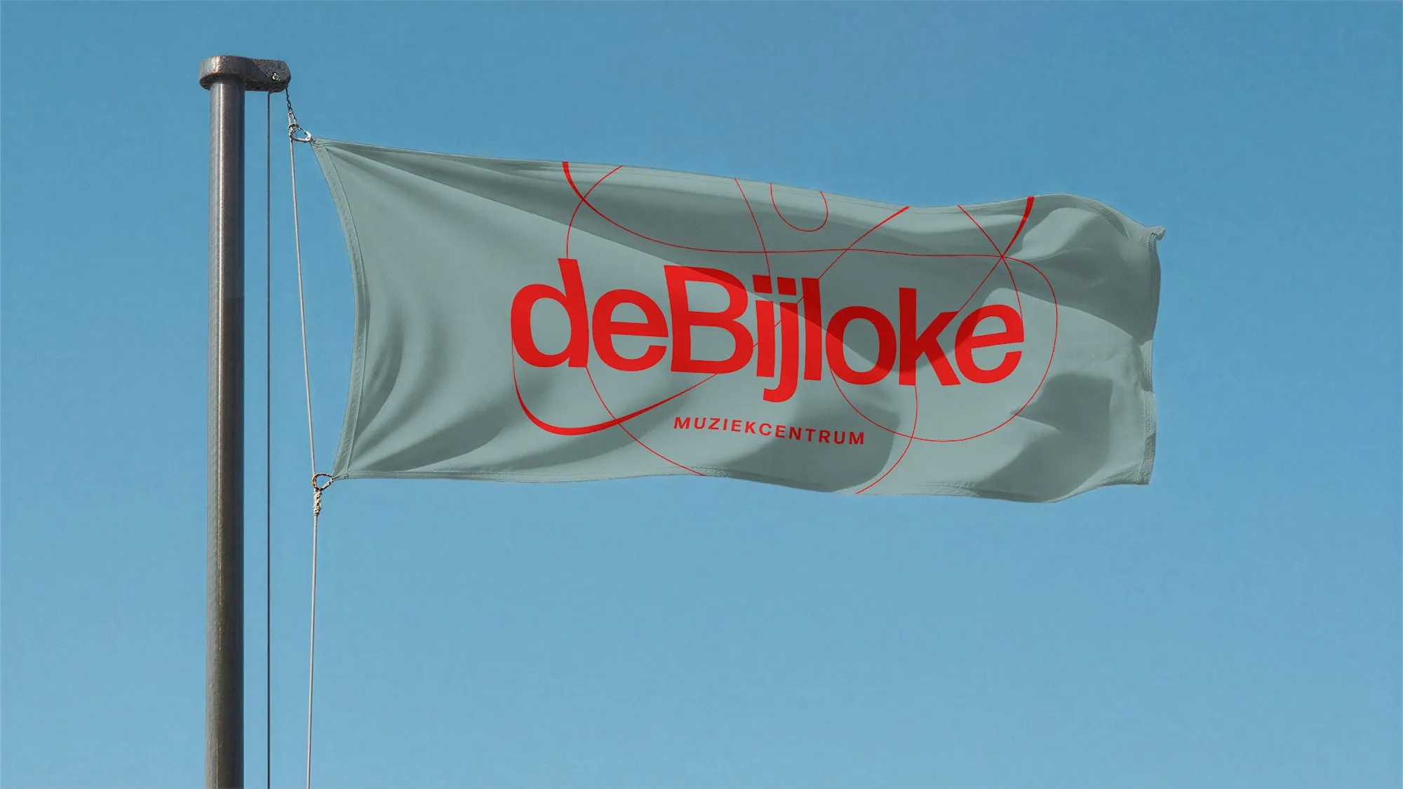
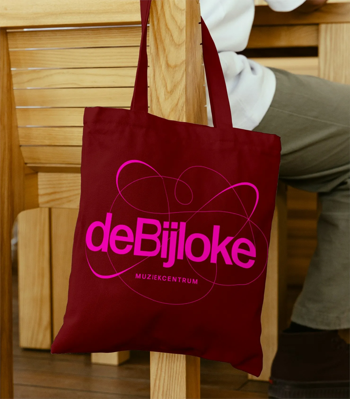
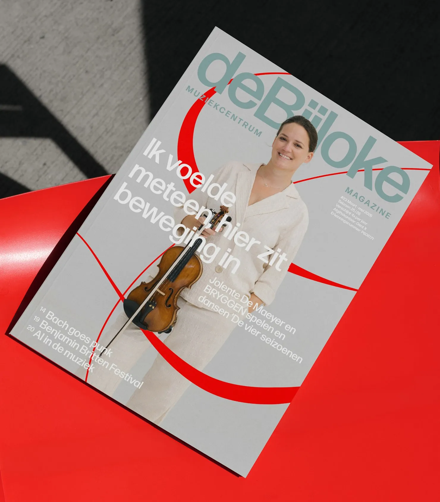
This identity really shines when brought into physical spaces. The design scales smoothly across touchpoints: from reddish-brown outdoor A-frame signs featuring the Jazz sub-brand logo in crisp white and purple, to bluish-gray and red street banners, reddish-brown tote bags popped with a bright pink wordmark, and season magazine covers pairing violinist imagery with bold red swooshes. The New Music division pushes the boundaries even further with vinyl album sleeves pairing black typography and orange sound waves over a soft warm gray background, complete with a repeated lockup on the record label and fine artist credits running along the bottom edge. To top it all off, a custom generative tool was built to morph the Jazz and New Music patterns into endless, evolving shapes, keeping the entire system constantly in motion across every format.
Check out the full case study at www.pentagram.com/work/de-bijloke.
Pentagram Thổi Hồn Vào Nhận Diện Thương Hiệu Cho De Bijloke Với Sóng Âm Động
Trung tâm âm nhạc De Bijloke tại Ghent vừa khoác lên mình một bộ nhận diện thương hiệu cực kỳ sống động và linh hoạt do đội ngũ Pentagram thực hiện, phù hợp cho cả nhạc cổ điển, jazz lẫn âm nhạc hiện đại. Điểm nhấn chính của bộ nhận diện này là biểu tượng nét vẽ uốn lượn như một sóng âm đang bay lượn trên không trung. Đội ngũ của Marina Willer tại Pentagram đã lấy cảm hứng từ hai nguồn đặc biệt: ký xướng âm phá cách của John Cage và máy hiện sóng (oscilloscope) – công cụ analog chuyển đổi tín hiệu âm thanh thành đường nét. Logo xuất hiện như các đường quỹ đạo mảnh xoay quanh wordmark deBijloke, biến đổi màu sắc linh hoạt trên từng ứng dụng: từ hồng neon trên nền nâu đỏ, xanh điện trên nền kem, cho đến đỏ trên nền xanh xám. Phía sau wordmark là một con số phóng to mờ ẩn, đóng vai trò như phần khung kết cấu định hình cho từng bố cục. Toàn bộ hệ thống được định hướng digital-first và luôn “sống”, có khả năng biến chuyển giữa không gian ấm cúng lẫn quy mô hoành tráng mà không hề mất đi phom dáng.
Trái ngược với logo đầy tính biểu cảm, hệ thống typography lại được giữ ở mức tối giản và điềm tĩnh. Pentagram đã chọn bộ font Forma DJR – một kiểu chữ grotesque đơn giản với các đường nét gọn gàng giúp cân bằng lại sự bay bổng của các đường sóng. Các tiêu đề chính được trình bày to và tự tin: biển quảng cáo của Benjamin Clementine xếp chữ tên nghệ sĩ dạng cap-height khổng lồ đè lên ảnh chân dung, trong khi poster của Nadar Ensemble phủ kín nửa trên bằng tên nhóm ngay trên vùng sóng âm màu cam cháy. Các thông tin phụ dạng small-caps được đặt gọn gàng phía dưới wordmark như “MUZIEKCENTRUM” hay “MUZIEKCENTRUM JAZZ” với khoảng cách chữ (tracking) rộng, tạo nên điểm tựa vững chắc cho thương hiệu trong khi các đường quỹ đạo thoải mái thể hiện cá tính.
Hệ thống này chứng tỏ giá trị thực tế rõ rệt khi ứng dụng vào không gian vật lý. Thiết kế được mở rộng từ bảng hiệu chữ A màu nâu đỏ đặt ngoài trời mang logo nhánh Jazz màu trắng và tím, đến cờ trang trí ngoài trời màu xanh xám – đỏ, túi tote vải màu nâu đỏ với wordmark hồng nổi bật, cho tới bìa tạp chí mùa giải nơi hình ảnh nghệ sĩ vĩ cầm kết hợp cùng các đường cong sắc đỏ. Nhánh New Music thậm chí còn đẩy thiết kế đi xa hơn: vỏ đĩa than vinyl kết hợp chữ màu đen với sóng âm màu cam trên nền xám ấm mờ, phần lockup được lặp lại trên nhãn đĩa cùng hàng chữ tên các nghệ sĩ in nhỏ chạy dọc mép dưới. Đặc biệt, một công cụ generative đã được phát triển để biến đổi các họa tiết của nhánh Jazz và New Music thành vô số hình thái liên tục thay đổi, giúp hệ thống luôn chuyển động trên mọi định dạng.
Xem đầy đủ bài nghiên cứu thực tế tại www.pentagram.com/work/de-bijloke.