Riserva Brasitália: Packaging and Brand Identity Design for Specialty Coffee
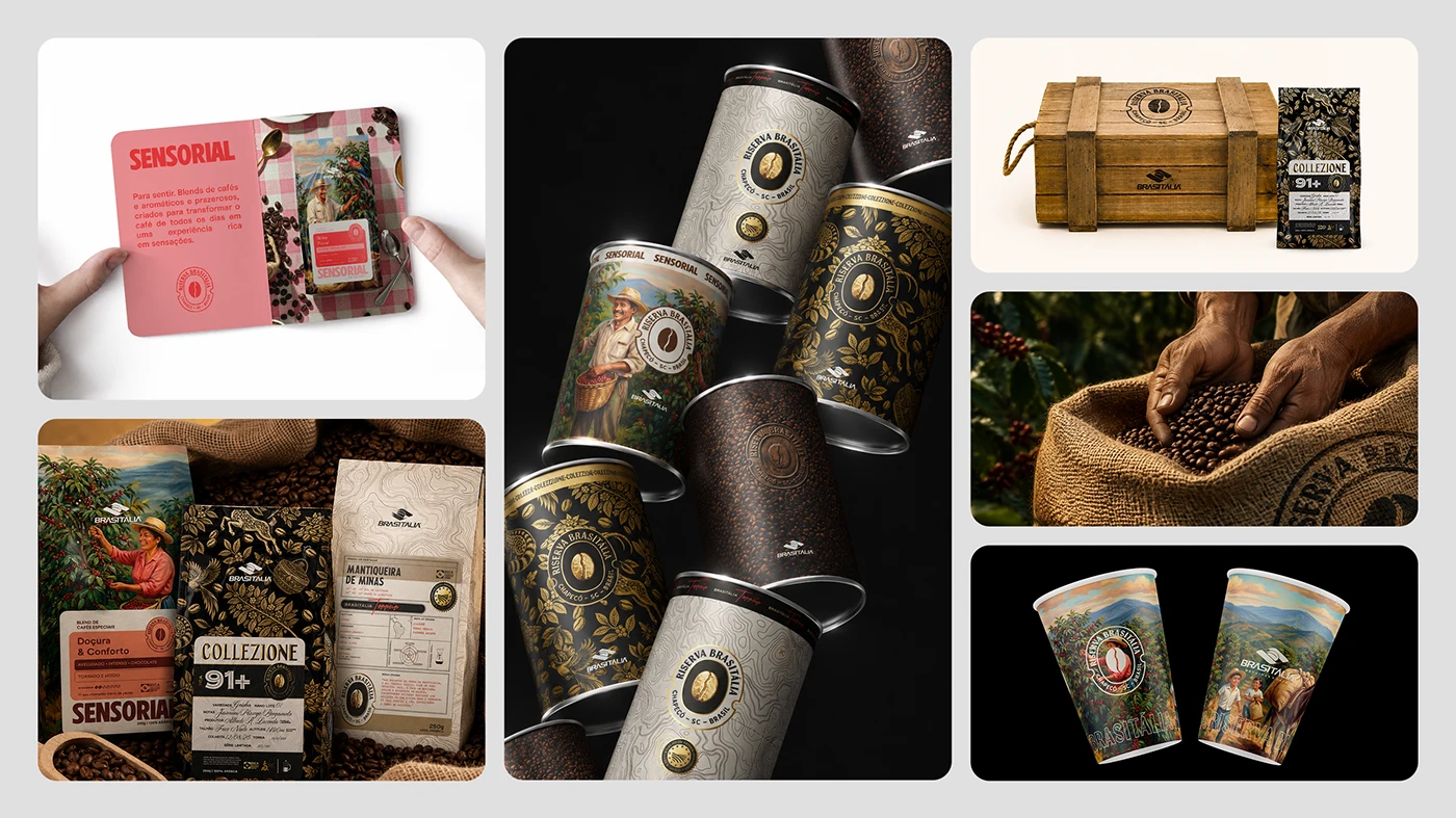
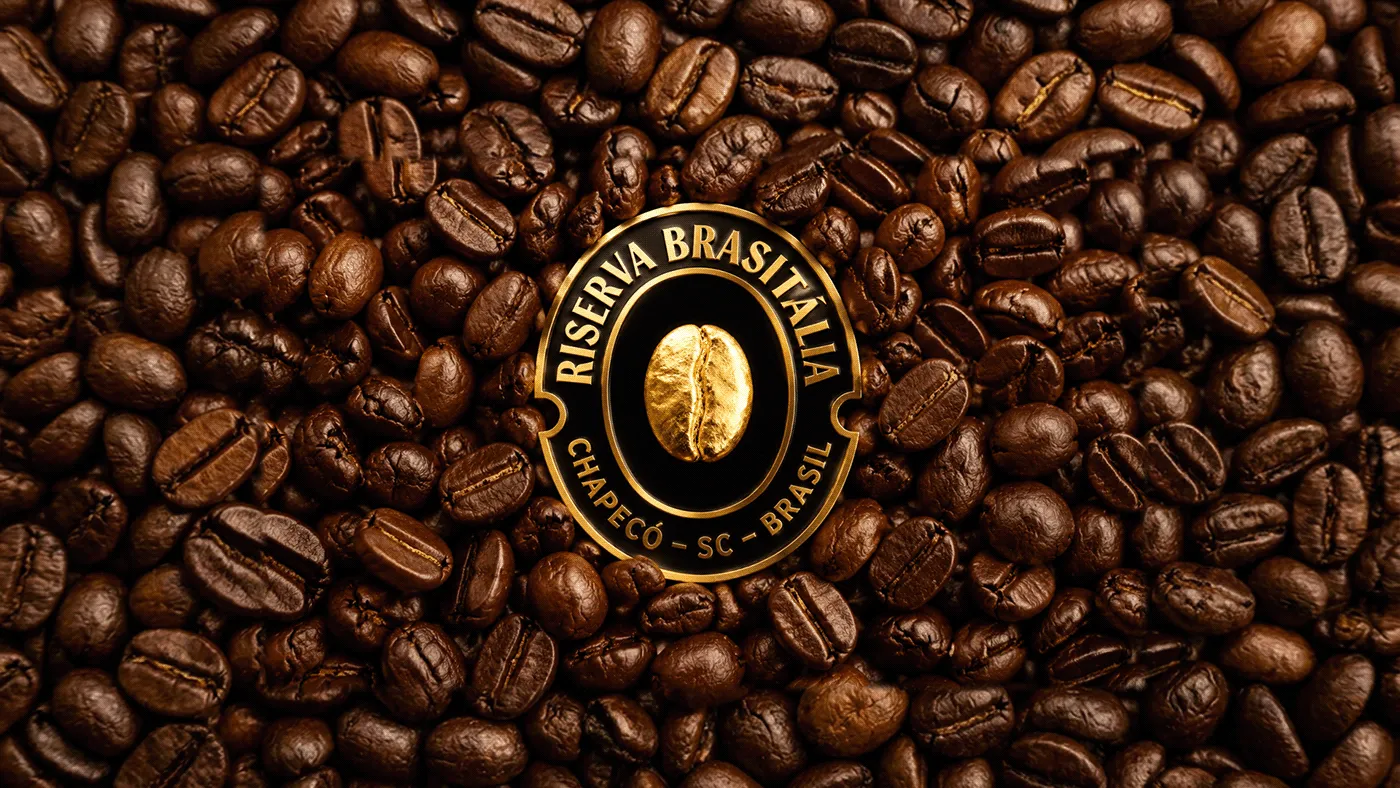
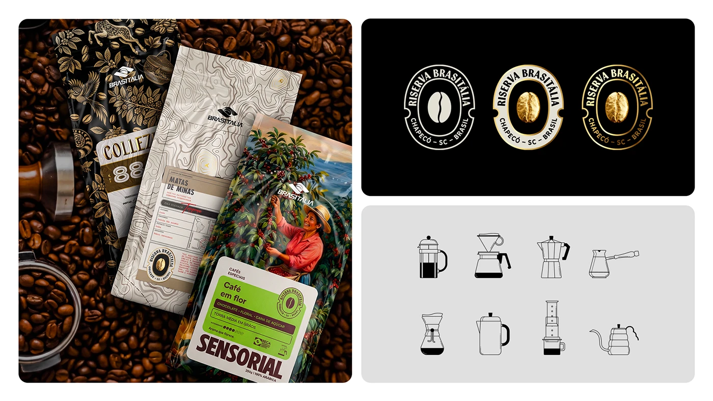
The Riserva Brasitália specialty coffee packaging project is a clever blend of detailed line art, luxurious gold foil accents, and a rich color system. Crafted by a design dream team—Pablo Eduardo Frandoloso, Chaminé Branding, Matthew Corseuil, and Lamaisson Marques dos Santos—the lineup spans three distinct coffee collections. Each collection brings its own artistic flair to highlight bean origins and unique tasting profiles:
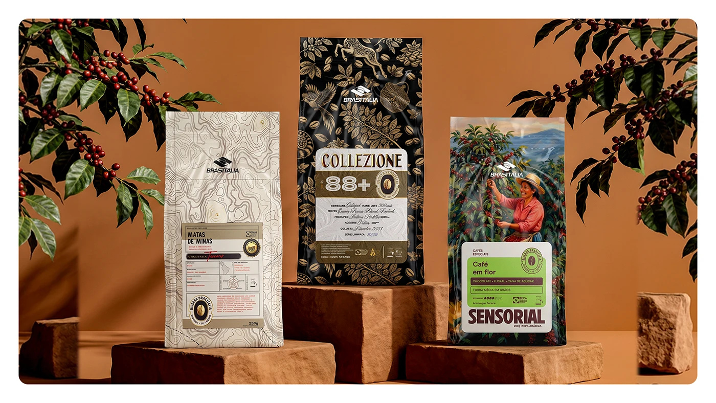
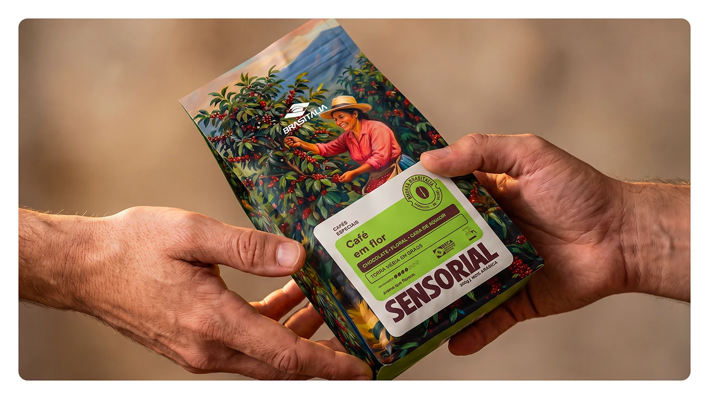
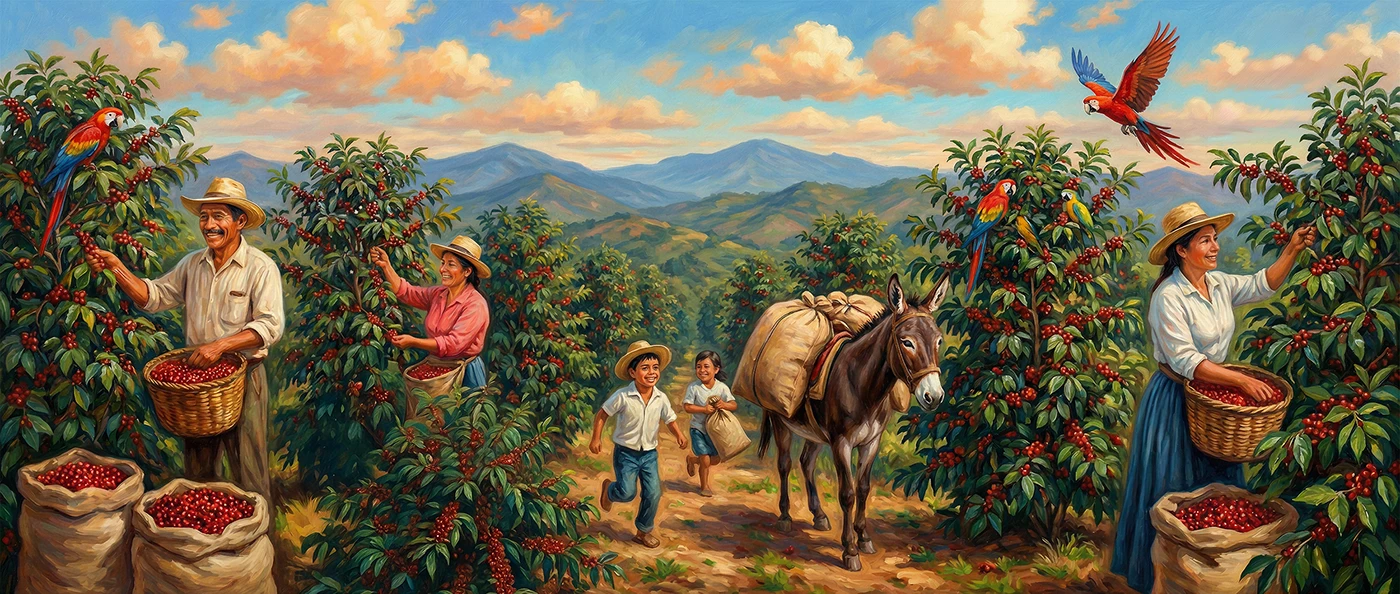
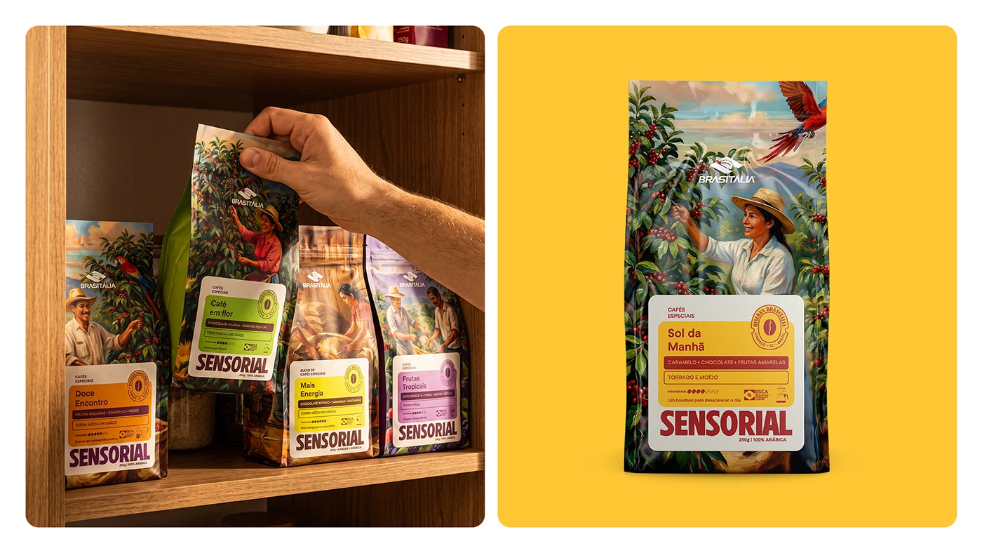
- Sensorial Collection: Bursting with bright floral patterns and warm color blocks.
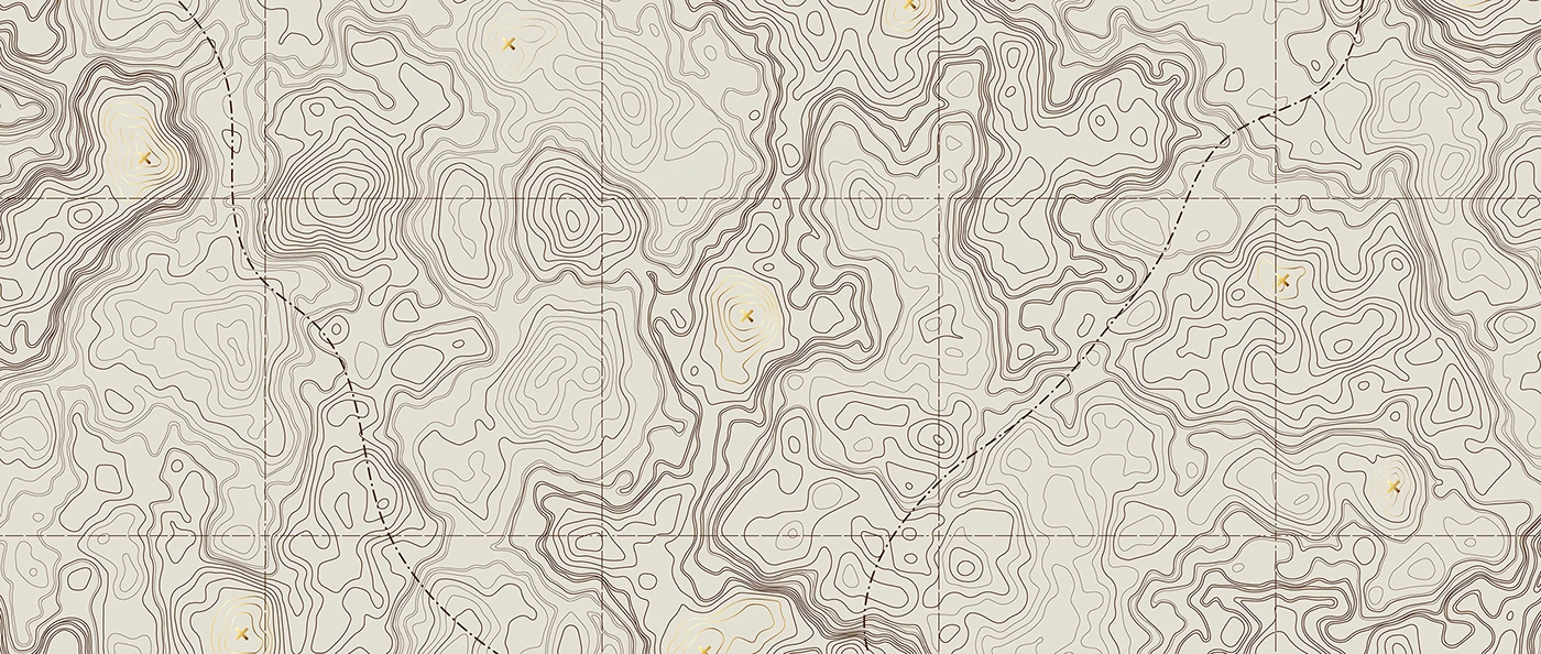
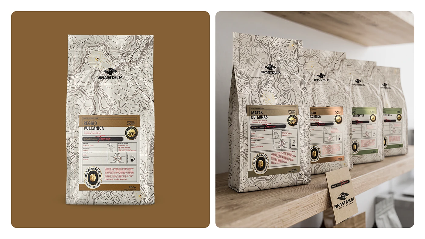
- Terroir Collection: Showcases clean topographic map lines printed on sleek, minimalist paper pouches.
- Collezione Collection: Displays vintage botanical illustrations set against dark backgrounds with stamped gold foil seals.
The typography across the packaging is delightfully crisp and organized, making origin details, roast levels, and tasting notes super easy to read. Clear label layouts help coffee lovers grab their favorite pick in no time, accompanied by neat little badge icons showing off farm altitude and processing methods.
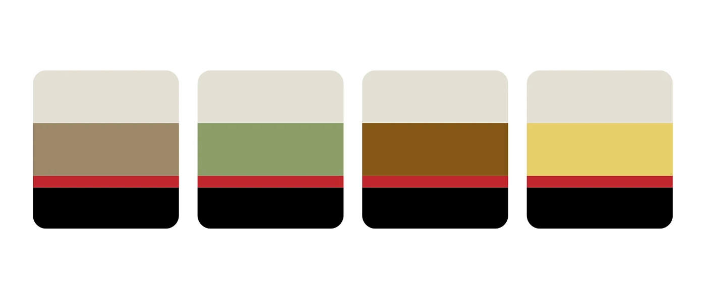
A cohesive visual grid ties everything together across various materials and sizes—from paper bags and gift tins to sturdy wooden crates. Combining smooth paper textures, color-coded flavor bands, and shimmering gold foil detailing adds striking visual depth. This project beautifully fuses brand strategy with meticulous print techniques, giving every coffee harvest the spotlight it deserves.
Explore the full collection of project visuals at www.behance.net/gallery/254085957/Riserva-Brasitalia.
Riserva Brasitália: Bộ thiết kế bao bì và nhận diện cho thương hiệu cà phê đặc sản
Dự án bao bì cà phê specialty Riserva Brasitália là sự kết hợp khéo léo giữa nét vẽ nét (line art) chi tiết, các biểu trưng ép kim vàng sang trọng và hệ thống màu sắc đa dạng. Được thực hiện bởi nhóm thiết kế gồm Pablo Eduardo Frandoloso, Chaminé Branding, Matthew Corseuil và Lamaisson Marques dos Santos, bộ sản phẩm được phân chia thành 3 dòng cà phê riêng biệt. Mỗi dòng sản phẩm lại mang một chủ đề mỹ thuật riêng để làm nổi bật nguồn gốc hạt cùng tầng hương vị đặc trưng:
- Dòng Sensorial: Nổi bật với họa tiết hoa lá tươi sáng cùng các mảng màu ấm áp.
- Dòng Terroir: Sử dụng hình ảnh bản đồ đường nét địa hình (topography maps) in trên chất liệu túi giấy tối giản.
- Dòng Collezione: Trình bày minh họa thực vật học trên nền màu tối kết hợp tem niêm phong dập kim vàng.
Phông chữ trên bao bì được sắp xếp vô cùng gọn gàng, giúp người dùng dễ dàng nắm bắt thông tin xuất xứ, độ rang (roast levels) và ghi chú hương vị (tasting notes). Bố cục nhãn dán rõ ràng hỗ trợ khách hàng đưa ra lựa chọn nhanh chóng, đi kèm các biểu tượng badge nhỏ gọn hiển thị độ cao trang trại cùng quy trình sơ chế.
Hệ thống thiết kế áp dụng một lưới thị giác (visual grid) đồng bộ trên nhiều chất liệu và kích thước, từ túi giấy, hộp thiếc quà tặng cho đến thùng gỗ vận chuyển. Sự kết hợp giữa bề mặt giấy mịn, các dải màu phân loại hương vị và chi tiết ép kim tạo nên hiệu ứng thị giác có chiều sâu. Dự án thể hiện sự gắn kết giữa chiến lược thương hiệu và kỹ thuật in ấn tỉ mỉ, giúp tôn vinh giá trị của từng mùa thu hoạch cà phê.
Bạn có thể tham khảo đầy đủ hình ảnh dự án tại www.behance.net/gallery/254085957/Riserva-Brasitalia.