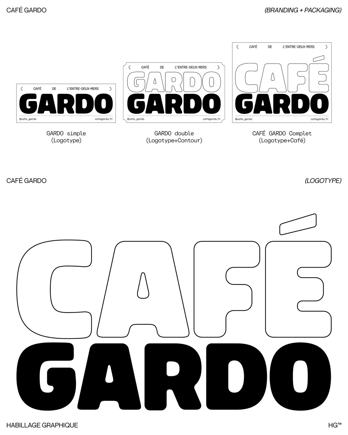

Modular Packaging Design for Café Gardo by Florian Cornut Café Gardo is a specialty coffee brand hailing from the Entre-Deux-Mers region in Southwestern France, founded by artisan roaster Frank Soccio in Camblanes-et-Meynac. The brand’s name takes inspiration from the vibrant meeting point of the Garonne and Dordogne rivers. Driven by a mission to source beans from eco-friendly agroforestry farms and transport them via sailboat to minimize carbon emissions, Café Gardo needed a brand identity that completely captures its deep ties to the land, the rivers, and artisanal craft. Media artist Florian Cornut knocked this challenge out of the park with a brilliant design solution.
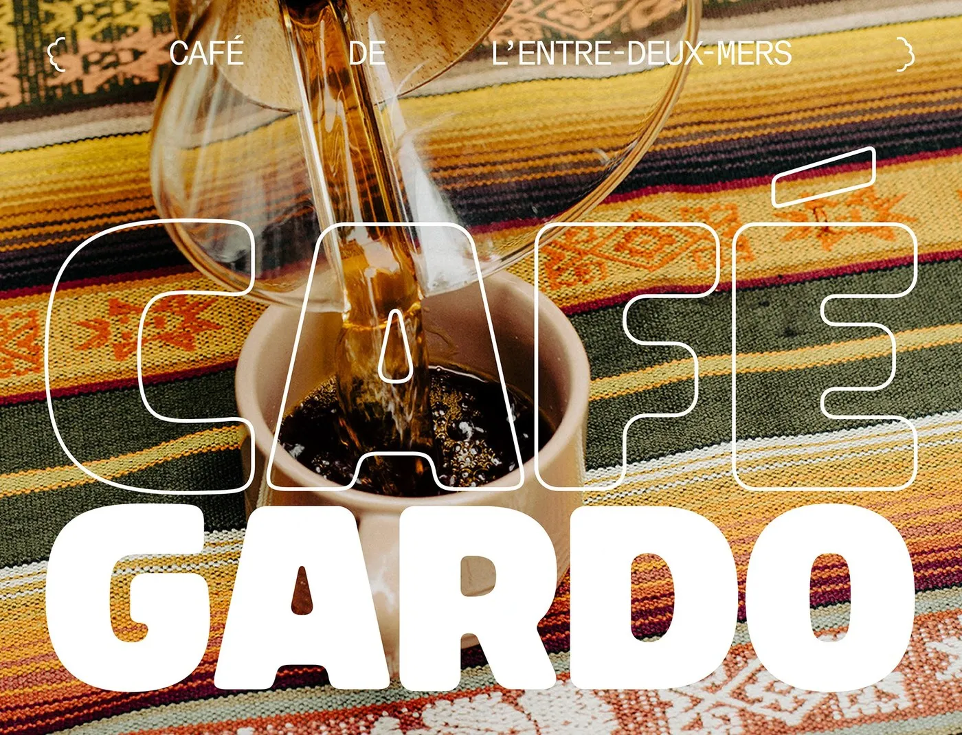
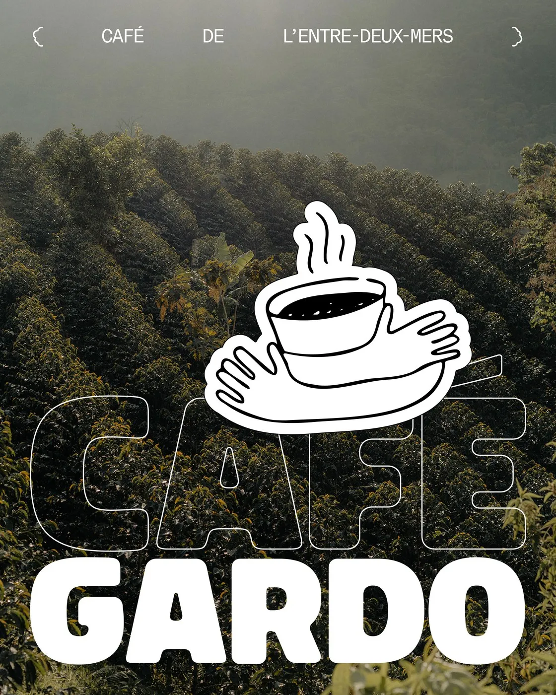
Instead of leaning into the cold, sterile minimalism so common among third-wave coffee brands, Café Gardo’s packaging goes for a richly tactile, authentic feel. Warm harvest tones blend seamlessly with Grant Harder’s organic photography and subtle, natural print textures, creating a lovely bridge between agricultural origins and modern graphic arts.
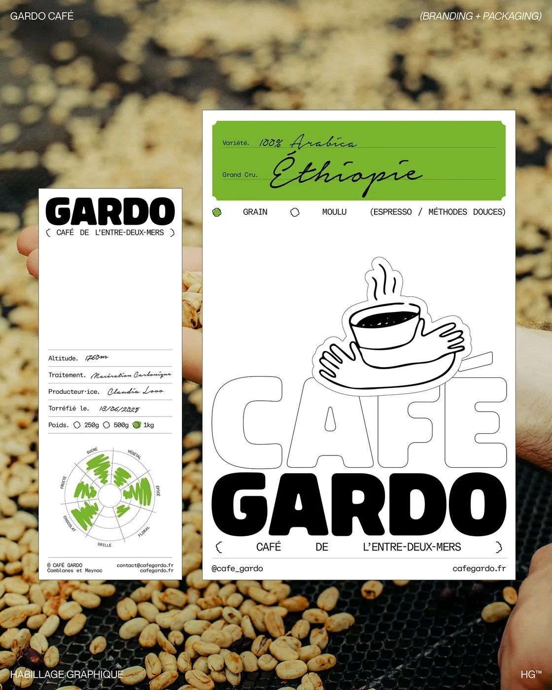
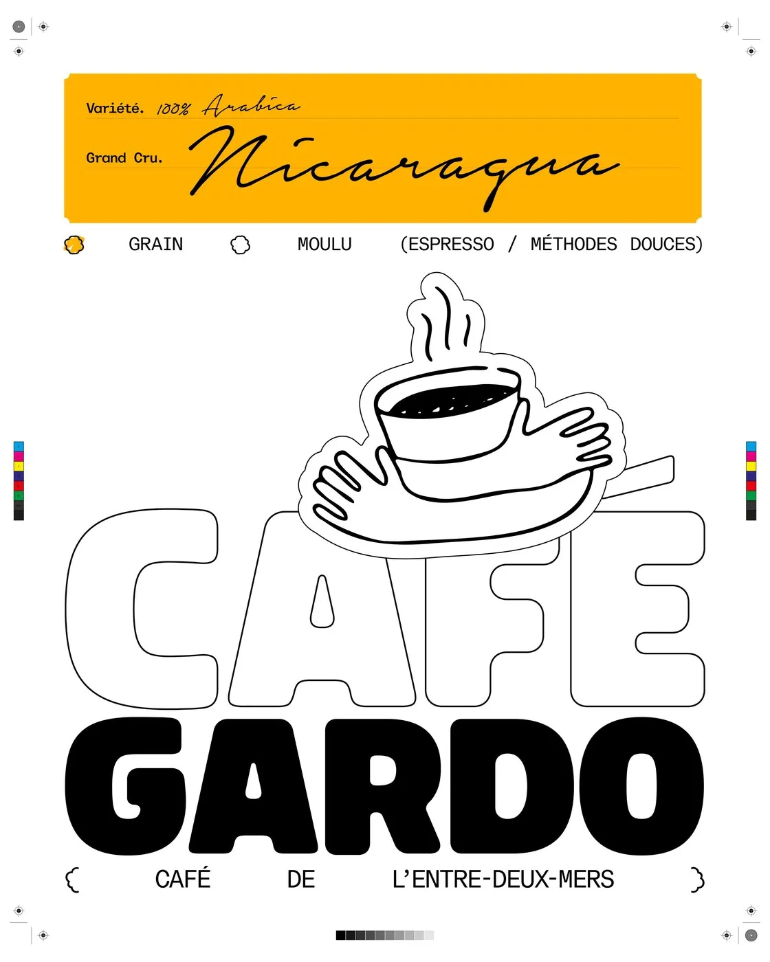
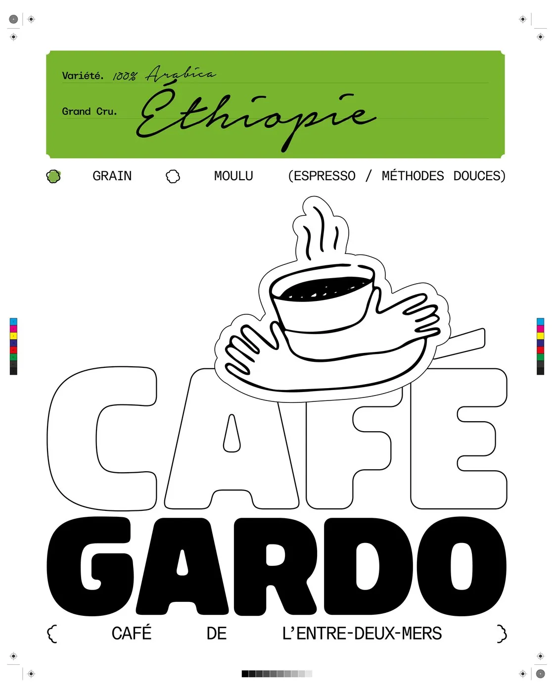
The typography system packs a punch thanks to a fun contrast between expressive display type and crisp technical structure. For the main GARDO brand mark, Gabriel Pang’s Bolota typeface brings thick, chunky letterforms that balance effortlessly with an outlined CAFÉ logotype for a lighter touch. To keep details neat and organized, ABC Dinamo’s monospaced ABC Repro Mono font handles the technical notes, curly brackets like { CAFÉ DE L’ENTRE-DEUX-MERS }, and a detailed info grid.
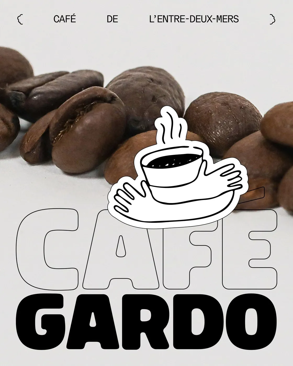
On the packaging front, the design rocks a modular system of tags and stickers applied right onto the coffee bags. Distinct color bands highlight each bean variety—like earthy yellow for Nicaraguan origin or deep green for an Ethiopian micro-lot. Side tags act as technical spec sheets, laying out details like a 1,760-meter elevation, carbonic maceration processing, roast date, producer info like Claudia Lovo, and a radar chart mapping out flavor notes. Topped off with an animated mascot of caring hands cradling a steaming cup by Baptiste De Almeida, the design brings a delightfully warm, community-focused vibe to the whole coffee experience.
Check out the full project breakdown on www.behance.net/gallery/227784643/CAFE-GARDO-BrandingVisual-Identity-Packaging.
Thiết kế bao bì dạng module cho Café Gardo của Florian Cornut
Café Gardo là thương hiệu cà phê specialty đến từ vùng Entre-Deux-Mers ở Tây Nam nước Pháp, do nhà rang xay Frank Soccio thành lập tại Camblanes-et-Meynac. Tên gọi thương hiệu được lấy cảm hứng từ điểm giao nhau giữa hai dòng sông Garonne và Dordogne. Với định hướng ưu tiên nguồn hạt từ các trang trại lâm nghiệp sinh thái và vận chuyển bằng thuyền buồm nhằm giảm thiểu lượng phát thải carbon, Café Gardo cần một bộ nhận diện phản ánh trọn vẹn tinh thần gắn kết với đất đai, dòng sông và lao động thủ công. Bài toán này đã được nghệ sĩ truyền thông Florian Cornut giải quyết vô cùng khéo léo.
Thay vì chạy theo phong cách tối giản có phần lạnh lẽo thường thấy ở nhiều thương hiệu cà phê làn sóng thứ ba, thiết kế bao bì của Café Gardo chọn cách thể hiện giàu tính cảm giác và chân thật. Các gam màu ấm áp của mùa thu hoạch được kết hợp hài hòa với chất ảnh mộc mạc của Grant Harder cùng những vệt in ấn tự nhiên, tạo nên sợi dây kết nối giữa nguồn gốc nông nghiệp và mỹ thuật đồ họa hiện đại.
Hệ thống typography gây ấn tượng nhờ sự tương phản giữa nét chữ trưng bày đầy phá cách và sự chính xác mang tính kỹ thuật. Tên thương hiệu GARDO sử dụng phông chữ Bolota của Gabriel Pang với các đường nét mập mạp, tạo độ khối dày dặn, đối lập với phần chữ CAFÉ dạng viền rỗng (outline) giúp tổng thể trông thanh thoát hơn. Để giữ cấu trúc thông tin ngăn nắp, phông monospaced ABC Repro Mono từ nhà thiết kế ABC Dinamo được đưa vào sử dụng cho các phần chú thích, cặp ngoặc nhọn { CAFÉ DE L’ENTRE-DEUX-MERS } cùng hệ thống khung lưới phân loại chi tiết.
Về mặt bao bì, dự án áp dụng hệ thống thẻ và tem dán dạng module trực tiếp lên túi cà phê. Mỗi dòng hạt được phân biệt bằng các dải màu sắc riêng, như sắc vàng thổ cho hạt Nicaragua hay xanh lá sẫm cho dòng micro-lot từ Ethiopia. Thẻ thông tin đi kèm ở mặt bên đóng vai trò như một hồ sơ kỹ thuật, chi tiết hóa độ cao vùng trồng ở mức 1.760 mét, phương pháp sơ chế ủ yếm khí (carbonic maceration), ngày rang, thông tin người trồng như cô Claudia Lovo, cùng biểu đồ radar thể hiện các tầng hương vị. Bên cạnh đó, hình ảnh linh vật đôi bàn tay nâng niu tách cà phê bốc khói do Baptiste De Almeida diễn họa chuyển động đã góp phần tạo nên nét ấm áp, tôn vinh nét đẹp cộng đồng trong văn hóa thưởng thức cà phê.
Bạn có thể xem thêm chi tiết dự án của www.behance.net/gallery/227784643/CAFE-GARDO-BrandingVisual-Identity-Packaging trên Behance.