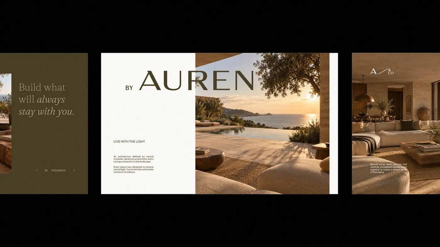
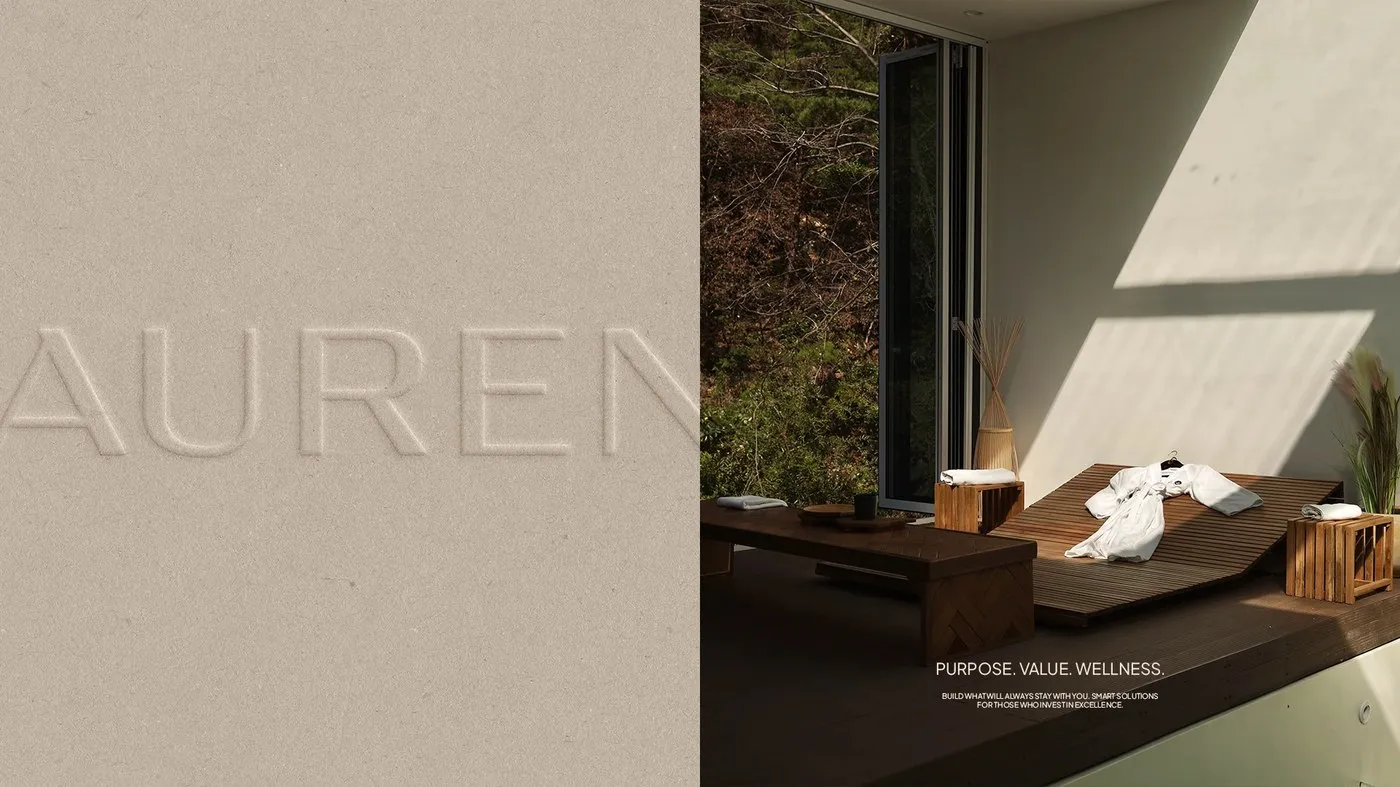
Nathalia Ultramar’s Auren Branding: Balancing Architecture and Tactile Design Auren & Co. is a real estate developer focused on blending property development with wellness spaces. Instead of chasing short-term commercial trends, Auren builds spaces with lasting, sustainable value. To reflect this philosophy, designer Nathalia Ultramar crafted a minimalist visual identity centered on balance and clean structure.
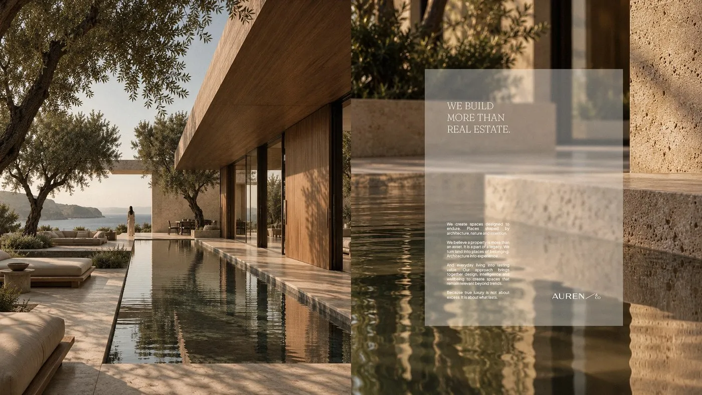
The color palette sets a serene Mediterranean coastal mood with soft earth tones, warm grays, and subtle olive green. Crisp, airy layouts make generous use of negative space, creating an effortless and comforting viewing experience.
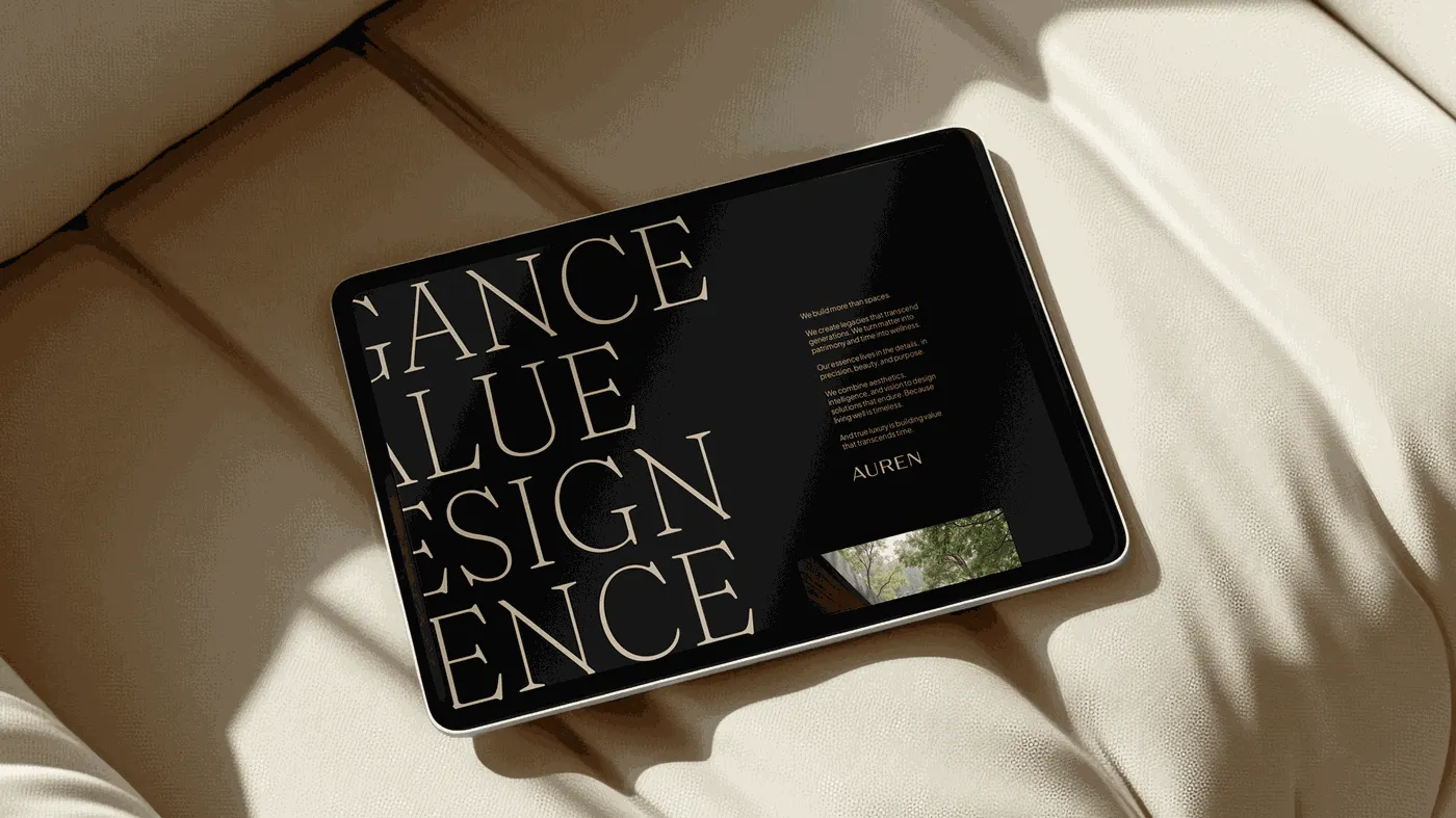
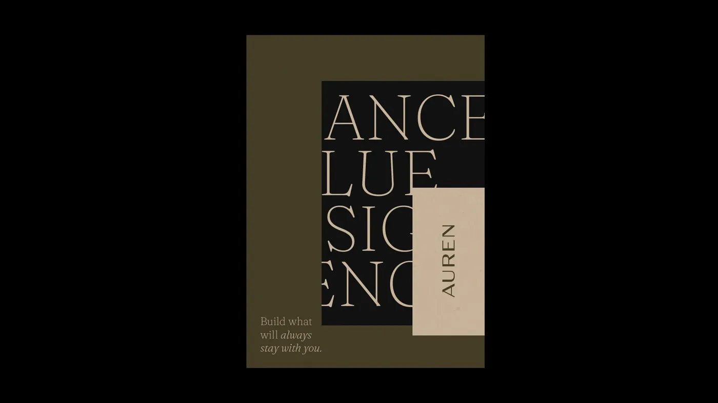
Typography is a standout feature, headlined by a custom uppercase sans-serif wordmark with delicate, precise cuts. Pairing this modern sans-serif with an editorial serif gives the brand an architecturally grounded feel mixed with artistic depth. Meanwhile, technical monospace accents display coordinates and index specs, keeping every layout anchored to a strict grid system.
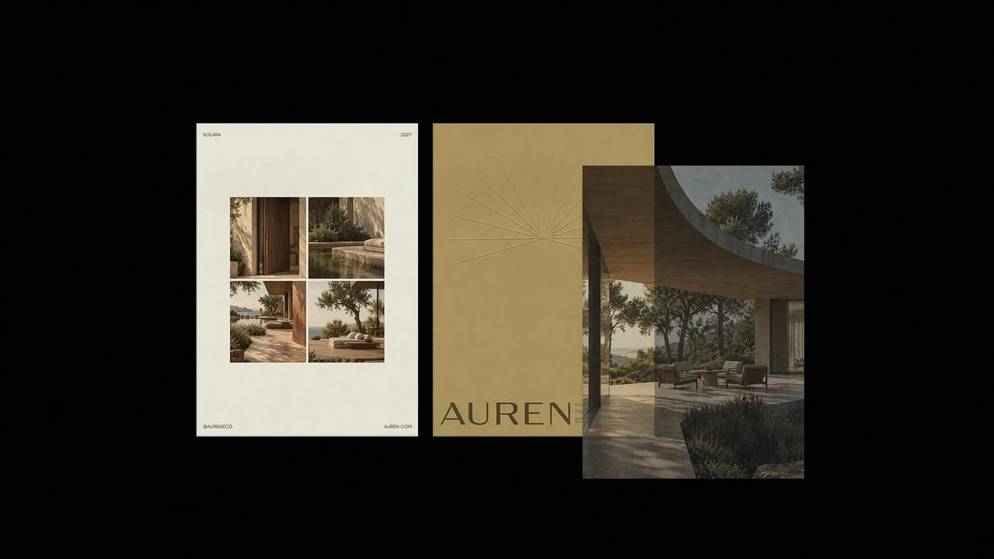
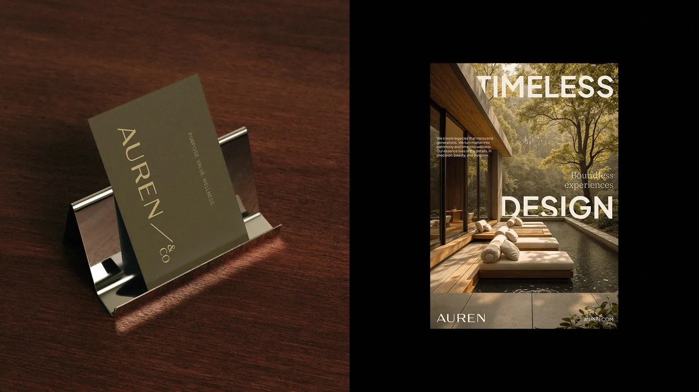
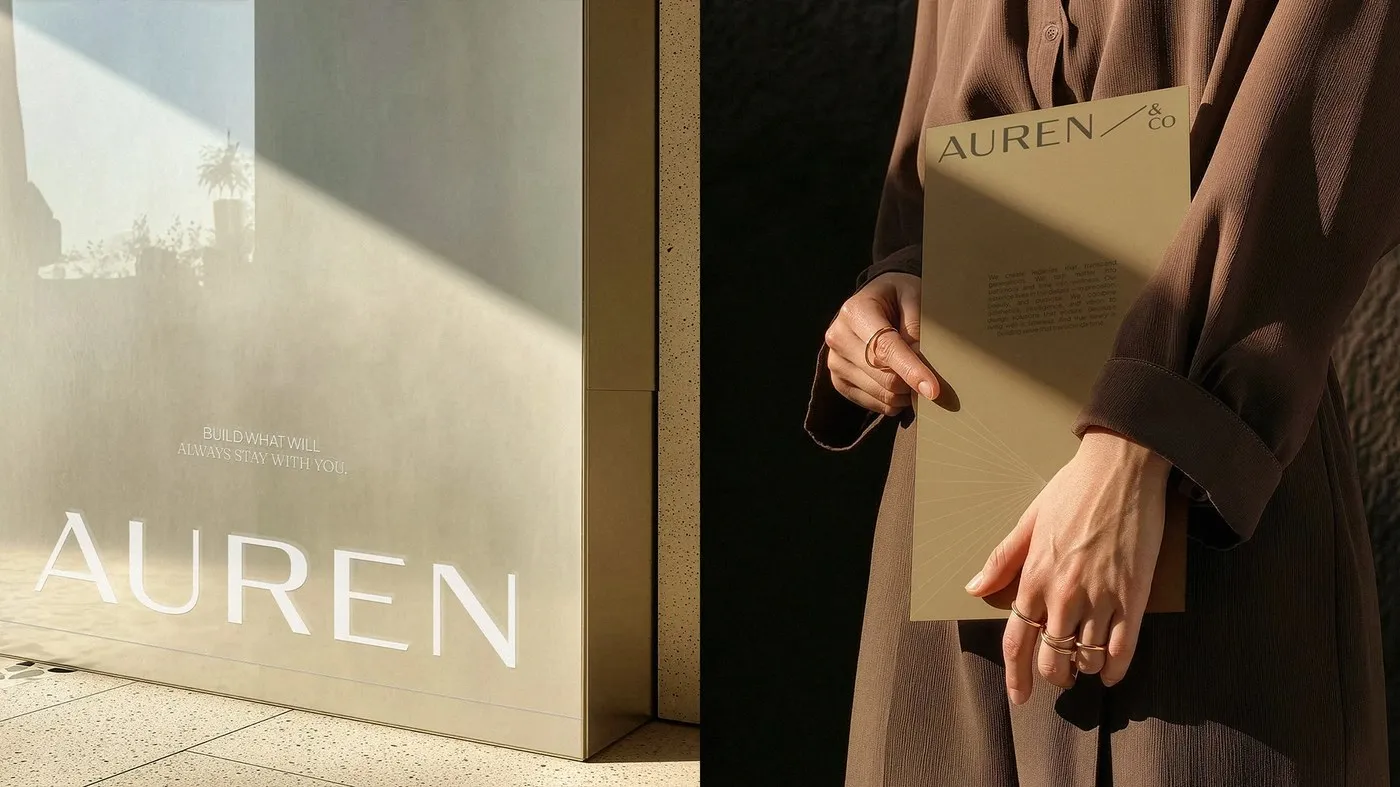
This identity truly levels up in real-world tactile applications. Think debossed logos pressed directly into raw limestone walls, matte olive business cards paired with chrome holders, heavyweight mustard cardstock folders, and blind-embossed print work paired with translucent vellum overlays. Every material choice is meticulously planned, allowing Auren’s visual system to blend seamlessly with real architectural elements like travertine stone and plaster.
Bộ nhận diện thương hiệu Auren của Nathalia Ultramar: Sự cân bằng giữa kiến trúc và chất liệu
Auren & Co. là một doanh nghiệp hoạt động trong lĩnh vực phát triển bất động sản kết hợp các không gian chăm sóc sức khỏe. Thay vì chạy theo tính thương mại ngắn hạn, Auren hướng đến việc tạo ra những công trình mang giá trị bền vững theo thời gian. Để truyền tải tinh thần này, designer Nathalia Ultramar đã tạo nên một bộ nhận diện thương hiệu (visual identity) mang phong cách tối giản, chú trọng vào sự cân bằng và cấu trúc.
Bảng màu chủ đạo của dự án sử dụng các tông màu đất nhẹ nhàng, xám ấm và xanh olive, gợi liên tưởng đến khung cảnh ven biển Địa Trung Hải. Các thiết kế được dàn trang thoáng đãng, tận dụng khoảng trắng (negative space) hợp lý để mang lại cảm giác dễ chịu cho người xem.
Về phần typography, điểm nhấn nằm ở phần wordmark chữ in hoa dạng sans-serif được tùy chỉnh với những đường nét cắt tinh tế. Việc kết hợp giữa phông sans-serif hiện đại và phông serif mang phong cách editorial giúp thương hiệu vừa giữ được nét vững chãi của ngành kiến trúc, vừa có chiều sâu nghệ thuật. Bên cạnh đó, phông chữ monospace cũng được đưa vào để thể hiện các thông số tọa độ và chỉ số phân loại, giữ cho mọi layout luôn tuân thủ hệ thống lưới (grid) chặt chẽ.
Bộ nhận diện này thể hiện rõ sự đầu tư khi bước ra ứng dụng thực tế trên các chất liệu vật lý. Logo thương hiệu được dập chìm trực tiếp trên tường đá vôi thô, danh thiếp màu olive nhám đi cùng chân đế chrome, bìa hồ sơ làm từ giấy cardstock dày màu vàng mù tạt, hay các ấn phẩm in ấn kết hợp dập nổi cùng lớp giấy can (vellum) xuyên sáng. Sự tính toán tỉ mỉ về chất liệu giúp hình ảnh của Auren hòa quyện tự nhiên với các chất liệu kiến trúc như đá travertine và thạch cao.