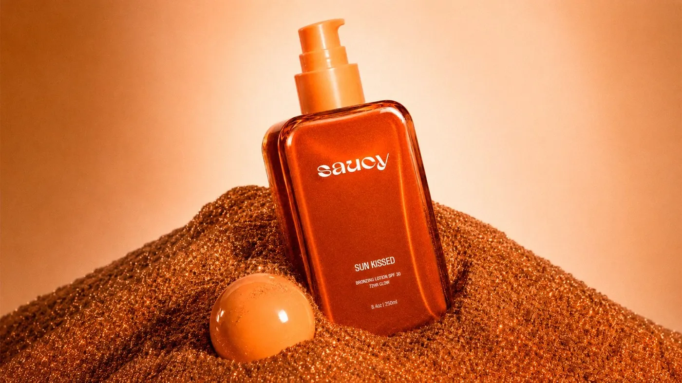
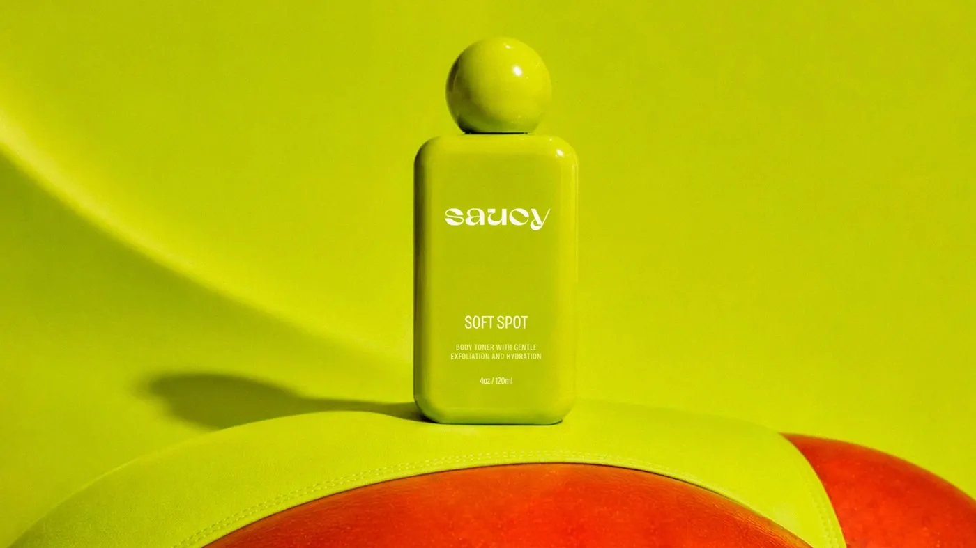
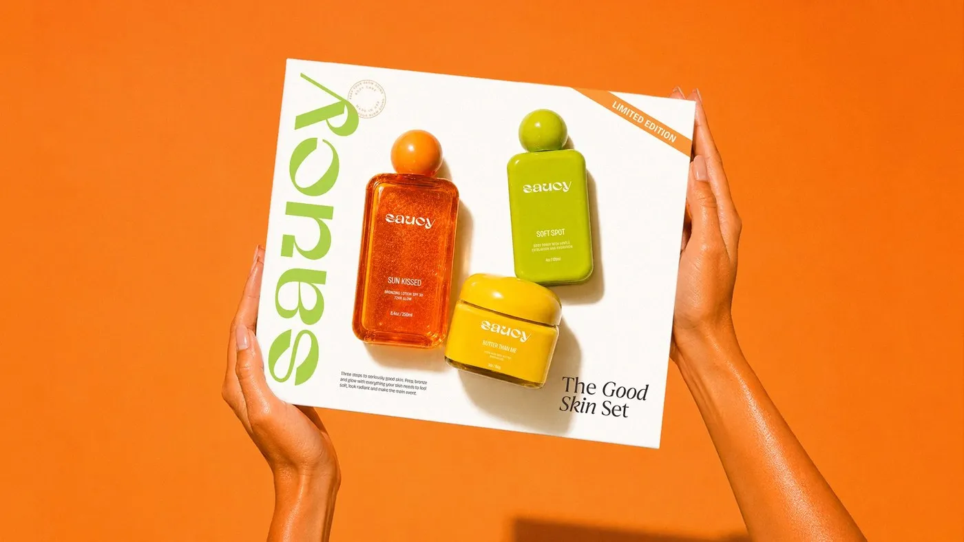
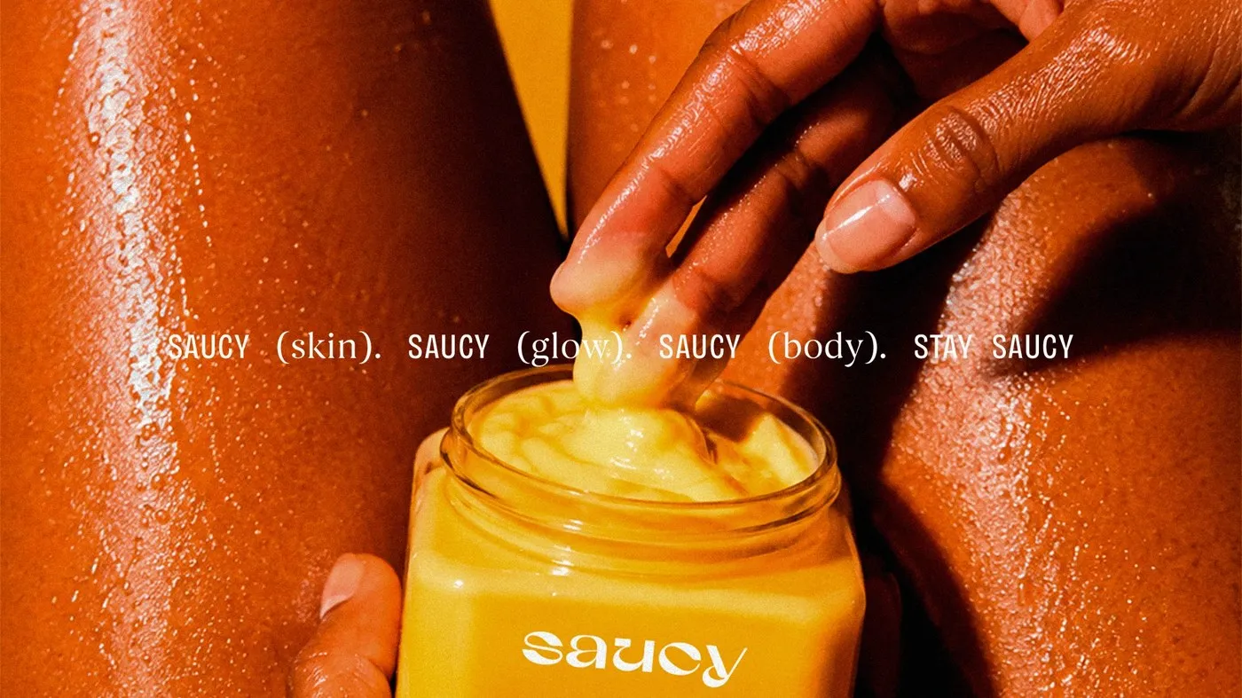
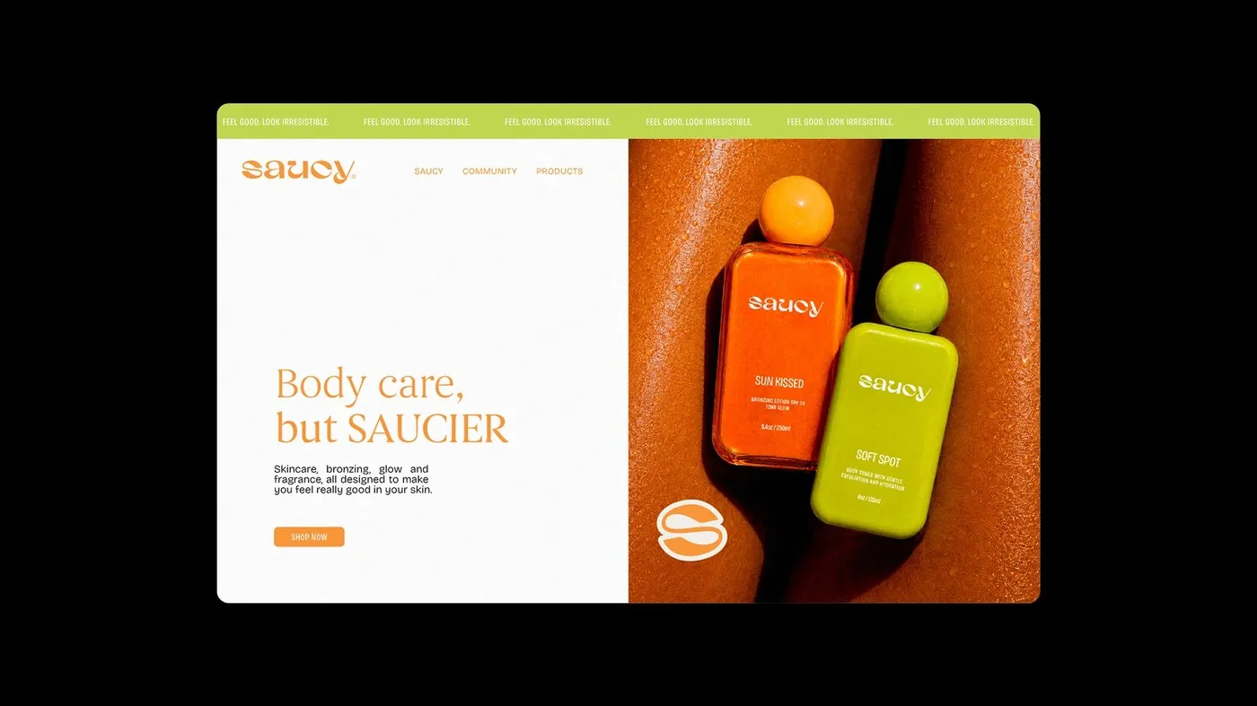
Saucy – A Bold, Personality-Packed Packaging Design by Nathalia Ultramar Stepping away from predictable clinical minimalism and standard warm gold tones, Brazilian designer Nathalia Ultramar teamed up with Orcaah to give body care brand Saucy a fresh, standout look. Centered around the core message “stay saucy,” the visual identity leans heavily into personality-filled typography, solid proportions, and a striking color palette that commands attention on any shelf.
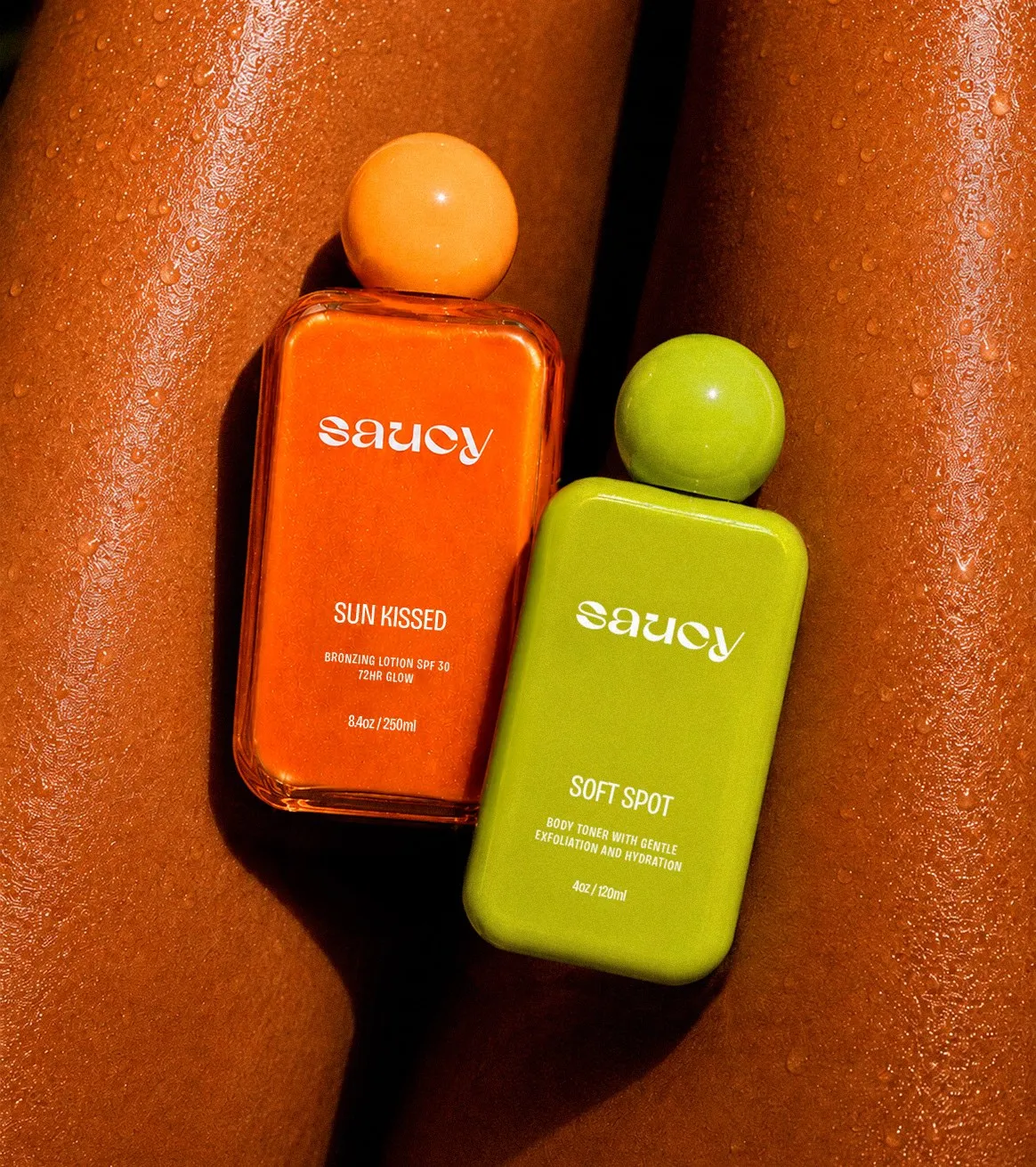
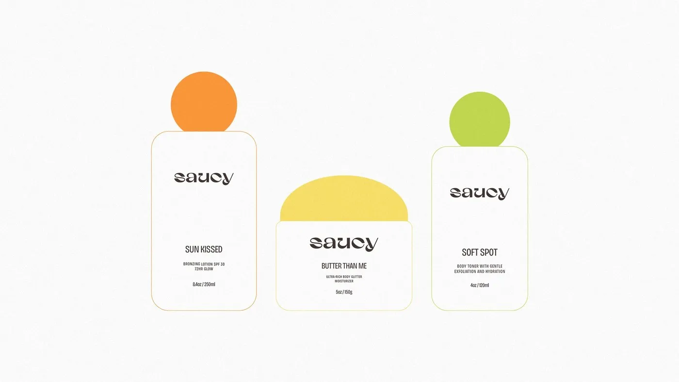
One of the coolest details is the cheeky product naming—swapping dry technical jargon for playful titles like Soft Spot, Sun Kissed, and Butter Than Me. The cylindrical spray bottles and squeeze tubes feature a high-contrast palette blending rich cocoa brown, warm marigold yellow, and soft pastel purple. A smart typographic hierarchy effortlessly pairs a bold, expressive wordmark with clean sans-serif type, making ingredients, usage instructions, and volume details super easy to read.
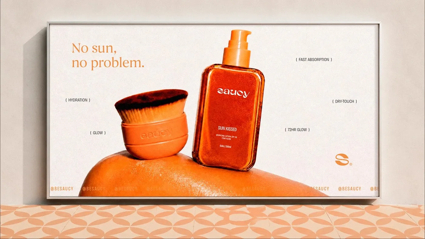
This vibrant design system goes way beyond physical packaging, translating seamlessly into e-commerce layouts and art-directed photography. Crafted with industry-standard tools like Adobe Illustrator, Photoshop, and InDesign, the project proves how thoughtful packaging design can turn an everyday skincare routine into a genuinely joyful experience.
Check out the full project on www.behance.net/gallery/255021191/Saucy.
Saucy – Thiết Kế Bao Bì Đầy Cá Tính Của Designer Nathalia Ultramar
Thay vì đi theo lối mòn thiết kế tối giản mang hơi hướng y khoa hay những tông màu vàng đồng quen thuộc, designer người Brazil Nathalia Ultramar đã cùng Orcaah mang đến một diện mạo hoàn toàn mới cho dòng chăm sóc cơ thể Saucy. Với thông điệp chủ đạo “stay saucy”, bộ nhận diện này tập trung vào typography giàu cá tính, tỷ lệ bố cục vững vàng cùng bảng màu ấn tượng, giúp sản phẩm nổi bật ngay khi xuất hiện trên kệ hàng.
Điểm thú vị nằm ở cách đặt tên sản phẩm đầy hóm hỉnh như Soft Spot, Sun Kissed hay Butter Than Me thay cho những dòng mô tả kỹ thuật khô khan. Các dạng chai xịt cylindrical và tuýp nặn sở hữu sự kết hợp màu sắc tương phản cao giữa sắc nâu ca cao, vàng vạn thọ ấm áp và tím pastel nhẹ nhàng. Hệ thống phân cấp typography tạo sự cân bằng khéo léo giữa phần wordmark dạng nét dày cá tính với phần chữ sans-serif tinh gọn, giúp người dùng dễ dàng theo dõi thông tin thành phần, hướng dẫn sử dụng và dung tích.
Không chỉ dừng lại ở bao bì chai lọ, ngôn ngữ thiết kế này còn lan tỏa đồng bộ sang cả giao diện thương mại điện tử và định hướng hình ảnh nhiếp ảnh. Được hoàn thiện bằng các công cụ quen thuộc như Adobe Illustrator, Photoshop và InDesign, dự án cho thấy một thiết kế bao bì chuẩn chỉnh có thể biến thói quen chăm sóc da hằng ngày thành một trải nghiệm đầy niềm vui.
Mọi người có thể xem toàn bộ dự án của www.behance.net/gallery/255021191/Saucy trên Behance.