Digigoat Brand Redesign: From Detailed Illustration to Minimalist Typography Digigoat is a sleek visual identity redesign centered on minimalism, crafted by the creative team at Paprika Design. It instantly makes a statement with a high-contrast geometric typeface.
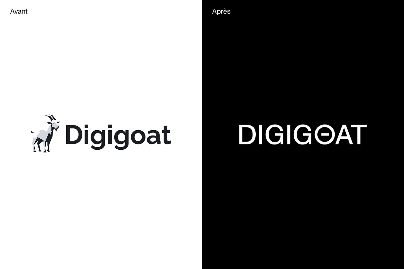
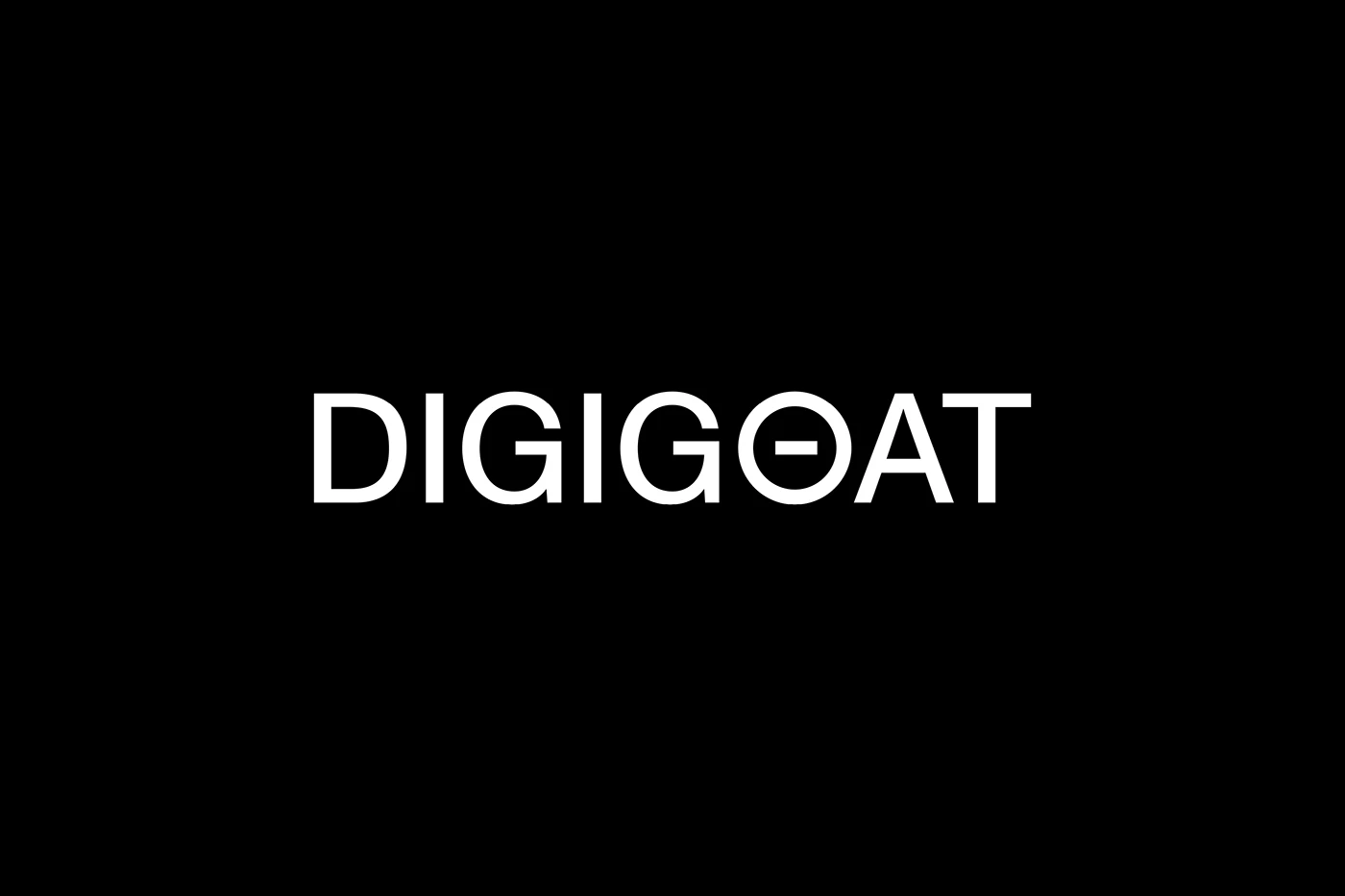
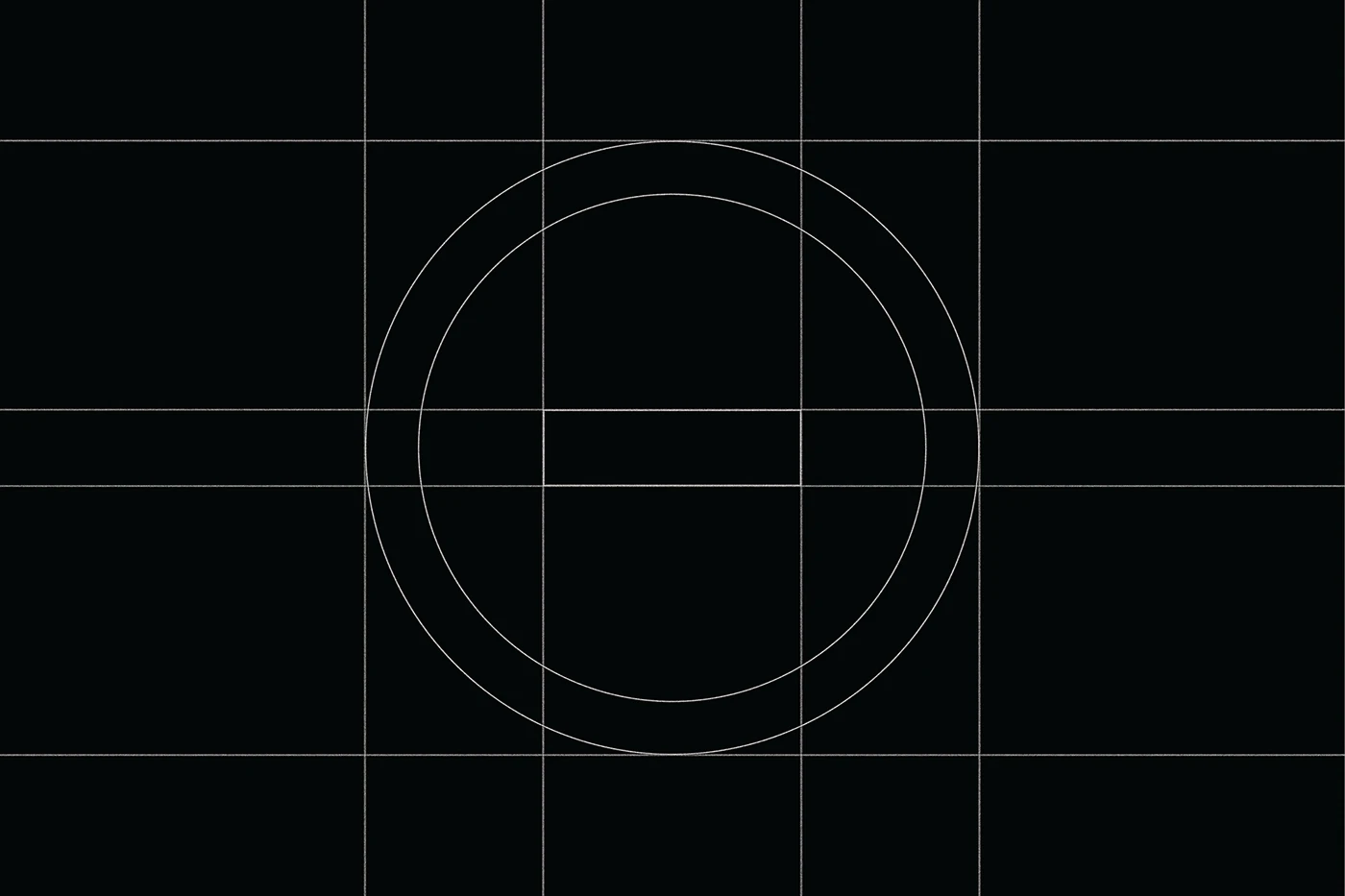
Ditching the overly complex goat illustration from the original identity, the brand made a bold pivot toward a crisp, clean wordmark. Front and center is the name DIGIGOAT, built with sharp block letters. In a clever design twist, Paprika Design flattened the inner counter of the letter O into a horizontal bar, playfully mimicking the shape of a goat’s pupil. The high-contrast black-and-white color palette gives the logo an extra visual punch, while detailed grid-line breakdowns demonstrate how every curve adheres strictly to design standards.
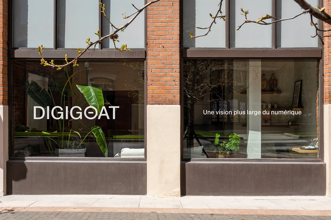
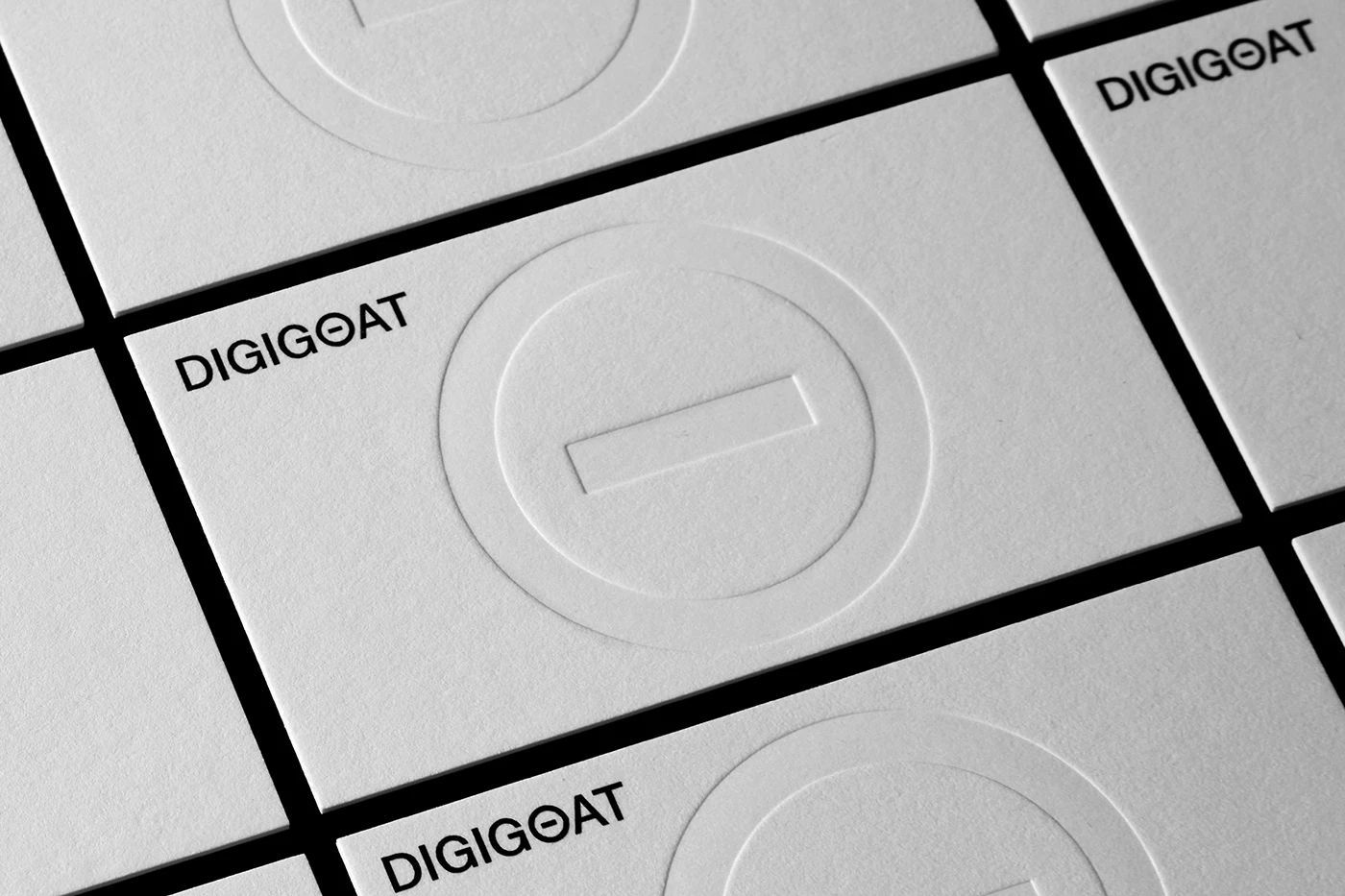
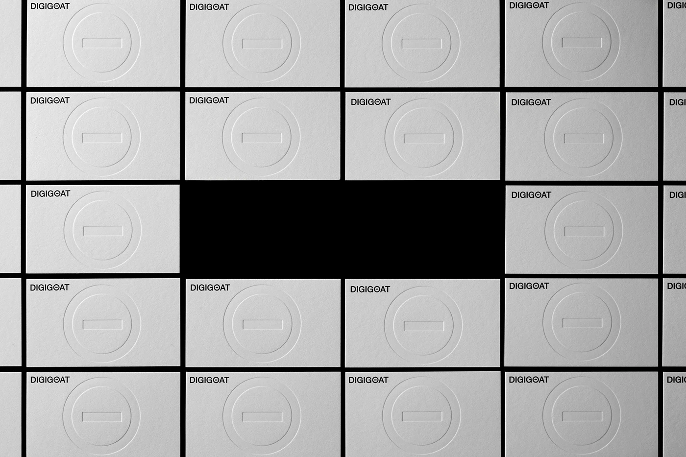
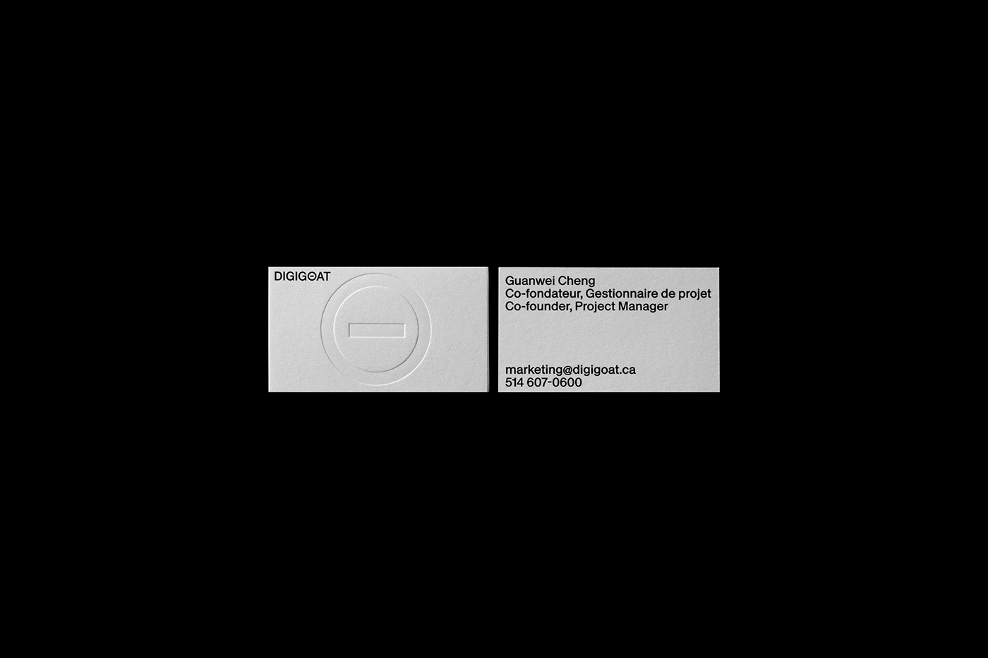
In physical applications, this identity comes to life on thick, premium white fine-art paper. The business cards make an impact with a blind-embossed logo right in the center and contact info neatly organized in the top corner. A bold white version of the wordmark is also applied to the studio window, popping beautifully against the dark background inside. Pairing high contrast with raw, tactile paper texture really elevates the crisp cuts of the print materials.
This project proves how much impact a typography refresh can bring to a tech brand. Shifting from a realistic drawing to a streamlined, typographic logo gives the brand a fresh, digital-first look. It stands out as an inspiring, actionable case study for any design refresh.
Check out the full redesign project over on www.behance.net/gallery/249794437/Digigoat.
Tái Nhận Diện Thương Hiệu Digigoat: Thay Đổi Từ Hình Vẽ Tả Thực Sang Bộ Chữ Tối Giản
Digigoat là dự án tái thiết kế hệ thống nhận diện thương hiệu theo phong cách tối giản đến từ studio Paprika Design, gây ấn tượng bởi font chữ hình học có độ tương phản cao.
Thay vì sử dụng hình minh họa con dê rườm rà như trước, thương hiệu đã chuyển sang một wordmark vô cùng gọn gàng. Trung tâm của bộ nhận diện là cái tên DIGIGOAT với các nét chữ khối sắc nét. Paprika Design đã biến tấu phần ruột của chữ O thành một gạch ngang phẳng, mô phỏng lại hình dáng đồng tử mắt dê khá thú vị. Việc kết hợp hai mảng màu đen và trắng tương phản giúp logo dễ dàng thu hút thị giác. Các đường grid line chi tiết cho thấy từng đường cong của ký tự đều tuân thủ chính xác theo quy chuẩn.
Trên các ấn phẩm thực tế, bộ nhận diện được thể hiện trên chất liệu giấy mỹ thuật trắng và dày. Bộ danh thiếp gây chú ý với logo dập chìm không dùng mực ở chính giữa, còn phần thông tin liên hệ được xếp gọn gàng ở góc trên. Wordmark màu trắng còn được dán lên mặt kính studio, nổi bật trên nền không gian tối bên trong. Sự kết hợp giữa tỷ lệ tương phản và chất liệu giấy thô tự nhiên giúp làm tôn lên các góc cắt sắc lẹm của ấn phẩm.
Dự án này cho thấy việc thay đổi typography có thể tạo nên bước ngoặt lớn cho một thương hiệu công nghệ. Sự chuyển dịch từ hình vẽ tả thực sang một biểu tượng chữ tinh giản mang lại cho thương hiệu một vẻ ngoài hiện đại, chuẩn kỹ thuật số. Đây là một case study thú vị và hữu ích cho các nhà thiết kế khi làm mới nhận diện thương hiệu.
Xem trọn vẹn dự án tái nhận diện thương hiệu này trên Behance của www.behance.net/gallery/249794437/Digigoat.