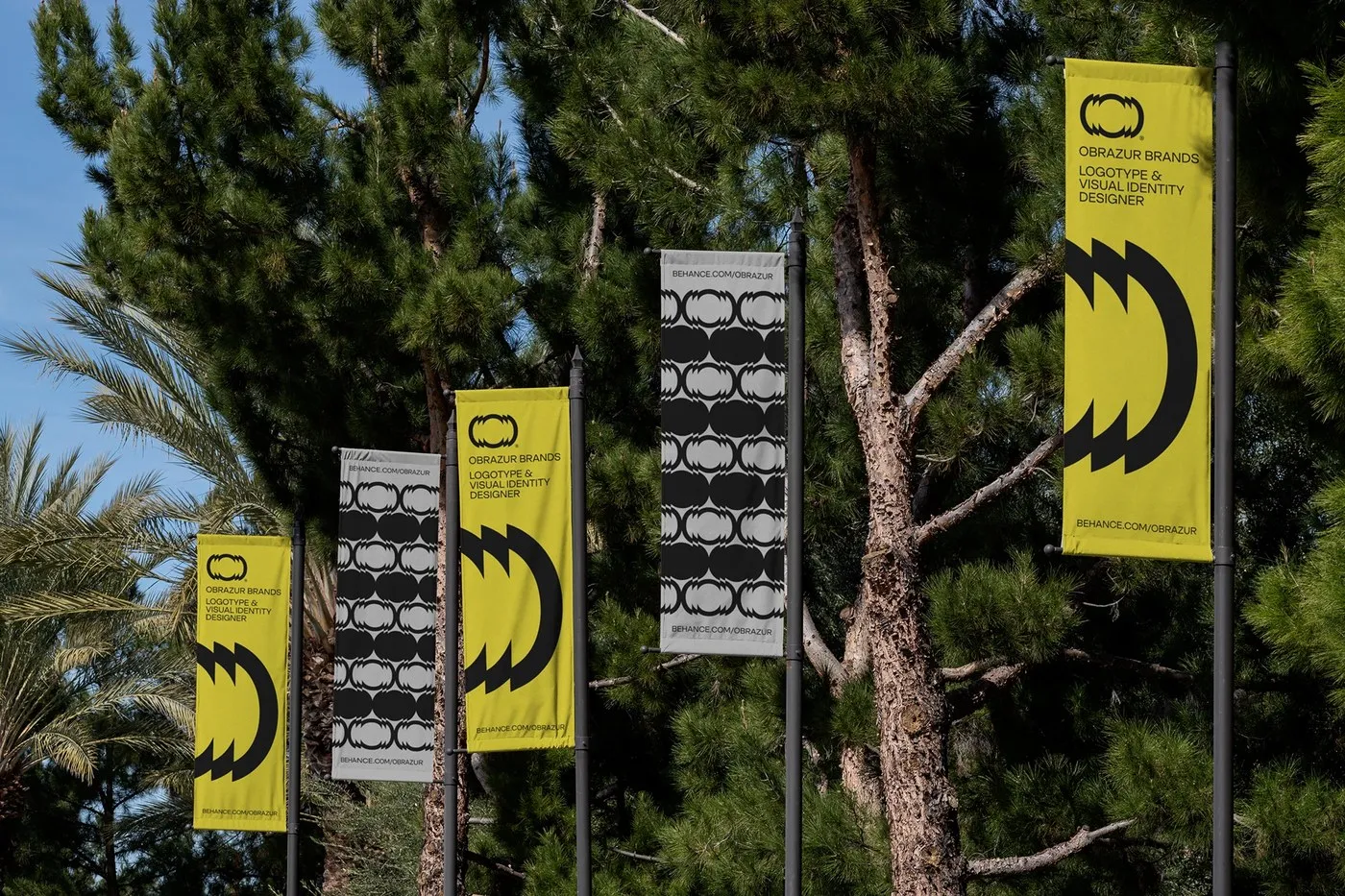
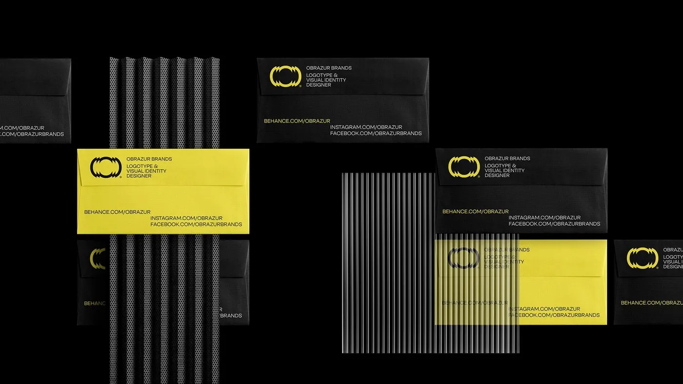
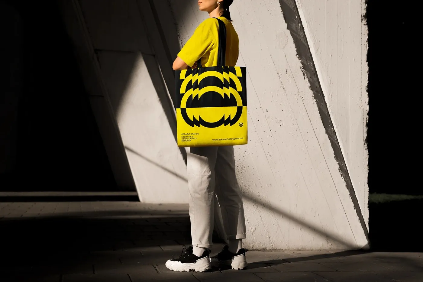
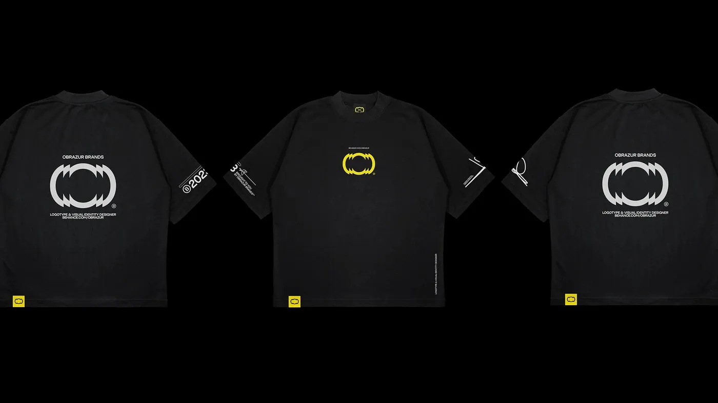
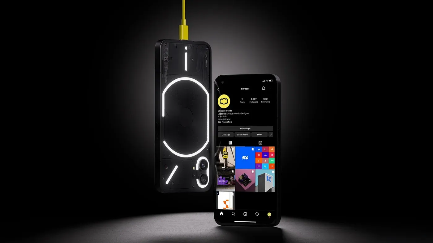
A Mechanical and Kinetic Visual Identity System by Obrazur Brands Ukrainian design studio Obrazur Brands just dropped a high-energy brand identity concept. Instead of playing it safe with typical minimal logos or monograms, this project brings a sharp, angular graphic system built around kinetic visual effects and industrial precision. It flows seamlessly across everything from directional signage and stationery to digital products and screen-printed workwear.
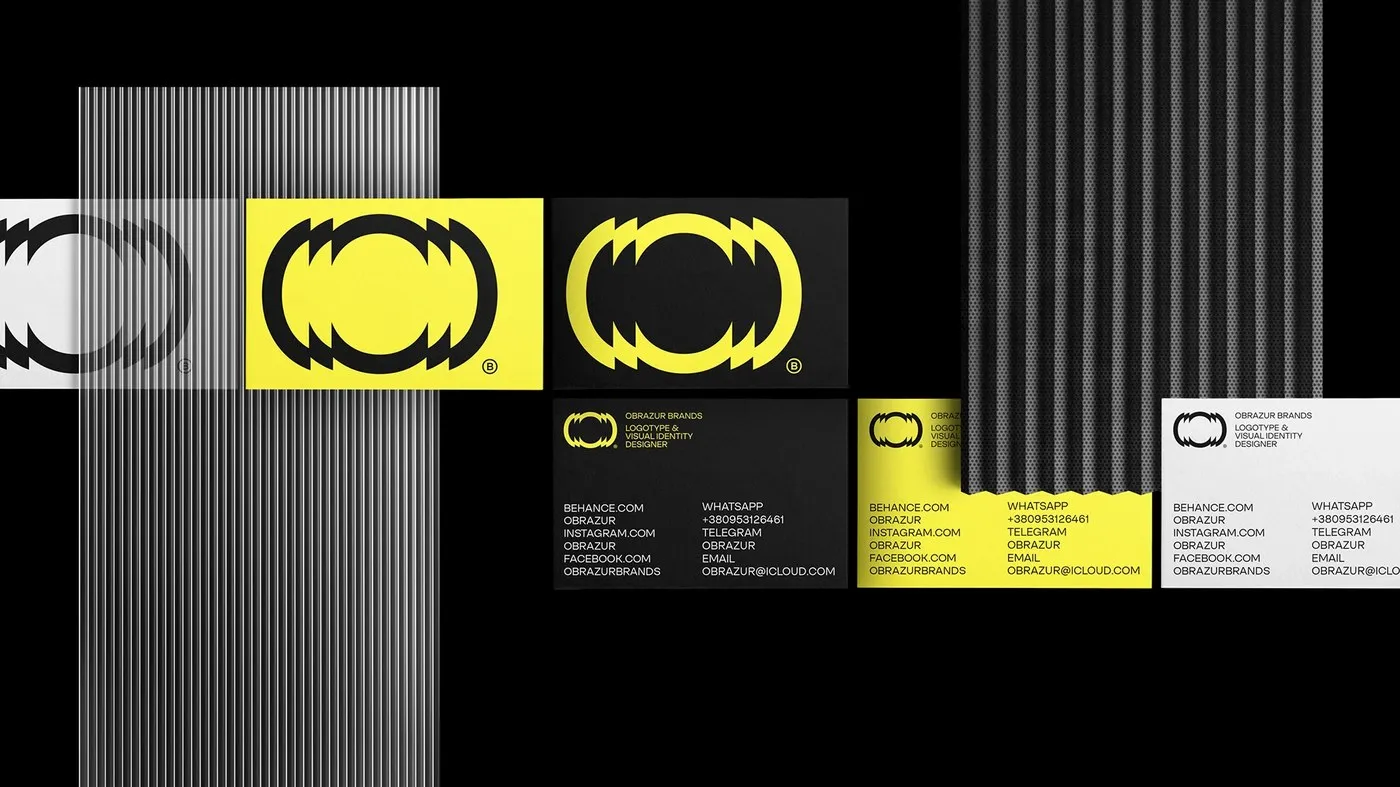
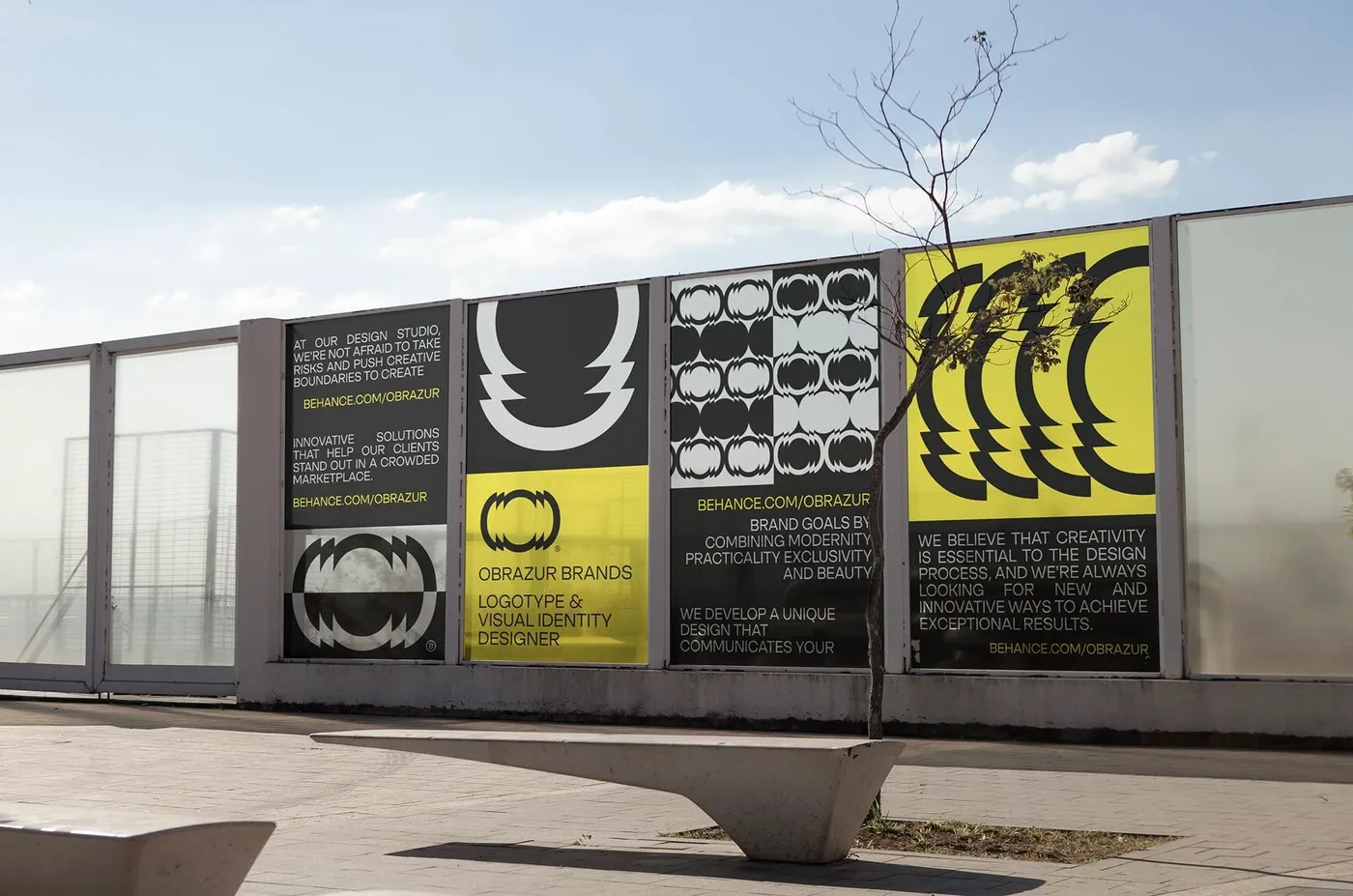
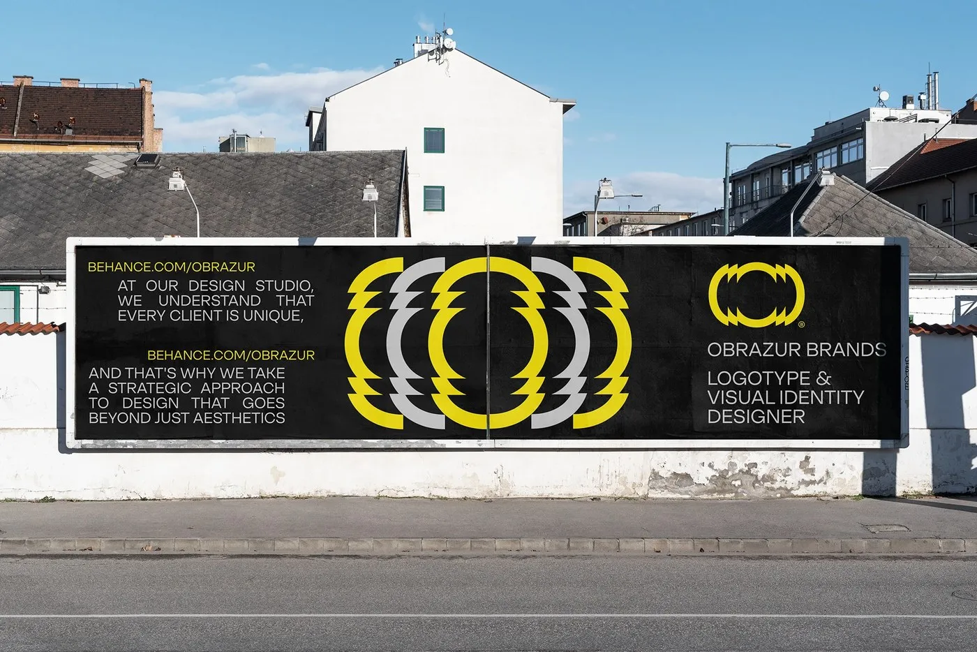
Serrated Symbols and Dynamic Shapes At the heart of the identity lies a circular logo wrapped in layered serrated edges. The design creates instant visual vibration, conjuring up images of mechanical gears, optical lenses, and continuous rotation. On posters, exhibition banners, and social posts, the emblem duplicates into op-art grids, transforming a standalone logo into rhythmic, architectural surfaces.
Balancing out that dynamic circular energy is crisp, Swiss-style typography. Clean, uppercase grotesque fonts sit tightly on a grid, keeping contact details and technical specifications razor-sharp and legible—even across challenging surfaces like corrugated metal or high-contrast backdrops.
Color Contrast and Industrial Materials The color scheme packs a major punch by pairing electric acid yellow with matte charcoal, stark white, and concrete gray. In real-world applications, industrial materials like ribbed glass, perforated metal sheets, and heavy art paper with blind embossing elevate the tactile feel. From massive outdoor billboards to black cotton tees with woven yellow tags, the system adapts effortlessly across diverse media.
Check out the full project details on www.behance.net/gallery/168064821/Obrazur-Concept-2023.
Bộ nhận diện thương hiệu đậm chất cơ khí và hiệu ứng thị giác của Obrazur Brands
Studio thiết kế Obrazur Brands đến từ Ukraine vừa ra mắt concept nhận diện thương hiệu mới đầy năng lượng. Thay vì lựa chọn các biểu tượng tối giản hay monogram quen thuộc, dự án tạo ra một hệ thống đồ họa góc cạnh, chú trọng vào hiệu ứng thị giác chuyển động (kinetic) và độ chính xác mang tinh thần công nghiệp. Thiết kế này được tối ưu để ứng dụng linh hoạt từ bảng biển hướng dẫn, văn phòng phẩm, sản phẩm kỹ thuật số cho đến trang phục làm việc in lưới.
Biểu tượng răng cưa và hình khối chuyển động
Linh hồn của bộ nhận diện nằm ở logo hình tròn với các đường viền dạng răng cưa xếp tầng. Thiết kế này tạo ra độ rung thị giác tức thì, gợi liên tưởng đến bánh răng cơ khí, thấu kính quang học và sự quay tròn liên tục. Khi xuất hiện trên poster, banner triển lãm hay các thiết kế mạng xã hội, biểu tượng được nhân bản theo dạng lưới op-art, biến một logo độc lập thành những mảng bề mặt kiến trúc đầy nhịp điệu.
Cân bằng lại sự sống động của logo là tư duy typography chuẩn mực kiểu Thụy Sĩ. Phông chữ grotesque dạng in hoa được căn chỉnh chặt chẽ theo lưới (grid), giúp các thông tin liên hệ và chi tiết kỹ thuật luôn rõ ràng, dễ đọc trên những bề mặt phức tạp như kim loại dập sóng hay các mảng màu tương phản cao.
Tương phản màu sắc và chất liệu công nghiệp
Bảng màu của dự án tạo nét chấm phá mạnh mẽ bằng việc kết hợp màu vàng acid rực rỡ cùng màu than mờ, màu trắng và xám bê tông. Ở các ứng dụng thực tế, bộ nhận diện kết hợp thêm các chất liệu công nghiệp như kính gân, tấm kim loại đục lỗ và giấy mỹ thuật dày dặn với kỹ thuật dập chìm (blind emboss). Từ các biển quảng cáo ngoài trời cỡ lớn cho đến áo phông chất liệu cotton đen kết hợp nhãn dệt màu vàng, hệ thống này thể hiện sự thích ứng mượt mà trên đa dạng chất liệu.
Xem chi tiết dự án tại www.behance.net/gallery/168064821/Obrazur-Concept-2023.