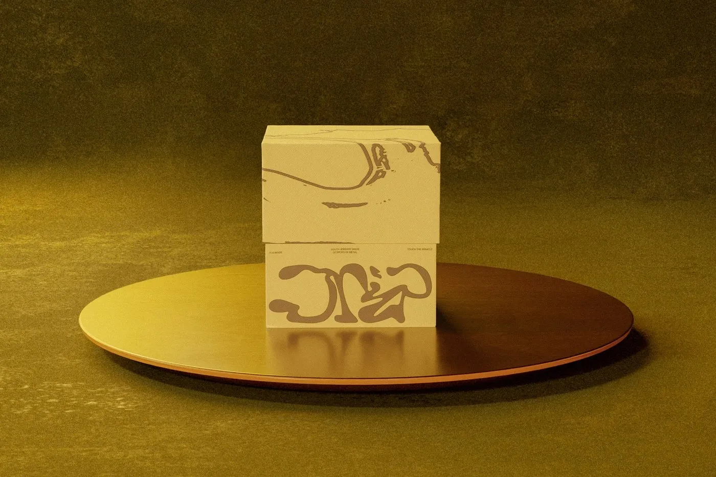

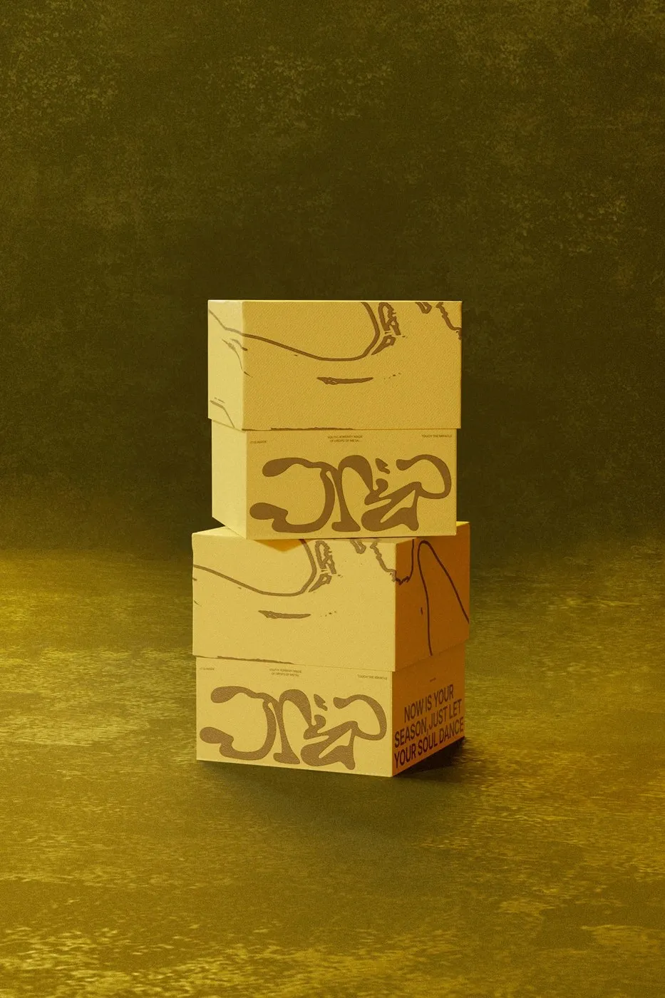

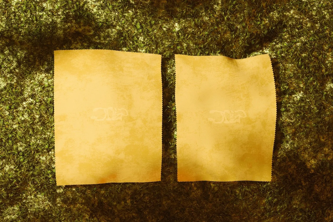
Drip Silver Packaging Design by Takt Studio: Where Minimalist Structure Meets Organic Lines Designing silver jewelry packaging can easily fall into cliché territory. But Takt Studio took a completely fresh route for Drip Silver, focusing on minimalism, raw warmth, and a deeply tactile experience.
This brand identity draws inspiration from memory and the fluid softness of nature. The magic happens in the contrast between structured packaging and the liquid-like, organic shapes of the silver pieces tucked inside. Crisp white paper paired with charcoal accents delivers an effortlessly editorial feel. Instead of relying on loud visual tricks, the design creates quiet spaces that let the jewelry make its own statement, complemented by art direction grounded in natural stones and serene forest landscapes.
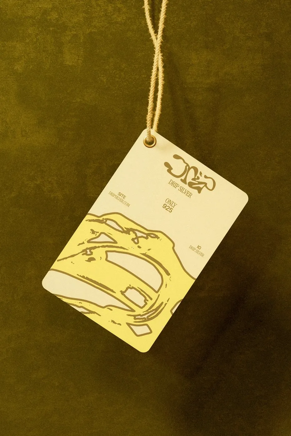
Layout Systems & Material Craft The typography sits on a sleek, rigid grid structure. Oversized, off-center sans-serif headlines create dynamic visual tension across different physical surfaces. Dramatic scale contrasts—like placing massive logos right next to micro-sized technical details—add an engaging layout rhythm. Thoughtful negative space gives every text element room to breathe, keeping things effortlessly cohesive across hangtags, wraps, and boxes.
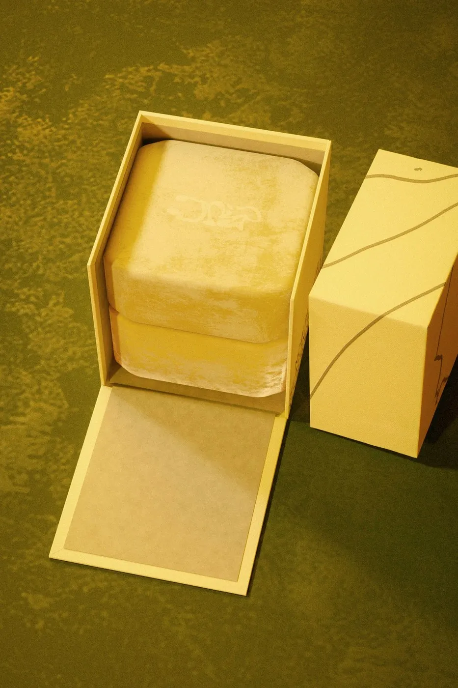
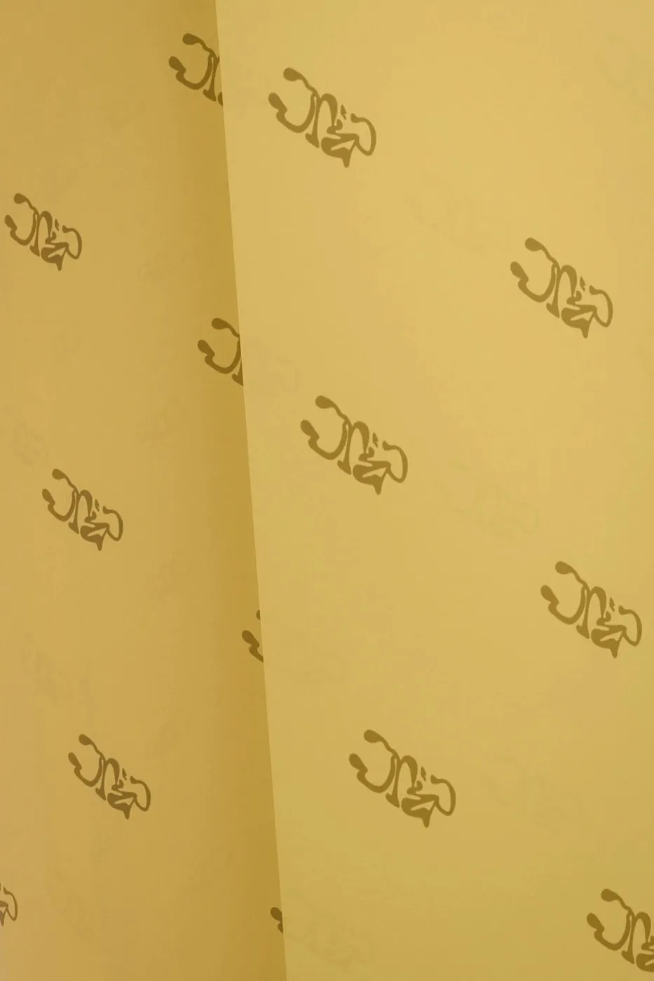
On the physical side, Takt Studio paired raw, textured paper with metallic foil stamping. A blind embossed logo on the outer box adds subtle, elevated depth. The unboxing experience feels meticulously engineered, featuring a sliding sleeve mechanic and custom structural trays inside that keep the jewelry safe while showing off every detail.
Check out all the details of this packaging project on www.behance.net/gallery/243044429/Drip-Silver or explore more work over on www.behance.net/takt-studio.
Thiết kế bao bì Drip Silver của Takt Studio: Sự giao thoa giữa cấu trúc tối giản và đường nét tự nhiên
Khi làm bao bì cho trang sức bạc, nhiều thiết kế dễ rơi vào lối mòn quen thuộc. Tuy nhiên, Takt Studio đã chọn một hướng đi khác cho thương hiệu Drip Silver: tập trung vào sự tối giản, mộc mạc và cảm giác bề mặt (tactile).
Bộ nhận diện này lấy cảm hứng từ ký ức và sự mềm mại của tự nhiên. Điểm thú vị nằm ở sự tương phản giữa cấu trúc bao bì chỉn chu với những món trang sức bạc mang hình dáng uốn lượn như chất lỏng bên trong. Tông màu giấy trắng tương phản với các chi tiết màu than (charcoal) tạo nên một tinh thần rất editorial. Thay vì sử dụng bộ nhận diện quá phô phang, thiết kế tạo khoảng lặng để sản phẩm tự cất lời, kết hợp cùng hình ảnh đá tự nhiên và khung cảnh rừng cây trong phần art direction.
Hệ thống dàn trang và kỹ thuật chất liệu
Phần typography được sắp xếp theo một lưới (grid) rất chặt chẽ. Việc đặt tiêu đề dạng sans-serif bản to chệch trục (off-center) tạo nên sự căng nhịp thị giác rõ ràng trên các bề mặt chất liệu. Studio cũng tạo ra sự tương phản mạnh về tỉ lệ khi đặt logo kích thước lớn ngay bên cạnh những thông tin kỹ thuật nhỏ xíu. Khoảng trống (negative space) được chừa lại có tính toán, giúp các yếu tố chữ dễ thở và giữ được sự đồng bộ trên từng thẻ treo, bao bì hay hộp đựng.
Về mặt vật lý, Takt Studio kết hợp chất liệu giấy thô nhám với kỹ thuật ép kim (metallic foil stamping). Logo thương hiệu ở hộp ngoài được xử lý dập nổi mờ (blind embossing) để tạo độ sâu tinh tế. Trải nghiệm mở hộp (unboxing) cũng được tính toán tỉ mỉ với cơ cấu nắp trượt (sliding sleeve mechanic) và các khay định hình bên trong, vừa bảo vệ trang sức vừa tôn lên giá trị của sản phẩm.
Mọi người có thể xem đầy đủ chi tiết về dự án packaging này trên www.behance.net/gallery/243044429/Drip-Silver hoặc xem thêm các dự án khác tại www.behance.net/takt-studio.