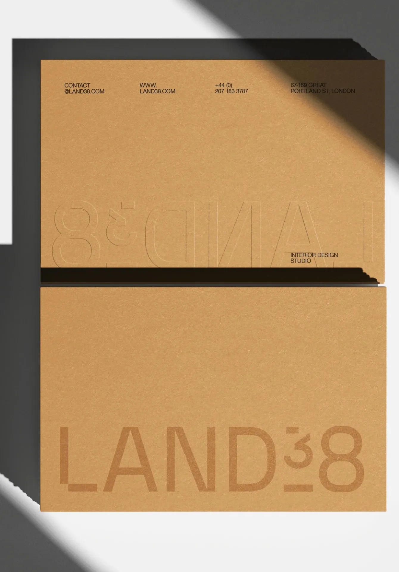





LAND38 Brand Identity: Clean Swiss Style for an Interior Architecture Studio AQUELE Studio—led by Art Director Mari Hauers alongside designers Leticia Pegoli and Clara Abreu—crafted a comprehensive brand identity system for LAND38, an interior architecture design studio.
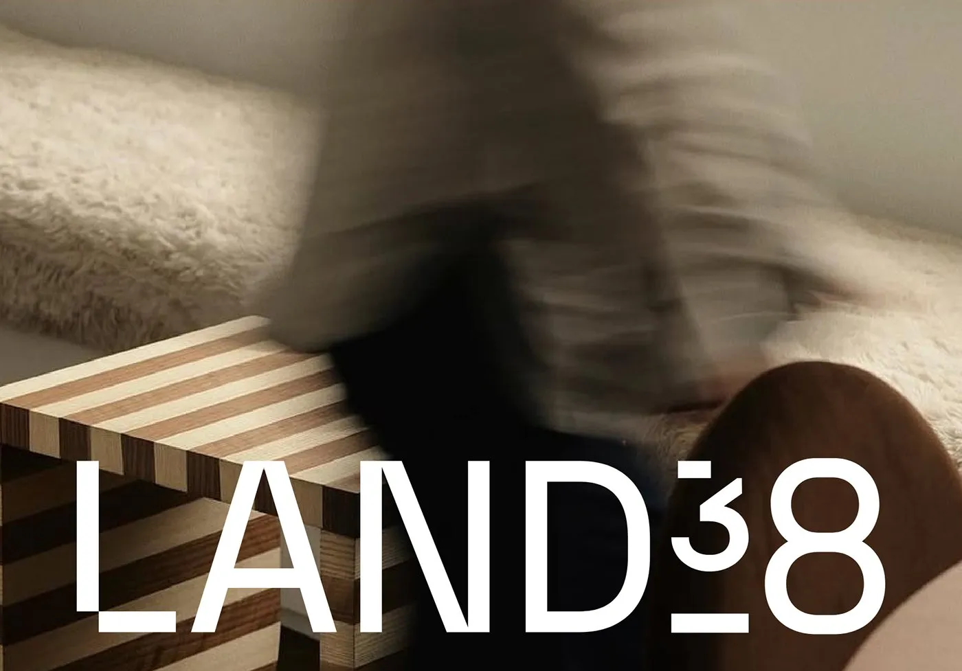
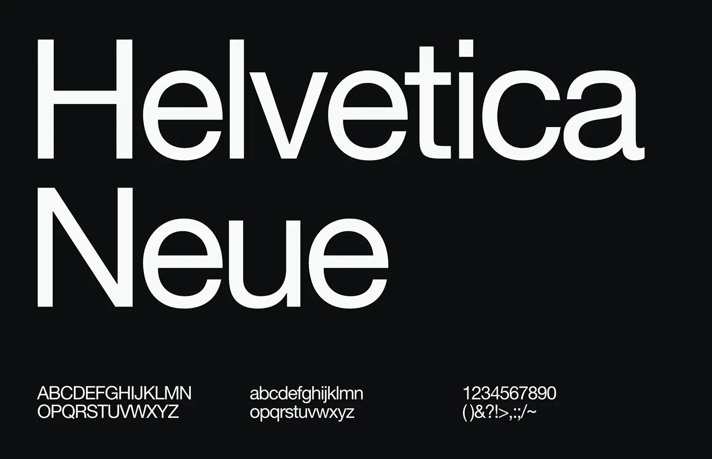
Swiss typography principles serve as the ultimate guiding light for this design. Utilizing Helvetica Neue across crisp, tight grids brings a neat sense of order and clarity to everything from internal documents and signage to business cards. The primary logo features minimalist lines paired with a striking, block-stacked number graphic. The brand palette brings together five rich tones: solid black, stone gray, off-white, soft light gray, and warm sun ochre accents. Every single color draws direct inspiration from raw construction elements like stone, clay, and wood.
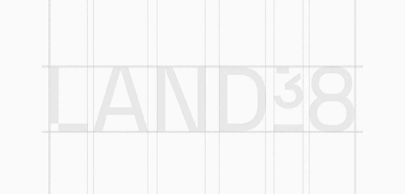
Layout-wise, generous white space lets the geometry of the interior spaces take center stage. Technical, blueprint-inspired grid lines in the logo design reflect the studio’s meticulous approach to shaping physical space. On document covers and spec sheets, text stays neatly organized in structured columns. The bold contrast between punchy headlines and fine body text creates a grounded yet graceful balance. Wide page margins wrap around compact blocks of text, bringing a calm, airy feel across all print collateral.
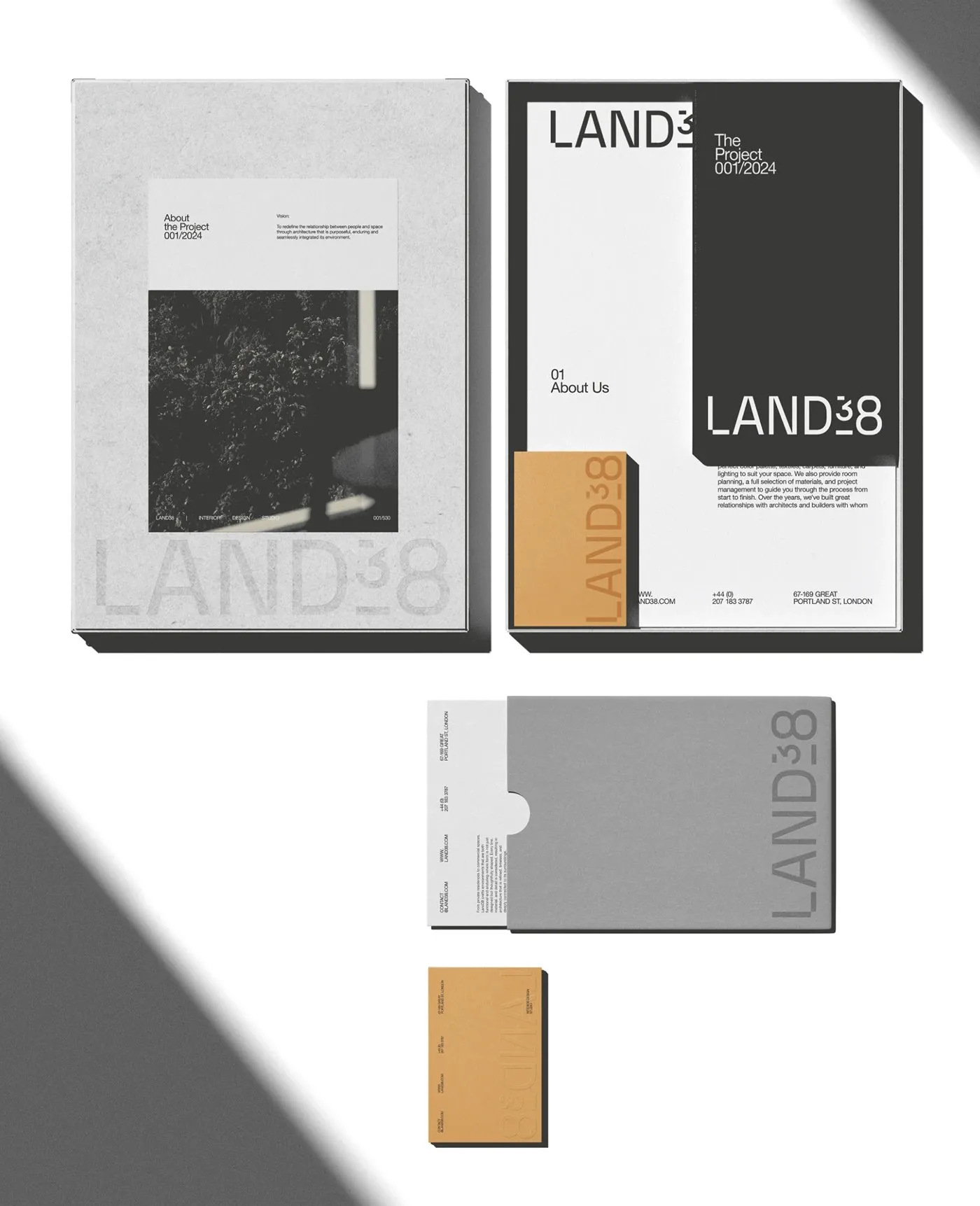
When it comes to physical print pieces, the graphic concept comes alive through awesome tactile experiences. Thick, raw kraft stock, blind debossing, and sleek die-cut sleeves bring real depth to note cards and client welcome kits. Substantial project profile books, finished with dark spine bindings, make architectural floor plans and interior shots pop.
The LAND38 branding project is a seamless bridge between spatial design thinking and pure print craft. Check out more details on www.behance.net/gallery/247326787/LAND38.
Bộ nhận diện thương hiệu LAND38: Phong cách Thụy Sĩ gọn gàng cho studio kiến trúc nội thất
Studio AQUELE – dưới sự dẫn dắt của Art Director Mari Hauers cùng hai designer Leticia Pegoli và Clara Abreu – đã xây dựng một hệ thống nhận diện thương hiệu toàn diện dành cho LAND38, một studio thiết kế kiến trúc nội thất.
Thiết kế lần này lấy chuẩn mực typography Thụy Sĩ làm kim chỉ nam. Việc ứng dụng phông chữ Helvetica Neue trên các đường lưới chặt chẽ mang lại sự trật tự và mạch lạc cho từng trang tài liệu, biển hiệu lẫn danh thiếp. Logo chính sở hữu đường nét tối giản đi kèm cụm số được xếp khối nổi bật. Bảng màu của thương hiệu gồm 5 tông: đen tuyền, xám đá phối cùng trắng đục, xám nhạt và sắc vàng nắng (sun ochre) điểm xuyết. Mỗi gam màu đều mô phỏng trực tiếp từ các vật liệu xây dựng thô như đá, đất sét và gỗ.
Về mặt bố cục, những khoảng trắng rộng mở giúp hình khối của các không gian nội thất trở thành tâm điểm. Các đường lưới thiết kế logo mang hơi hướng bản vẽ kỹ thuật, thể hiện sự tỉ mỉ trong việc định hình không gian của studio. Trên các bìa hồ sơ và bảng thông số, chữ viết được chia cột ngay ngắn. Sự tương phản giữa phần tiêu đề nét đậm và phần nội dung nét mảnh tạo nên cảm giác vững chãi nhưng vẫn cân bằng. Lề trang rộng bao bọc những khối chữ nhỏ, đem lại tinh thần yên bình trên toàn bộ ấn phẩm in ấn.
Ở các sản phẩm thực tế, tinh thần đồ họa được chuyển hóa thành những trải nghiệm xúc giác chân thực. Chất liệu bìa kraft thô dày, kỹ thuật dập chìm (blind deboss) và các vỏ bao die-cut mang lại độ sâu cho thiệp nhắn lẫn bộ tài liệu gửi khách hàng. Những cuốn profile dự án dày dặn với phần gáy bọc tối màu giúp tôn lên các bản vẽ mặt bằng và hình ảnh không gian bên trong.
Bộ nhận diện thương hiệu LAND38 là sự kết nối nhịp nhàng giữa tư duy xử lý không gian và thiết kế in ấn thuần túy. Chi tiết về dự án này có thể xem thêm trên Behance của www.behance.net/gallery/247326787/LAND38.