LYX Furniture Brand Identity by Muhammad Abu Bakr: Refined Elegance Meets Editorial Style Crafting a visual identity for luxury furniture is all about precision and letting every piece shine. Muhammad Abu Bakr’s branding project for LYX hits the sweet spot, effortlessly blending editorial typography with an earthy, natural color palette.
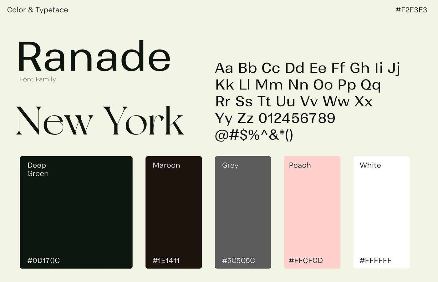
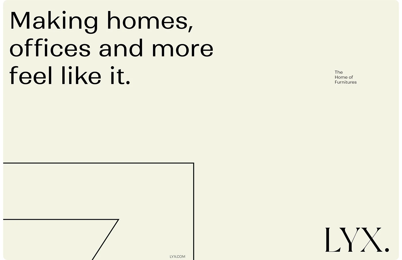
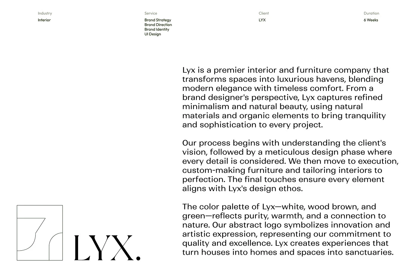
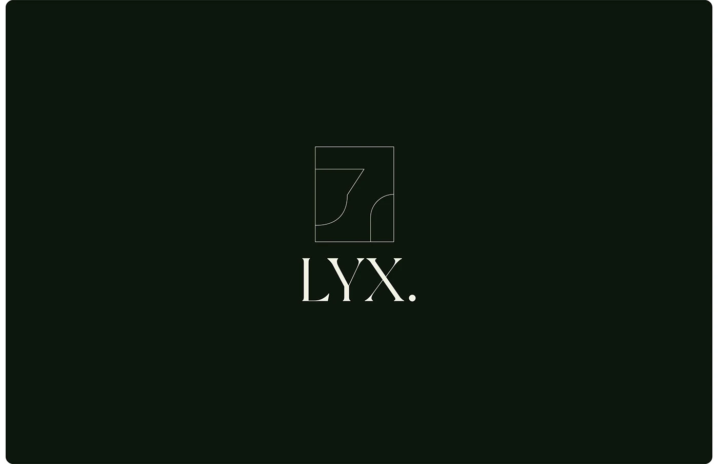
At the heart of this visual system is a sharp, confident serif wordmark. New York Serif brings a touch of high-end luxury, while Ranade—a clean, minimalist sans-serif—handles supporting details seamlessly. The color palette feels super relaxing and grounded, pulling inspiration straight from nature with deep moss green, rich timber red, soft gray, and a subtle pop of peach. A simple box-frame symbol wraps it all together, perfectly framing the clean lines of the furniture.
The design relies heavily on generous white space, neatly structured type blocks, and a rock-solid grid system. This approach keeps every asset balanced, harmonious, and completely effortless on the eyes.
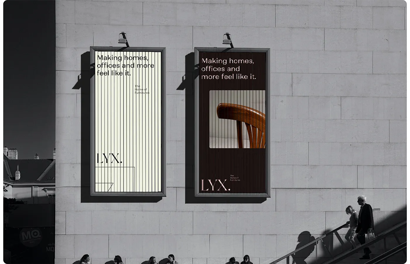
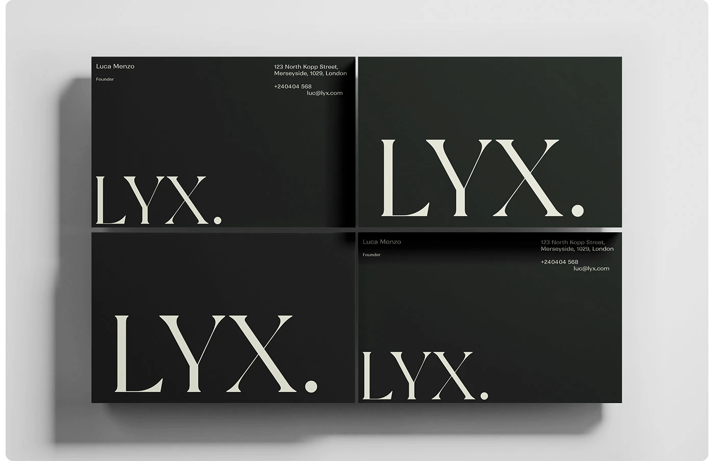
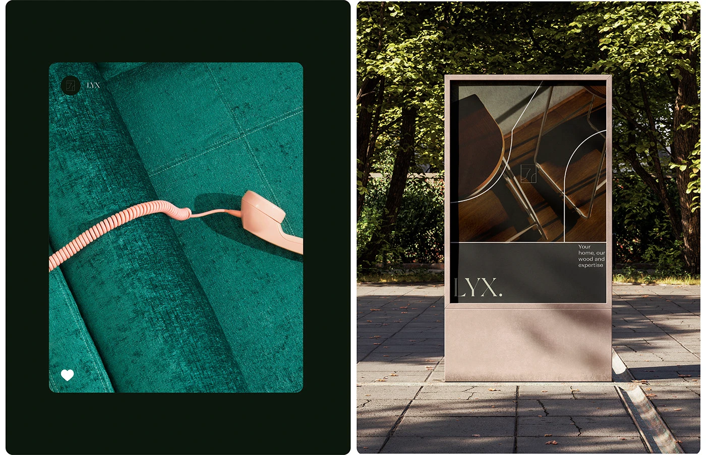
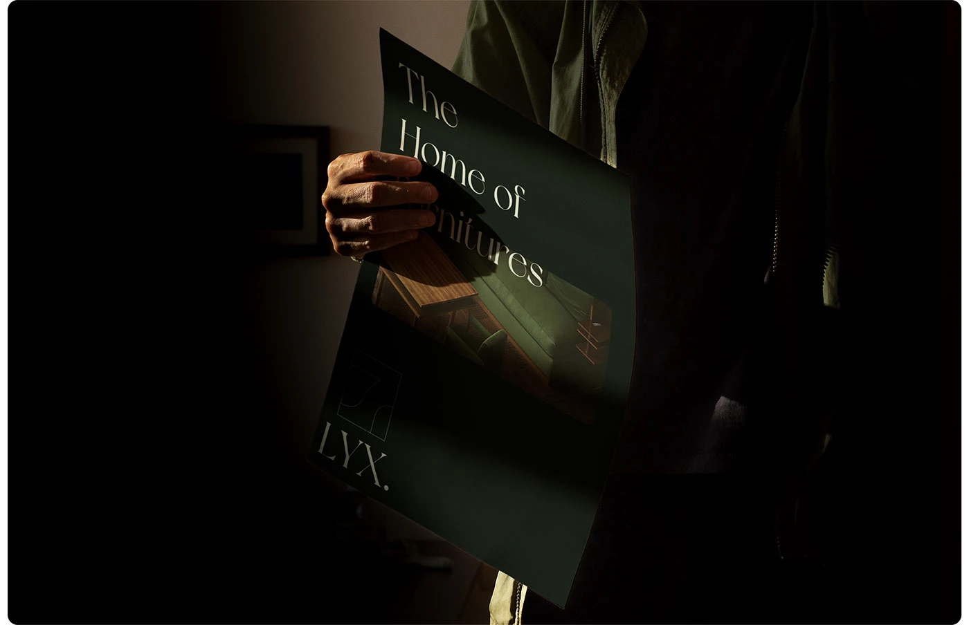
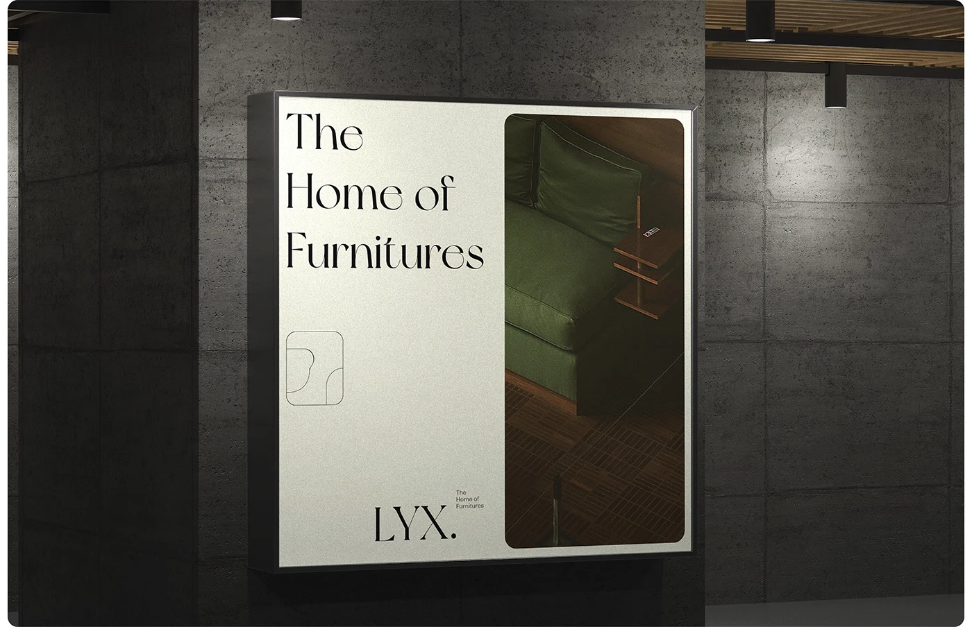
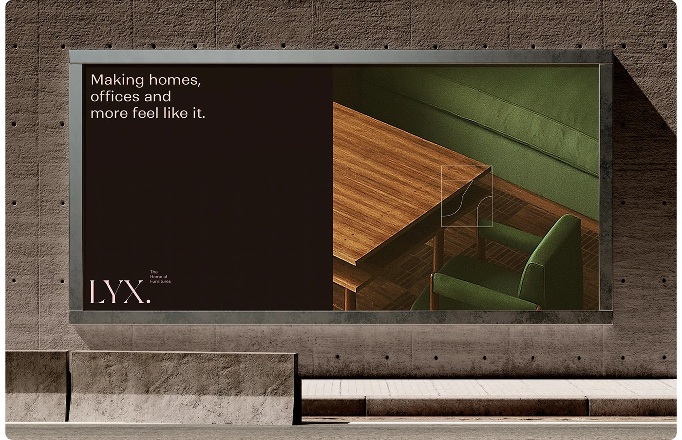
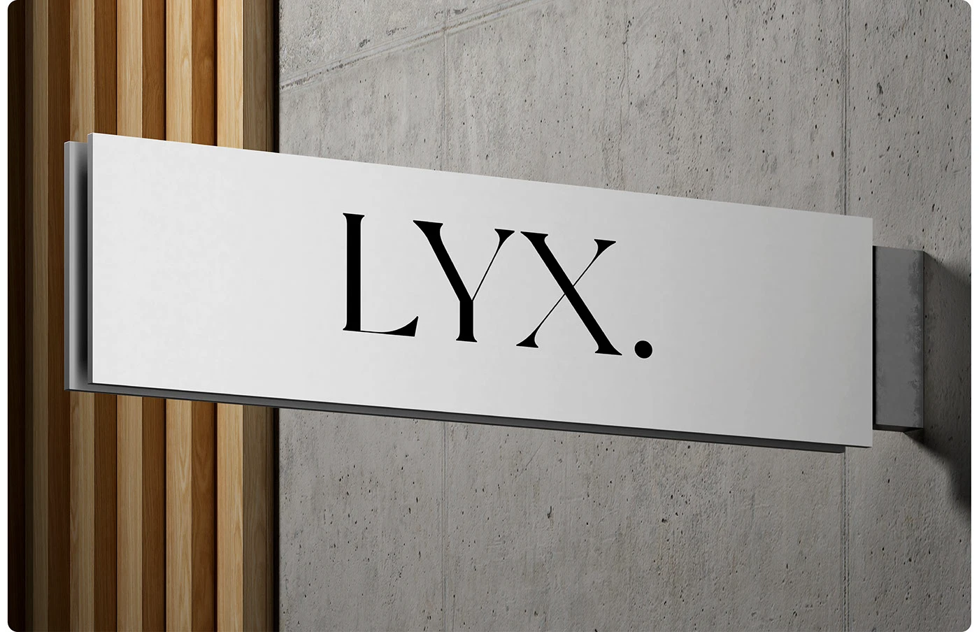
In print, the identity truly comes to life. Business cards feature thick black cardstock paired with creamy typography, large-scale posters make a bold statement against stone walls, and sleek metal signage sits directly on raw concrete and wood textures. Product booklets arrive in deep moss green, providing a rich backdrop that lets wooden chairs and fabric sofas steal the show. That sharp contrast between dark backgrounds and light typography ensures the brand pops in any space.
The LYX brand identity proves that thoughtfully restrained minimalism is often the best way to celebrate fine craftsmanship. Check out the full case study over on www.behance.net/gallery/208291677/LYX-BRAND-IDENTITY.
Bộ nhận diện thương hiệu nội thất LYX của Muhammad Abu Bakr: Tinh tế và đậm chất editorial
Thiết kế nhận diện cho mảng nội thất cao cấp luôn cần sự chỉn chu để làm bật lên giá trị của từng sản phẩm. Dự án branding cho thương hiệu LYX của designer Muhammad Abu Bakr là một ví dụ cực kỳ vừa vặn, kết hợp khéo léo giữa phong cách typography dạng editorial và bảng màu tự nhiên đầy mộc mạc.
Trái tim của hệ thống thị giác này là bộ wordmark dạng serif với nét chữ cứng cáp, sắc sảo. Tác giả đã chọn font serif New York để tạo điểm nhấn sang trọng, đi kèm với họ font sans-serif Ranade tối giản cho các phần thông tin phụ. Bảng màu của LYX mang cảm giác rất thư thái khi lấy cảm hứng từ thiên nhiên: màu xanh rêu đậm, màu đỏ gỗ trầm, xám dịu và một chút tone cam đào nhẹ nhàng. Đi cùng với đó là một symbol dạng khung hộp đơn giản, giúp bao trọn những đường nét gọn gàng của sản phẩm nội thất.
Trục thiết kế của dự án ưu tiên những khoảng trống (white space) rộng rãi, các khối chữ (type block) phân bố rõ ràng và hệ thống grid chuẩn chỉnh. Nhờ vậy, mỗi ấn phẩm đều giữ được sự cân bằng và dễ chịu cho thị giác.
Khi bước ra thực tế, các ấn phẩm in ấn càng thể hiện rõ tinh thần này. Card visit sử dụng giấy đen dày dặn nổi bật với phần chữ màu kem, poster khổ lớn đặt trên nền tường đá, còn biển hiệu kim loại thì được gắn trực tiếp lên mảng tường bê tông và gỗ thô. Những cuốn booklet giới thiệu sản phẩm mang sắc xanh rêu đậm, làm nền cho các mẫu ghế gỗ hay sofa vải tôn lên vẻ đẹp riêng. Sự tương phản rõ rệt giữa nền tối và chữ sáng giúp thương hiệu luôn nổi bật trong mọi không gian.
Bộ nhận diện của LYX cho thấy đôi khi sự tiết chế và tối giản lại là cách tốt nhất để tôn vinh tay nghề thủ công của sản phẩm. Bạn có thể xem đầy đủ case study của dự án này trên Behance của www.behance.net/gallery/208291677/LYX-BRAND-IDENTITY.