

Type 1.1: Isometric 3D Lettering and Granular Shading by Hust Wilson
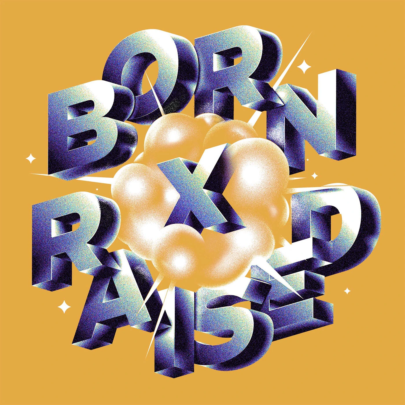
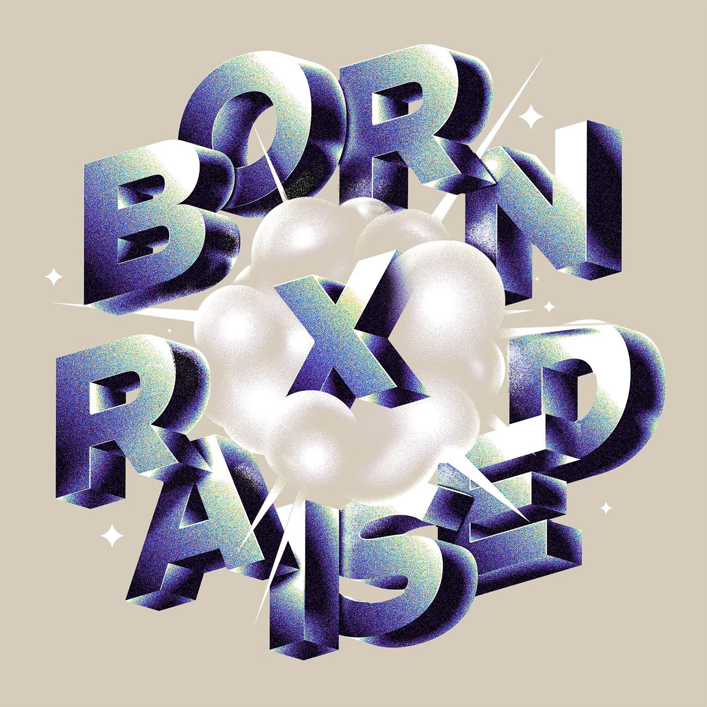
The Type 1.1 project by designer Hust Wilson dives deep into expressive lettering using bold isometric 3D shapes and detailed granular stipple shading.
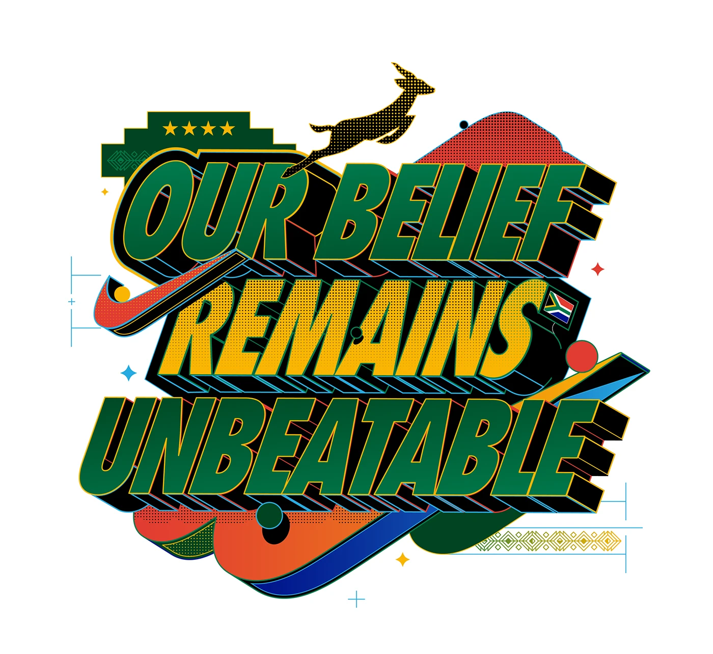
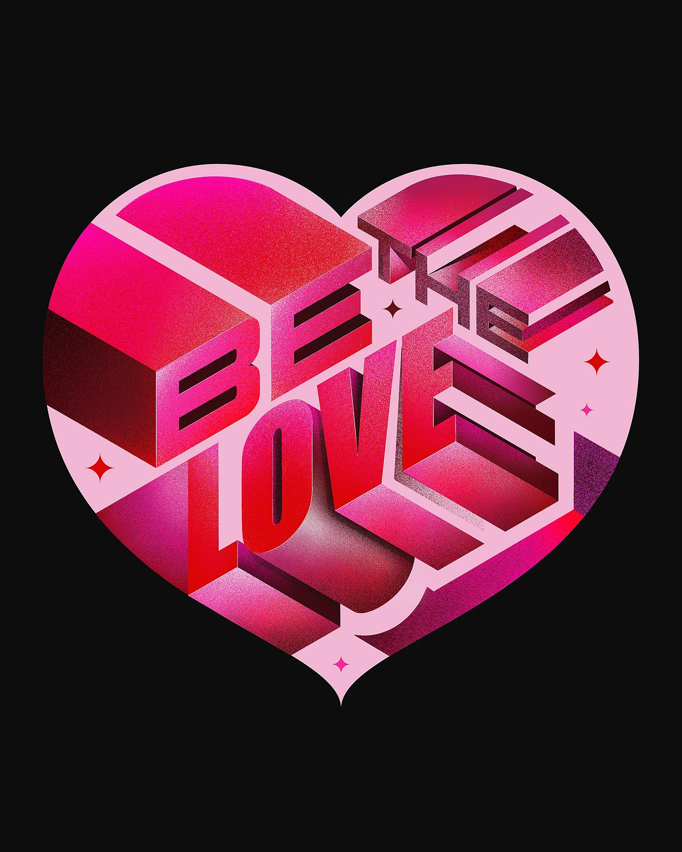
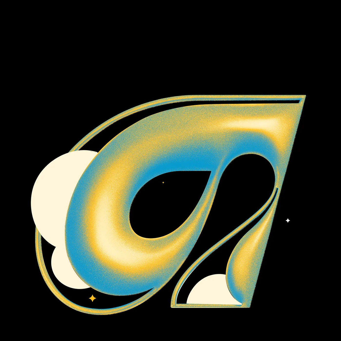
Each character in the collection is crafted like its own standalone 3D graphic structure. The real magic happens where isometric perspectives, deep block drop shadows, and velvety grain textures meet. Thick, punchy outlines form the letterforms, paired with silky smooth color gradients and a soft, tactile stippled finish.
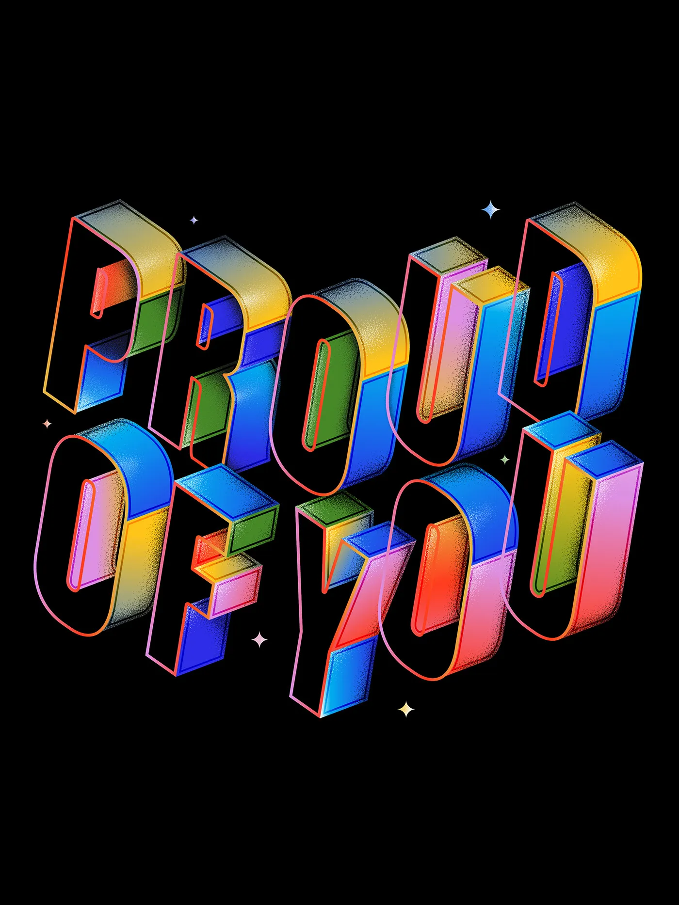
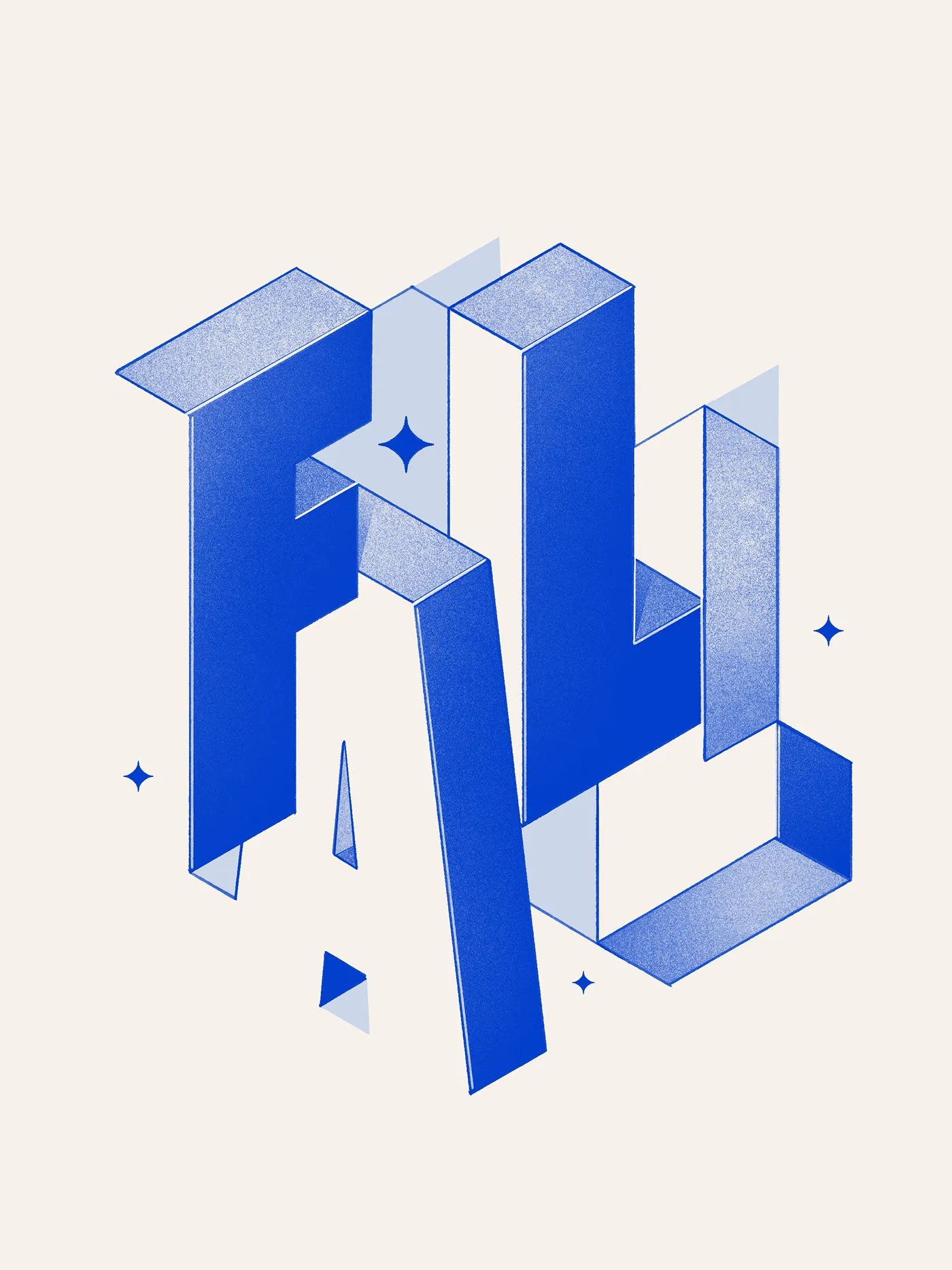
In pieces like “Proud of You” and “Fall,” letter strokes bend and twist like folded ribbons set against high-contrast backgrounds. A rock-solid grid system keeps the 3D structure crisp and clean, perfectly balancing stroke weight and letter proportions.
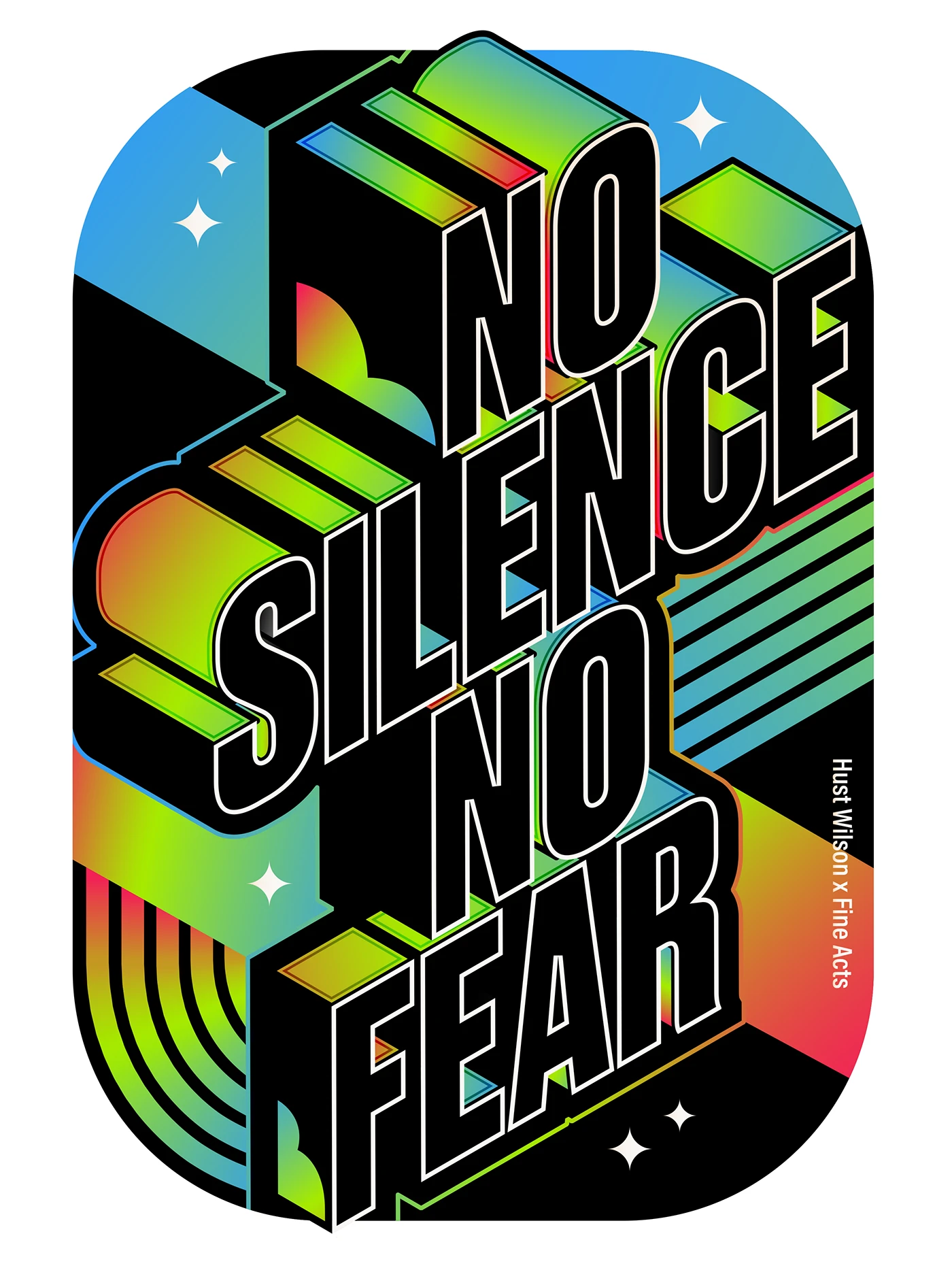
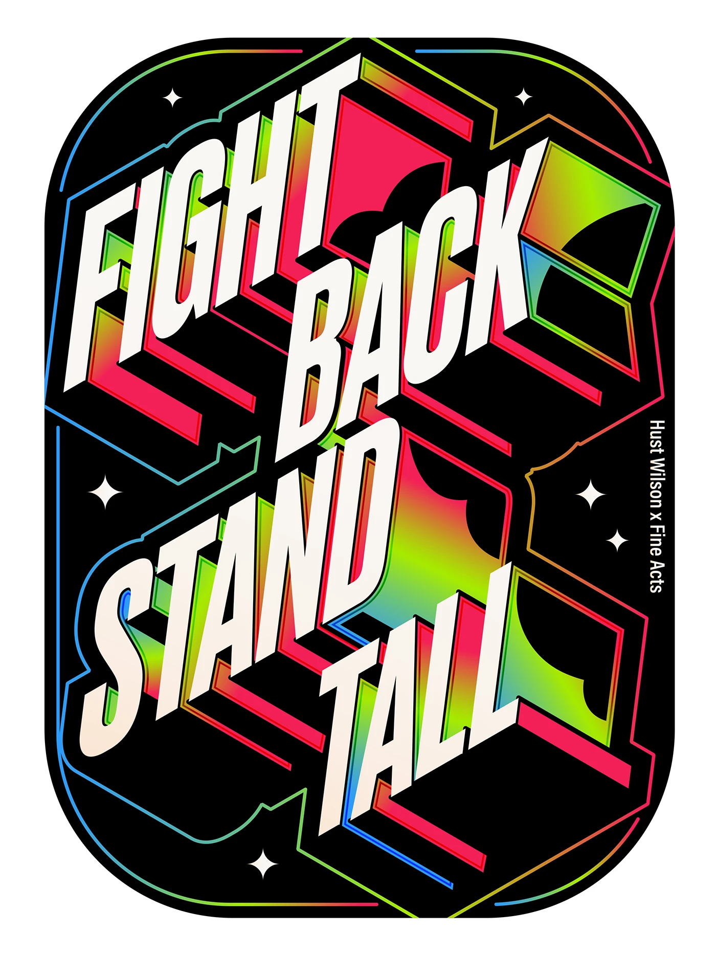
Using digital vector tools, these letterforms evolve into vibrant standalone poster designs. The subtle grain shading breathes rich depth into flat color fields. Take “Fight Back” and “Stand Tall”—slanted block typography sits snugly inside rounded frames, where sharp boundary lines split glowing yellow gradients from deep navy backgrounds, accented by charming little stars and crisp drop-shadow hatches.
This approach seamlessly blends classic sign-painting artistry with modern vector techniques. Playing around with fresh perspectives, dramatic lighting, and fluid letter curves creates striking visual impact across both light and dark backgrounds.
This showcase offers tons of practical inspiration for brand mark design and poster art alike. Check out the full typography project on www.behance.net/gallery/254317227/TYPE-11.
Type 1.1: Chữ 3D Isometric và Kỹ Thuật Đổ Bóng Hạt Của Hust Wilson
Dự án Type 1.1 của designer Hust Wilson tập trung vào việc xử lý expressive lettering thông ra các hình khối 3D isometric và kỹ thuật đổ bóng hạt (granular stipple shading).
Mỗi ký tự trong bộ chữ được tạo dựng như một cấu trúc đồ họa 3D riêng biệt. Điểm nhấn nằm ở sự kết hợp giữa góc nhìn isometric, các khối nổi sâu (block drops) và lớp phủ grain shading mịn. Hust Wilson xây dựng nét chữ bằng đường outline dày, kết hợp mảng chuyển màu mượt cùng bề mặt điểm hạt mềm mại.
Ở các sáng tác như “Proud of You” hay “Fall”, từng nét chữ bẻ góc uốn lượn như dải ruy-băng gấp nếp trên nền màu tương phản. Hệ thống lưới (grid) chỉn chu giúp cấu trúc 3D giữ được độ rõ ràng, cân bằng với độ dày và tỉ lệ của nét chữ.
Thông qua công cụ vẽ vector, các chữ cái được phát triển thành những thiết kế poster độc lập. Kỹ thuật grain shading giúp các mảng màu phẳng có thêm độ sâu. Trong hai bức poster “Fight Back” và “Stand Tall”, chữ khối nghiêng được đặt vừa vặn bên trong khung bo góc. Đường nét ranh giới phân chia mảng màu vàng chuyển sắc với nền xanh thẫm, đi kèm các chi tiết điểm xuyết như biểu tượng ngôi sao nhỏ và đường gạch bóng đổ.
Cách tiếp cận này kết hợp giữa tư duy làm bảng hiệu truyền thống (sign painter) và kỹ thuật xử lý vector hiện đại. Việc thử nghiệm góc nhìn, hiệu ứng ánh sáng và độ uốn của nét chữ tạo nên hiệu ứng thị giác rõ ràng cho các ký tự trên nền giấy phẳng cũng như nền tối.
Bộ sản phẩm mang đến những gợi ý ứng dụng thực tế cho việc thiết kế brand mark và poster art. Xem trọn vẹn dự án typography này trên Behance tại www.behance.net/gallery/254317227/TYPE-11.