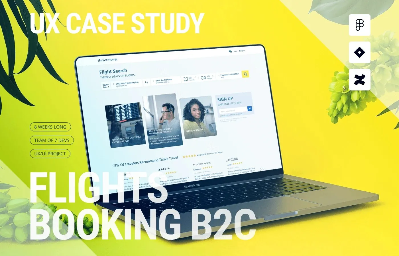
UI/UX Design Solution for the Thrive Travel Flight Booking Platform by Roman Yashchenko Booking flights usually comes with a head-spinning wave of information overload and hidden fees. Enter Thrive Travel, a flight booking platform concept by designer www.behance.net/gallery/224548535/B2C-Frlights-Booking-Platform-UX-case-study that brings a refreshingly sleek and intuitive interface to the table.
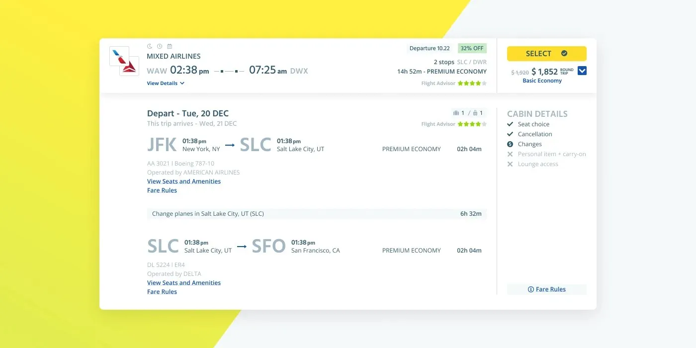
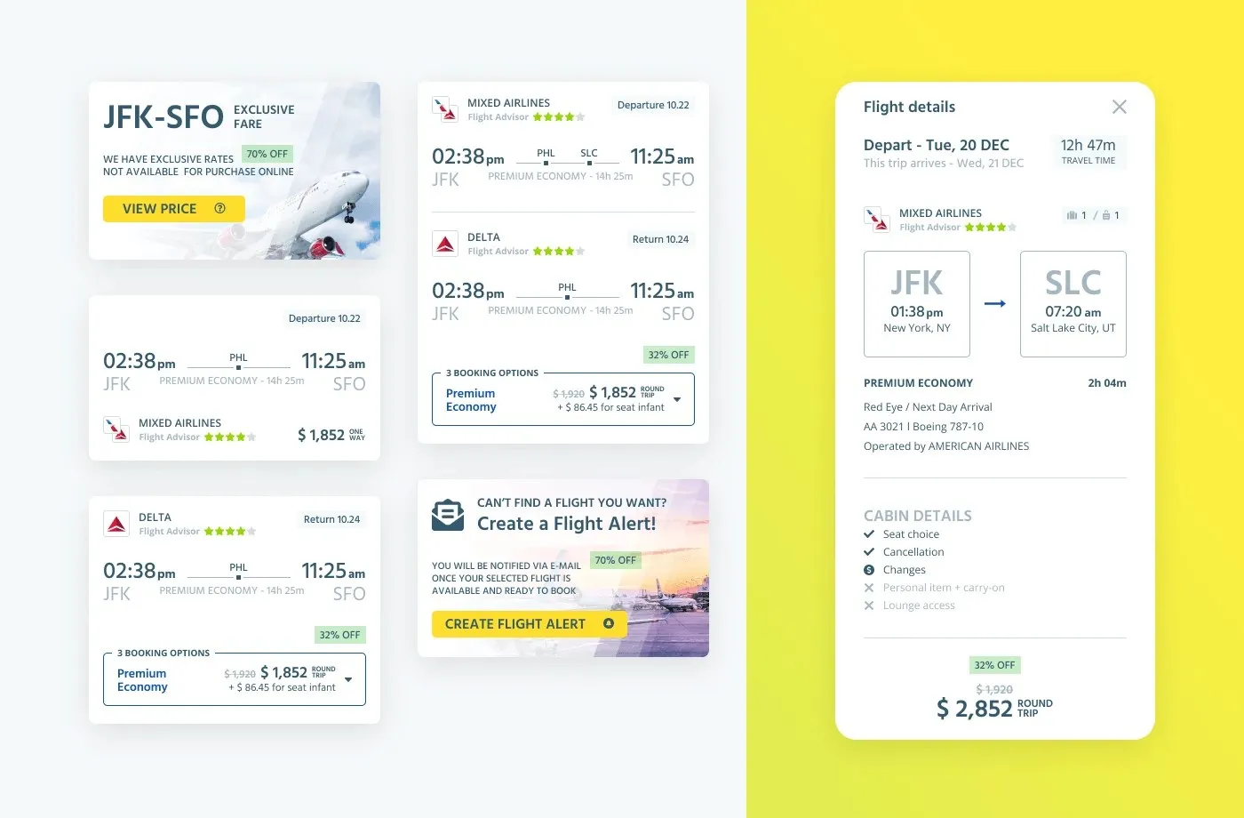
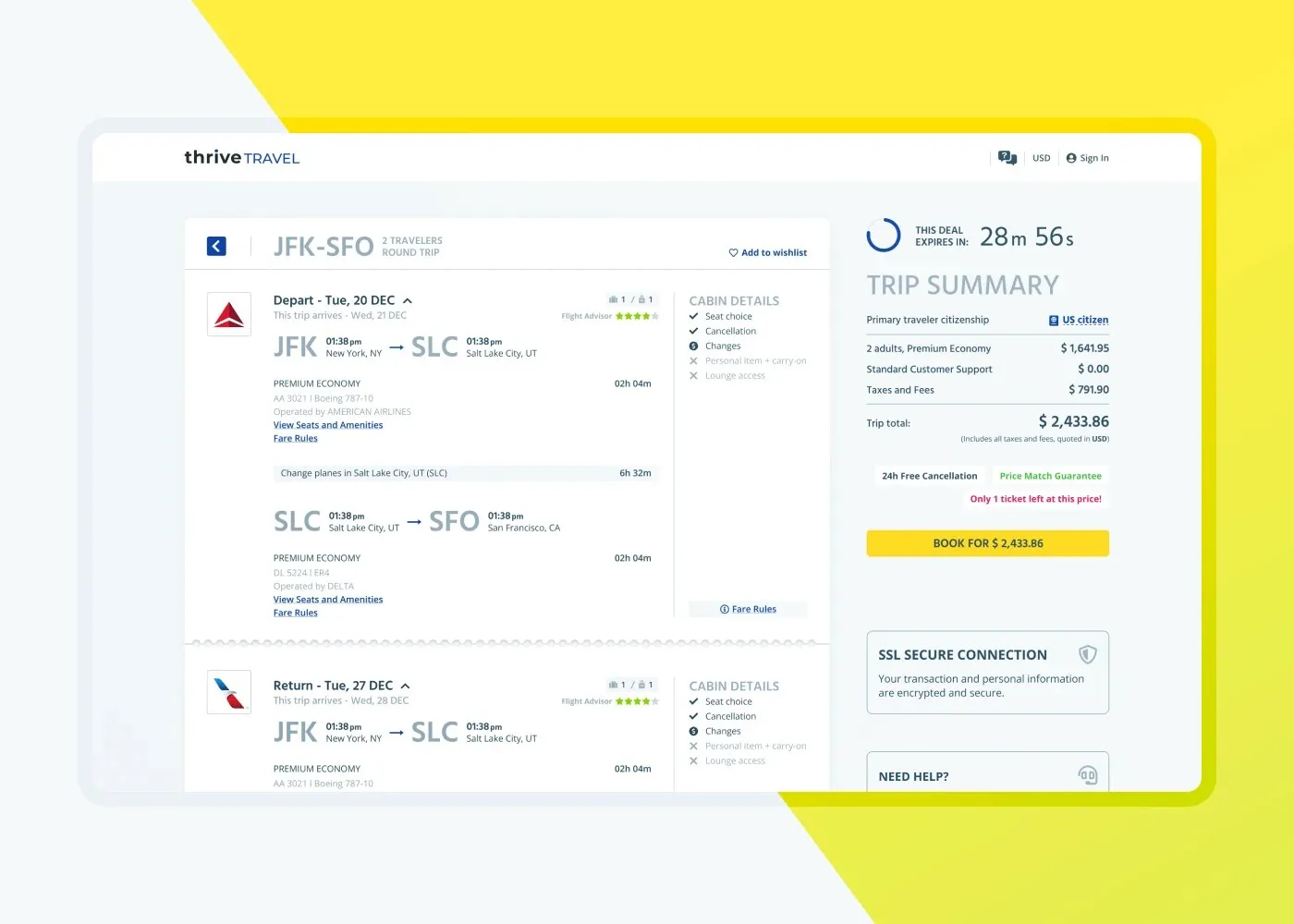
Grounded in qualitative interviews with over 20 travelers, this design zeros in on tackling choice paralysis and bringing total transparency to pricing. The interface features crisp, high-contrast dark and light modes paired with thoughtfully letter-spaced typography and clear fare breakdown cards. By cutting out clunky filter steps and displaying comparison data in clean, horizontal modular blocks, users can effortlessly make sense of complex travel itineraries.
At the core of the design is a disciplined modular grid system that allows the design system to scale smoothly while revealing information through smart progressive disclosure. Clever use of negative space keeps data-dense tables clean and visually clear. Key details like price differences, layover times, and included amenities are organized seamlessly. From micro-interactions on buttons and input fields to modal overlays, immediate visual feedback keeps cognitive load low and speeds up the path from search to checkout.
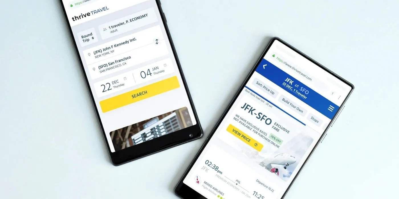
The experience feels completely unified across mobile, tablet, and desktop. A responsive, mobile-first layout ensures touch targets, gesture controls, modal filters, and real-time price alerts work like a charm on touchscreens. During usability testing, this clean approach cut booking completion time by 25% and reduced search drop-off rates by 30%.
Check out the full case study on www.behance.net/gallery/224548535/B2C-Frlights-Booking-Platform-UX-case-study.
Giải Pháp Thiết Kế UI UX Cho Nền Tảng Đặt Vé Máy Bay Thrive Travel Của Roman Yashchenko
Việc tìm kiếm và đặt vé máy bay vốn hay đi kèm với cảm giác rối mắt vì quá nhiều thông tin cùng mức giá mập mờ. Nền tảng đặt vé máy bay Thrive Travel do nhà thiết kế www.behance.net/gallery/224548535/B2C-Frlights-Booking-Platform-UX-case-study thực hiện mang đến một giải pháp giao diện tối giản và trực quan hơn rất nhiều.
Dựa trên cuộc phỏng vấn định tính với hơn 20 du khách, thiết kế này tập trung giải quyết tình trạng bị “bội thực” lựa chọn và minh bạch hóa chi phí. Giao diện áp dụng hai chế độ dark mode và light mode có độ tương phản cao, kết hợp typography được căn chỉnh letter-spacing kỹ lưỡng cùng các thẻ phân rã giá vé (fare breakdown cards) rõ ràng. Nhờ cắt bỏ các bước lọc rườm rà và đưa dữ liệu so sánh vào các khung ngang dạng modular, nền tảng giúp người dùng nhanh chóng nắm bắt các hành trình phức tạp.
Cốt lõi của thiết kế nằm ở hệ thống grid dạng modular kỷ luật, cho phép mở rộng design system mượt mà và hiển thị thông tin theo cơ chế progressive disclosure. Sự kết hợp giữa việc bố trí khoảng trắng (negative space) hợp lý giúp các bảng dữ liệu dày đặc thông tin vẫn giữ được visual hierarchy rõ ràng. Các yếu tố như mức chênh lệch giá, thời gian quá cảnh hay tiện ích dịch vụ đều được tổ chức gọn gàng. Từ trạng thái nút bấm (button state), ô nhập liệu (input field) đến các bảng thông báo (modal overlay) đều cung cấp phản hồi thị giác tức thì, làm giảm tải trọng ký ức (cognitive load) và rút ngắn hành trình từ tìm kiếm đến checkout.
Trải nghiệm trên các thiết bị di động, máy tính bảng hay trình duyệt máy tính đều đạt sự đồng bộ. Layout chuẩn responsive ưu tiên mobile-first đảm bảo các vùng chạm (touch target), thao tác cử chỉ, bộ lọc dạng modal và thông báo biến động giá theo thời gian thực hoạt động trơn tru trên màn hình cảm ứng. Kết quả kiểm thử độ dụng (usability testing) ghi nhận thiết kế giúp giảm 25% thời gian hoàn tất đặt vé và giảm 30% tỷ lệ bỏ dở tìm kiếm.
Có thể xem chi tiết dự án này trên www.behance.net/gallery/224548535/B2C-Frlights-Booking-Platform-UX-case-study.