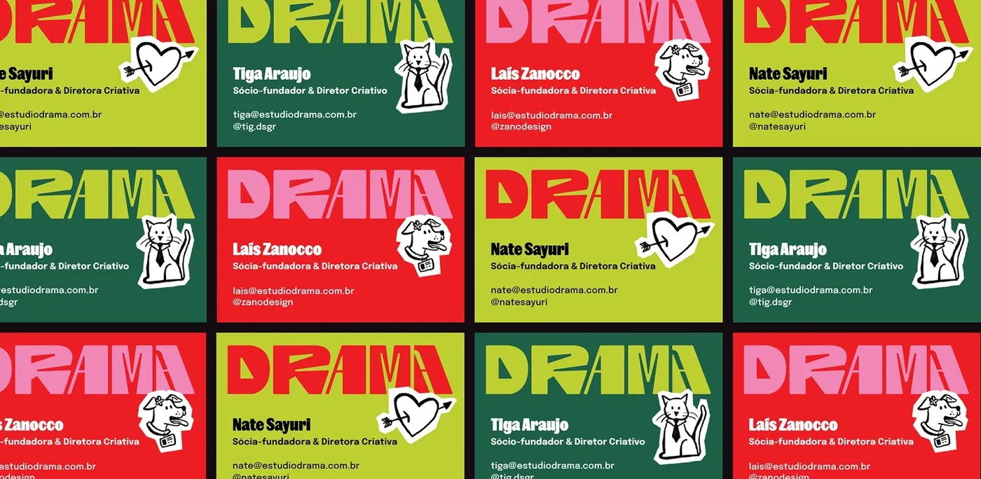
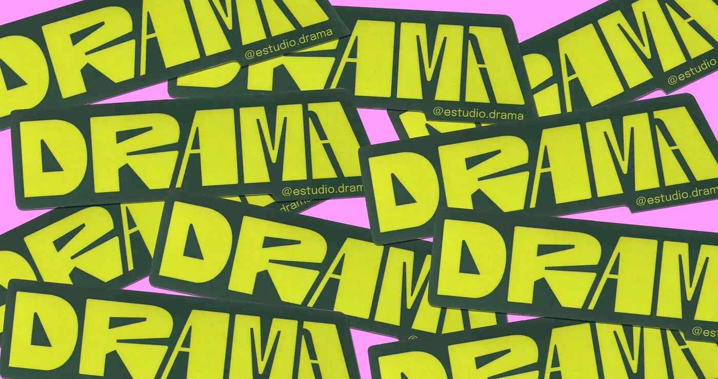
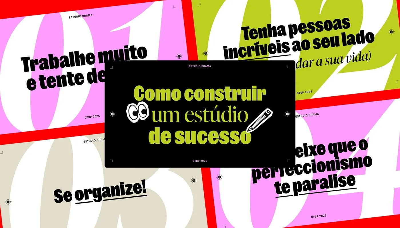
Estúdio Drama’s Unique Brand Identity Featuring Custom Hand-Drawn Lettering In 2025, Brazilian graphic design studio Estúdio Drama crafted its own brand identity to showcase its bold, direct, and personality-packed creative perspective. Instead of grabbing off-the-shelf digital fonts, the studio hand-drew every single letter for its core logotype. Each character sports unique subtle breaks, dynamic thick-and-thin line contrast, and sharp serifs, creating a raw, high-energy handmade vibe. This intentionally rough-around-the-edges feel helps the brand stand out completely from rigid corporate aesthetics.
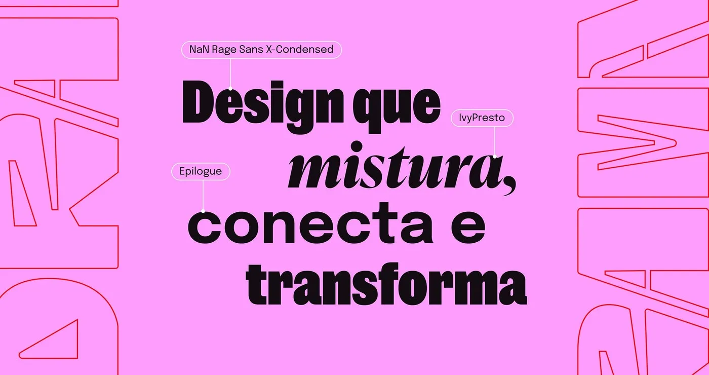
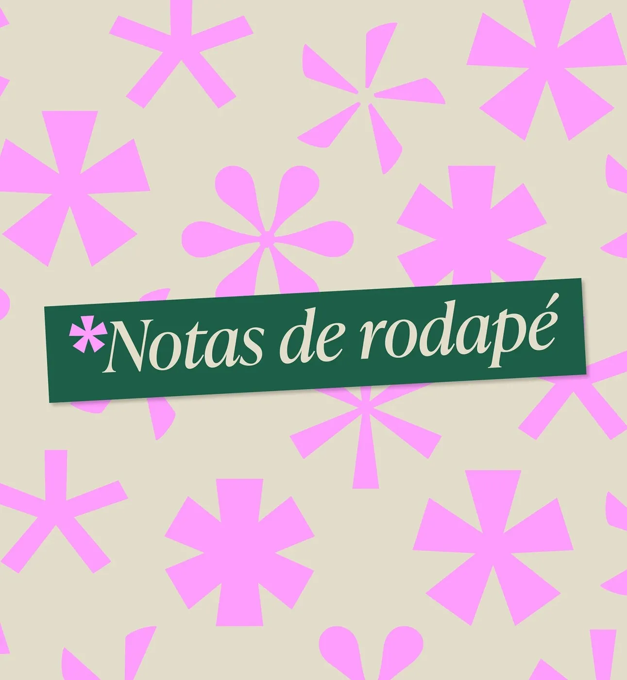
To support the main logotype, Estúdio Drama built a high-contrast typographic trio that pairs a sleek condensed grotesque, sharp serif accents, and crisp geometric monospaced type. This setup delivers a dynamic visual rhythm across large-scale posters, editorial layouts, and event announcements. Thoughtful layout and spacing keep dense info blocks super easy to read while maintaining a striking graphic structure.
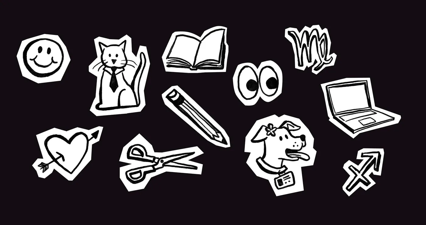
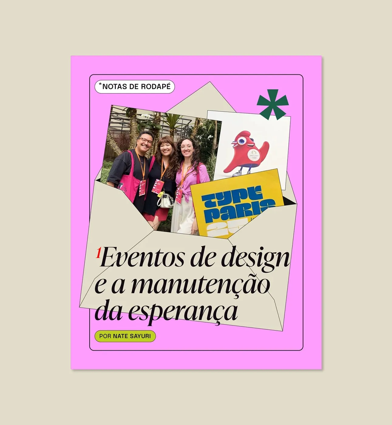
Beyond typography, the identity incorporates fun, comic-inspired character illustrations and loose sketches that add an approachable, friendly touch. The signature palette combines eye-catching vermilion red, natural cream, and rich carbon black. The whole look translates seamlessly across merch, tote bags, studio tees, editorial newsletters, and storefront signage. Everything was carefully crafted using Illustrator, InDesign, and Photoshop to ensure razor-sharp lines and perfect color accuracy across every material.
Check out the complete project on www.behance.net/gallery/255111073/Identidade-visual-Estudio-Drama.
Bộ Nhận Diện Thương Hiệu Độc Đáo Từ Estúdio Drama Với Logotype Vẽ Tay
Năm 2025, studio thiết kế đồ họa Estúdio Drama đến từ Brazil đã tự tạo nên bộ nhận diện thương hiệu cá nhân để thể hiện rõ nét quan điểm sáng tạo trực diện và cá tính của mình. Thay vì sử dụng các phông chữ kỹ thuật số có sẵn, studio đã tự tay vẽ từng chữ cái cho phần logotype chính. Mỗi ký tự đều sở hữu nét đứt gãy riêng, độ tương phản nét dày mỏng linh hoạt cùng phần chân chữ sắc sảo, tạo cảm giác thủ công đầy năng lượng. Sự “thô ráp” này giúp thương hiệu tách biệt hoàn toàn khỏi phong cách doanh nghiệp cứng nhắc thường thấy.
Để hỗ trợ cho phần logo chính, Estúdio Drama đã xây dựng bộ ba phông chữ đầy tính tương phản. Hệ thống này phối hợp giữa font condensed grotesque tối giản, điểm nhấn serif góc cạnh và nét chữ geometric mono gọn gàng. Sự kết hợp này mang lại nhịp điệu thị giác rõ ràng khi ứng dụng trên poster khổ lớn, trang báo hay thông báo sự kiện. Việc phân bổ không gian hợp lý giữa các khối thông tin dày đặc giúp người đọc dễ theo dõi mà vẫn duy trì được cấu trúc đồ họa ấn tượng.
Bên cạnh yếu tố chữ, bộ nhận diện còn kết hợp các nét vẽ minh họa nhân vật mang phong cách truyện tranh và phác thảo tự do, giúp tổng thể trở nên gần gũi hơn. Bảng màu chủ đạo gồm đỏ vermilion nổi bật, màu kem tự nhiên và đen carbon đậm nét. Toàn bộ thiết kế được ứng dụng đồng bộ từ các sản phẩm quà tặng, túi tote, áo phông studio cho đến bản tin editorial và biển hiệu cửa hàng. Dự án được xử lý kỹ lưỡng trên Illustrator, InDesign và Photoshop để đảm bảo đường nét luôn sắc sảo và màu in chuẩn xác trên mọi chất liệu.
Xem chi tiết dự án tại www.behance.net/gallery/255111073/Identidade-visual-Estudio-Drama trên Behance.