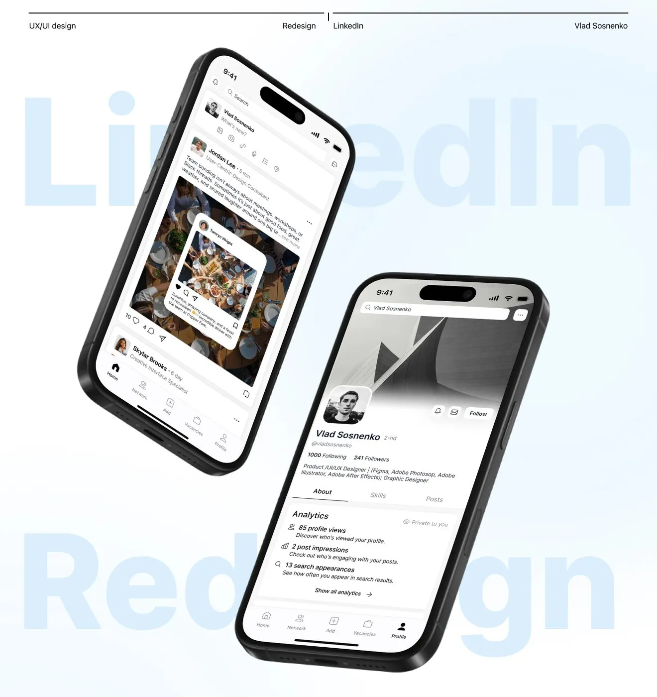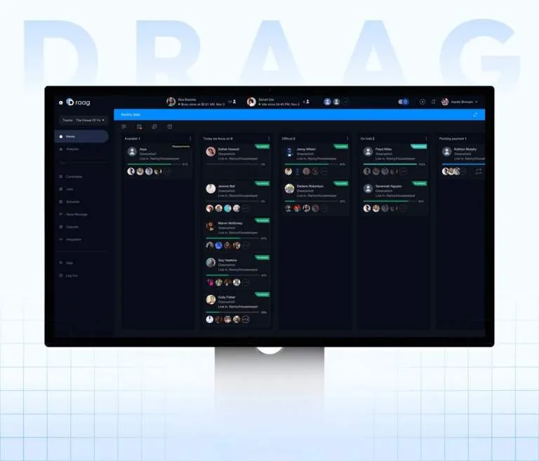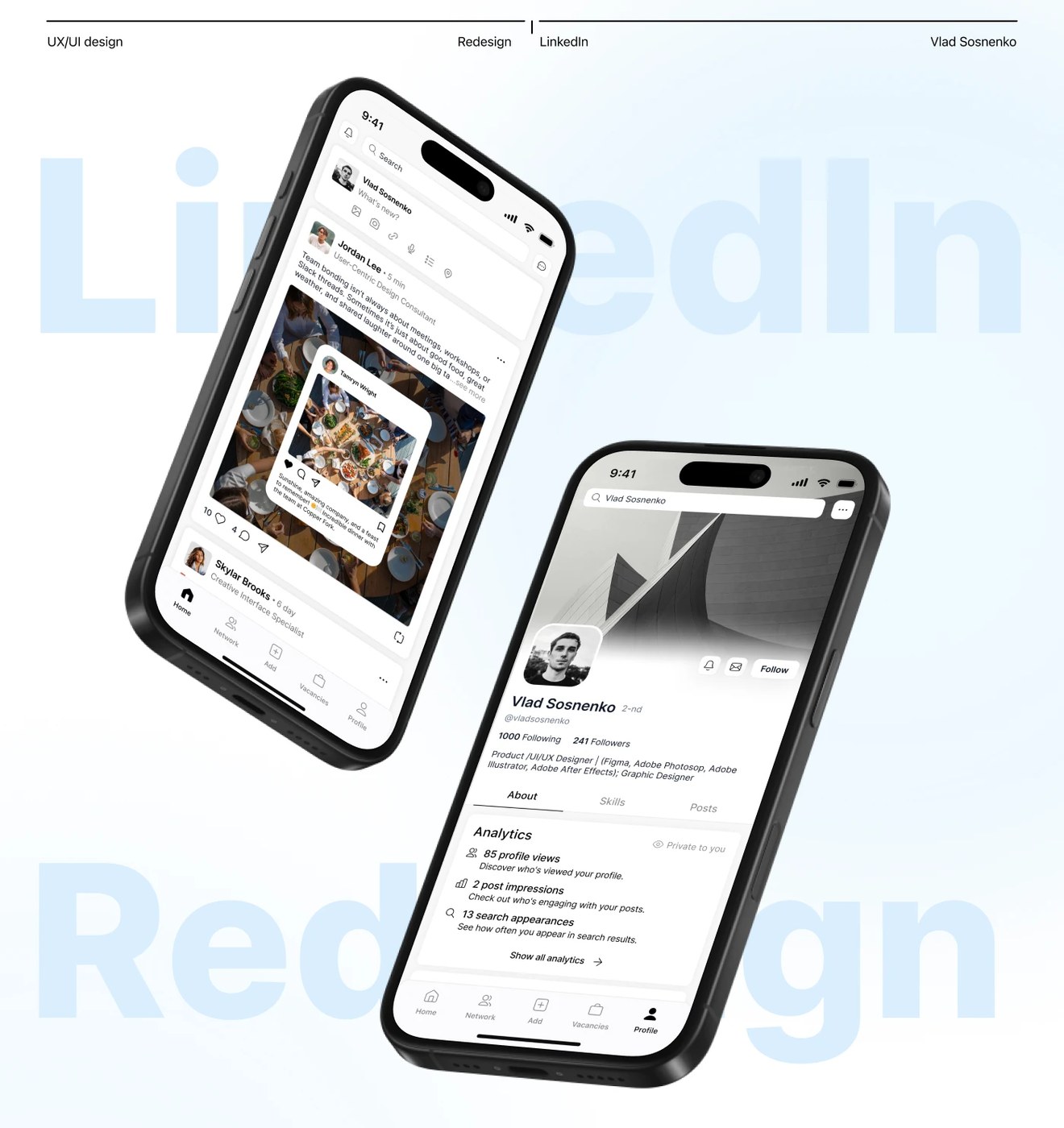
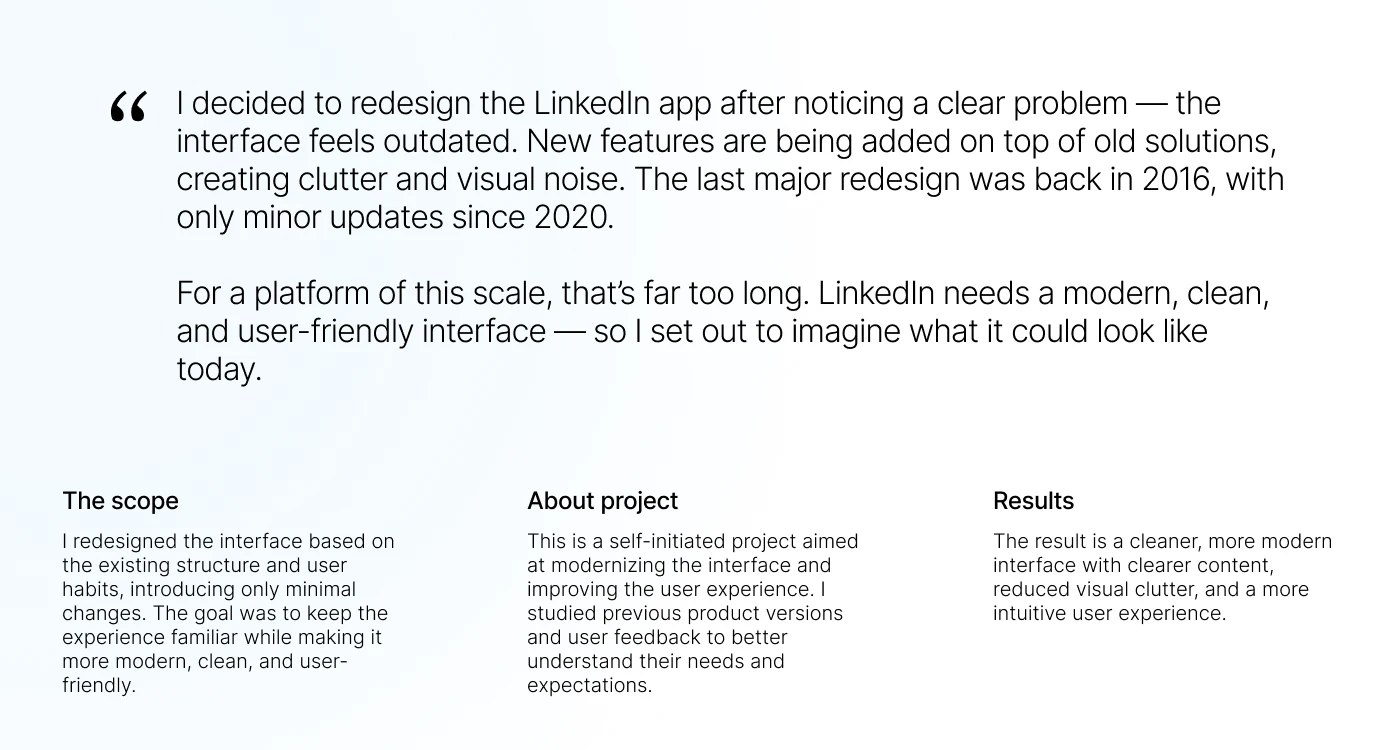
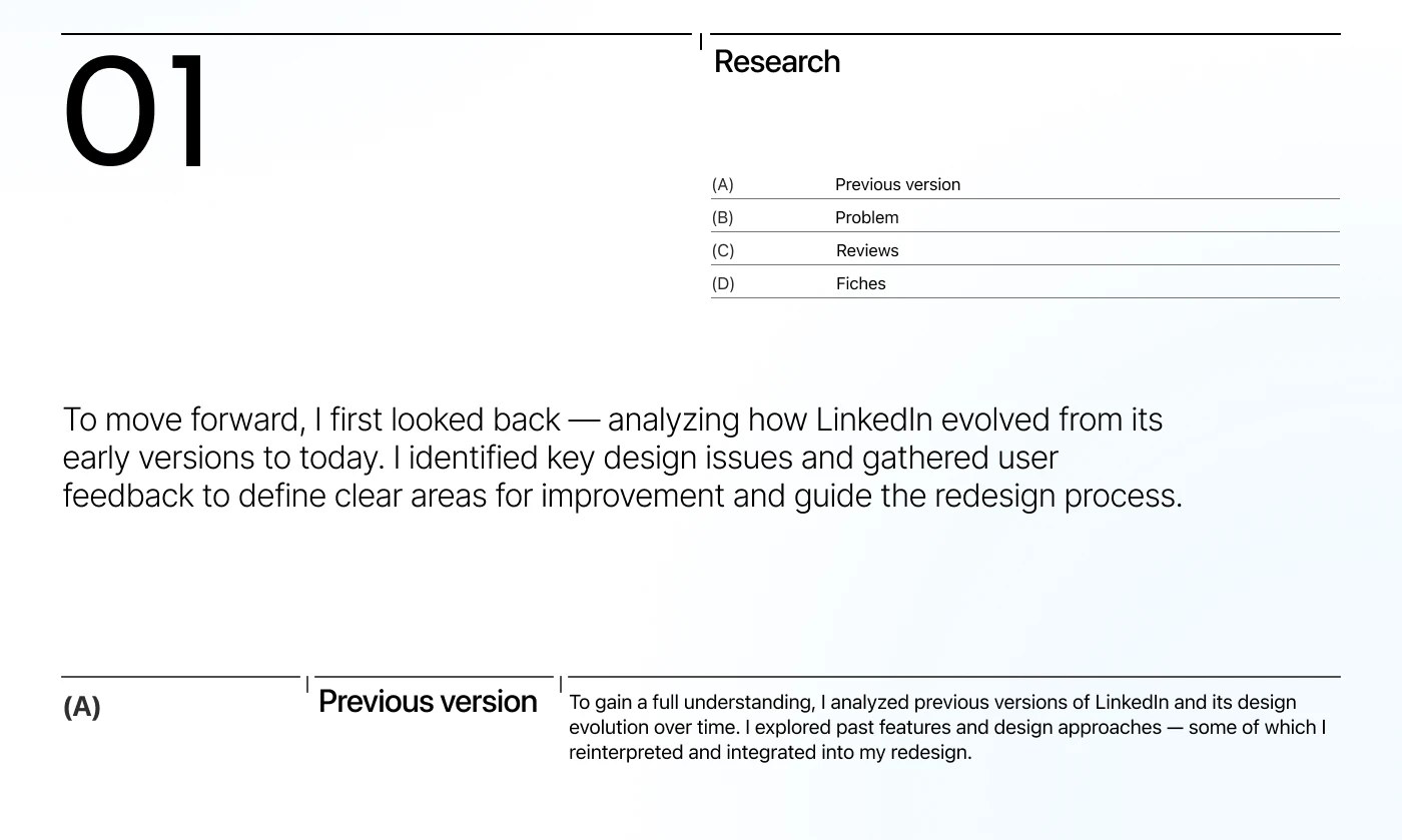
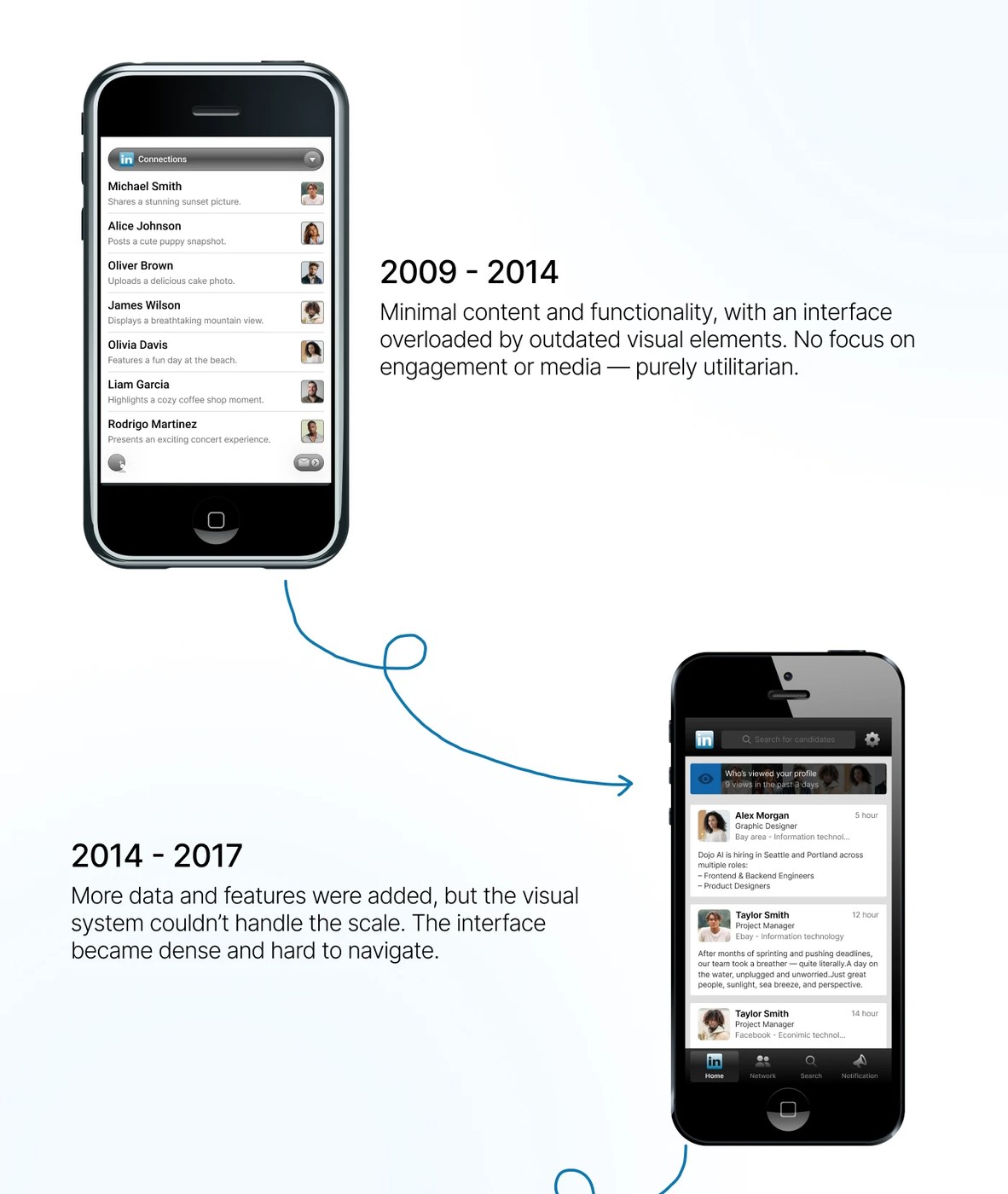
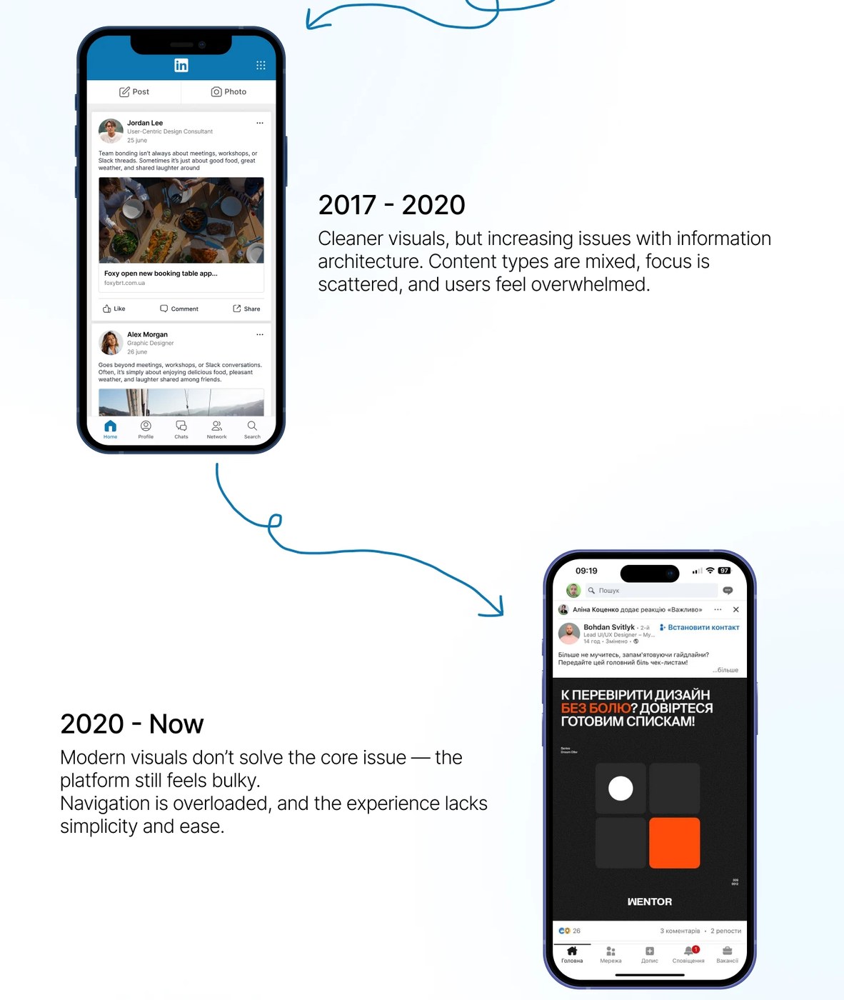
Mạng xã hội việc làm vốn nổi tiếng với giao diện phức tạp nay đã được đơn giản hóa một cách vô cùng gọn gàng qua bàn tay của Vlad Sosnenko. Bản layout dashboard UI/UX này tập trung vào cấu trúc hình học sạch sẽ, tận dụng triệt để hệ thống lưới modular grid nghiêm ngặt. Việc căn lề chuẩn chỉnh kết hợp cùng các khoảng trắng hợp lý tạo nên một nhịp điệu thị giác rất dễ chịu. Tác giả đã xử lý cực mượt bài toán cân bằng giữa lượng thông tin dày đặc và phân cấp bố cục rõ ràng. Các thẻ card được thiết kế sắc nét giúp sắp xếp chi tiết hồ sơ cá nhân cực kỳ ngăn nắp, kết hợp cùng thanh menu bên hông hiển thị trực quan mọi lựa chọn điều hướng chính.
Hệ thống phân cấp thị giác mạnh mẽ chính là điểm mấu chốt dẫn dắt ánh nhìn của người dùng trên toàn bộ ứng dụng. Tỷ lệ typography được tinh chỉnh kỹ lưỡng, sử dụng độ tương phản cao để tăng trải nghiệm đọc. Sự kết hợp giữa font chữ tiêu đề to, đậm đặt cạnh các khối thông tin kỹ thuật nhỏ nhắn tạo ra một sự tương phản đầy thú vị. Giao diện sử dụng bảng màu tối tinh tế giúp giảm mỏi mắt, đi kèm với các gam màu nhấn có độ tương phản cao để làm nổi bật những thông báo quan trọng.
Bản redesign của Vlad Sosnenko đã thách thức những quy chuẩn giao diện mạng xã hội thông thường, đơn giản hóa các luồng điều hướng phức tạp để mang lại trải nghiệm kết nối chuyên nghiệp tập trung nhất. Cách tiếp cận này thể hiện tư duy kỷ luật trong thiết kế kỹ thuật số hiện đại, mang đến một tổng thể vừa cao cấp vừa tối ưu hóa công năng sử dụng.
Xem thêm các dự án thiết kế khác trên portfolio chính thức của www.behance.net/gallery/226702719/LinkedIn-Redesign-App-UXUI-Design.
The professional networking site, famous for its cluttered interface, gets a super clean makeover by Vlad Sosnenko. This UI/UX dashboard layout focuses on a clean geometric structure, making full use of a strict modular grid system. Perfect alignment paired with generous white space creates a really pleasing visual rhythm. The designer smoothly tackles the challenge of balancing data-heavy info with a clear hierarchy. Crisp cards keep profile details incredibly organized, while a sleek sidebar menu keeps all the main navigation options intuitive and right at hand.
A strong visual hierarchy is the secret sauce here, effortlessly guiding the eyes across the app. The typography scale is finely tuned, utilizing high contrast to boost readability. Mixing big, bold headers right next to small, technical details creates a super fun contrast. A sophisticated dark mode palette keeps eye strain away, paired with high-contrast accent colors that make important notifications pop.
Vlad Sosnenko’s redesign challenges standard social media UI norms, streamlining complex navigation flows for a hyper-focused professional networking experience. This approach shows serious discipline in modern digital design, delivering a look that’s both high-end and fully optimized for usability.
Check out more design projects on the official portfolio at www.behance.net/gallery/226702719/LinkedIn-Redesign-App-UXUI-Design.