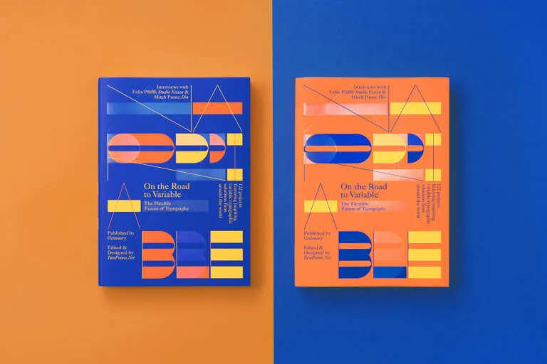
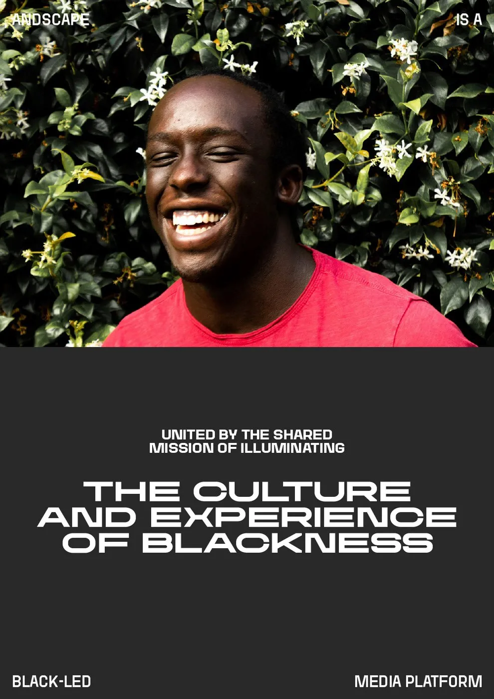

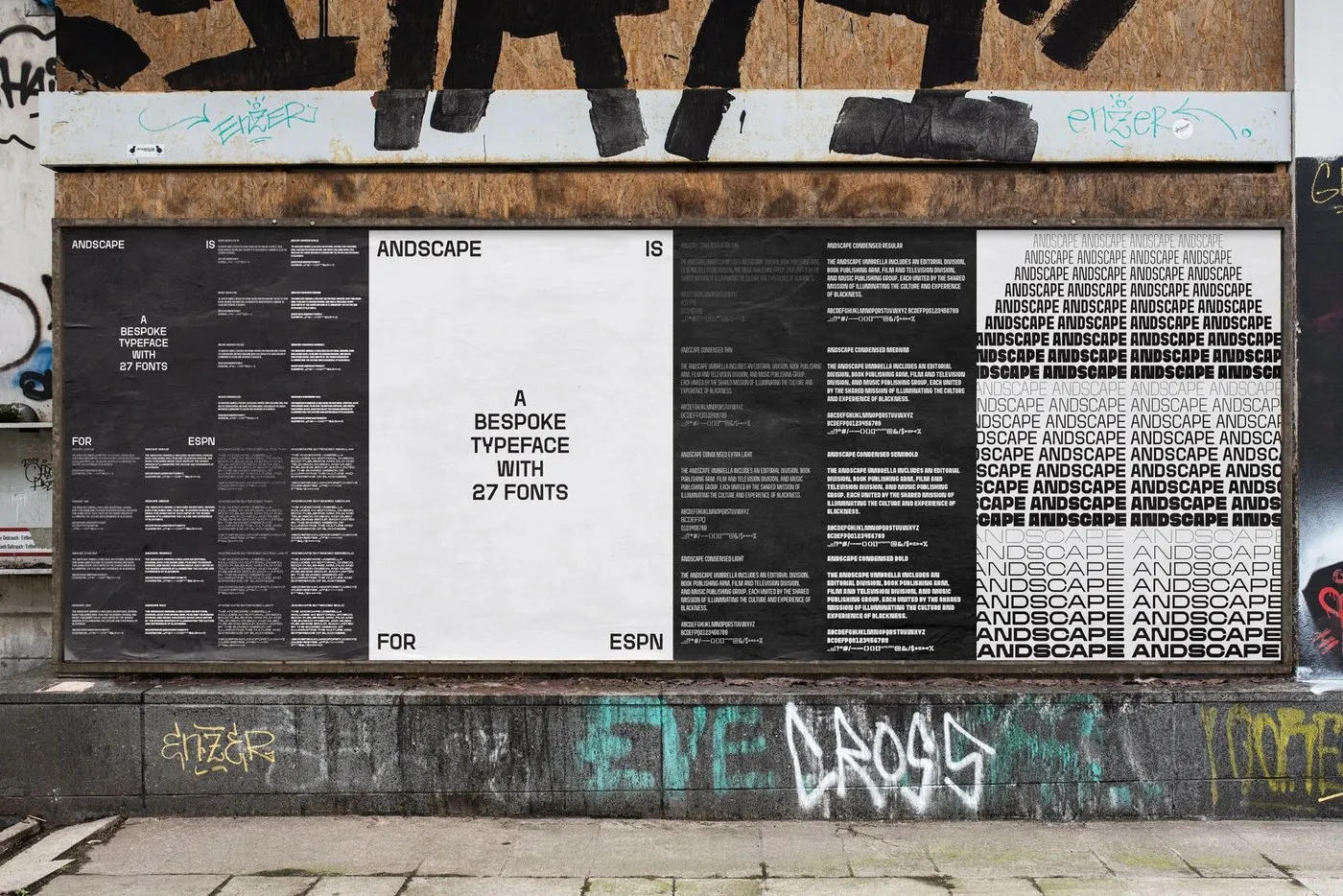
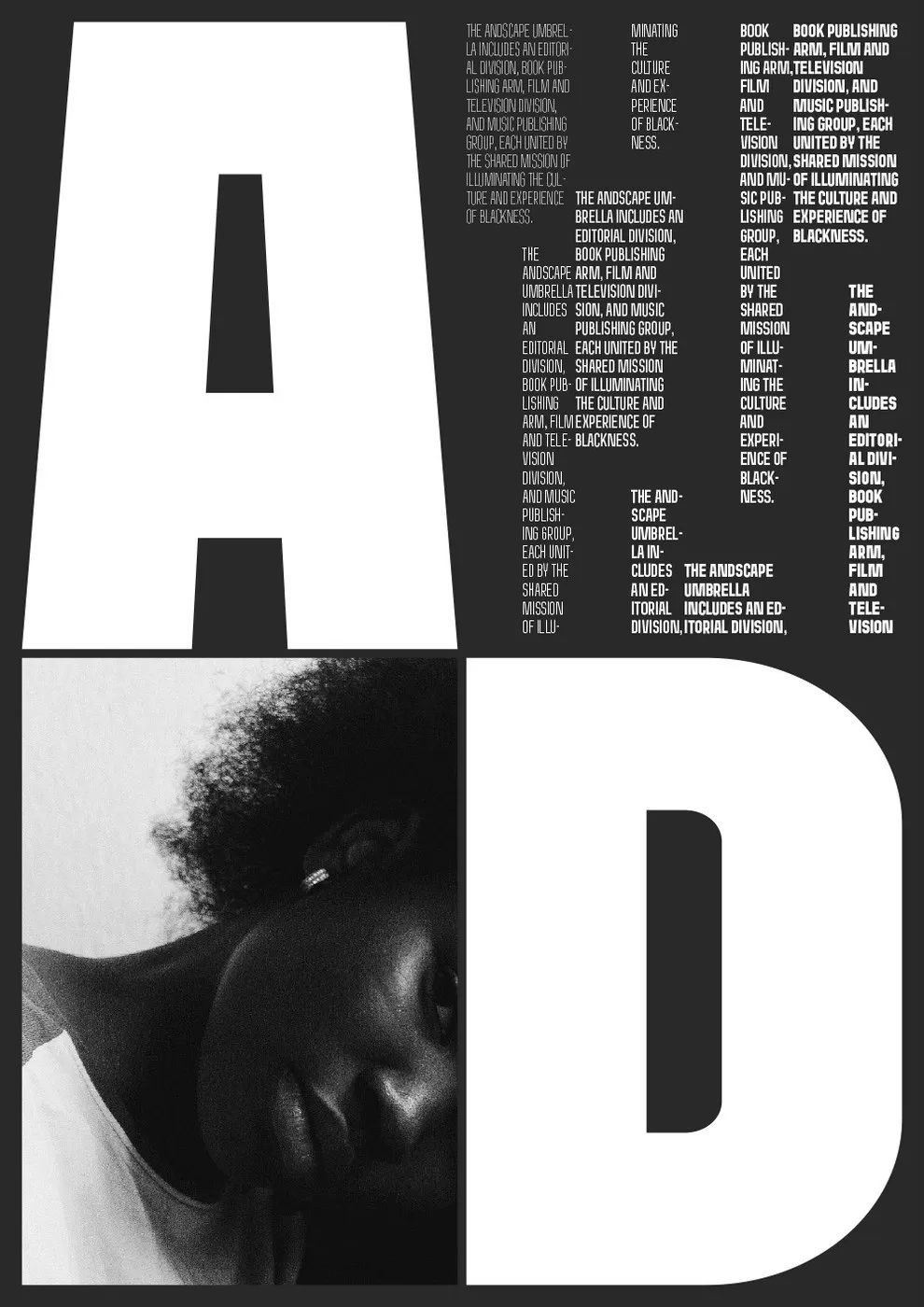
The Andscape Font Family by twopoints.net: A Super Flexible Typography Solution for ESPN ESPN teamed up with design studio twopoints.net to create Andscape—a custom bespoke typeface designed for a media platform dedicated to uplifting Black identity and stories. This massive typographic system features 27 distinct styles, effortlessly moving from Condensed to Extended formats, with weights ranging from Ultra Thin all the way to Extra Bold.
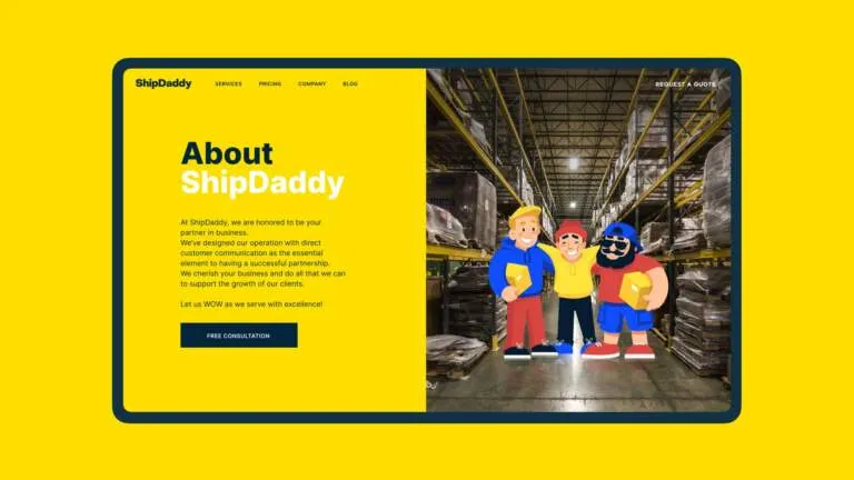
Every designer knows the struggle when working on massive web banners: pull a font too far horizontally, and it instantly looks warped and awkward. twopoints.net tackled this challenge by integrating fixed horizontal elements directly into the character geometry. Whether it’s a rounded letter like ‘O’ or a sharp shape like ‘A’, stretching the type horizontally maintains perfectly balanced stroke weight without any ugly distortion.
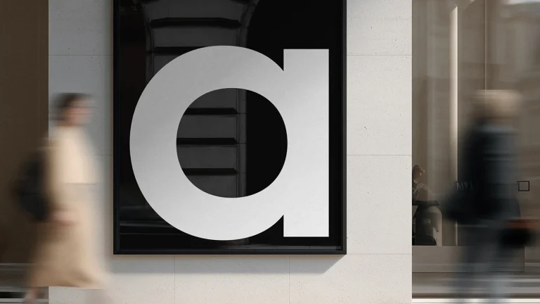
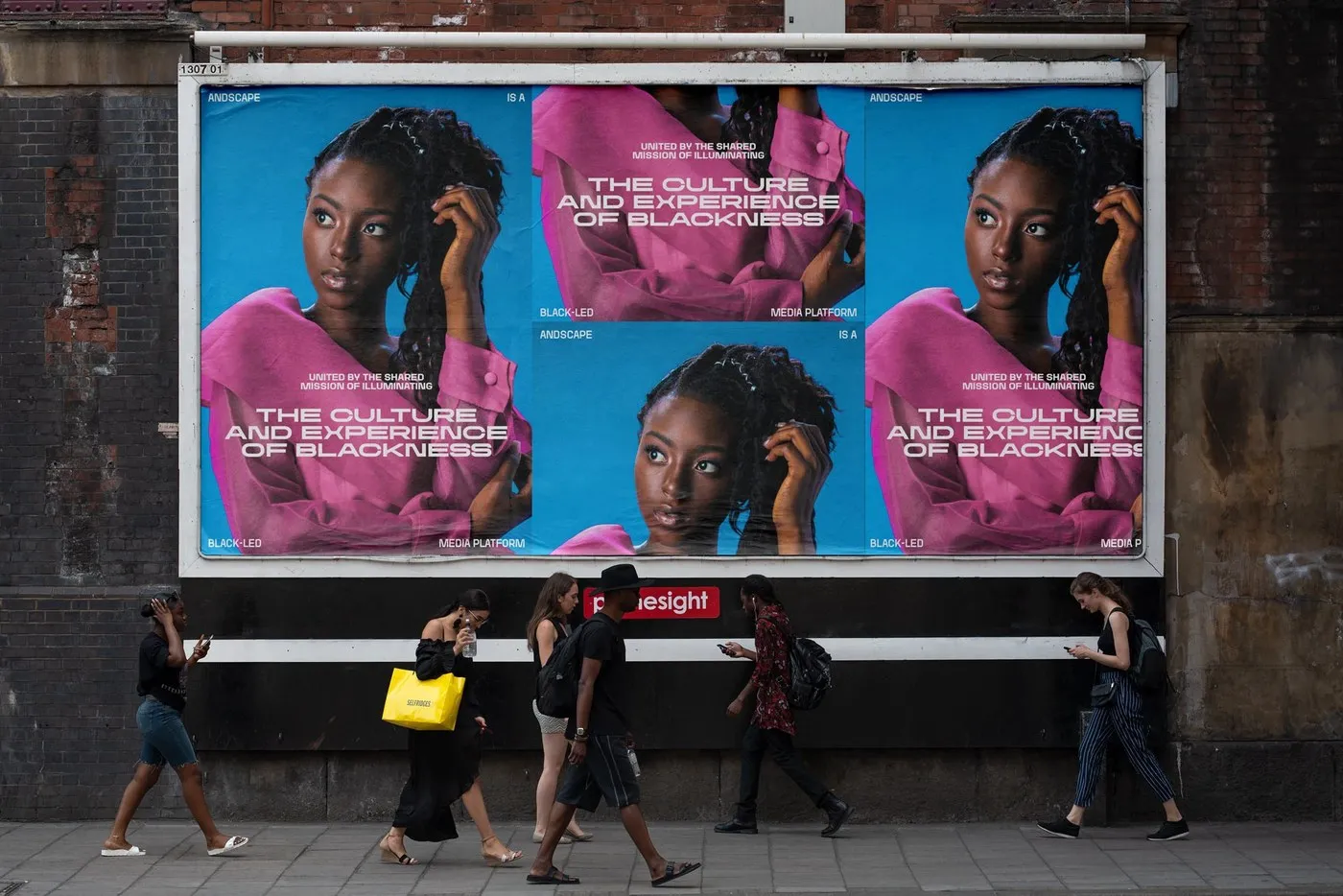
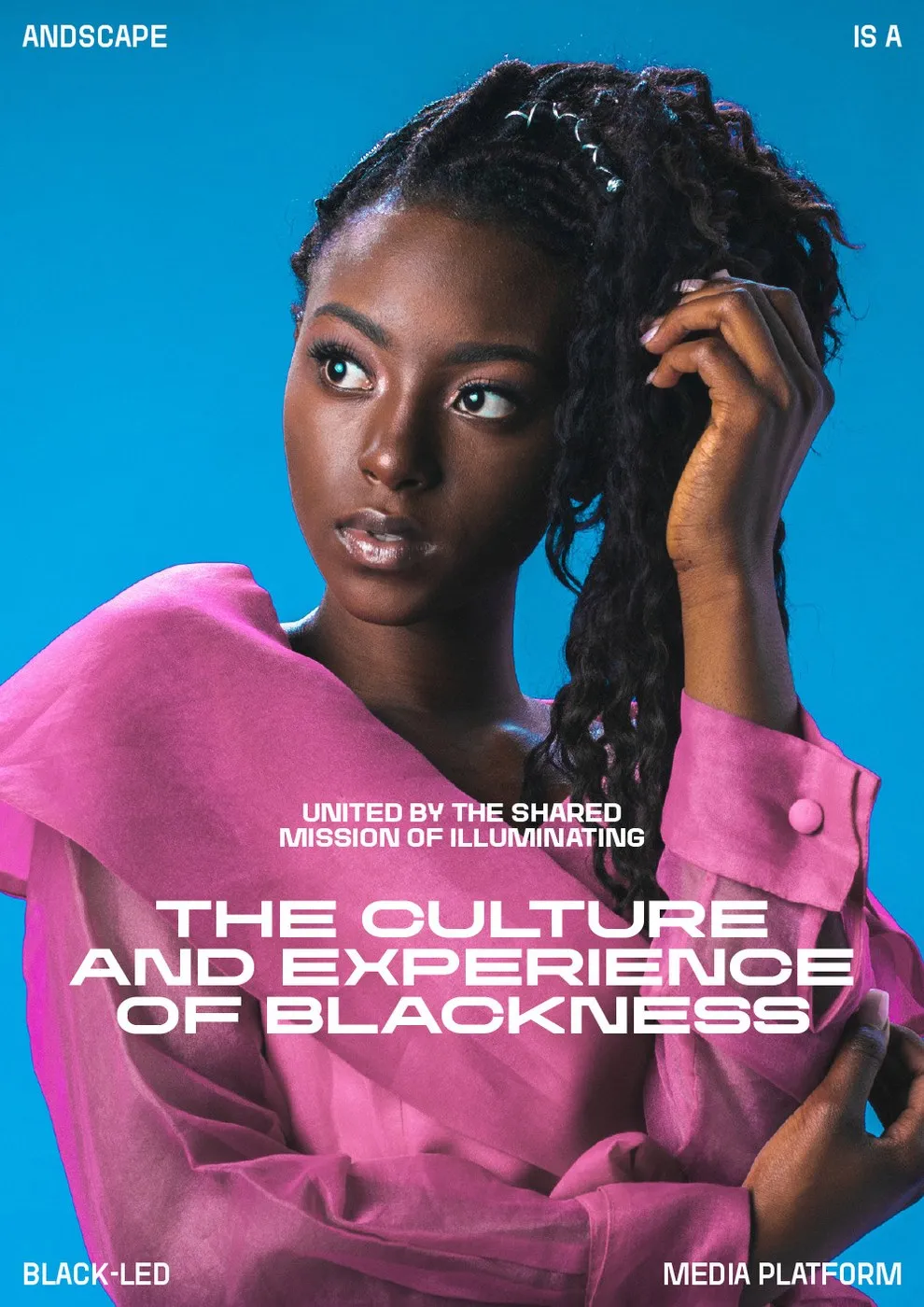
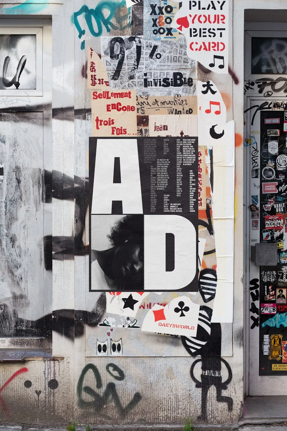
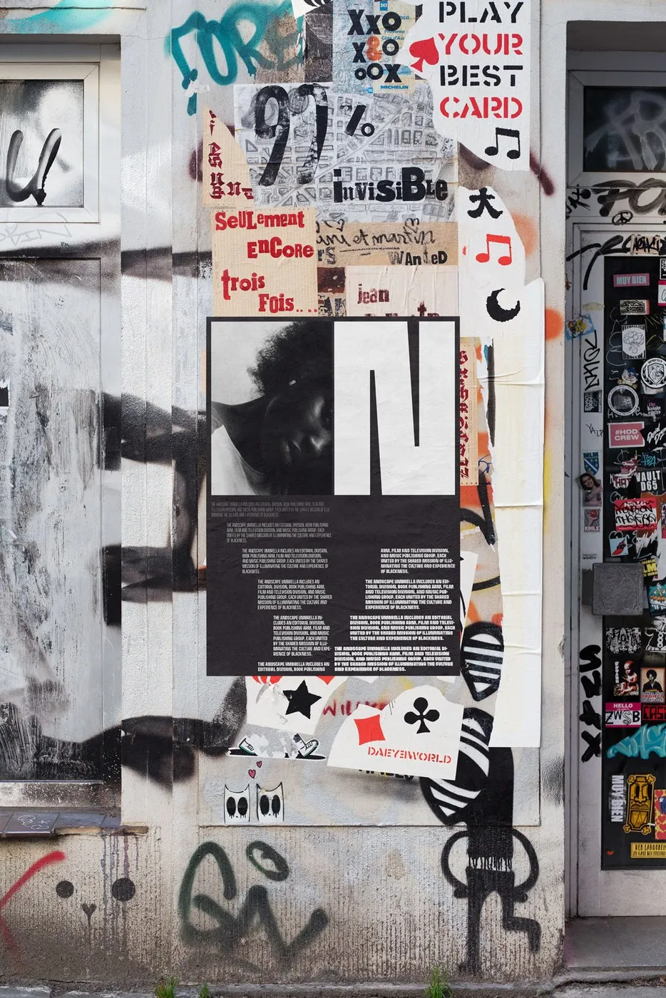
While it excels on digital screens, this typeface also brings serious visual punch to print work. From wild-posting street posters on brick walls to huge outdoor billboards, a strict layout grid keeps the typography neat and structured. Condensed styles let long words fit tightly into narrow spaces, while the wider extended styles make headlines pop with maximum impact.
Be sure to check out the full typography showcase by twopoints.net on Behance.
Bộ Font Andscape Của twopoints.net: Giải Pháp Typography Co Giãn Linh Hoạt Cho ESPN
ESPN đã bắt tay cùng studio twopoints.net để tạo nên Andscape — bộ font chữ thiết kế riêng cho nền tảng truyền tải các câu chuyện về đời sống và văn hóa của người da đen. Hệ thống typography này sở hữu tổng cộng 27 style, biến chuyển đa dạng từ bản hẹp (Condensed) đến bản mở rộng (Extended), cùng dải độ dày kéo dài từ Ultra Thin cho tới Extra Bold.
Vấn đề quen thuộc của thiết kế khi làm banner web cỡ lớn là chữ dễ bị biến dạng hoặc méo nét khi kéo giãn. twopoints.net đã xử lý bài toán này bằng cách tích hợp các đoạn thanh ngang cố định ngay trong cấu trúc ký tự. Dù là hình khối bo tròn như chữ O hay góc cạnh như chữ A, khi kéo rộng theo chiều ngang, phần nét chữ vẫn giữ nguyên độ cân bằng chuẩn xác, không bị bẹt hay mỏng đi.
Không chỉ tối ưu trên môi trường màn hình kỹ thuật số, hệ thống chữ này còn thể hiện hiệu ứng thị giác mạnh mẽ trên các ấn phẩm in ấn. Từ những tấm poster khổ lớn dán trên tường gạch đường phố cho đến các bảng quảng cáo ngoài trời, quy chuẩn grid chặt chẽ giúp bố cục chữ luôn gọn gàng. Các bản chữ hẹp giúp xếp gọn những từ dài vào không gian hẹp, trong khi bản chữ rộng tạo điểm nhấn rõ nét cho các phần tiêu đề.
Bạn có thể xem đầy đủ dự án thiết kế typography này của twopoints.net trên Behance.