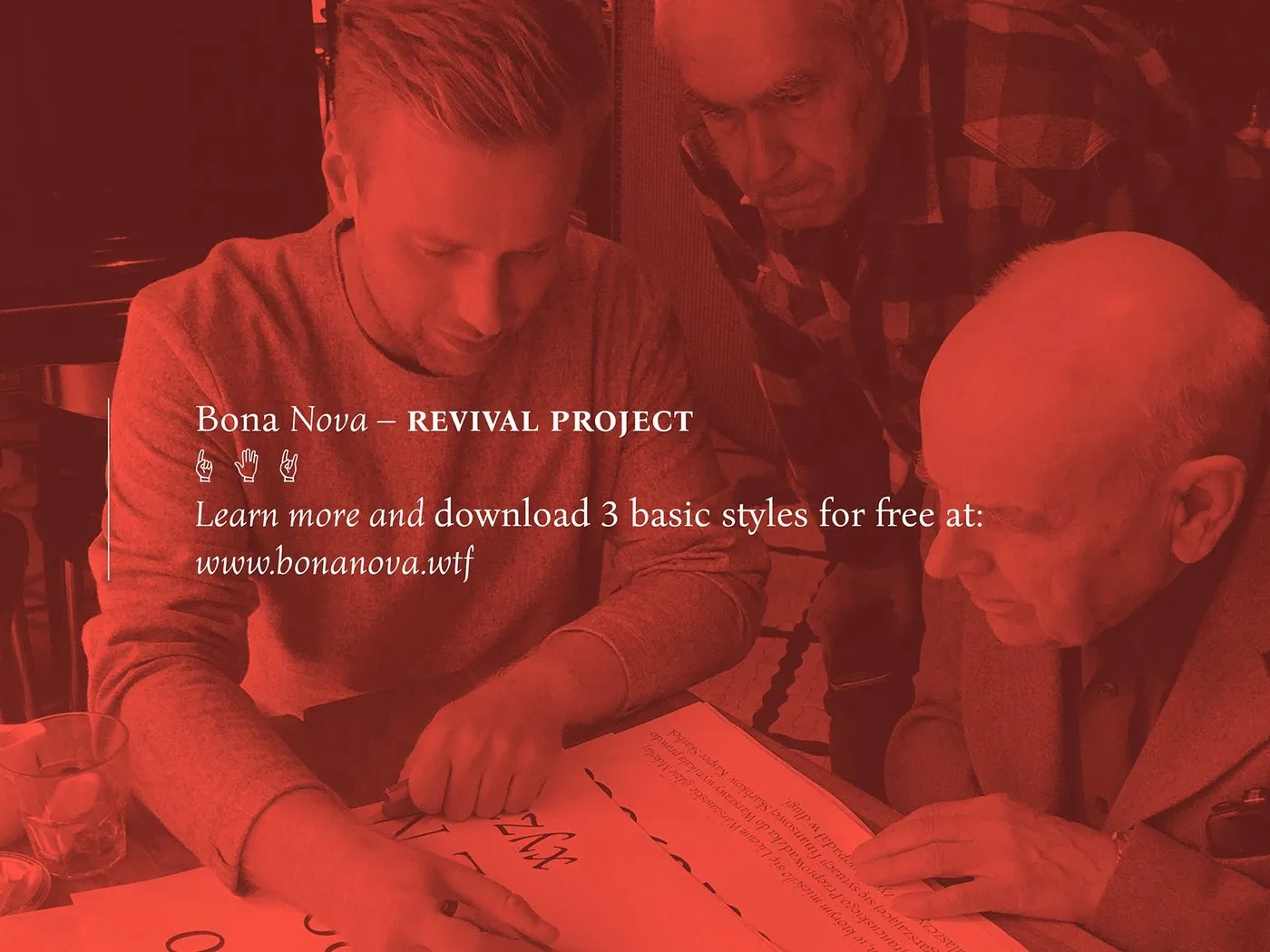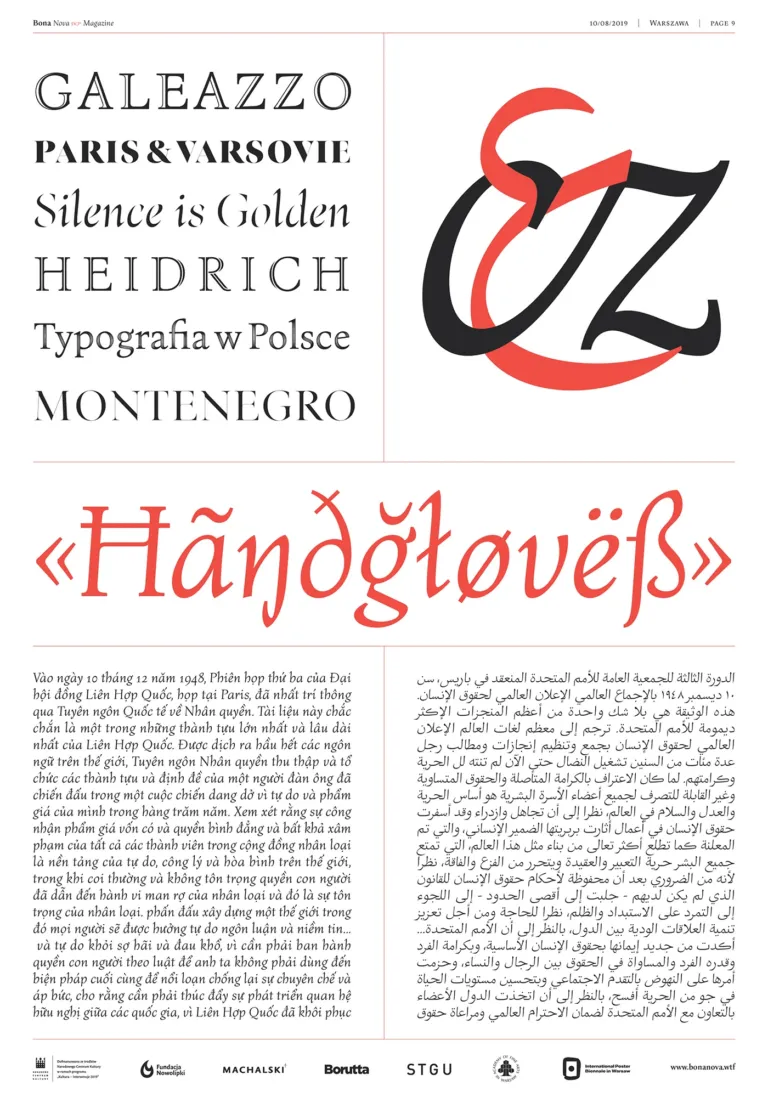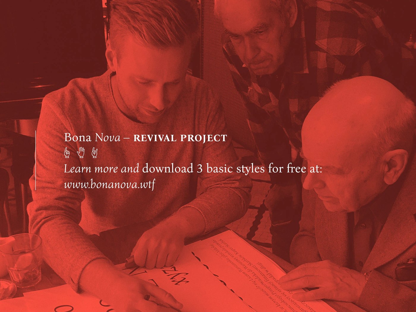
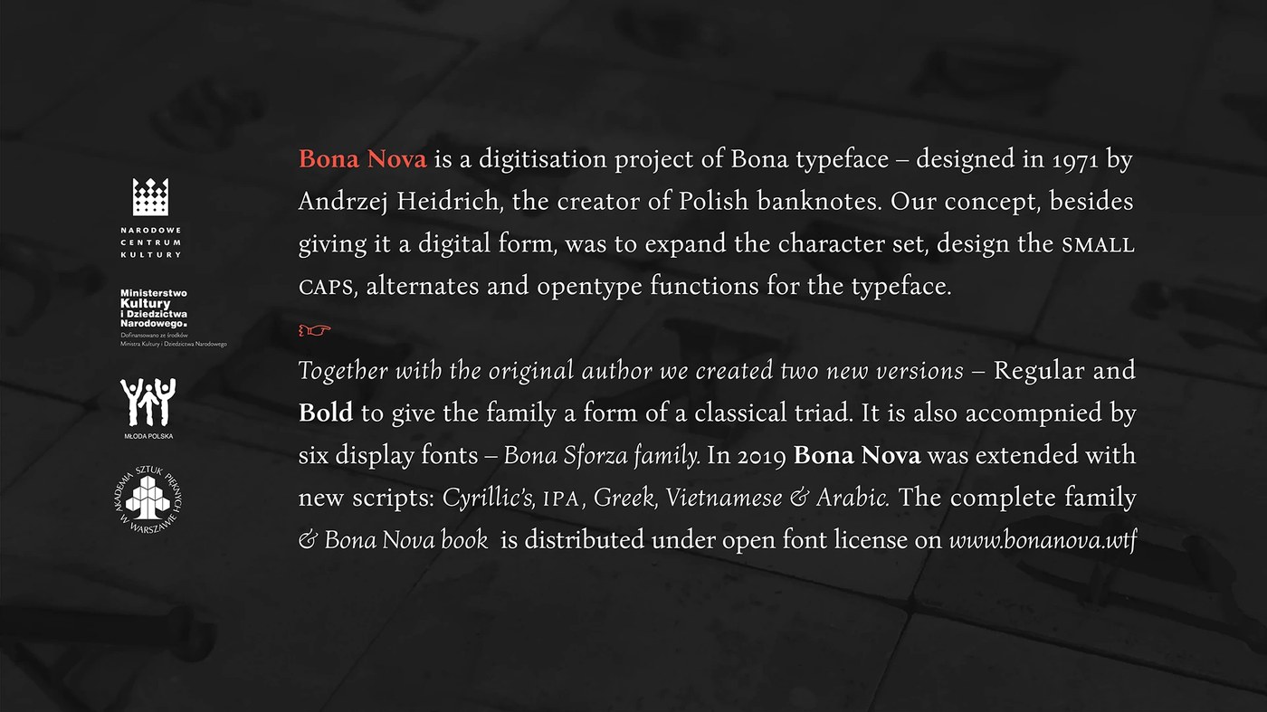

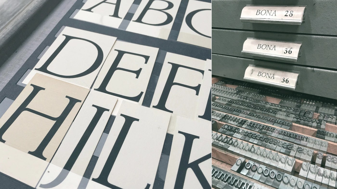
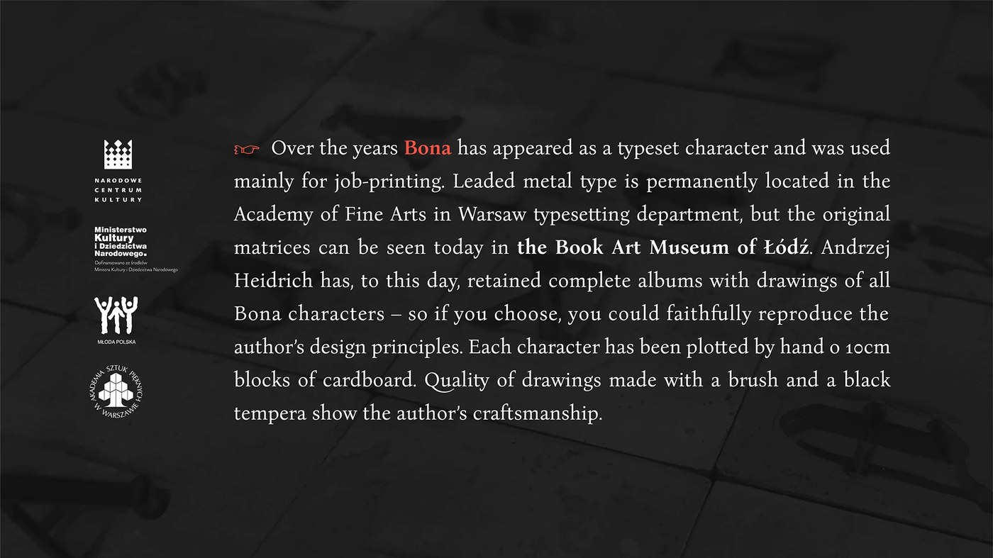
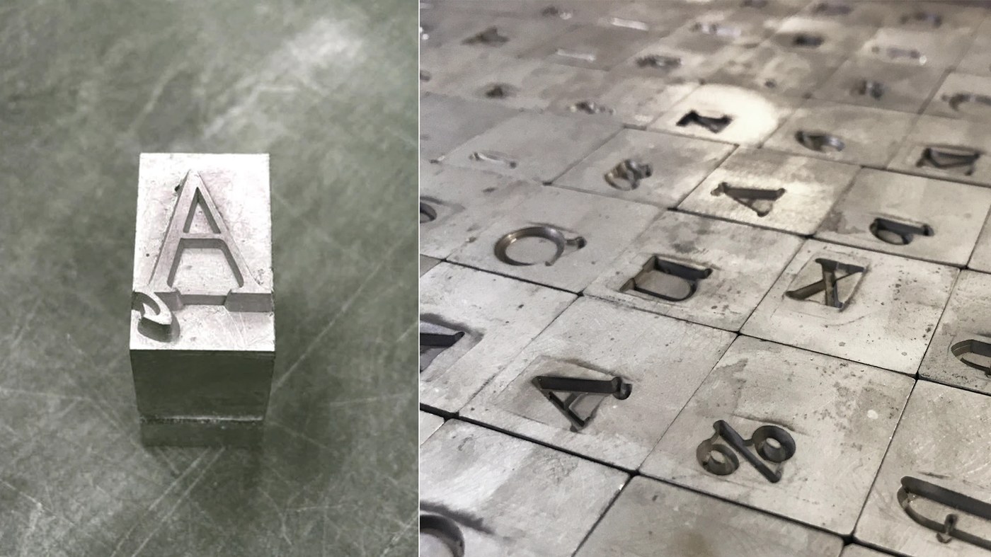
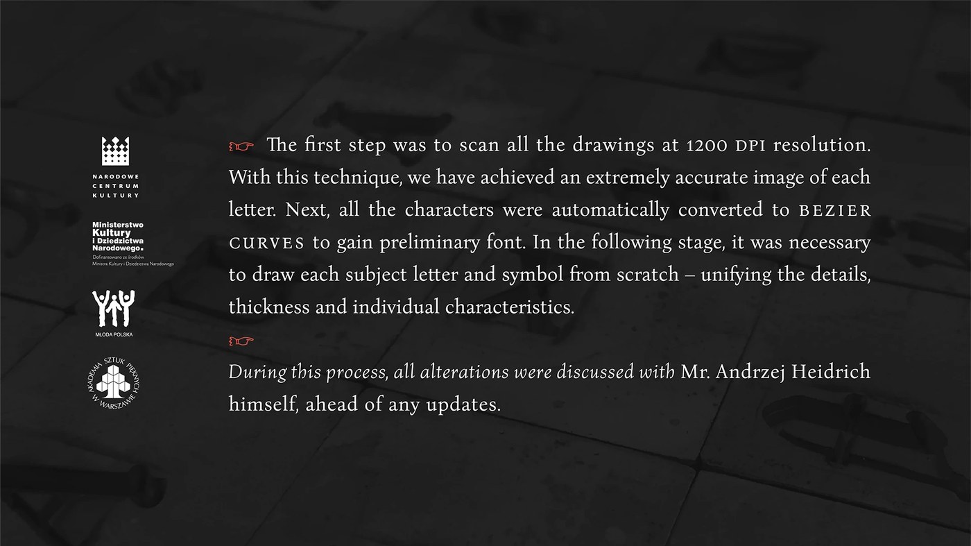
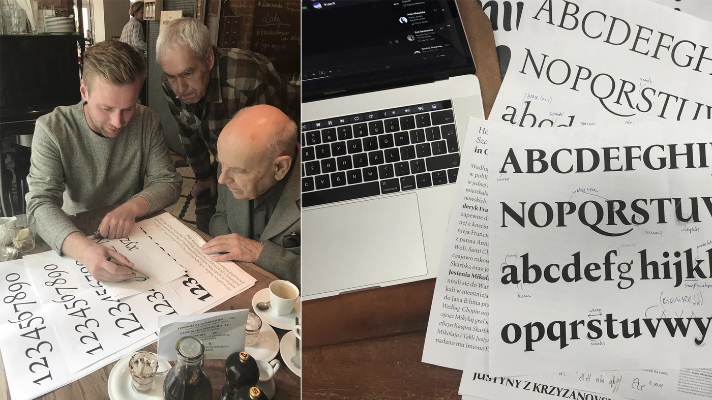
Bona Nova is an amazing digitization project of the original 1971 Bona typeface by Andrzej Heidrich, the famous designer behind Poland’s banknotes. Thanks to the creative vision of Mateusz Machalski and the team, this font has not only been reborn for the digital world but has also received a massive upgrade. The project introduces small caps, alternates, and plenty of super-handy OpenType features, offering ultimate flexibility for complex typographic layouts. Even with these extensive updates, the letterforms beautifully preserve the unique visual rhythm and calligraphic contrast of the original design.
This font family includes professional display weights like Bona Title. Every single line shines with absolute precision during print testing, showcasing a deep respect for Polish printing history. It is a fantastic, high-quality choice for design studios looking to strike the perfect balance between historical charm and modern digital needs, making it an absolute dream for magazine and editorial layouts.
Right now, the Bona Nova font is available completely free for creative projects, bringing a fresh, vibrant energy to brand identity designs. The download package comes fully loaded with an extensive system of alternates and ligatures. The entire project and the download files are publicly available on the Bona Nova Behance Page.
Bona Nova là một dự án số hóa đầy ấn tượng từ phông chữ Bona gốc năm 1971 của Andrzej Heidrich – người từng thiết kế các tờ tiền giấy tại Ba Lan. Qua bàn tay sáng tạo của Mateusz Machalski và đội ngũ của mình, bộ font này không chỉ hồi sinh trong thế giới kỹ thuật số mà còn được nâng cấp mạnh mẽ. Dự án đã bổ sung thêm các ký tự viết hoa nhỏ (small caps), các ký tự thay thế (alternates) và nhiều tính năng OpenType tiện lợi, mang lại sự linh hoạt tối đa cho các cấu trúc typography phức tạp. Dù mở rộng quy mô, các chữ cái vẫn giữ nguyên nhịp điệu thị giác độc đáo và độ tương phản nét vẽ mang tính thư pháp của phiên bản gốc.
Hệ phông chữ này mang đến các định dạng hiển thị (display weights) chuyên nghiệp như Bona Title. Từng đường nét khi in ấn thử nghiệm trên giấy cho thấy sự chỉn chu tuyệt đối, phản ánh sự tôn trọng sâu sắc đối với lịch sử ngành in ấn Ba Lan. Đây là một lựa chọn chất lượng cho các studio thiết kế muốn tìm kiếm sự cân bằng giữa yếu tố lịch sử và nhu cầu kỹ thuật số hiện đại, đặc biệt là trong các layout thiết kế tạp chí hay biên tập (editorial layout).
Hiện tại, bộ font Bona Nova đã được phát hành miễn phí cho các dự án sáng tạo, mang lại làn gió mới cho các thiết kế nhận diện thương hiệu. Gói tải về cung cấp đầy đủ hệ thống ký tự thay thế và các nét nối chữ (ligatures). Toàn bộ dự án và file tải đều được đăng tải công khai trên trang Behance của www.behance.net/gallery/60843427/Bona-Nova-(FREE-FONT