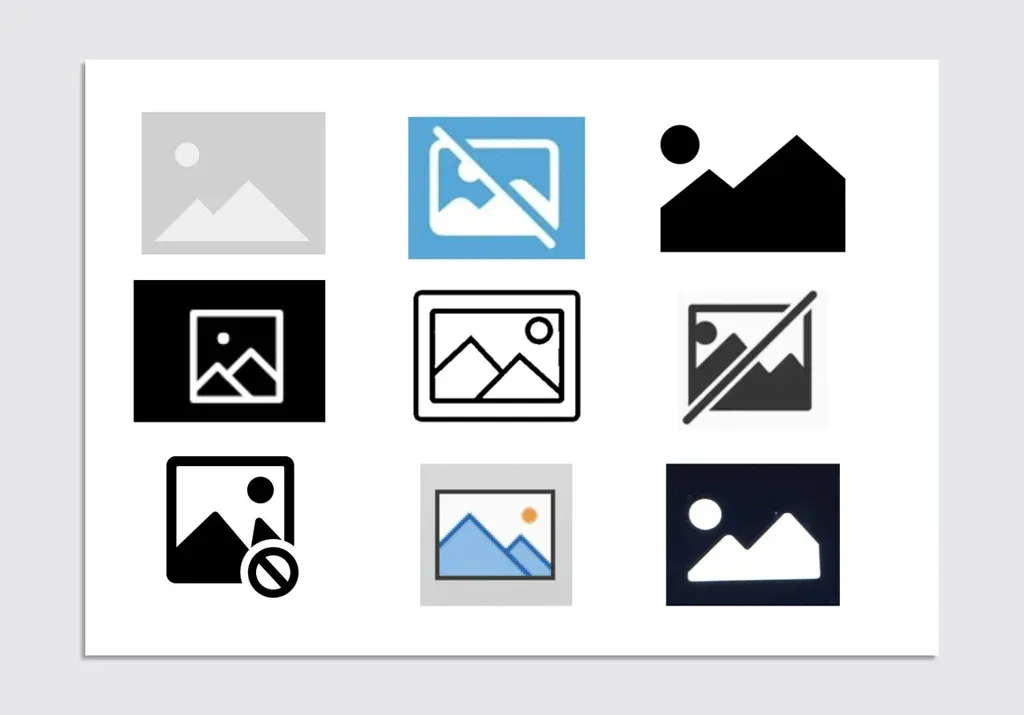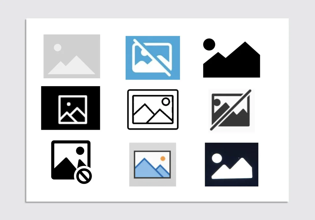

Ever been browsing the web and ran into that lonely little box with two mountain peaks because an image failed to load or is taking its sweet time? It is the universal placeholder icon for a missing image. But ever wonder how this specific double-mountain design became the absolute gold standard across the entire digital world?
Semiotic Convergence in UI Design This icon is a textbook example of nyupress.org/9780814742952/convergence-culture/ or convergent design evolution. This happens when different cultures or tech platforms naturally land on the exact same visual solution for a problem. Just like using a magnifying glass for a search bar or a green leaf for eco-friendly products, those two little mountain peaks have become universally recognized shorthand for “an image belongs here”.
This design pops up everywhere—from the image insertion button in Microsoft Word and PowerPoint to car infotainment screens, and even as www.redbubble.com/i/art-print/Broken-Internet-Image-Icon-by-TheShirtYurt/13019447.1G4ZT.
Roots in Japanese Film Cameras
According to discussions among developers and designers, this iconic placeholder most likely traces its roots back to the landscape mode icon found on the mode dials of Japanese SLR film cameras from the early 1990s, like the 1993 Canon EOS 500.
Back then, the landscape setting used a generic two-peak mountain symbol so photographers would intuitively know it was for outdoor shooting. This specific mode maximized the depth of field by adjusting the aperture, keeping both the foreground and background crystal clear. Before the internet took over, this exact same graphic was also used to represent landscape printing mode on home computers.
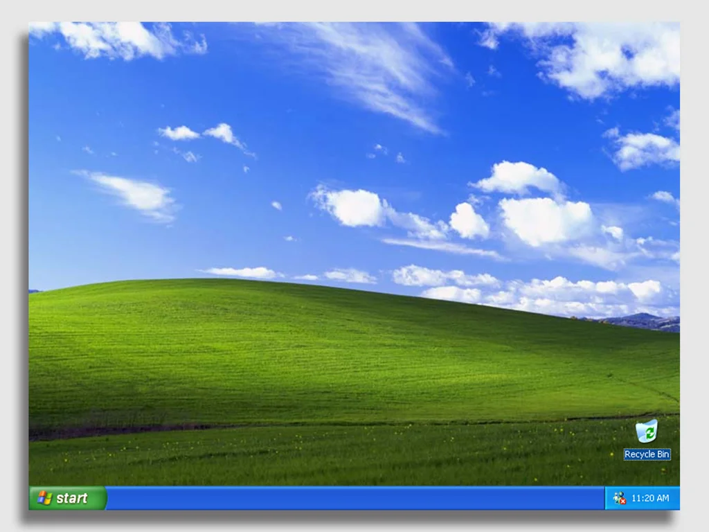
The Windows XP Connection There is also a fascinating parallel between this placeholder and “Bliss,” the legendary default wallpaper for Windows XP featuring rolling green hills and a dreamlike blue sky with wispy clouds. Captured by photographer Charles O’Rear and acquired in 1998, both “Bliss” and the mountain icon share a minimalist aesthetic that achieved massive, global omnipresence.
A Deeper Symbolic Meaning Way back in 1994, visual designer Marsh Chamberlain created a graphic with three colorful geometric shapes (a square, circle, and triangle) on a ripped piece of paper as a broken image placeholder for the Netscape Navigator browser. Over time, however, the dual mountain peaks paired with a sun or cloud completely took over, becoming the standard for UI wireframes and skeleton loaders.
From the perspective of www.bloomsbury.com/us/adventure-9798765101469/, mountains act as ultimate objects of desire—distant, mysterious, and grand—yet here they are, tucked into the most mundane digital tasks. It might just prove that humans are inherently nature-positive, subconsciously bringing the great outdoors right onto screens and phones.
Chắc hẳn ai cũng từng gặp tình huống lướt web và thấy một ô vuông có hình hai ngọn núi nhỏ nằm trơ trọi khi ảnh bị lỗi hoặc chưa kịp tải. Đây chính là biểu tượng placeholder quen thuộc cho một hình ảnh bị thiếu. Nhưng tại sao hình ảnh hai ngọn núi này lại trở thành một quy chuẩn chung trên toàn thế giới kỹ thuật số?
Hiện tượng hội tụ trong thiết kế UI
Biểu tượng này là một ví dụ điển hình cho khái niệm nyupress.org/9780814742952/convergence-culture/ (sự hội tụ ký hiệu học) hay tiến hóa thiết kế hội tụ. Điều này xảy ra khi các nền văn hóa hoặc nền tảng khác nhau cùng chọn một giải pháp hình ảnh tương đồng cho một vấn đề. Tương tự như việc dùng kính lúp cho tính năng search hay chiếc lá cho sản phẩm thân thiện với môi trường, hình ảnh hai ngọn núi đã được mặc định hiểu là “đáng lẽ phải có một bức ảnh ở đây”.
Biểu tượng này xuất hiện rất nhiều khi chọn chèn ảnh trong Microsoft Word, PowerPoint, trên màn hình thông tin giải trí của xe ô tô, hoặc thậm chí là trên www.redbubble.com/i/art-print/Broken-Internet-Image-Icon-by-TheShirtYurt/13019447.1G4ZT nghệ thuật treo tường.
Khởi nguồn từ những chiếc máy ảnh phim Nhật Bản
Theo các cuộc thảo luận của giới lập trình viên và designer, biểu tượng này nhiều khả năng bắt nguồn từ icon landscape mode (chế độ chụp phong cảnh) trên các vòng xoay chế độ của máy ảnh phim SLR Nhật Bản từ đầu những năm 1990, tiêu biểu như chiếc Canon EOS 500 ra mắt năm 1993.
Chế độ chụp phong cảnh lúc đó thường được minh họa bằng hai ngọn núi để người dùng hiểu ngay rằng đây là thiết lập tối ưu khi chụp ngoài trời. Tính năng này giúp điều chỉnh khẩu độ nhằm tối đa hóa độ sâu trường ảnh (depth of field), đảm bảo cả tiền cảnh lẫn hậu cảnh đều rõ nét. Trước khi Internet phổ biến, hình ảnh này cũng từng được dùng để biểu thị chế độ in ngang trên máy tính.
Mối liên hệ với ảnh nền quốc dân Windows XP
Một góc nhìn thú vị khác chỉ ra rằng biểu tượng placeholder này có nét tương đồng lớn với “Bliss” – bức ảnh nền mặc định huyền thoại của hệ điều hành Windows XP với đồi cỏ xanh và bầu trời mây trắng mộng mơ. Bức ảnh do nhiếp ảnh gia Charles O’Rear chụp và được mua lại vào năm 1998. Cả ảnh nền “Bliss” lẫn biểu tượng ngọn núi đều mang tính chất tối giản nhưng lại có độ phủ sóng rộng khắp.
Ý nghĩa biểu tượng sâu xa
Vào năm 1994, nhà thiết kế Marsh Chamberlain từng tạo ra một đồ họa gồm ba hình khối màu sắc (vuông, tròn, tam giác) trên một mảnh giấy rách để làm biểu tượng ảnh lỗi cho trình duyệt Netscape Navigator. Tuy nhiên, theo thời gian, hình ảnh hai ngọn núi phối hợp cùng mặt trời hoặc đám mây đã hoàn toàn chiếm ưu thế và trở thành UI wireframes hoặc skeleton loader tiêu chuẩn.
Dưới góc nhìn của các chuyên gia nghiên cứu www.bloomsbury.com/us/adventure-9798765101469/, ngọn núi hoạt động như một đối tượng của sự khao khát – vừa xa xôi, bí ẩn nhưng lại xuất hiện trong những tác vụ công nghệ bình dị nhất. Đây cũng có thể là minh chứng cho thấy con người luôn có xu hướng hướng về thiên nhiên (nature-positive), ngay cả khi đang tương tác trong môi trường kỹ thuật số.