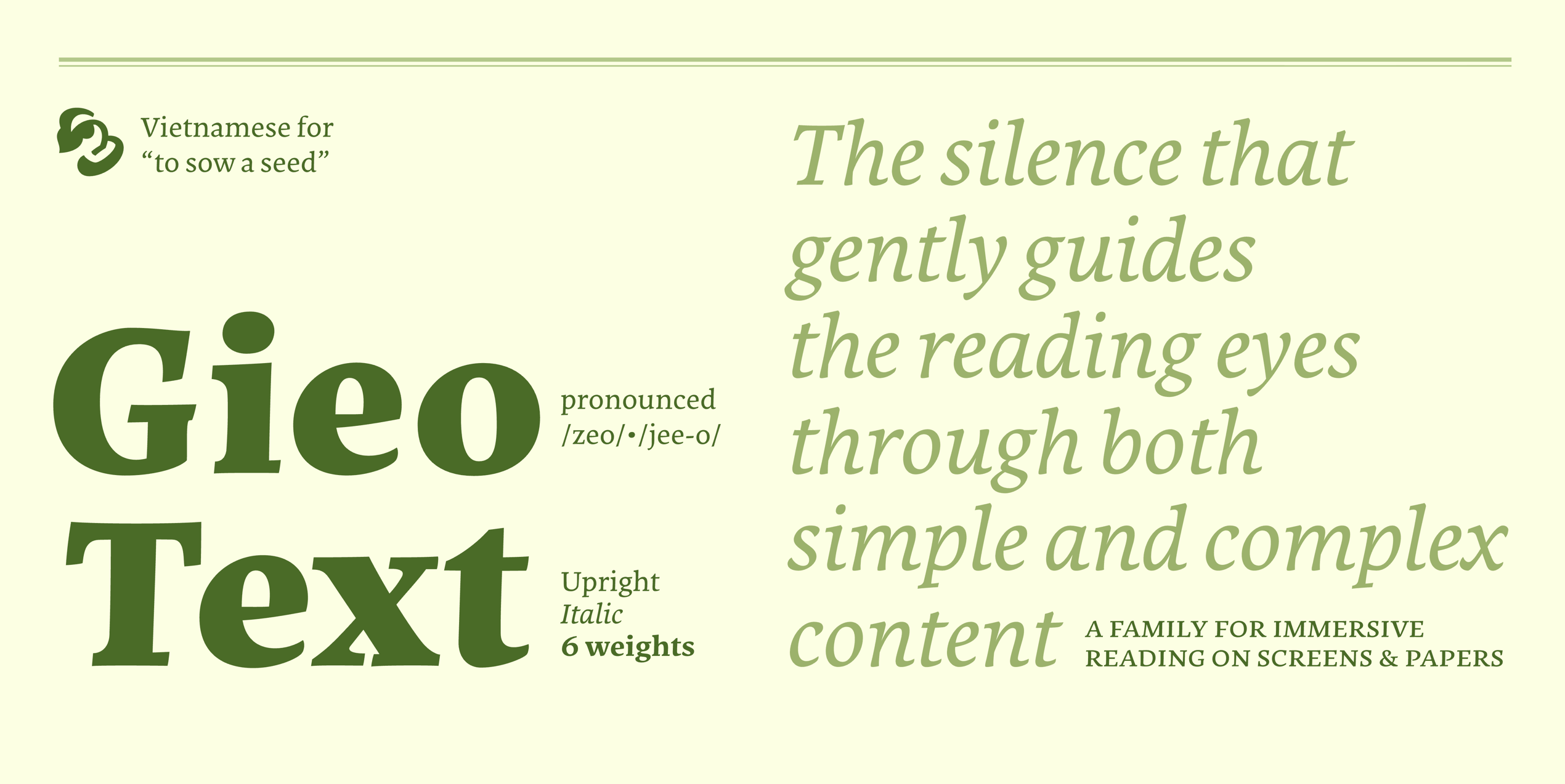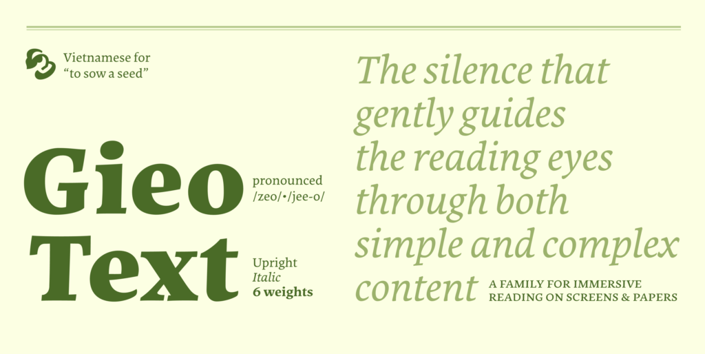


Gieo Text is a super exciting typeface designed by Linh Nguyễn from ÁccentiaType studio. This project actually started out as a practical assignment during the Master of Typeface Design (MATD) 20/21 program at the University of Reading. The name “Gieo” comes directly from the Vietnamese word for “to sow seeds,” giving the project a beautifully organic and meaningful vibe.
Drawing inspiration from classic Venetian styles, Gieo Text features a generous x-height, making it absolutely perfect for on-screen reading and digital typesetting. The font delivers a super calm and relaxing reading experience thanks to its smooth, flowing curves that mimic broad-nibbed pen strokes. The contrast is distinct yet incredibly gentle on the eyes.
A major highlight of Gieo Text is how the letters lean slightly to the right. Combined with open forms, this creates a continuous visual rhythm that feels just like handwriting, keeping readers effortlessly engaged. Overall, the typeface strikes a beautiful balance between traditional and contemporary design, seamlessly blending soft curves with sharp edges.
The Gieo Text family packs a punch with 12 fonts in total, ranging all the way from Regular and Italic to Extra Bold and Black Italic. It also comes loaded with advanced OpenType features like Contextual Alternates, Ligatures, Small Capitals, and versatile numeral styles. It is a fantastic tool for designers working on editorial layouts, book covers, brochures, or brand identity projects.
Gieo Text là một bộ font chữ cực kỳ thú vị đến từ nhà thiết kế Linh Nguyễn của studio ÁccentiaType. Dự án này ban đầu là một bài tập thực tế trong chương trình Thạc sĩ Thiết kế Chữ (MATD) khóa 20/21 tại Đại học Reading. Cái tên “Gieo” được lấy nguyên bản từ hành động “gieo hạt” trong tiếng Việt, mang một tinh thần rất tự nhiên và ý nghĩa.
Khơi nguồn cảm hứng từ phong cách Venetian cổ điển, Gieo Text sở hữu phần x-height lớn nên cực kỳ tối ưu cho việc hiển thị và đọc văn bản trên màn hình kỹ thuật số. Bộ font này mang lại một trải nghiệm đọc rất dễ chịu và thư thái nhờ những đường cong mượt mà, mô phỏng lại những nét mực từ ngòi bút dẹt (broad-nibbed pen). Độ tương phản của font rõ ràng nhưng lại rất nhẹ nhàng, vừa vặn với mắt người xem.
Điểm cộng lớn của Gieo Text là các con chữ có độ nghiêng nhẹ về bên phải kết hợp cùng phom dáng mở (open forms), tạo ra một dòng chảy thị giác liên tục như nét viết tay, giúp kích thích mạch đọc của người xem. Tổng thể bộ chữ là sự cân bằng tuyệt vời giữa yếu tố truyền thống và hiện đại, đan xen khéo léo giữa những đường nét mềm mại và các góc cạnh sắc sảo.
Gia đình Gieo Text có tổng cộng 12 font bao gồm đầy đủ các định dạng từ Regular, Italic cho đến Extra Bold và Black Italic. Bộ font này cũng đi kèm rất nhiều tính năng OpenType nâng cao như Contextual Alternates, Ligatures, Small Capitals hay các định dạng chữ số đa dạng, hỗ trợ đắc lực cho các designer khi làm layout tạp chí, thiết kế bìa sách, brochure hay phát triển hệ thống nhận diện thương hiệu.