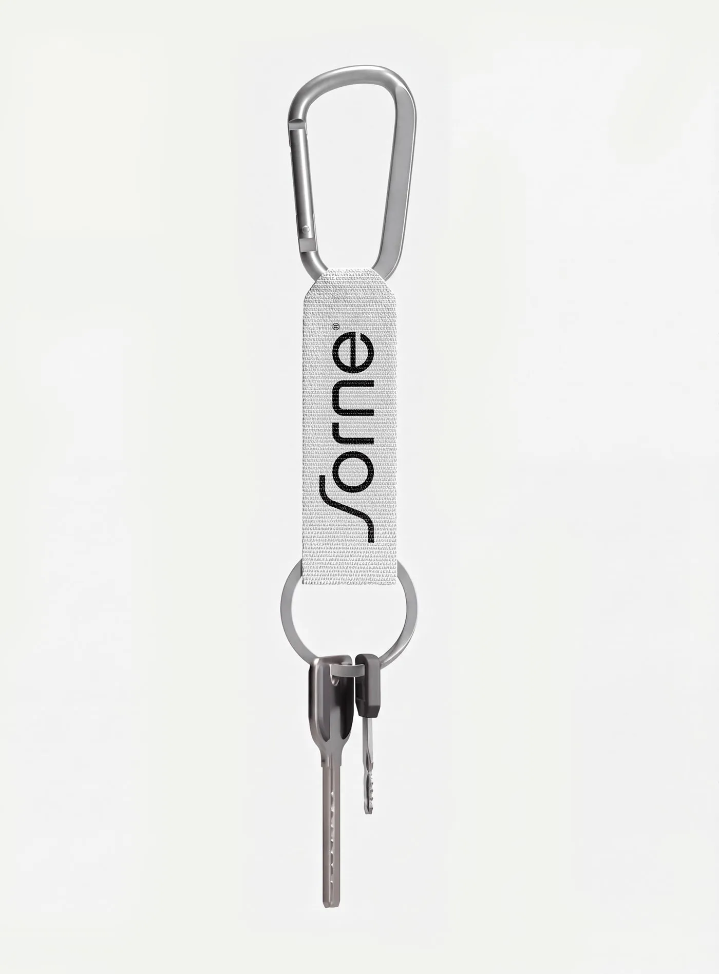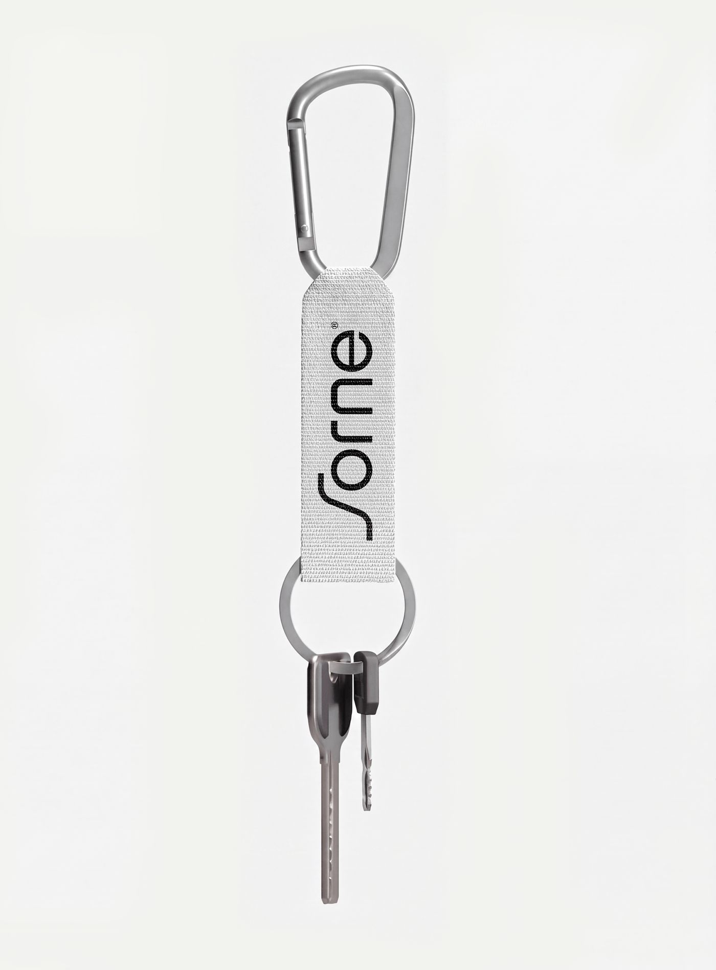
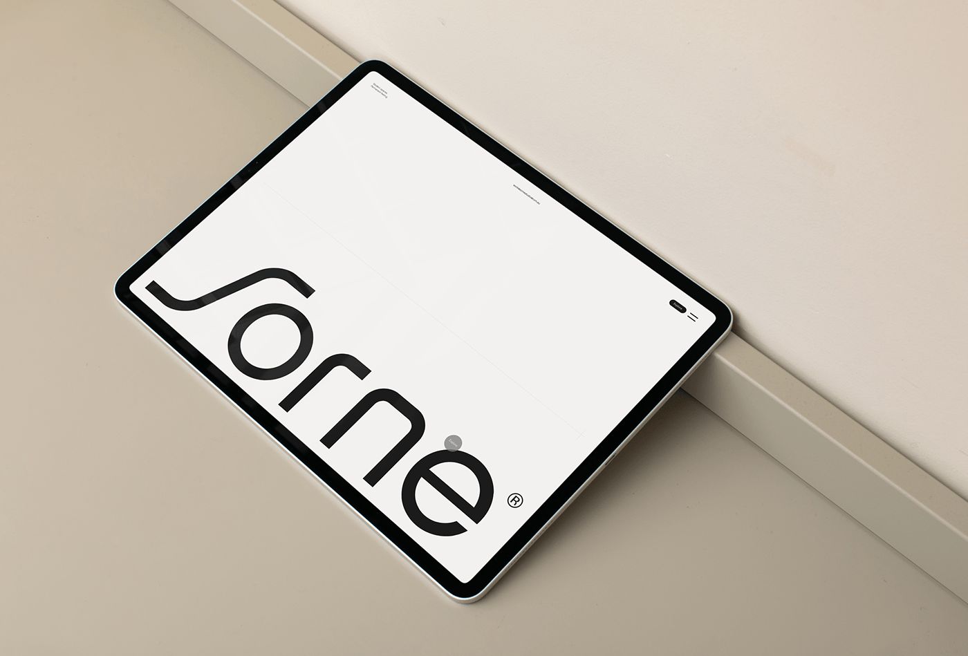
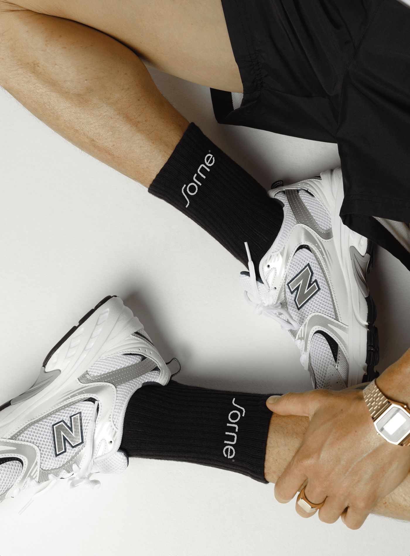

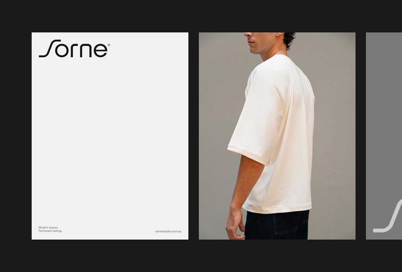
Sorne® vừa ra mắt bộ nhận diện thương hiệu tối giản nhưng đầy chiến lược, kết hợp các bố cục tương phản cao do Gideon Phillip đảm nhận.
Giám đốc sáng tạo Gideon Phillip cùng các nhà thiết kế tại KWIBA đã phát triển một hệ thống branding dạng mô-đun (modular system) làm nền tảng cho toàn bộ danh tính thị giác. Bảng màu được giới hạn nghiêm ngặt chỉ gồm hai màu đen than và trắng phấn, loại bỏ hoàn toàn các màu sắc trang trí. Sự kết hợp tương phản cao này tạo ra một hệ thống phân cấp thị giác rõ ràng ngay lập tức trên các ấn phẩm in ấn. Phần typography sử dụng font chữ sans-serif dày, có tính cấu trúc cao, khiến các chữ cái hoạt động gần như các yếu tố kiến trúc. Bằng cách kết hợp phần logotype táo bạo này với hệ thống lưới hairline chính xác, bố cục đã tạo ra một sự tương tác đầy thú vị giữa các mảng khối và khoảng trống. Mọi layout đều được căn chỉnh nghiêm ngặt theo hệ thống lưới dọc (vertical grid), làm nổi bật trật tự thị giác.
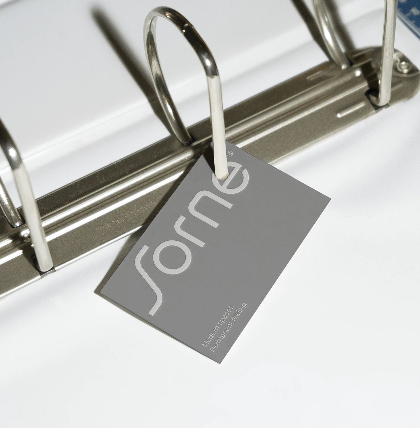
Hệ thống nhận diện này chuyển dịch sự chính xác của kỹ thuật số sang các điểm chạm vật lý thông qua những lựa chọn chất liệu rất tinh tế. Danh thiếp được dập chìm (letterpress debossing) sâu trên giấy cotton dày không tráng phủ, mang lại cảm giác cao cấp và chân thực cho các bố cục đơn giản. Sự tương phản giữa bề mặt giấy thô ráp và mực đen sắc nét mang lại rất nhiều cảm hứng. Nó chứng minh rằng sự tiết chế vẫn có thể truyền tải sự sang trọng mà không cần dùng đến ép kim vàng hay lớp phủ bóng bẩy thông thường. Bao bì sử dụng hộp bìa cứng (chipboard box) tối giản với nhãn quấn quanh, ưu tiên việc căn chỉnh theo lưới hơn là các yếu tố minh họa. Hướng đi vật lý này làm cho các tài sản hình ảnh trở nên chắc chắn và gắn kết hơn.
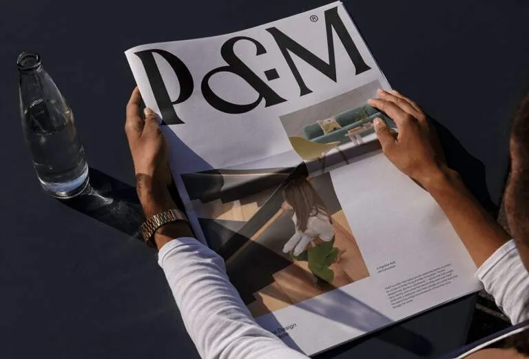
Cuối cùng, bộ nhận diện đã đơn giản hóa mối quan hệ giữa cấu trúc doanh nghiệp và hình thức thị giác. Đội ngũ thiết kế đã thành công trong việc tránh các layout phổ thông bằng cách để khoảng trắng (whitespace) tự sắp xếp thứ tự phân cấp. Cấu trúc lưới rõ ràng giúp cho các trang catalog luôn giữ được công năng và cực kỳ dễ đọc. Lựa chọn bố cục này biến các ấn phẩm truyền thông trở thành một công cụ đáng tin cậy cho doanh nghiệp. Dự án cho thấy chủ nghĩa tối giản chiến lược có thể định nghĩa lại nhận diện thương hiệu như thế nào. Để biết thêm chi tiết về bộ nhận diện thị giác này, hãy ghé thăm www.behance.net/gallery/250807271/Sorne. Hệ thống này giúp các trang giấy tiêu chuẩn trở nên ngăn nắp và có cấu trúc rõ ràng hơn.
Sorne® just dropped a fresh, hyper-strategic minimalist brand identity featuring high-contrast layouts masterminded by Gideon Phillip.
Creative Director Gideon Phillip and the design crew at KWIBA cooked up a modular branding system to serve as the backbone for the entire visual identity. They kept the color palette super strict—just charcoal black and chalk white, completely ditching any decorative colors. This high-contrast pairing creates an instant, crystal-clear visual hierarchy right on the printed page. For the typography, they went with a thick, structural sans-serif font, making the letters feel almost like architectural elements. Pairing this bold logotype with a precise hairline grid system creates an awesome interplay between solid blocks and negative space. Every single layout strictly aligns to a vertical grid, bringing out a beautiful sense of visual order.
This identity beautifully translates digital precision into physical touchpoints through some seriously sophisticated material choices. The business cards feature deep letterpress debossing on thick, uncoated cotton paper, giving the simple layouts a premium, tactile feel. The contrast between the raw, textured paper and the crisp black ink is pure inspiration! It proves that keeping things restrained can still scream luxury without relying on standard gold foils or glossy finishes. The packaging utilizes minimalist chipboard boxes with wrap-around labels, prioritizing grid alignment over busy illustrations. This tactile approach makes the visual assets feel incredibly grounded and cohesive.
Ultimately, this identity simplifies the relationship between corporate structure and visual form. The design team successfully steered clear of generic layouts by letting white space organically define the hierarchy. The clean grid system keeps the catalog pages highly functional and super easy to read. This layout choice transforms corporate communications into a reliable business tool. It’s a perfect example of how strategic minimalism can redefine a brand’s identity. To check out more details about this visual system, head over to www.behance.net/gallery/250807271/Sorne. This system beautifully transforms standard pages into clean, highly structured layouts.