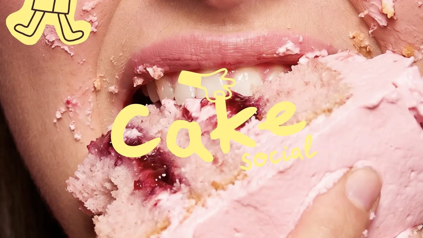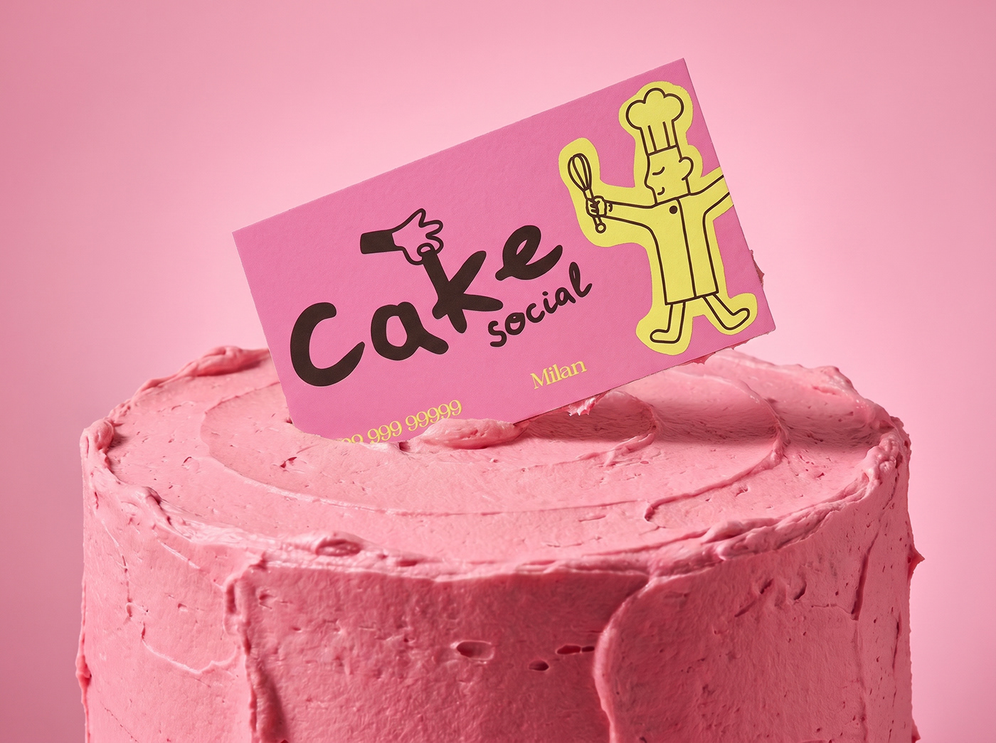
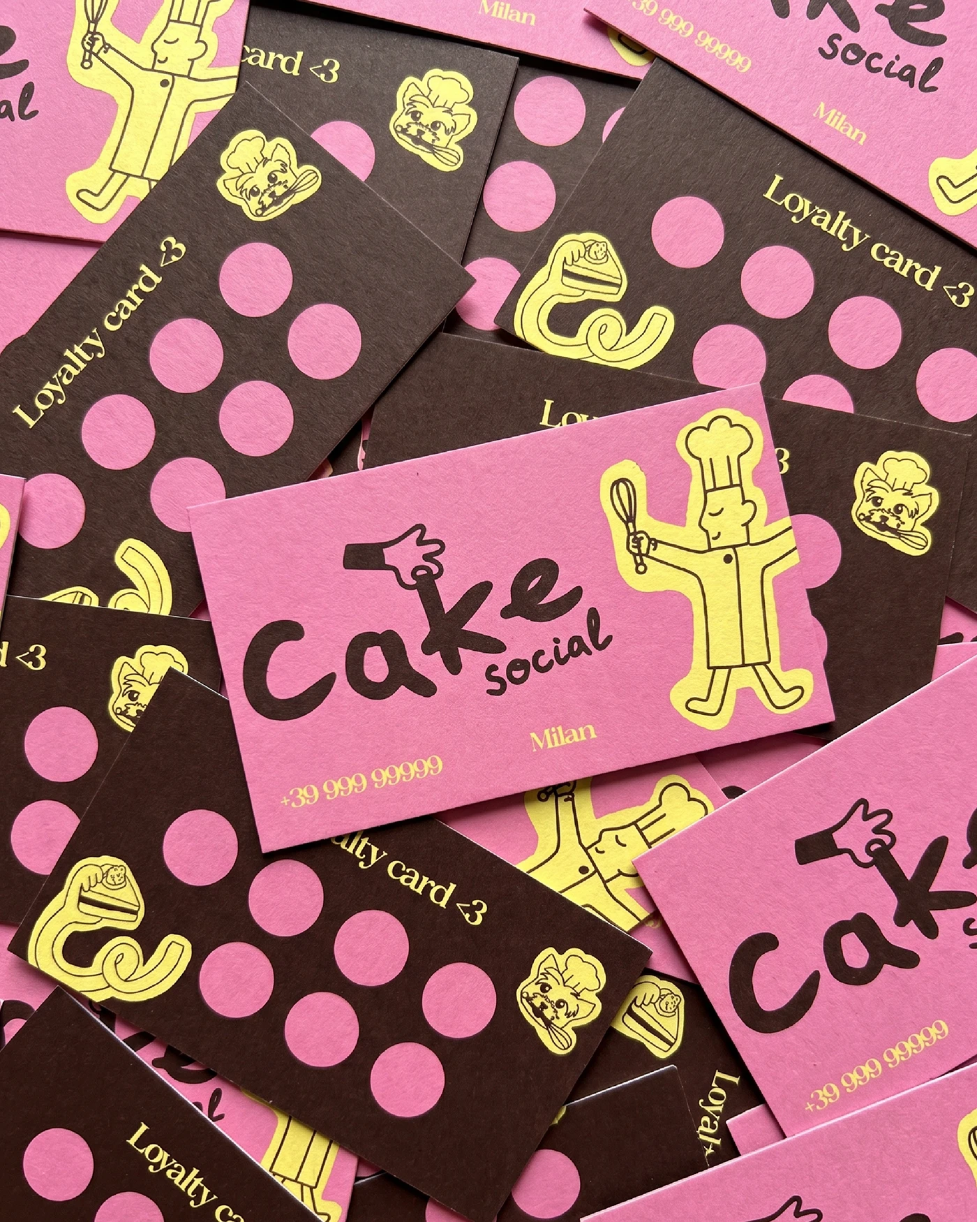
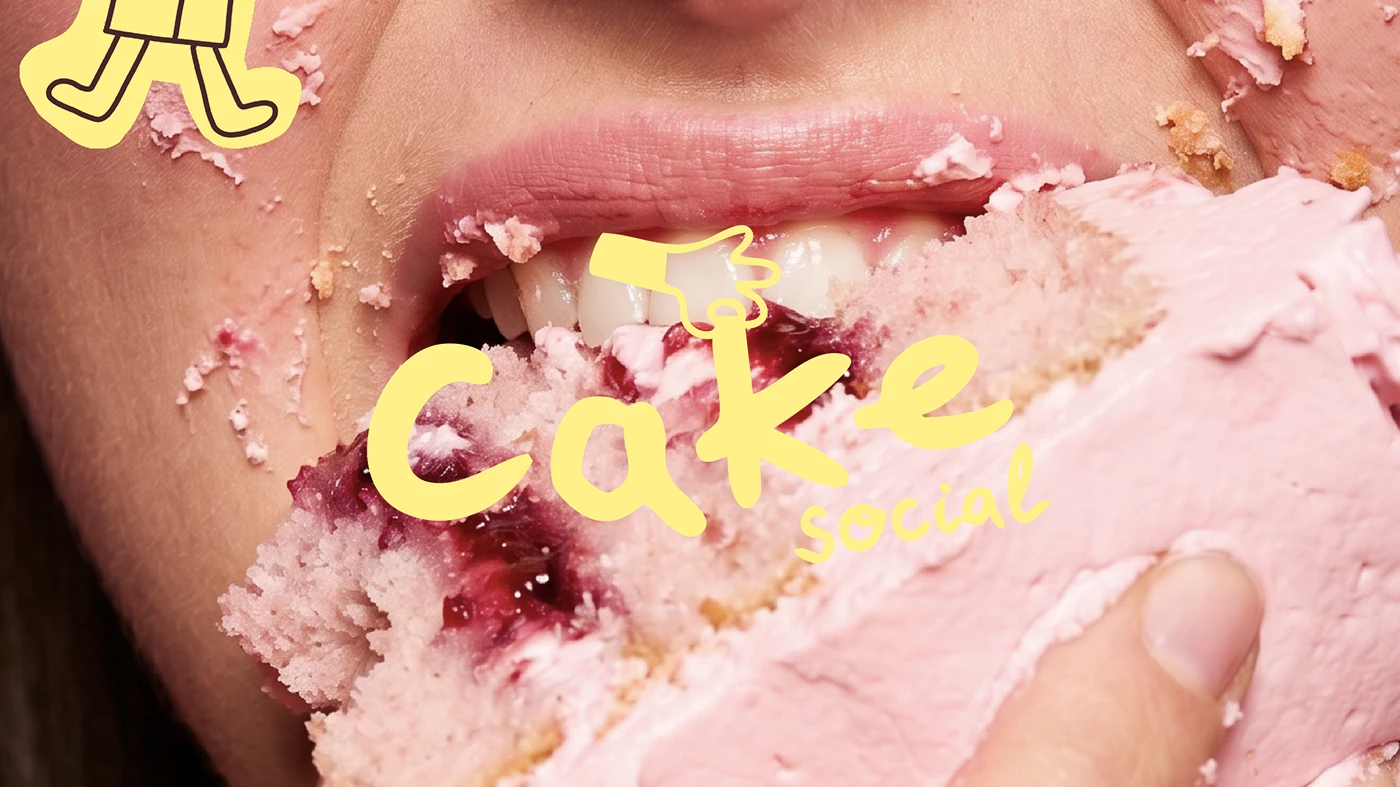
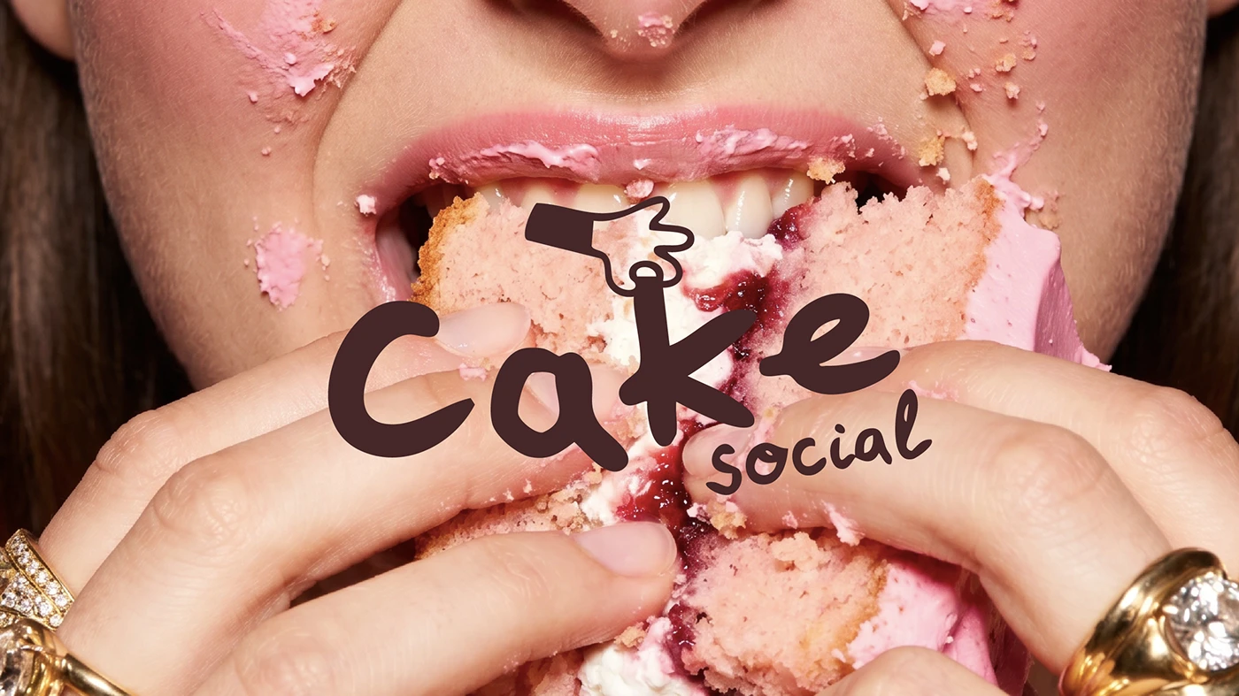
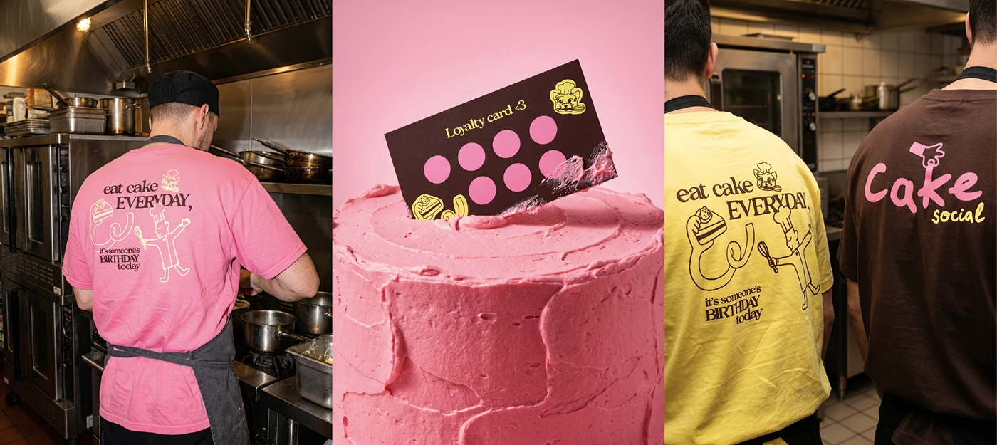
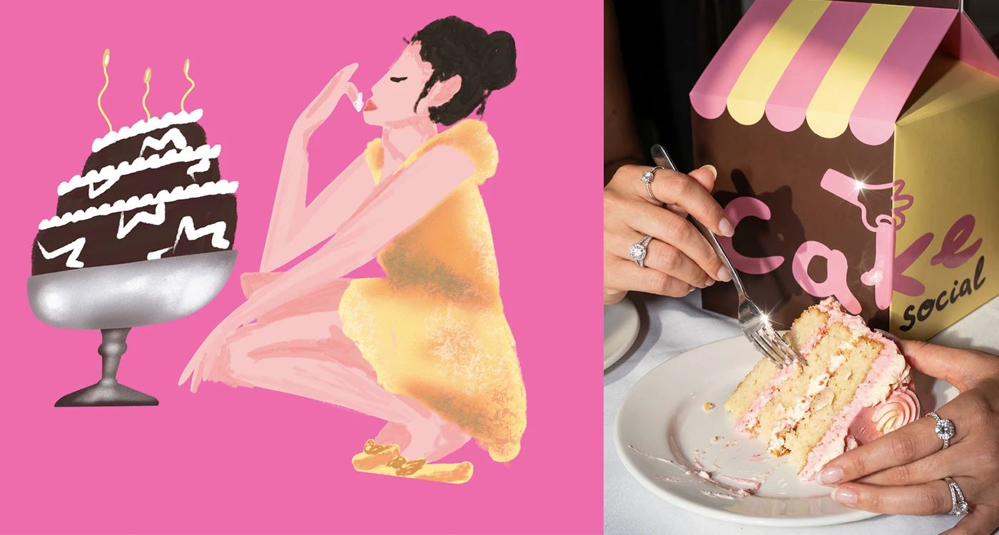
Cake Social vừa ra mắt một bộ nhận diện tiệm bánh siêu ngọt ngào với thiết kế branding đầy chiến lược, kết hợp cùng bao bì màu kem ấm áp do designer Mari Kvel thực hiện.
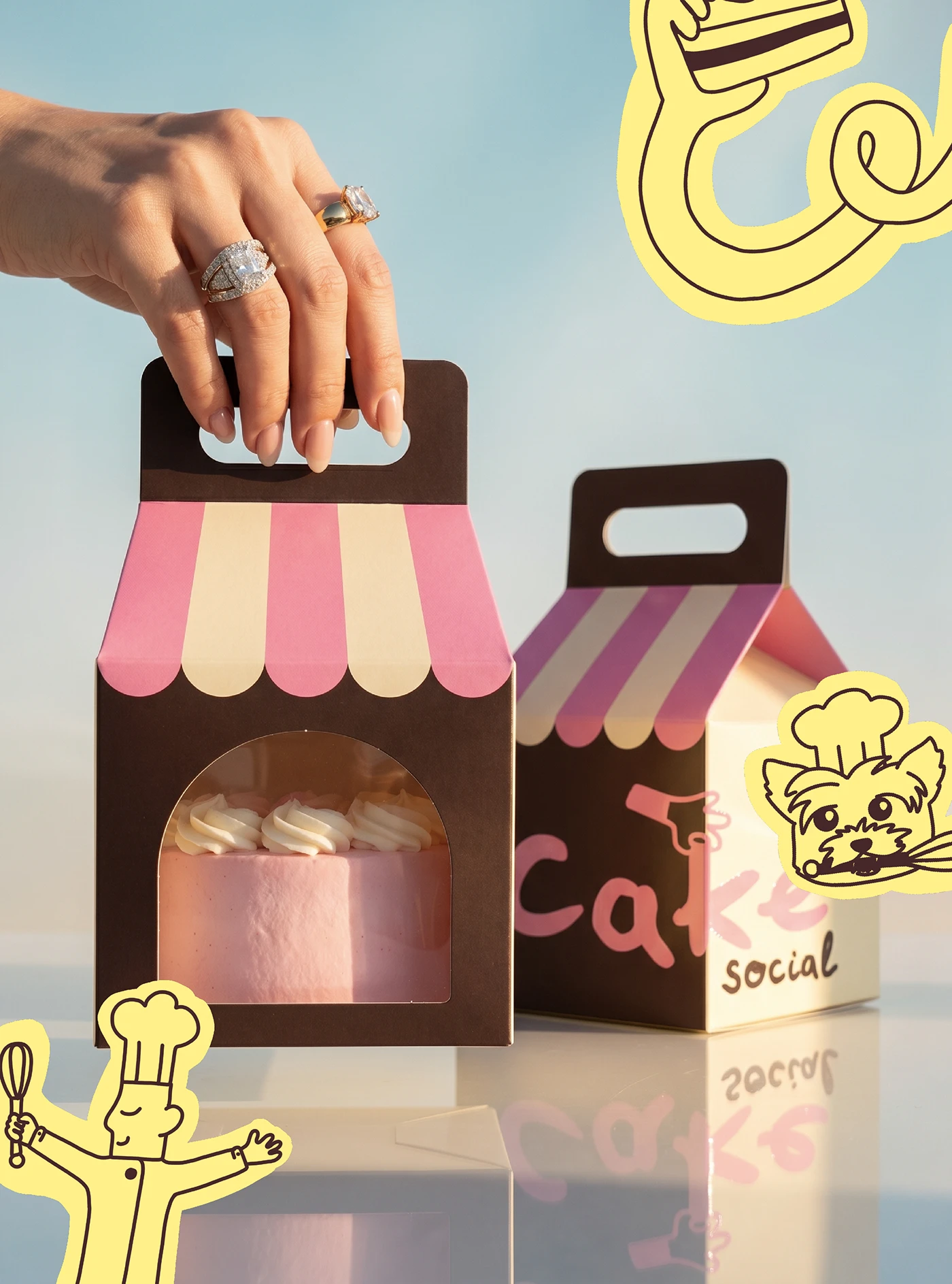
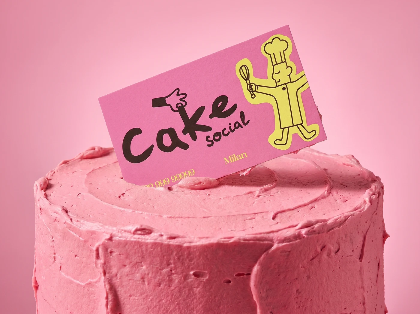
Hệ thống branding dạng module này chính là nền tảng định hình phong cách trực quan cho tiệm bánh. Bảng màu là sự kết hợp ăn ý giữa chất liệu giấy màu kem ấm áp và các điểm nhấn typography màu nâu espresso đậm. Sự đối lập này tạo nên một bố cục có độ tương phản cao trên mọi bề mặt hộp và túi đựng bánh. Về phần typography, dự án sử dụng một font chữ display serif thanh lịch, giúp cân bằng hoàn hảo giữa nét truyền thống của tiệm bánh thủ công và hệ thống lưới layout hiện đại. Bằng cách kết hợp những chữ cái kỹ thuật số sắc nét này với các sticker đồ họa vui nhộn, tổng thể thiết kế mang lại một cảm giác rất thú vị và có chiều sâu. Mọi tài sản thiết kế đều được căn chỉnh nghiêm ngặt theo hệ thống lưới dọc (vertical grid), giúp đảm bảo trật tự cấu trúc và phân cấp thị giác rõ ràng, giữ cho bố cục không bị rối mắt.
Sự thanh lịch và vui tươi trong thiết kế thương hiệu tiệm bánh
Hệ thống nhận diện này đã dịch chuyển khéo léo cấu trúc lưới kỹ thuật số sang các điểm chạm vật lý thông qua việc lựa chọn chất liệu giấy. Hộp bánh sử dụng chất liệu giấy uncoated mịn màng kết hợp với dây ruy-băng thắt nơ tùy chỉnh, mang lại cảm giác chạm rất tinh tế cho những bố cục typography đơn giản. Sự tương phản giữa lớp giấy kem mềm mại và phần chữ in lụa sắc nét thực sự mang lại nhiều cảm hứng. Nó cho thấy đồ họa thương mại vẫn có thể tạo cảm giác chân thực mà không cần phụ thuộc vào các hoa văn trang trí phức tạp. Phần giấy gói và túi có cửa sổ kính luôn ưu tiên những khoảng trắng (whitespace) rộng rãi và cấu trúc lưới sạch sẽ. Hướng đi thực tế này giúp các tài sản hình ảnh trở nên vô cùng gắn kết.
Sau cùng, bộ nhận diện đã đơn giản hóa cách khách hàng tìm hiểu thực đơn bánh ngọt của tiệm. Đội ngũ thiết kế đã thành công trong việc tạo ra một layout vừa chuyên nghiệp vừa hiện đại. Hệ thống lưới sạch sẽ đảm bảo thông tin chi tiết về thành phần luôn dễ đọc trong nháy mắt, biến các ấn phẩm trở thành một công cụ thị giác đáng tin cậy. Dự án này là minh chứng cho thấy phong cách tối giản có chiến lược có thể hiện đại hóa các nhãn tiện ích của doanh nghiệp như thế nào. Để biết thêm chi tiết về bộ nhận diện hình ảnh này, có thể xem thêm tại www.behance.net/gallery/252600139/Cake-Social-bakery-brand-identity. Thiết kế này đã thực sự thổi hồn vào những món đồ quen thuộc của một tiệm bánh.
Cake Social just rolled out a seriously sweet new identity. Designer Mari Kvel cooked up a strategic brand system complete with warm cream packaging.
This modular branding system serves as the perfect foundation for the bakery’s visual style. The color palette beautifully pairs warm cream paper stock with rich espresso-brown typography. This striking contrast creates high-impact layouts across all the boxes and bags. As for the typography, the project features an elegant display serif font that strikes a flawless balance between traditional artisan bakery vibes and a modern layout grid. Mixing these crisp digital letterforms with playful graphic stickers gives the overall design a fun, multi-layered feel. Every single asset is strictly aligned to a vertical grid, ensuring a clean structure and clear visual hierarchy that keeps things from looking cluttered.
Elegance Meets Playfulness in Bakery Branding This identity system seamlessly translates digital grid structures into physical touchpoints through thoughtful paper choices. The bakery boxes feature smooth, uncoated paper stock tied up with custom ribbon bows, bringing a tactile, sophisticated feel to the minimalist typographic layouts. The contrast between the soft cream paper and the sharp screen-printed text is incredibly inspiring. It proves that commercial graphics can feel genuinely authentic without relying on fussy, over-complicated patterns. The wrapping paper and window bags put a heavy emphasis on generous whitespace and clean grids. This practical approach ties all the visual assets together beautifully.
Ultimately, this identity simplifies how customers browse the pastry menu. The design team successfully crafted a layout that feels both professional and contemporary. The clean grid system ensures that ingredient details are highly readable at a glance, making the printed materials a reliable visual guide. This project is a prime example of how strategic minimalism can modernize everyday business labels. To check out more details on this gorgeous visual identity, take a look at the www.behance.net/gallery/252600139/Cake-Social-bakery-brand-identity. This design truly breathes fresh life into classic bakery essentials.