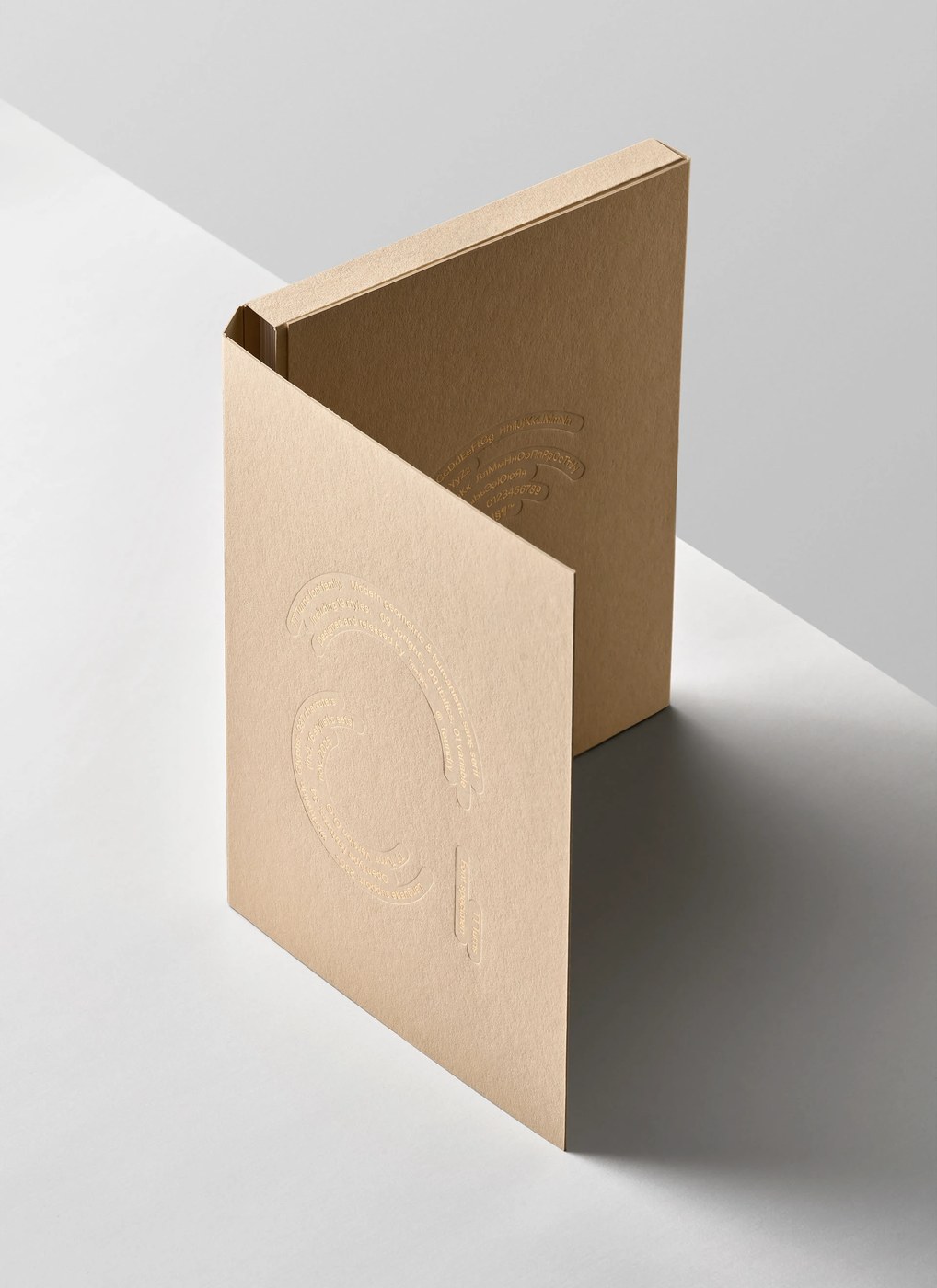
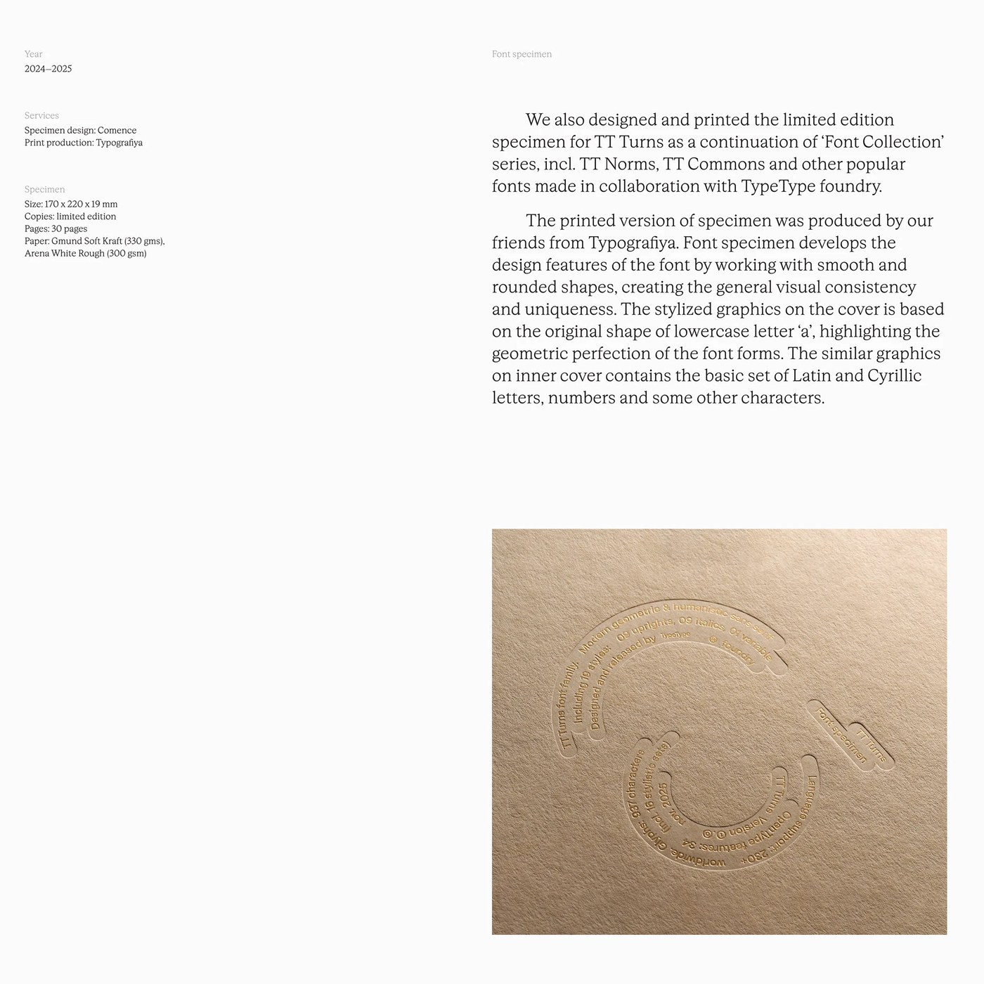
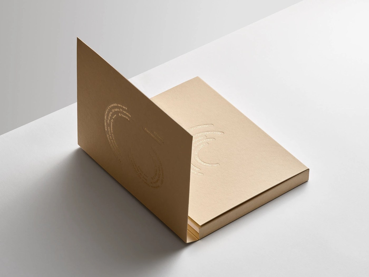
Bộ font chữ sans serif bo góc biến thể (variable font) TT Turns của Pavel Emelyanov là sự kết hợp hài hòa giữa cấu trúc hình học và nhịp điệu tự nhiên trên nền chất liệu giấy ấm áp.
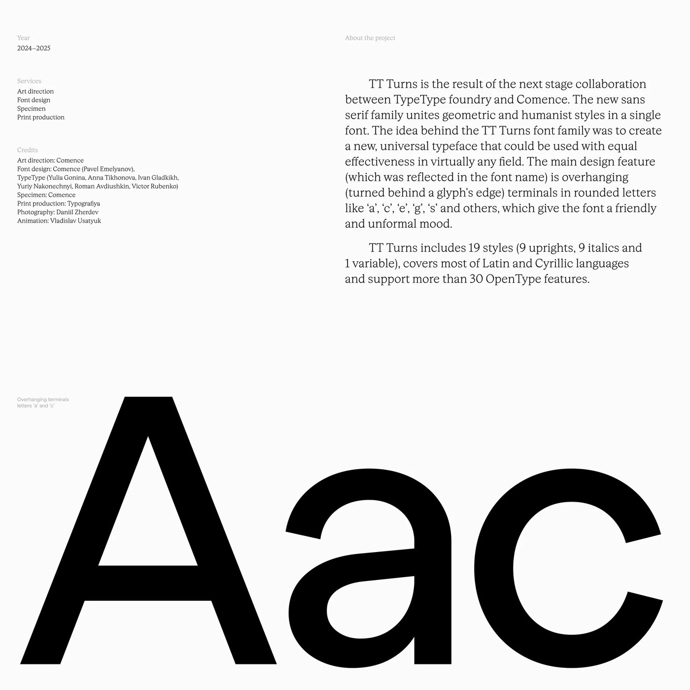
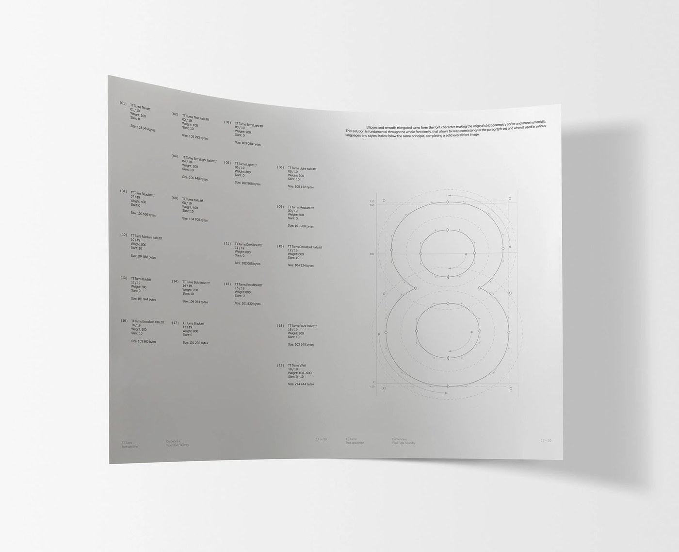
Mỗi đường nét con chữ đều thể hiện sự căn lề baseline chuẩn chỉnh và tuân thủ các quy tắc hình học nghiêm ngặt. Hệ thống lưới modular hỗ trợ tới 19 định dạng (style) khác nhau trên cùng một trục độ dày (weight axis). Hệ thống phân cấp cấu trúc này đảm bảo trải nghiệm đọc cực kỳ rõ ràng ở mọi kích thước. Những đường cong xoay ngược độc đáo tạo nên một nhịp điệu thị giác mới mẻ cho các layout thiết kế thông thường.
Bố cục độ tương phản cao
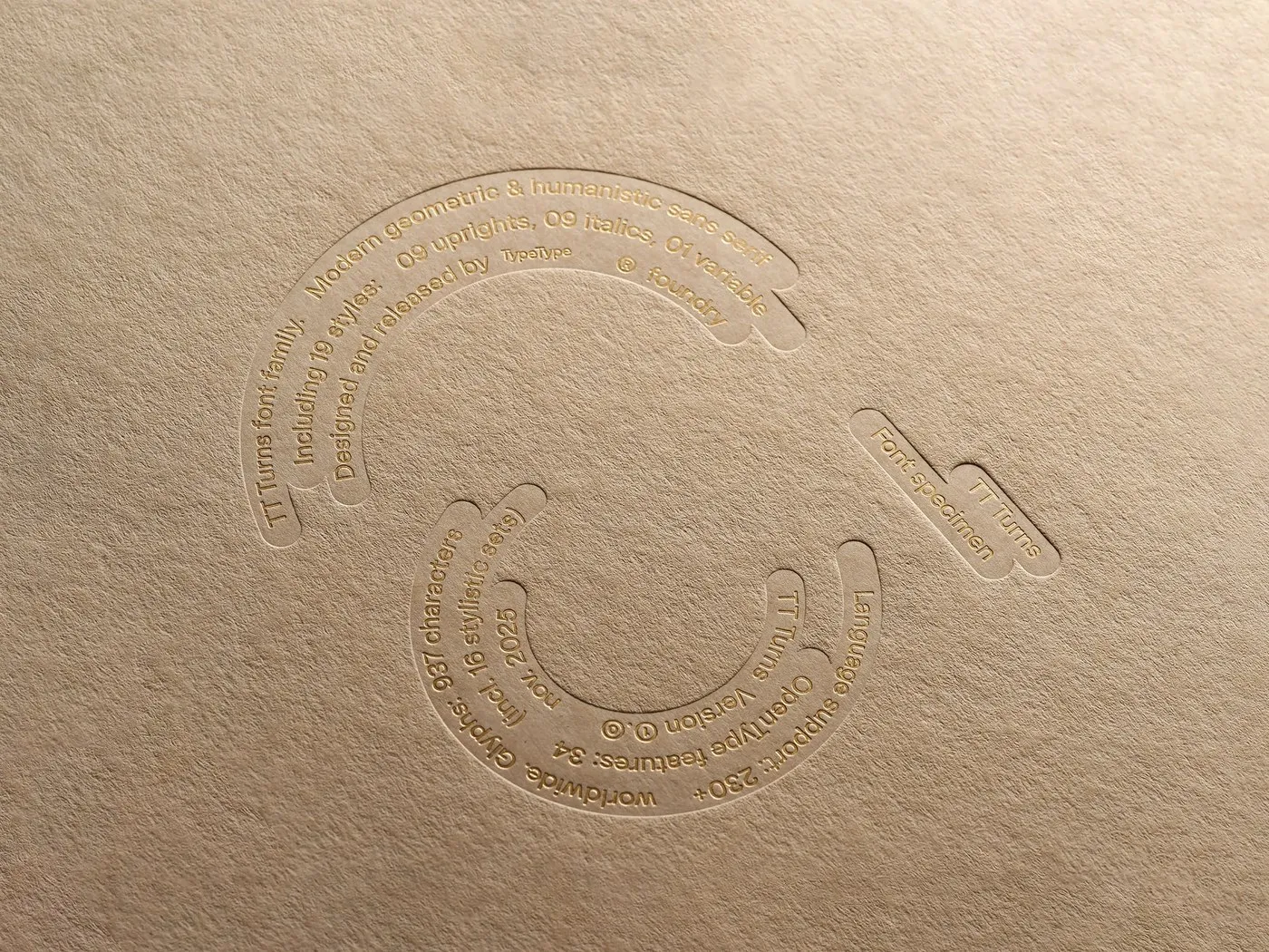
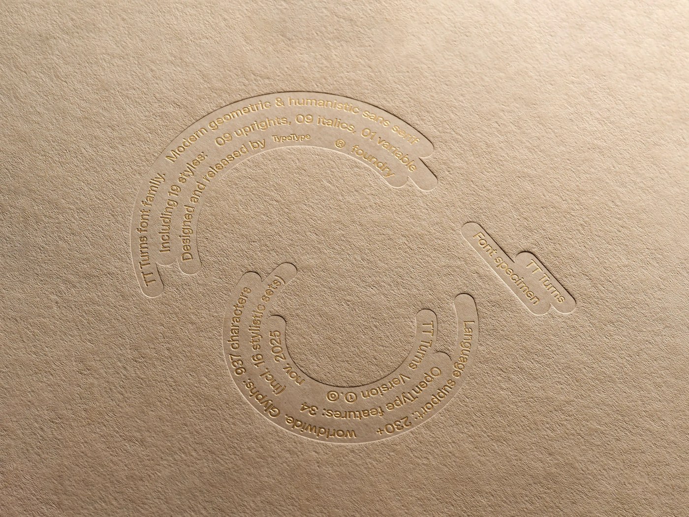
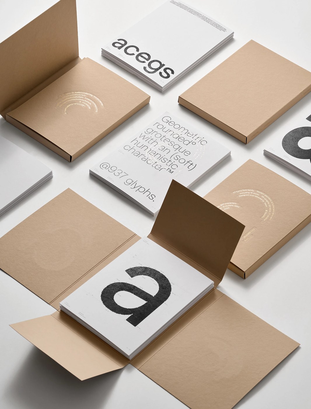
Bản in thử (specimen) trên giấy kraft tôn vinh kết cấu thô mộc của chất giấy ấm áp hòa quyện cùng sắc mực đen. Sự tương phản rõ rệt này hướng sự chú ý của người xem vào cấu trúc hình thể của con chữ hơn là phong cách trang trí. Kiểu dáng các ký tự vẫn giữ nguyên được thế mạnh trên cả hệ chữ Latin và Cyrillic. Phần đuôi chữ xoay ngược luôn đồng bộ trên tất cả các glyph.
Tỷ lệ typography hiển thị vô cùng vững chắc trong cả layout biên tập (editorial layout) lẫn môi trường giao diện. TypeType Foundry đã biến tác phẩm này thành một công cụ thiết kế vô cùng hữu ích. Để tìm hiểu thêm thông tin, mọi người có thể xem qua www.behance.net/gallery/245068053/TT-Turns-Font-Specimen.
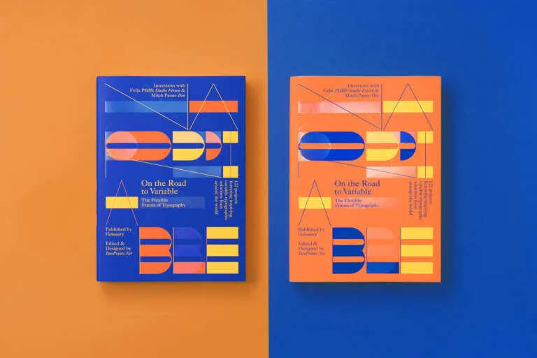
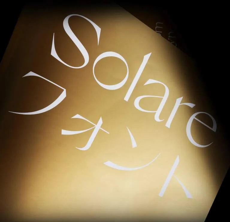
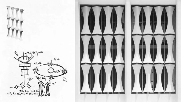
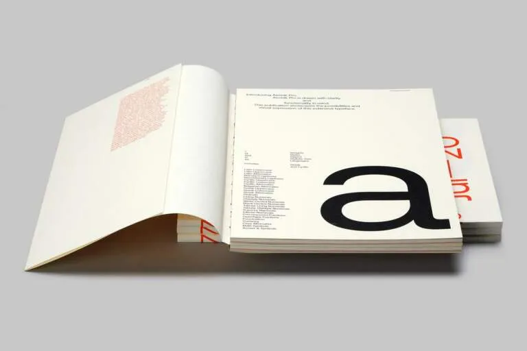
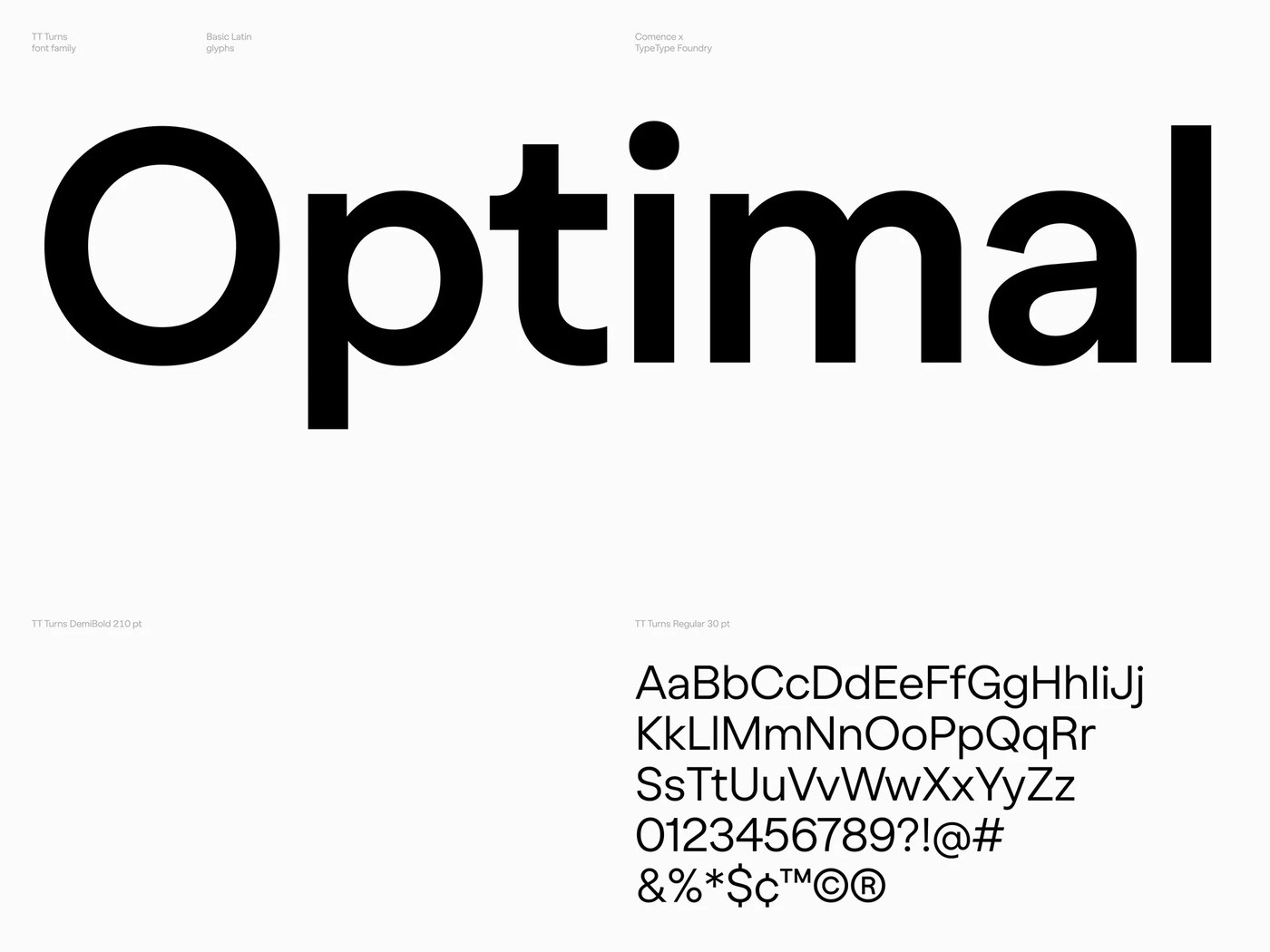
Bố cục sử dụng những khoảng trống (negative space) rộng rãi để tạo ra sự tương tác đầy chủ đích giữa các thành phần. Lựa chọn cấu trúc này giúp tôn vinh các hình dáng con chữ một cách tỉ mỉ nhất. Trọng lượng thị giác được giữ cân bằng hoàn hảo, mỗi glyph đều đứng vững vàng tại vị trí của mình. Kết quả mang lại là một hệ thống typography vô cùng ngăn nắp và chỉn chu.
Pavel Emelyanov’s TT Turns is a striking rounded geometric sans-serif variable font that beautifully balances clean geometry with a natural rhythm, all showcased against warm paper textures.
Every single stroke highlights flawless baseline alignment and strict geometric precision. Built on a modular grid, the family offers 19 different styles running along a flexible weight axis. This structural hierarchy guarantees crystal-clear readability at any size, while the unique inverted curves inject a fresh visual rhythm into everyday design layouts.
High-Contrast Layouts
The printed font specimen on kraft paper celebrates the raw texture of warm paper stock paired with deep black ink. This bold contrast locks the viewer’s focus directly onto the actual anatomy of the letterforms rather than decorative flair. The character shapes hold their ground beautifully across both Latin and Cyrillic alphabets, keeping those signature inverted tails perfectly consistent across the entire glyph set.
Typographic proportions feel incredibly solid, effortlessly adaptive for both editorial layouts and digital user interfaces. The team at TypeType Foundry has truly turned this release into a versatile, high-utility design tool. For a deeper dive into the project, check out the www.behance.net/gallery/245068053/TT-Turns-Font-Specimen.
The layouts make use of generous negative space to create a highly intentional interaction between design elements. This structural choice gives the meticulously crafted letterforms plenty of room to shine. Visual weight is balanced to perfection, ensuring every single glyph stands firmly in its place to deliver a clean, impeccably organized typographic system.