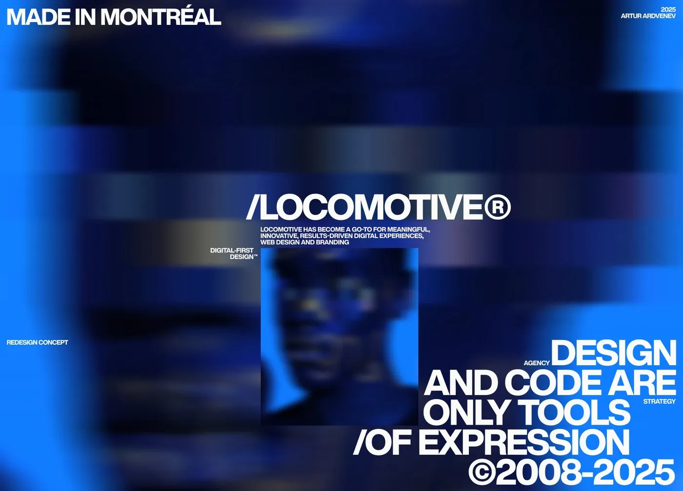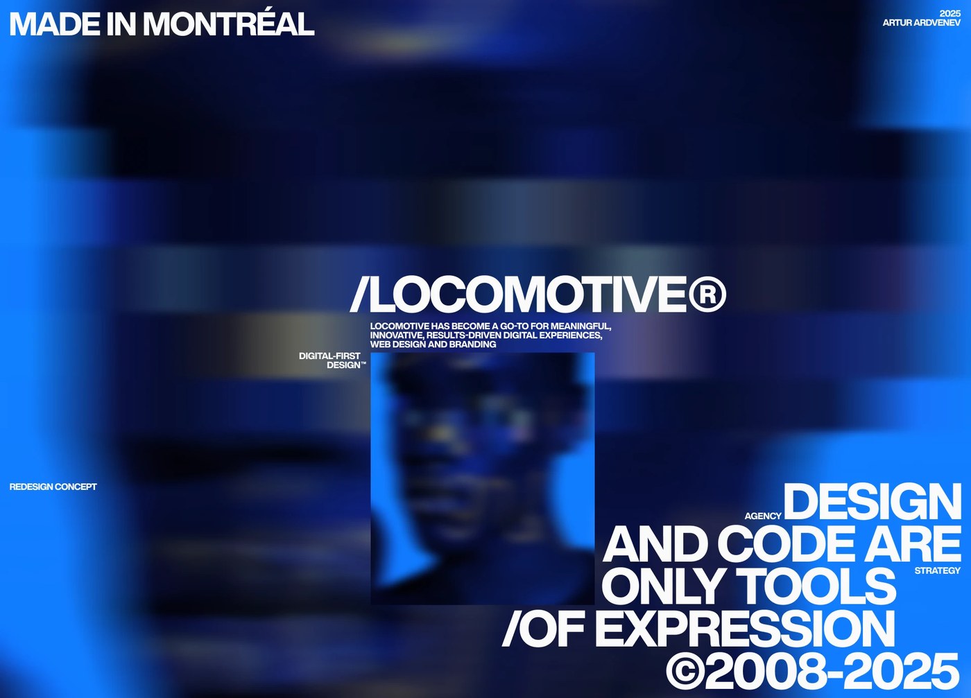
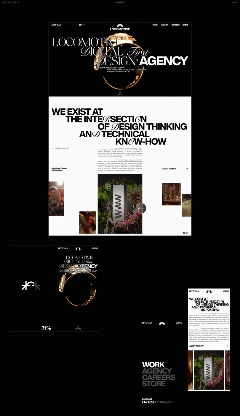
Dự án tái định hình giao diện website cho agency Locomotive của Artur Ardvenev thực sự mang đến một góc nhìn mới mẻ về không gian số. Bằng cách đưa các khối hình học 3D (volumetric objects) làm tiêu điểm, bố cục trang web không chỉ có chiều sâu mà còn khéo léo điều hướng thị giác của người xem một cách tự nhiên. Một hệ thống lưới (grid) vô cùng ngăn nắp kết hợp với các khoảng trắng (negative space) hợp lý giúp giao diện luôn thoáng đãng và dễ chịu. Đặc biệt, các hình khối này còn có khả năng tương tác, chuyển động mượt mà mỗi khi người dùng di chuột qua.
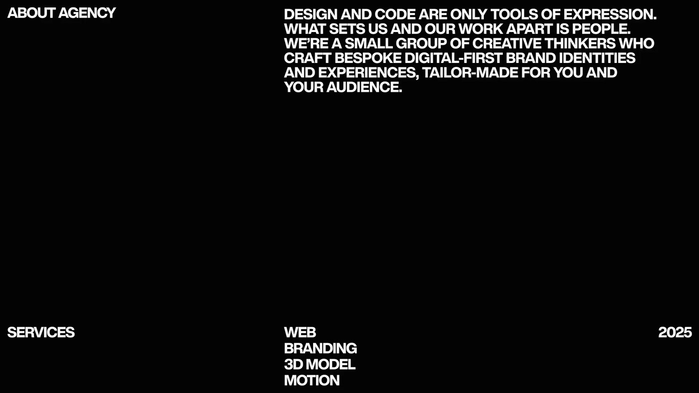
Điểm ấn tượng tiếp theo nằm ở hệ thống phân cấp chữ (typographic scale) cực kỳ rõ ràng. Tiêu đề kích thước lớn đối lập mạnh mẽ với các nhãn kỹ thuật nhỏ xung quanh, tạo nên một lối đọc thông tin nhanh chóng và mạch lạc. Trên nền tối tối giản, các khối 3D cùng bố cục căn lề cơ sở (baseline) càng trở nên nổi bật và gọn gàng hơn. Thiết kế này cũng được tối ưu hóa hoàn hảo để hiển thị mượt mà trên mọi thiết bị di động.
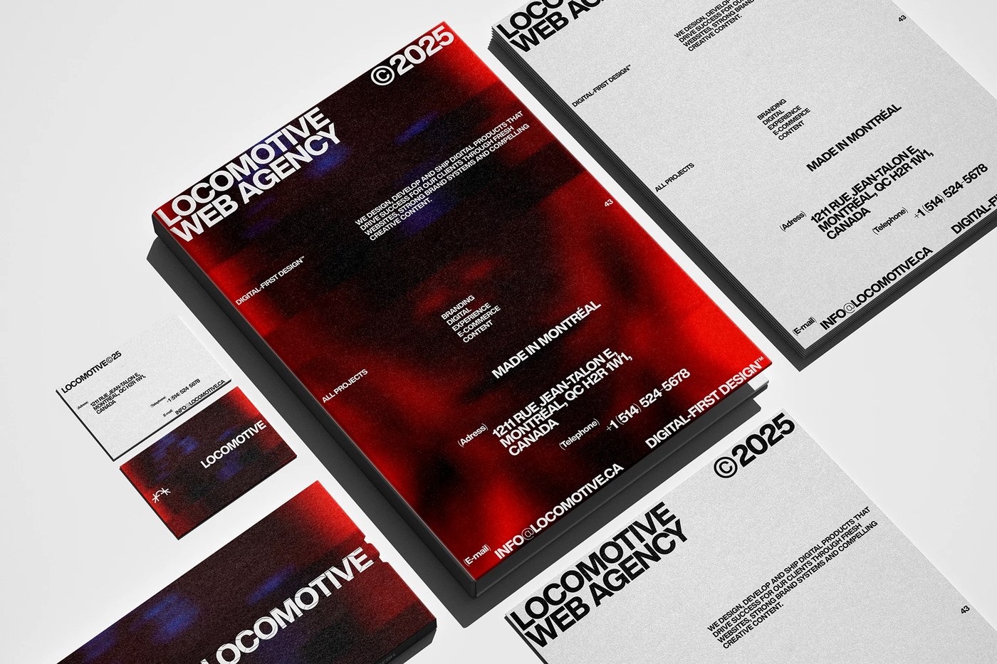
Lấy cảm hứng từ những quy tắc dàn trang báo giấy truyền thống (editorial design), tác giả đã chuyển hóa ngôn ngữ in ấn vào cấu trúc web hiện đại một cách đầy nghệ thuật. Đây là một định hướng thiết kế cao cấp, thể hiện sự kết hợp chặt chẽ giữa thiết kế và lập trình, giúp các agency khẳng định cá tính riêng mà không cần phụ thuộc vào những hình ảnh stock quen thuộc.
Mọi người có thể tìm hiểu kỹ hơn về dự án thiết kế giao diện 3D độc đáo này trên Behance nhé:
www.behance.net/gallery/209569507/Locomotive-Web-Identity-3D
Artur Ardvenev’s redesign concept for the Locomotive agency website brings a super fresh perspective to digital spaces. By putting volumetric 3D shapes front and center, the layout gains an incredible sense of depth while naturally guiding the viewer’s eyes across the screen. A super clean grid system paired with just the right amount of negative space keeps the entire interface feeling light and breathable. Best of all, these 3D objects are interactive, serving up buttery-smooth animations whenever hovered over.
Another standout feature is the ultra-sharp typographic scale. Bold, oversized headlines contrast beautifully with the smaller technical labels, making the information incredibly quick and easy to digest. Set against a minimalist dark background, the baseline grid and 3D elements pop even more while keeping everything perfectly aligned. Plus, the design is fully optimized to look just as stunning and run just as smoothly on mobile screens.
Taking a page from classic editorial design, this concept masterfully translates print layouts into a modern web structure. It’s a high-end approach that perfectly bridges the gap between design and development, giving agencies a powerful way to showcase their unique brand identity without relying on the same old stock imagery.
Want to dive deeper into this awesome 3D web design project? Check out the full case study on www.behance.net/gallery/209569507/Locomotive-Web-Identity-3D!