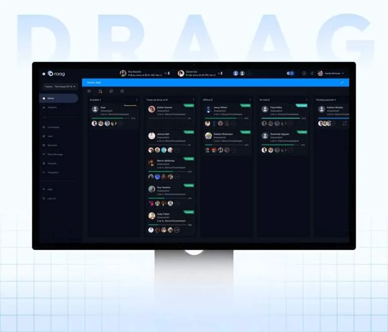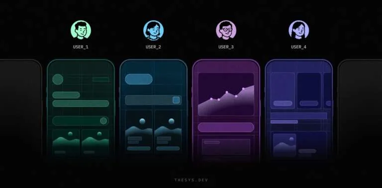
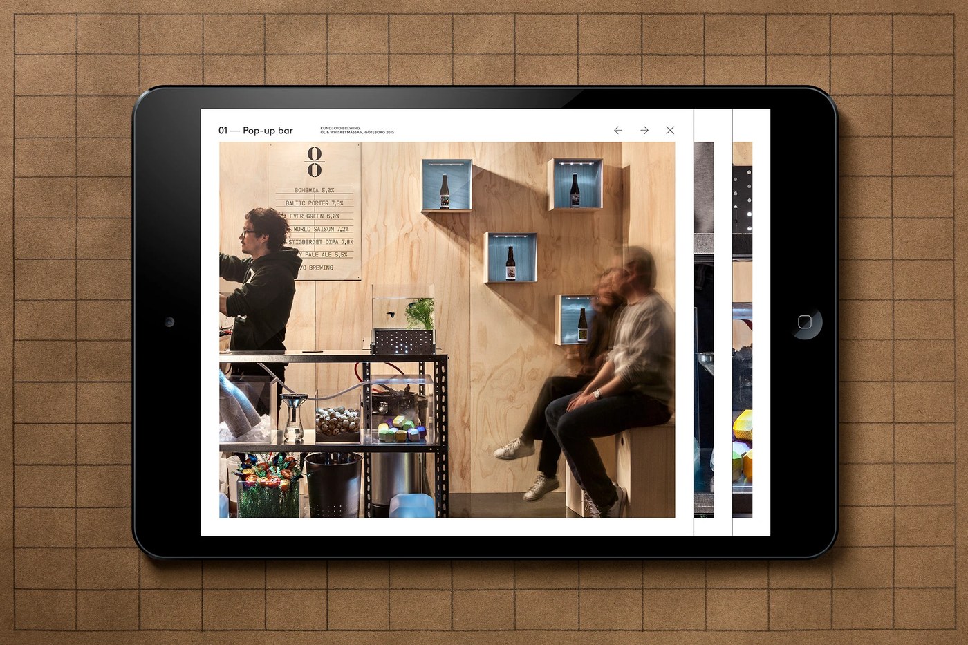
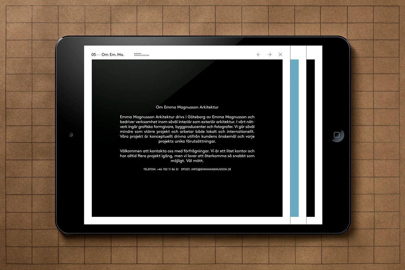
Studio Lundgren+Lindqvist vừa cho ra mắt một layout giao diện UI/UX web dashboard cực kỳ tinh tế, đề cao tính mô-đun trong cấu trúc cấu thành.
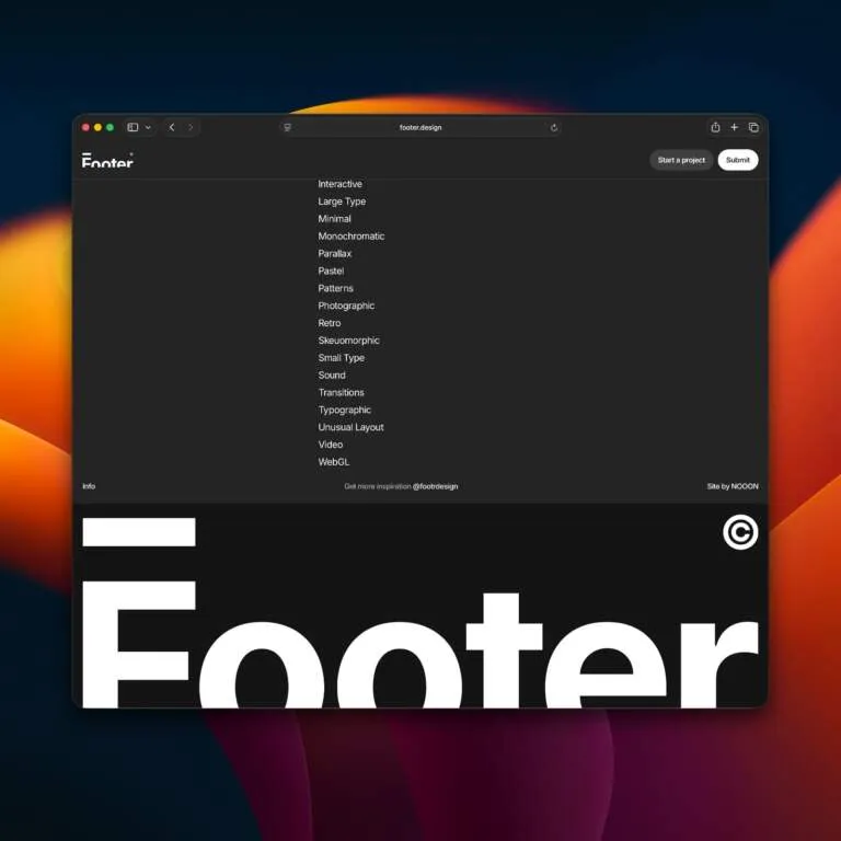
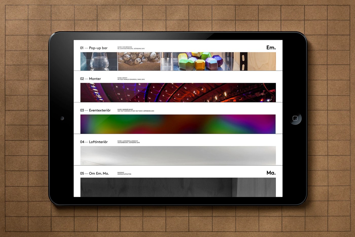
Hệ thống lưới (grid system) được áp dụng một cách chặt chẽ để sắp xếp toàn bộ các yếu tố chữ nghĩa. Mỗi phần của trang web đều có ranh giới rõ ràng nhờ các đường kẻ ngang phân chia không gian rất gọn gàng, ngăn nắp. Trải nghiệm thanh điều hướng (navigation) mang lại cảm giác như đang khám phá một kho lưu trữ thông tin. Khi chọn một dự án bất kỳ, hướng chuyển động sẽ thay đổi từ dọc sang ngang. Sự kết hợp này tạo ra một nhịp điệu chuyển động đầy thú vị và làm nổi bật mối tương quan về mặt không gian.
Giao diện UI/UX dashboard mượt mà
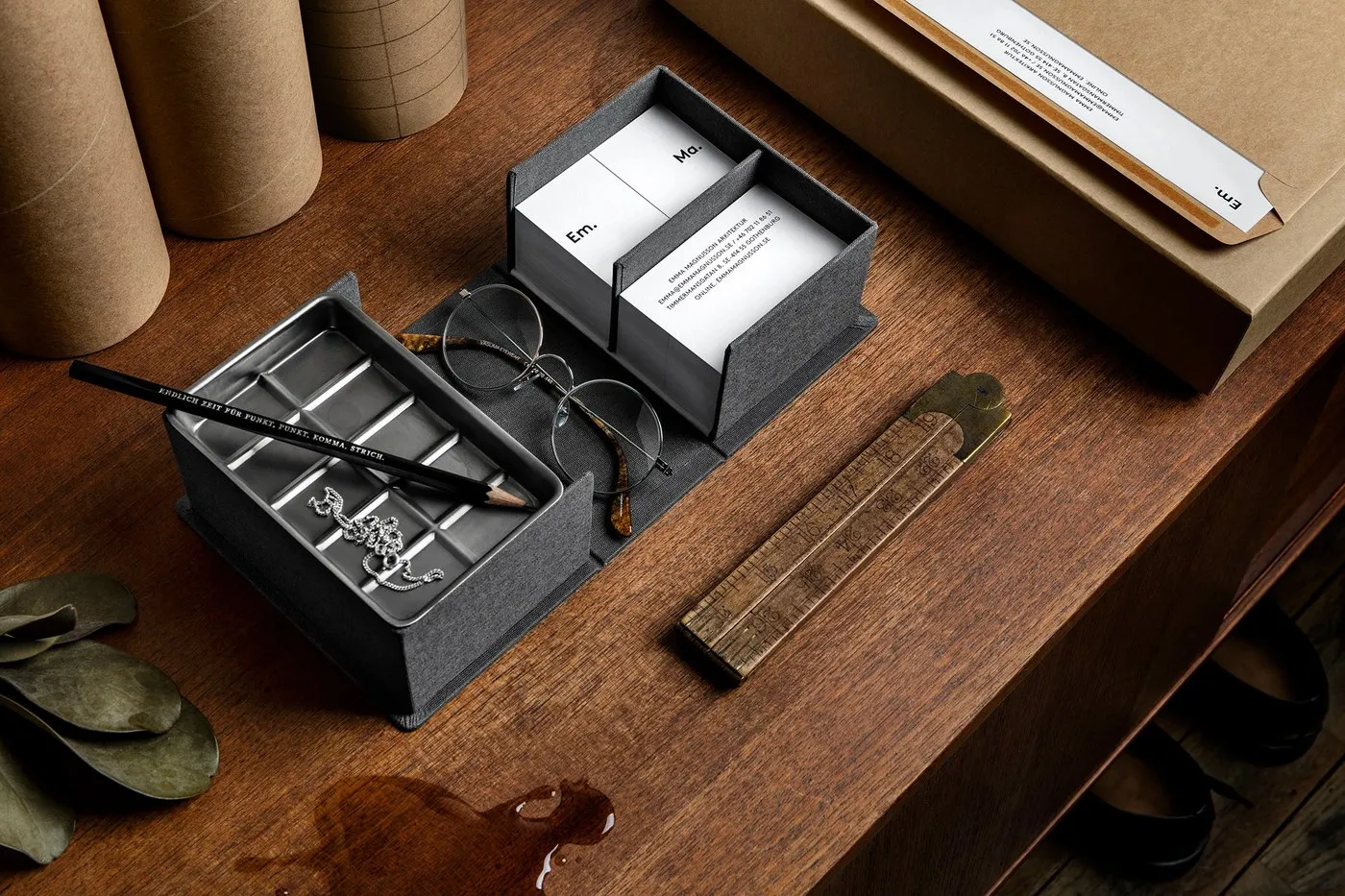
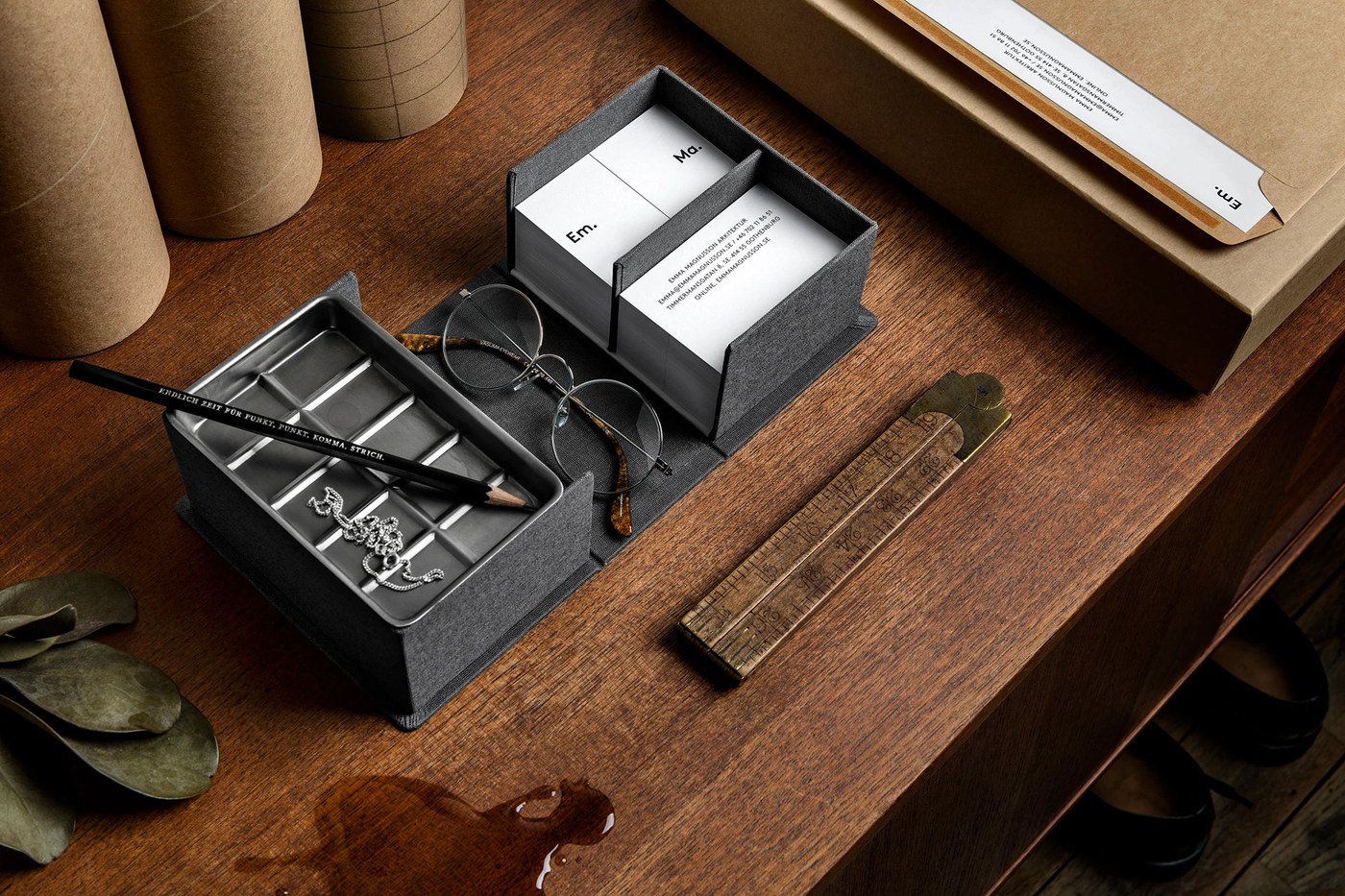
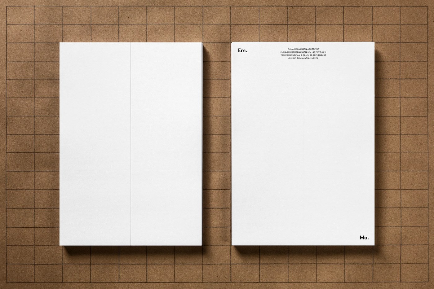
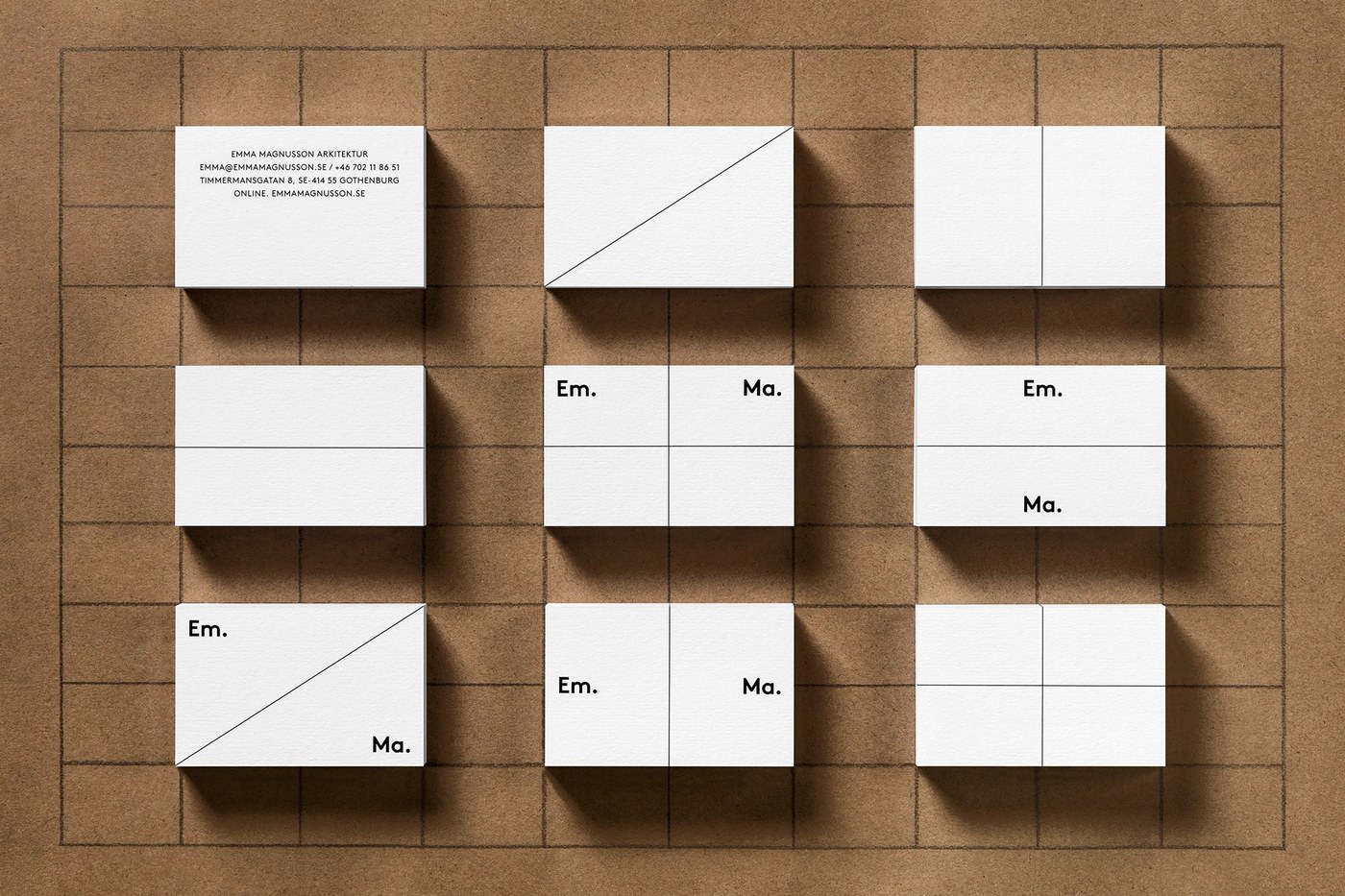
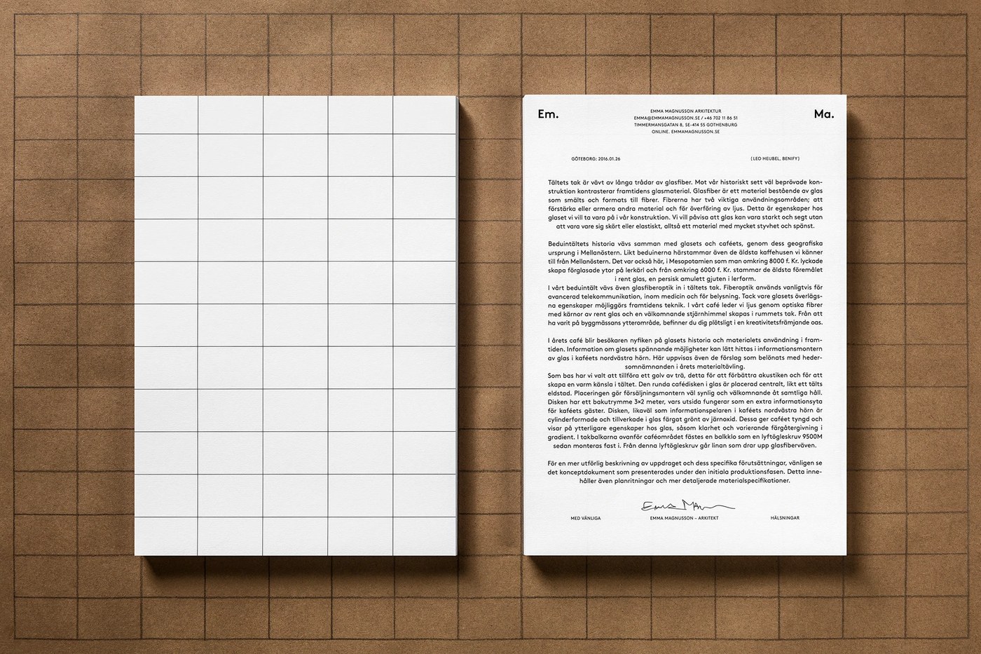
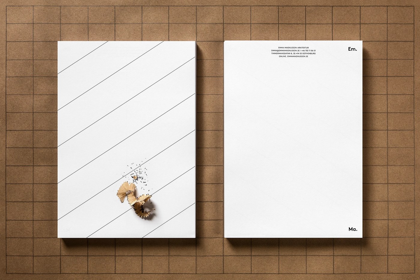
Hệ thống typography kỷ luật này không chỉ xuất hiện trên màn hình mà còn đồng bộ mượt mà sang cả các ấn phẩm văn phòng vật lý. Bộ sản phẩm sử dụng danh thiếp in riêng với độ tương phản xúc giác cao. Hệ màu sắc tối giản hết mức khi kết hợp mực đen sẫm trên nền giấy trắng tinh. Sự tương phản tuyệt đối này mô phỏng lại độ sắc nét của màn hình kỹ thuật số, tạo nên một tổng thể thiết kế UI/UX đồng bộ từ trực tuyến đến đời thực.
Mang đậm tầm ảnh hưởng của phong cách Thụy Sĩ hiện đại (Swiss style), phong cách dàn trang (editorial design) của Lundgren+Lindqvist mang một vẻ đẹp vượt thời gian. Studio luôn đặt tính trật tự và cấu trúc lên hàng đầu. Các nhà thiết kế hoàn toàn có thể học hỏi từ hệ thống lưới này, một minh chứng cho thấy tư duy logic có thể tạo nên vẻ đẹp nghệ thuật như thế nào. Tác phẩm này đã định nghĩa lại thẩm mỹ của các layout dashboard hiện đại mà vẫn đảm bảo tính công năng cao.
Hãy cùng xem trọn vẹn dự án của www.behance.net/gallery/45212923/Em-Ma-Arkitektur-Visual-Identity-Website trên Behance nhé.
Design studio Lundgren+Lindqvist just dropped a super sleek UI/UX web dashboard layout that’s all about a beautifully modular structure.
A strict grid system keeps the typography flawlessly organized. Every section of the site has clean, distinct boundaries thanks to crisp horizontal lines dividing the space. Navigating through it feels like exploring a curated information archive. When selecting a project, the movement dynamically shifts from vertical to horizontal. This clever combo builds an engaging rhythm and beautifully highlights spatial relationships.
Smooth UI/UX Dashboard Layout This disciplined typography system doesn’t just live on screens—it transitions perfectly into tangible stationery. The branding features custom business cards with incredible tactile contrast. The color palette stays ultra-minimal, pairing deep black ink with crisp white paper. This stark contrast mimics the sharpness of a digital screen, blending digital and physical UI/UX design into one seamless identity.
Heavily inspired by Modern Swiss Style, Lundgren+Lindqvist’s editorial layout brings a truly timeless aesthetic. The studio places structure and order above all else. Fellow designers can definitely learn a thing or two from this grid system—it’s a masterclass in how logical thinking can produce pure art. This project completely redefines the look of modern dashboards while keeping functionality front and center.
Check out the full project over on www.behance.net/gallery/45212923/Em-Ma-Arkitektur-Visual-Identity-Website.