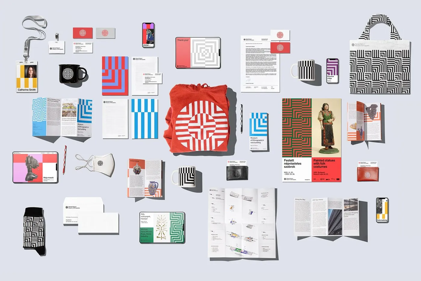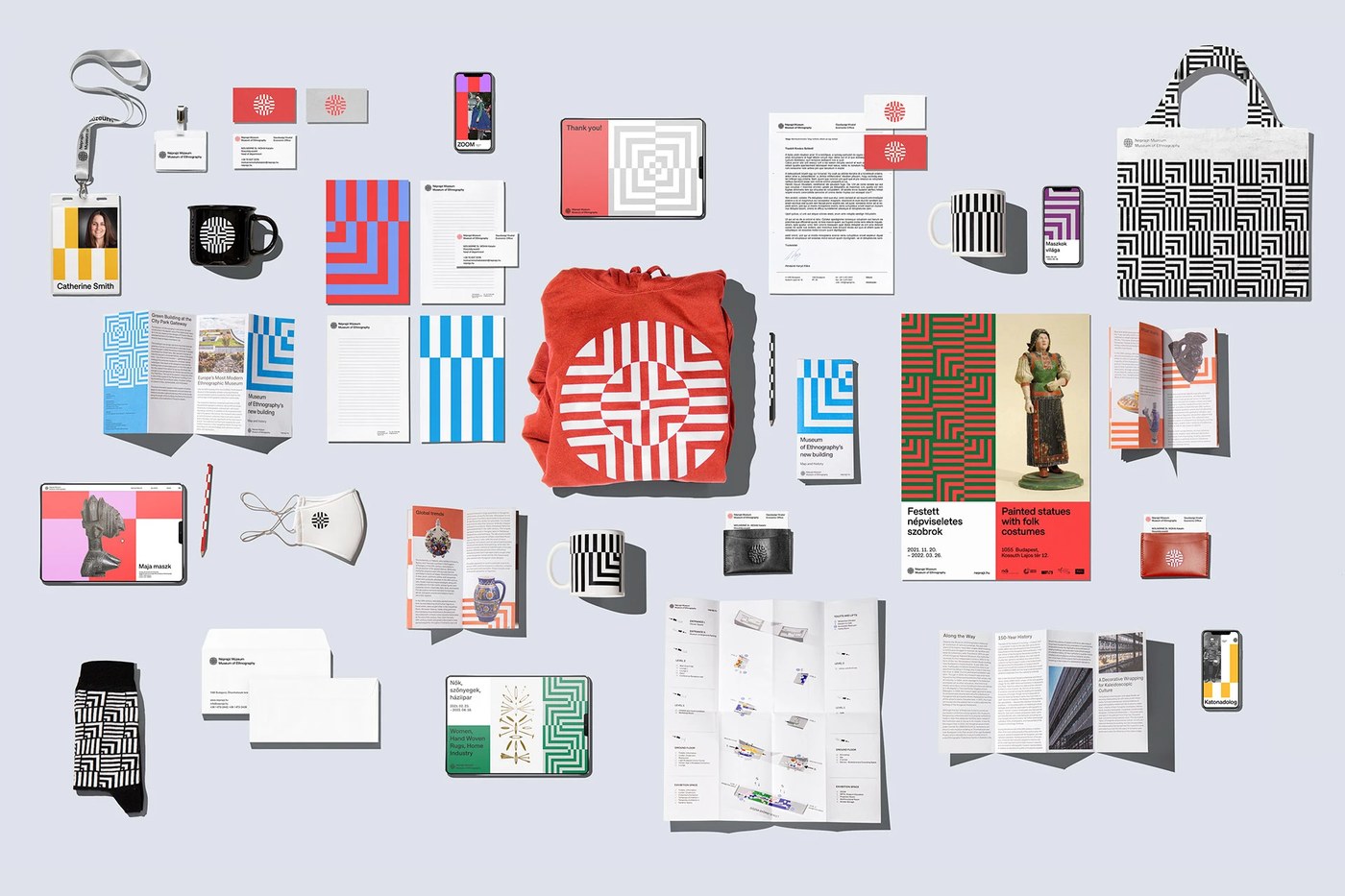
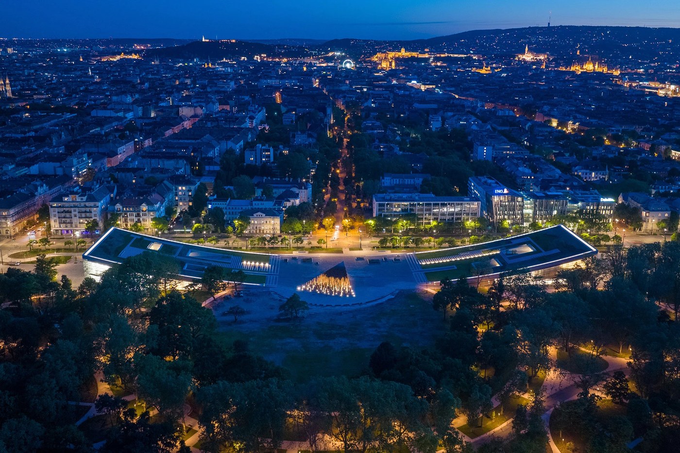
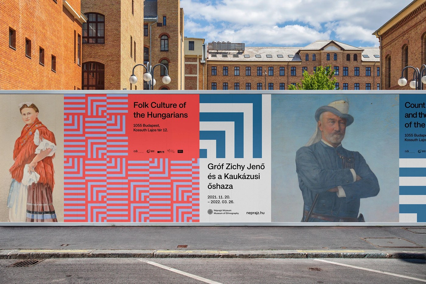
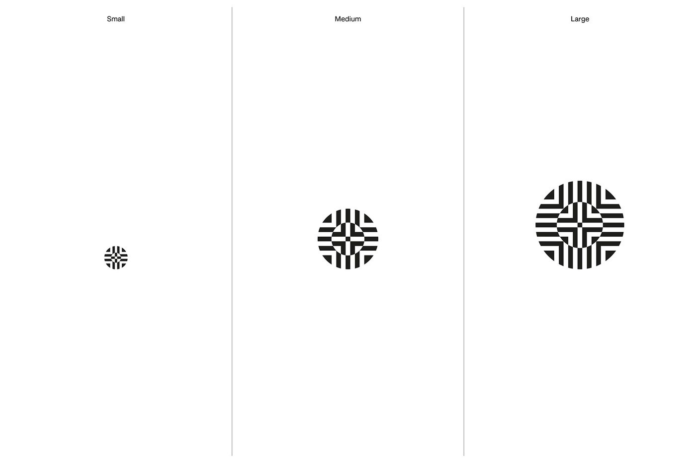
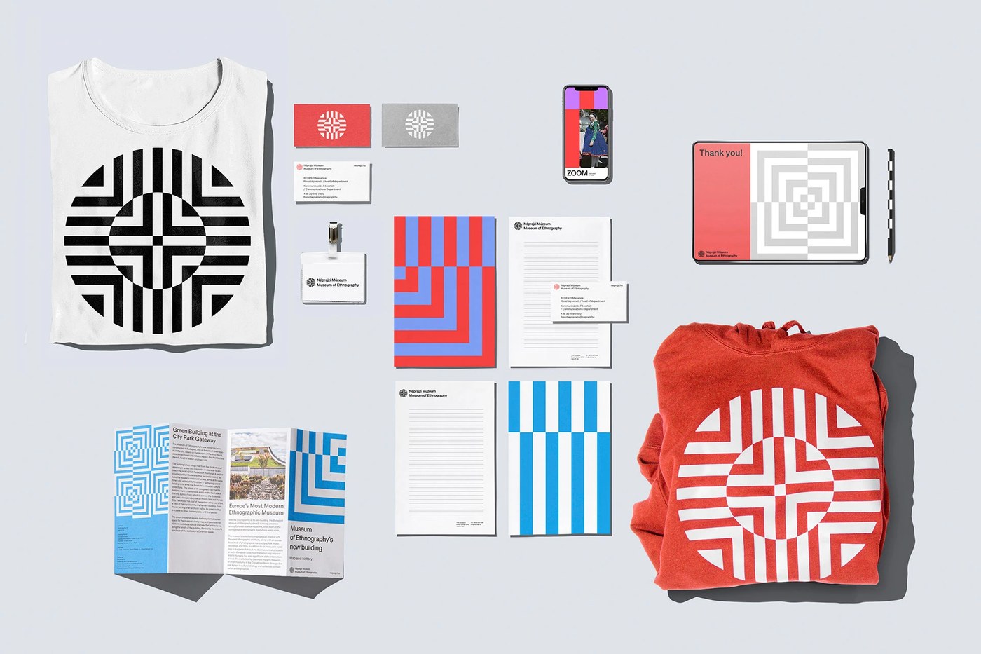
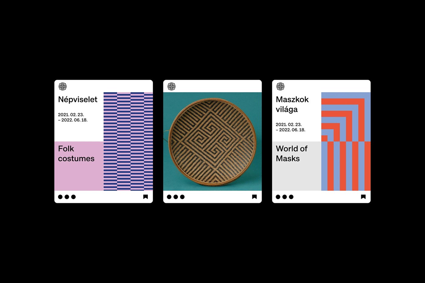
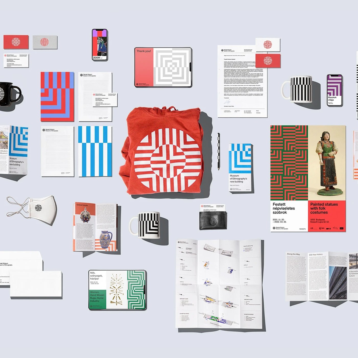
Hai studio DE_FORM và Explicit Design Studio vừa trình làng một hệ thống layout cực kỳ chặt chẽ và chỉn chu cho Bảo tàng Dân tộc học (Museum of Ethnography). Cấu trúc trực quan này sử dụng những đường lưới (grid lines) sắc nét, mô phỏng lại chính tòa nhà bảo tàng hoành tráng của kiến trúc sư Ferencz Marcel. Đội ngũ thiết kế đã khéo léo lồng ghép các góc hình học góc cạnh cùng một biểu tượng hợp nhất, kết hợp các họa tiết văn hóa đa dạng từ khắp các châu lục thành một khối đồ họa tổng hợp duy nhất. Biểu tượng này đóng vai trò làm điểm neo cho toàn bộ câu chuyện thị giác của thương hiệu.
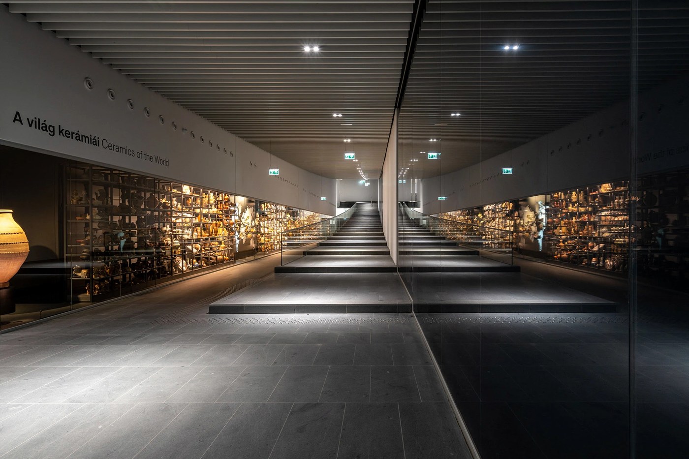
Hệ thống typography có độ tương phản cao tạo nên sự cân bằng cực kỳ hút mắt cho bố cục. Các yếu tố đồ họa này có khả năng co giãn linh hoạt trên cả ứng dụng kỹ thuật số lẫn thực tế. Nhờ hệ thống lưới modular, mọi thứ luôn giữ được thứ tự phân cấp cấu trúc tuyệt đối, từ các biển báo chỉ đường phức tạp cho đến màn hình kỹ thuật số. Hệ thống nhận diện này đã chuyển đổi mượt mà các khối không gian 3D thành đồ họa phẳng, lấy chính các hoa văn trên mặt tiền kiến trúc để định hình cho bố cục thương hiệu.
Triển khai bộ nhận diện thương hiệu bảo tàng
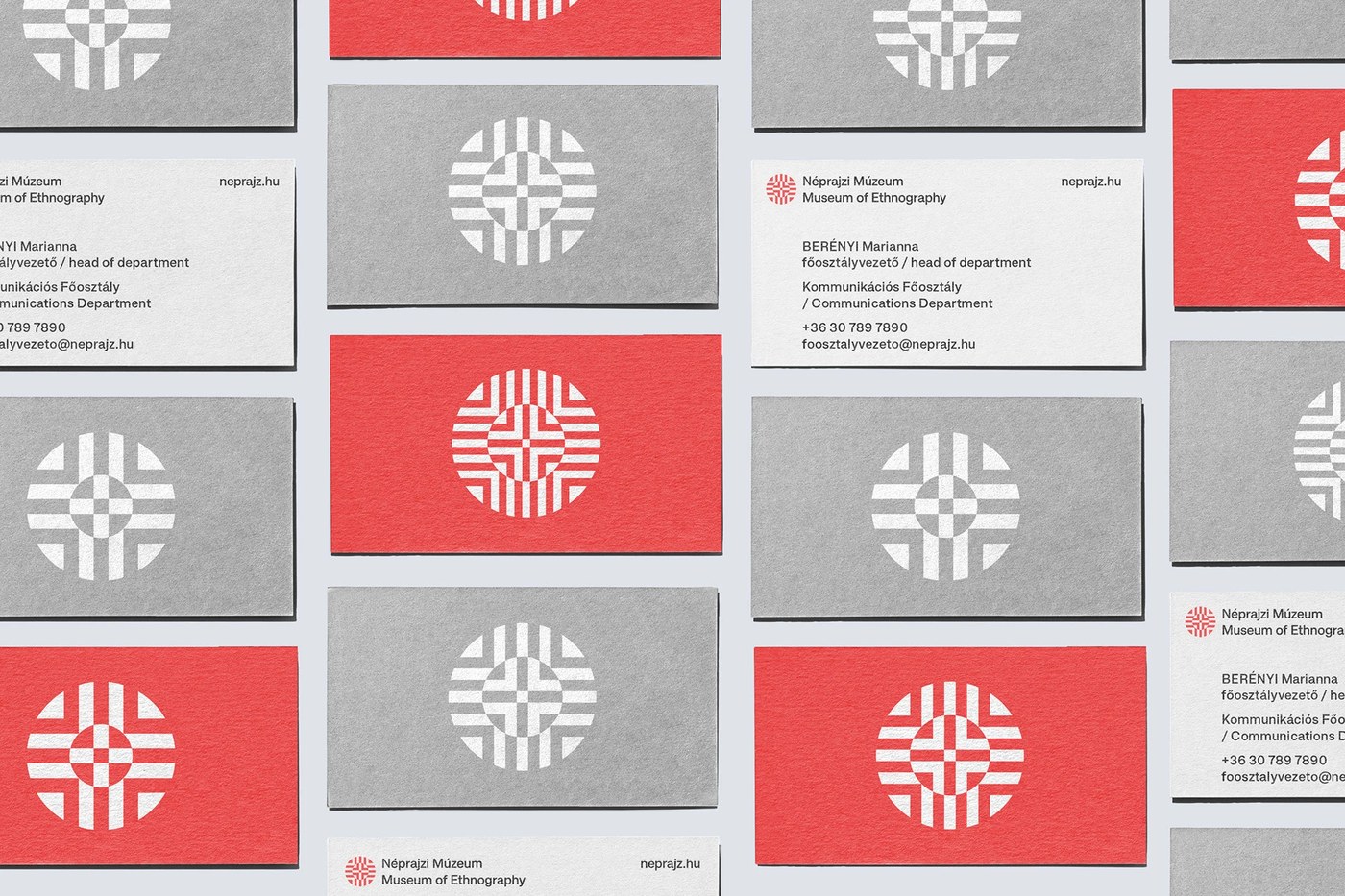
Hệ màu được lựa chọn là sự kết hợp giữa sắc đen than đậm và giấy màu kem nhạt, giúp làm nổi bật các họa tiết phổ quát. Hệ thống chữ có thể thay đổi kích thước linh hoạt, từ những chiếc nhãn nhỏ xíu cho đến các hình đồ họa khổng lồ trên tường. Các phông chữ sans-serif tinh giản định hình nên tông giọng trực quan, trong khi các nét chữ grotesque đậm mang lại sự nghiêm túc, chặt chẽ cho cấu trúc. Việc sử dụng các loại giấy cao cấp tạo thêm độ tương phản xúc giác cho bộ văn phòng phẩm, kết hợp cùng bề mặt phủ vecni mờ thể hiện sự tỉ mỉ trong khâu chọn chất liệu. Chữ viết trên các sản phẩm lưu niệm cũng cực kỳ dễ đọc. Mỗi ấn phẩm in ấn đều tuân theo một quy tắc bố cục nghiêm ngặt, đảm bảo mọi thứ luôn thẳng hàng trên mọi định dạng. Trên giao diện kỹ thuật số, một hệ thống lưới tinh tế giúp cân bằng hoàn hảo giữa hình ảnh lịch sử và các khoảng trắng sạch sẽ.
Dự án nhận diện thương hiệu này đã xuất sắc rinh về Giải thưởng Thiết kế Hungary vào năm 2023. Explicit Design Studio đã chứng minh rằng thiết kế thương hiệu cho các tổ chức công không hề khô khan mà có thể trở nên cực kỳ hiện đại. Thay vì đi theo lối mòn của các bố cục bảo tàng truyền thống, họ đã tạo ra một ngôn ngữ hoa văn năng động. Hệ thống này tôn vinh các hiện vật lịch sử thông qua hình học đương đại, thiết lập một tiêu chuẩn mới cho các học viện văn hóa trên toàn thế giới. Các thương hiệu hiện đại ngày nay luôn cần phải thích ứng tốt với môi trường số mà không làm mất đi bản sắc cá nhân, và dự án này là một ví dụ minh họa hoàn hảo. Cách tiếp cận này chắc chắn sẽ truyền cảm hứng cho nhiều hướng đi sáng tạo mới trong thiết kế bảo tàng công cộng.
Xem toàn bộ dự án tại www.behance.net/gallery/151869393/Museum-of-Ethnography.
DE_FORM and Explicit Design Studio just dropped a super clean and incredibly precise layout system for the Museum of Ethnography. This visual structure uses sharp grid lines that mimic the museum’s epic building designed by architect Ferencz Marcel. The design team sleekly blended sharp geometric angles with a unified emblem, bringing together diverse cultural motifs from across the globe into one cohesive graphic powerhouse. This emblem acts as the ultimate anchor for the brand’s entire visual storytelling.
A high-contrast typography system brings a seriously eye-catching balance to the layout. These graphic elements scale effortlessly across both digital and physical applications. Thanks to a modular grid system, everything maintains a flawless structural hierarchy—from complex wayfinding signs to digital screens. This identity smoothly translates 3D spaces into flat graphics, pulling patterns straight from the building’s architectural facade to shape the brand’s layout.
Rolling Out the Museum’s Brand Identity The chosen color palette pairs deep charcoal black with soft cream paper, making the universal patterns totally pop. The typography scales beautifully, working like a charm on everything from tiny labels to massive wall graphics. Clean sans-serif fonts set the visual tone, while bold grotesque lettering adds a serious, structured punch. Premium paper choices add a gorgeous tactile contrast to the stationery, and a matte varnish finish shows off some incredible attention to material detail. Souvenir typography is also perfectly readable. Every single printed piece follows strict layout rules, keeping everything aligned across all formats. On digital interfaces, a subtle grid beautifully balances historical imagery with crisp, clean white space.
This branding project deservingly took home the Hungarian Design Award in 2023. Explicit Design Studio proved that public institution branding doesn’t have to be boring—it can actually be incredibly modern. Instead of sticking to traditional, predictable museum layouts, they cooked up a dynamic pattern language. This system celebrates historical artifacts through contemporary geometry, setting a brand-new standard for cultural institutions worldwide. Modern brands need to adapt seamlessly to digital environments without losing their unique identity, and this project is a textbook example of how to do it right. This approach is bound to spark lots of fresh, creative directions in public museum design.
Check out the full project over on the Behance Project Page.