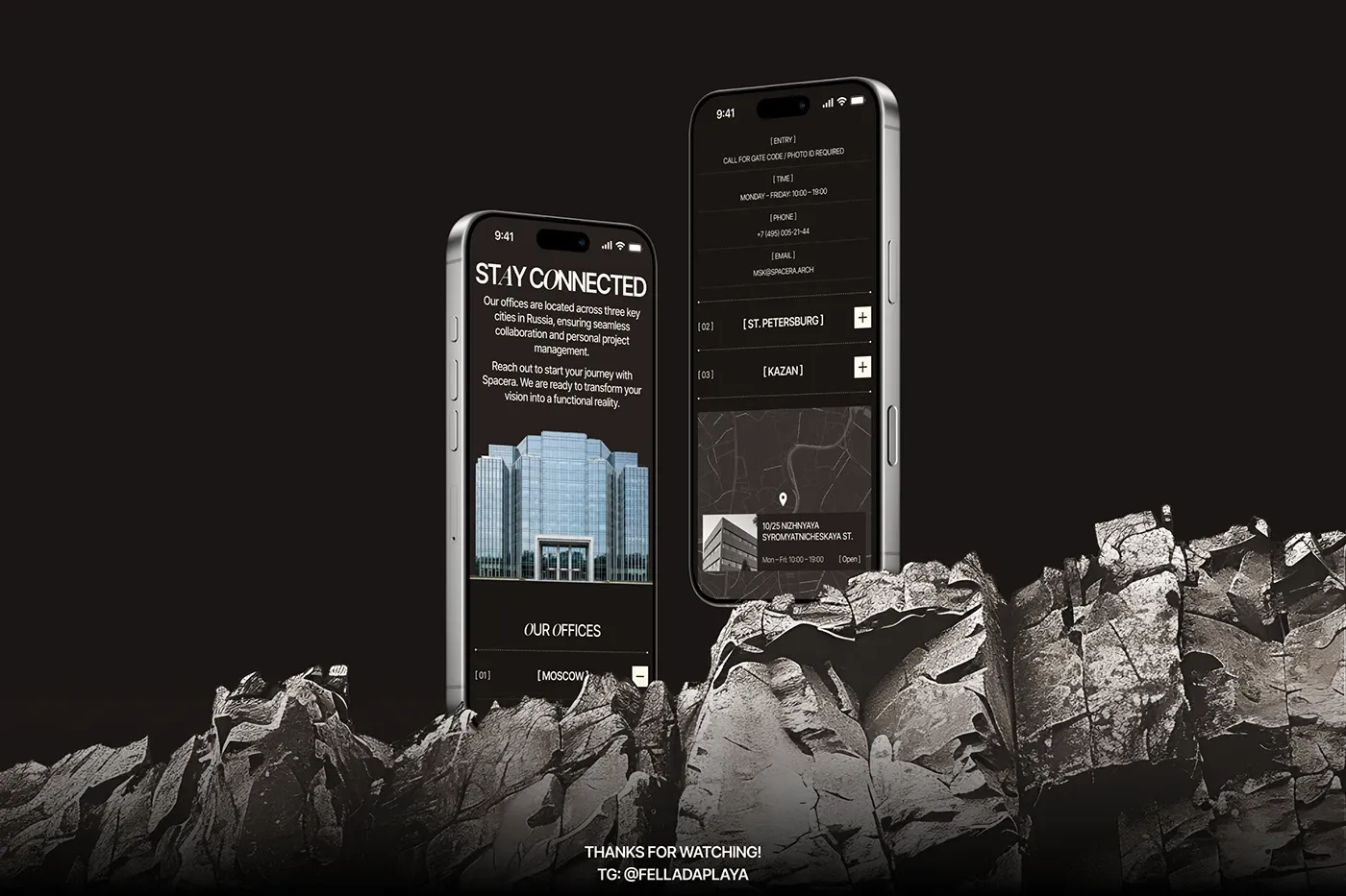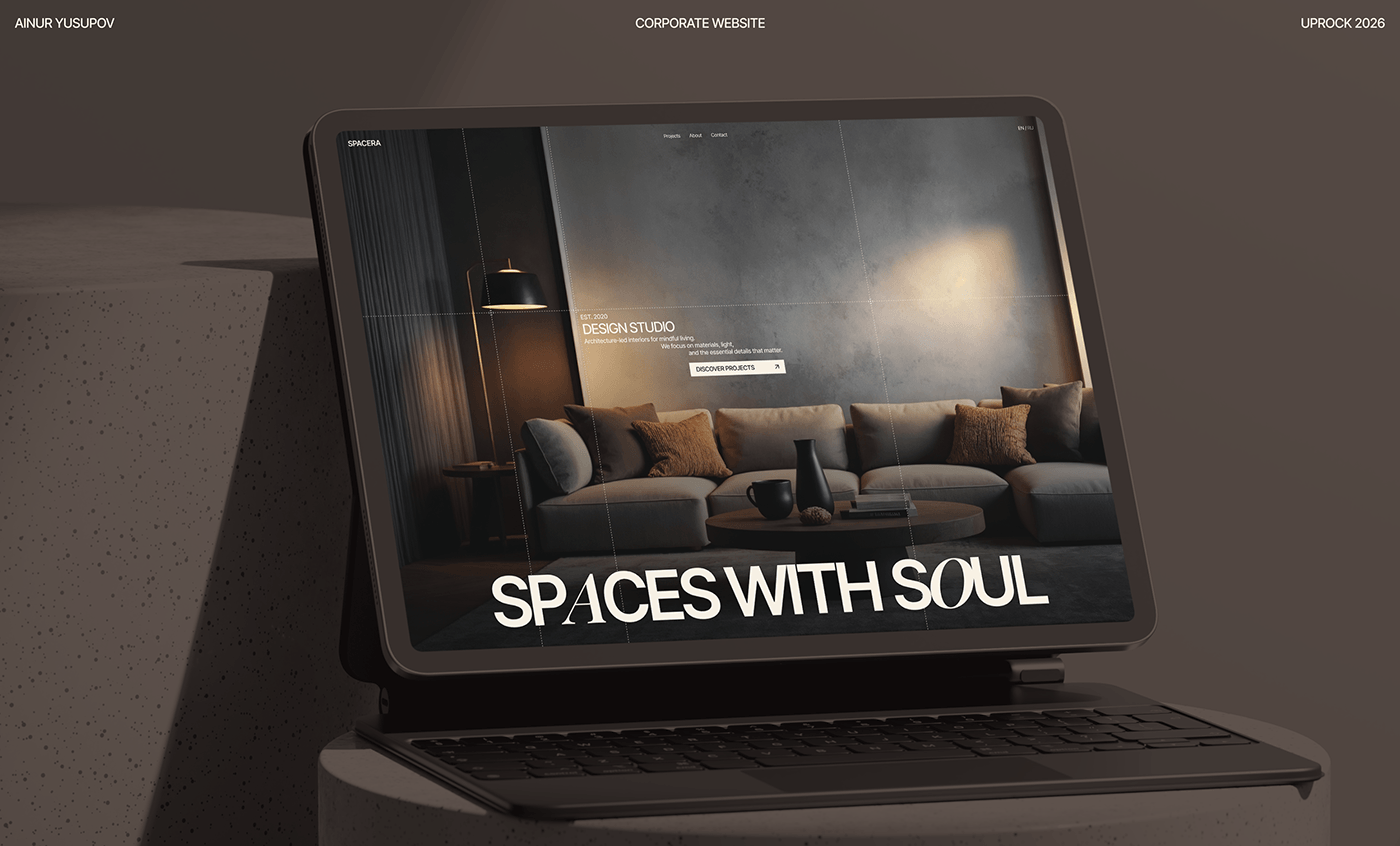
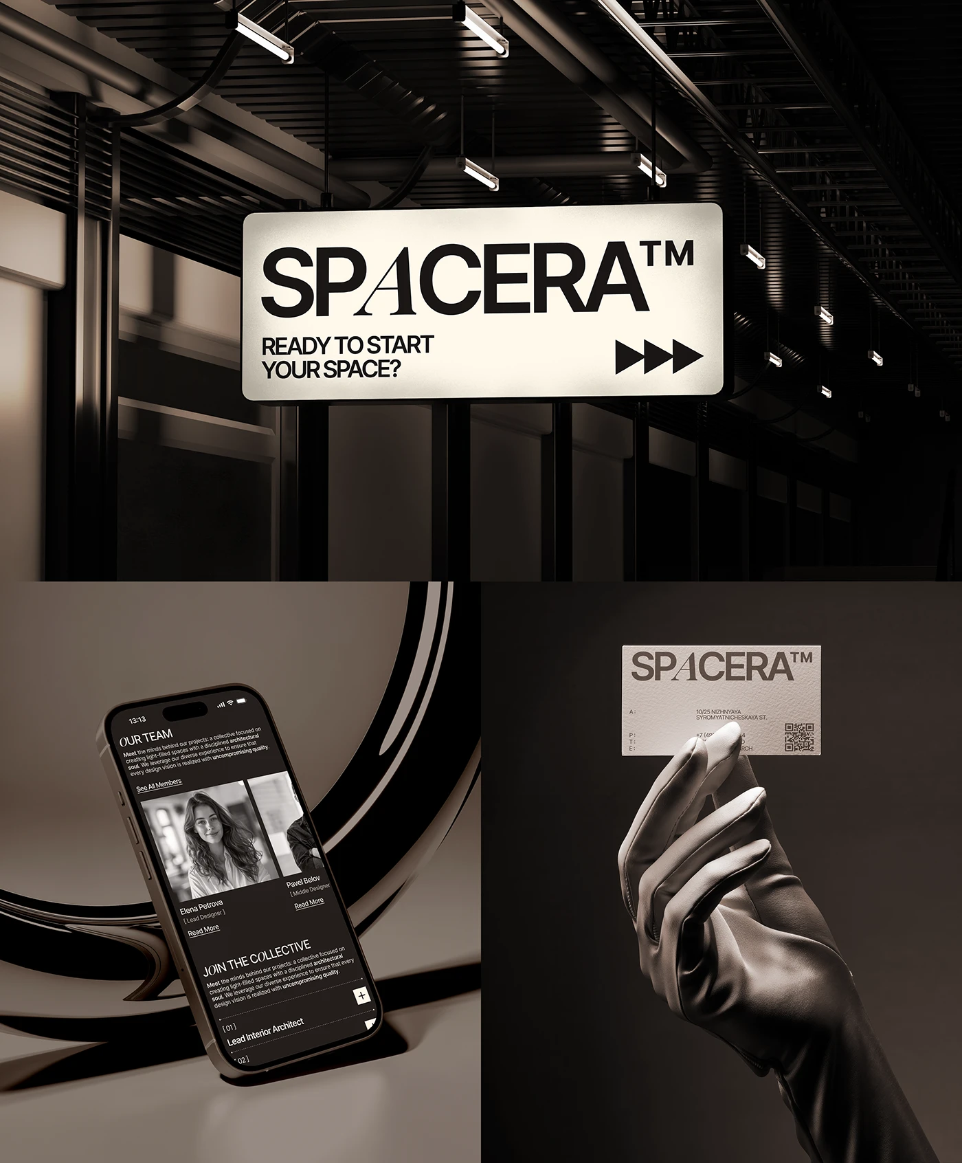
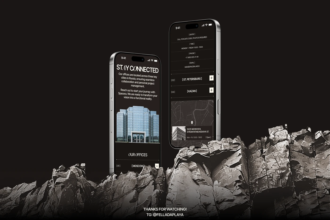
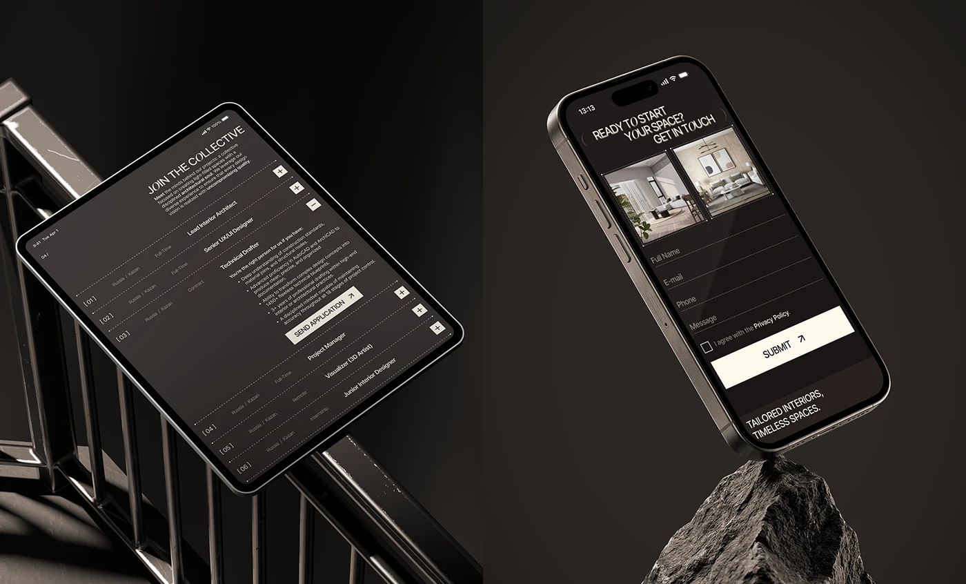
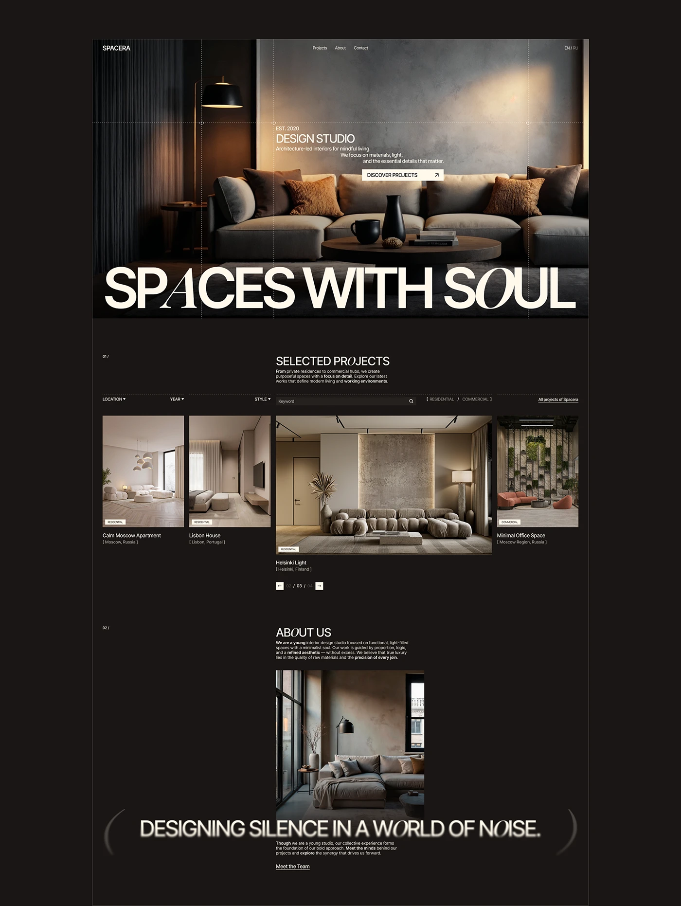
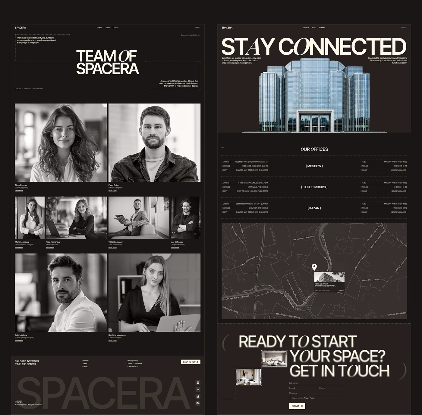
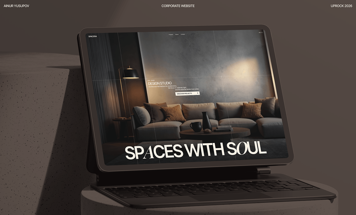
Designer Ainur Yusupov vừa cho ra mắt giao diện website và hệ thống nhận diện thương hiệu mang phong cách tương lai đầy ấn tượng dành cho SPACERA. Dự án này kết hợp khéo léo giữa tông màu tối chủ đạo và bố cục hình học gọn gàng, thể hiện nét chuẩn xác của công nghệ theo cách rất hiện đại.
Nhờ việc kết hợp phân cấp chữ (typography hierarchy) hiện đại cùng các biểu tượng kỹ thuật số được thiết kế riêng, bộ nhận diện doanh nghiệp này trông vẫn cực kỳ thân thiện. Từng chi tiết nhỏ đều cân bằng hoàn hảo giữa cấu trúc tối giản và cá tính riêng biệt. Phần logo mới mang hơi thở đương đại, vừa sắc sảo vừa tạo cảm giác tin cậy cho khách hàng.
Không chỉ dừng lại ở thế giới kỹ thuật số, hệ thống branding này còn lan tỏa sang các vật phẩm vật lý như văn phòng phẩm, danh thiếp, sticker và biển hiệu doanh nghiệp. Các hình khối modular đơn giản cùng đường nét đồng đều giúp tối ưu hóa trải nghiệm trên màn hình, tạo nên một phong cách đồng bộ mạnh mẽ trong ngành thiết kế.
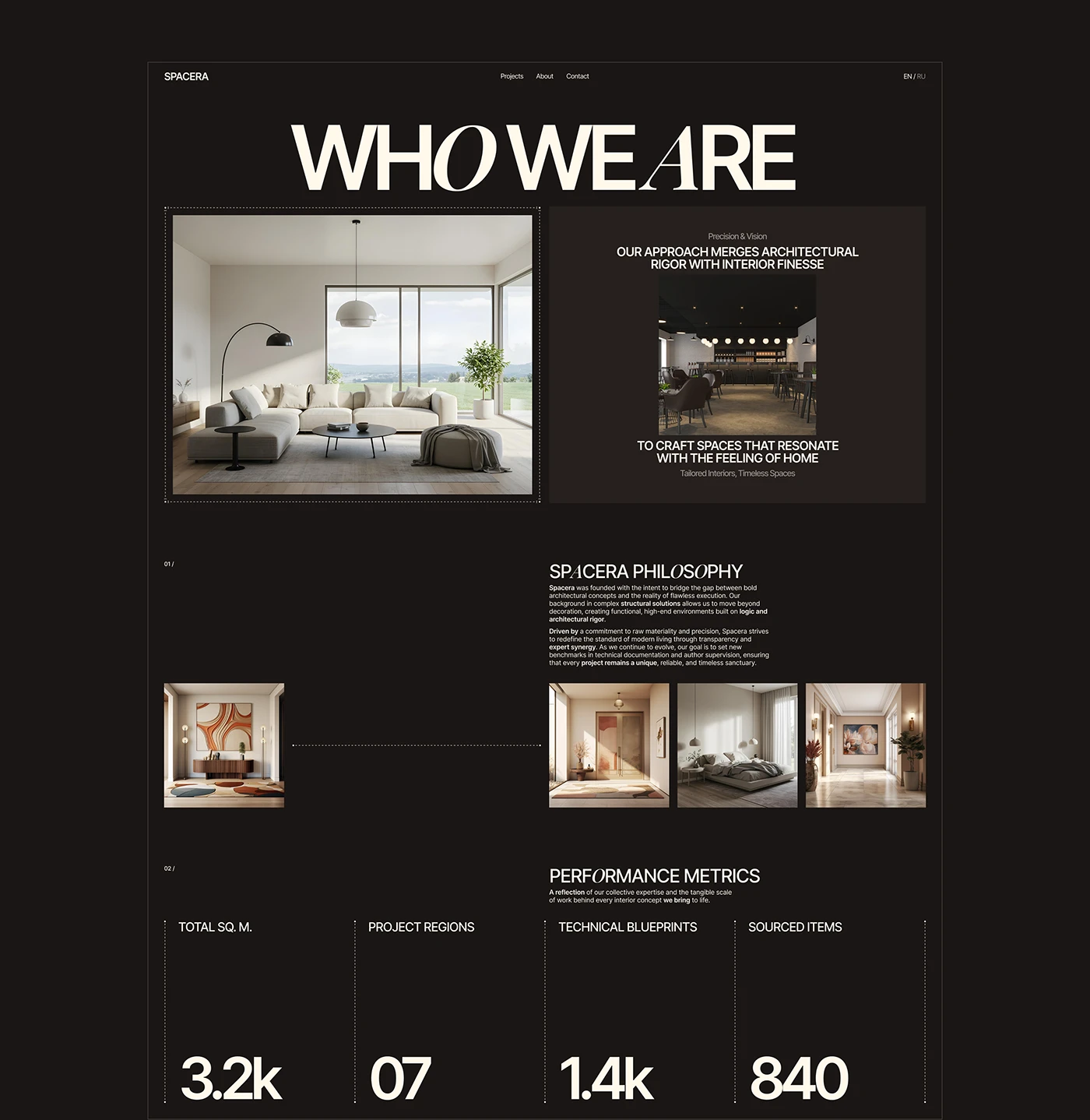
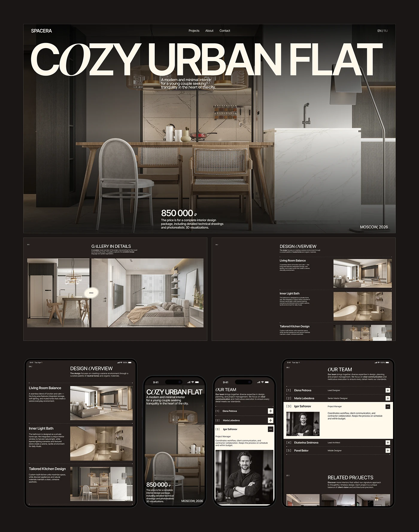
Cuối cùng, thiết kế mới giúp đơn giản hóa cách khách hàng tương tác với nền tảng trực quan. Cấu trúc bố cục rõ ràng giúp các chi tiết dự án phức tạp trở nên dễ hiểu ngay từ cái nhìn đầu tiên. Dự án là minh chứng cho thấy thiết kế chiến lược có thể thay đổi hoàn toàn một thương hiệu, tạo dựng chỗ đứng vững chắc trong thị trường thiết kế doanh nghiệp. Chi tiết toàn bộ dự án hiện đã có mặt trên www.behance.net/gallery/252031783/SPACERA-Corporate-Website-for-a-Design-Studio.
Designer Ainur Yusupov just dropped a super sleek, futuristic website and brand identity for SPACERA. This project perfectly blends a moody, dark color palette with clean geometric layouts, giving off major high-tech vibes in the coolest way possible.
By mixing modern typography hierarchy with custom-designed digital icons, this corporate identity manages to stay incredibly friendly and approachable. Every little detail strikes the perfect balance between minimalist structure and unique personality. The new logo feels fresh and contemporary—sharp yet totally trustworthy.
The branding doesn’t just live on screens, either! It transitions beautifully into the physical world, looking great on everything from stationery and business cards to stickers and corporate signage. Simple modular shapes and consistent line weights keep things looking sharp on any screen, creating a powerful, unified aesthetic.
Best of all, this redesign makes navigating the platform a breeze. The clear layout turns complex project details into something super easy to digest at a glance. It’s a prime example of how strategic design can totally transform a brand and carve out a strong spot in the corporate design world. Want to see the full project? Check it out on www.behance.net/gallery/252031783/SPACERA-Corporate-Website-for-a-Design-Studio.