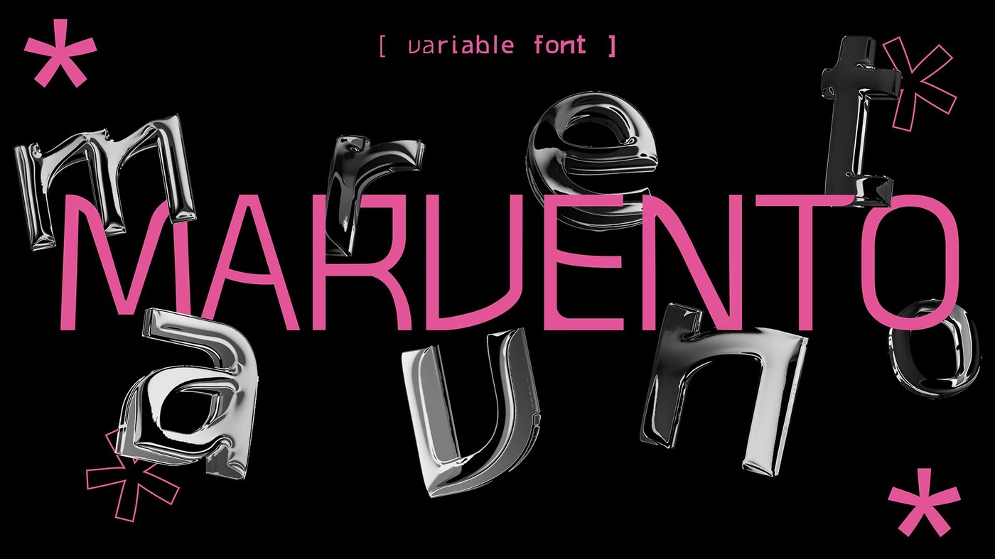
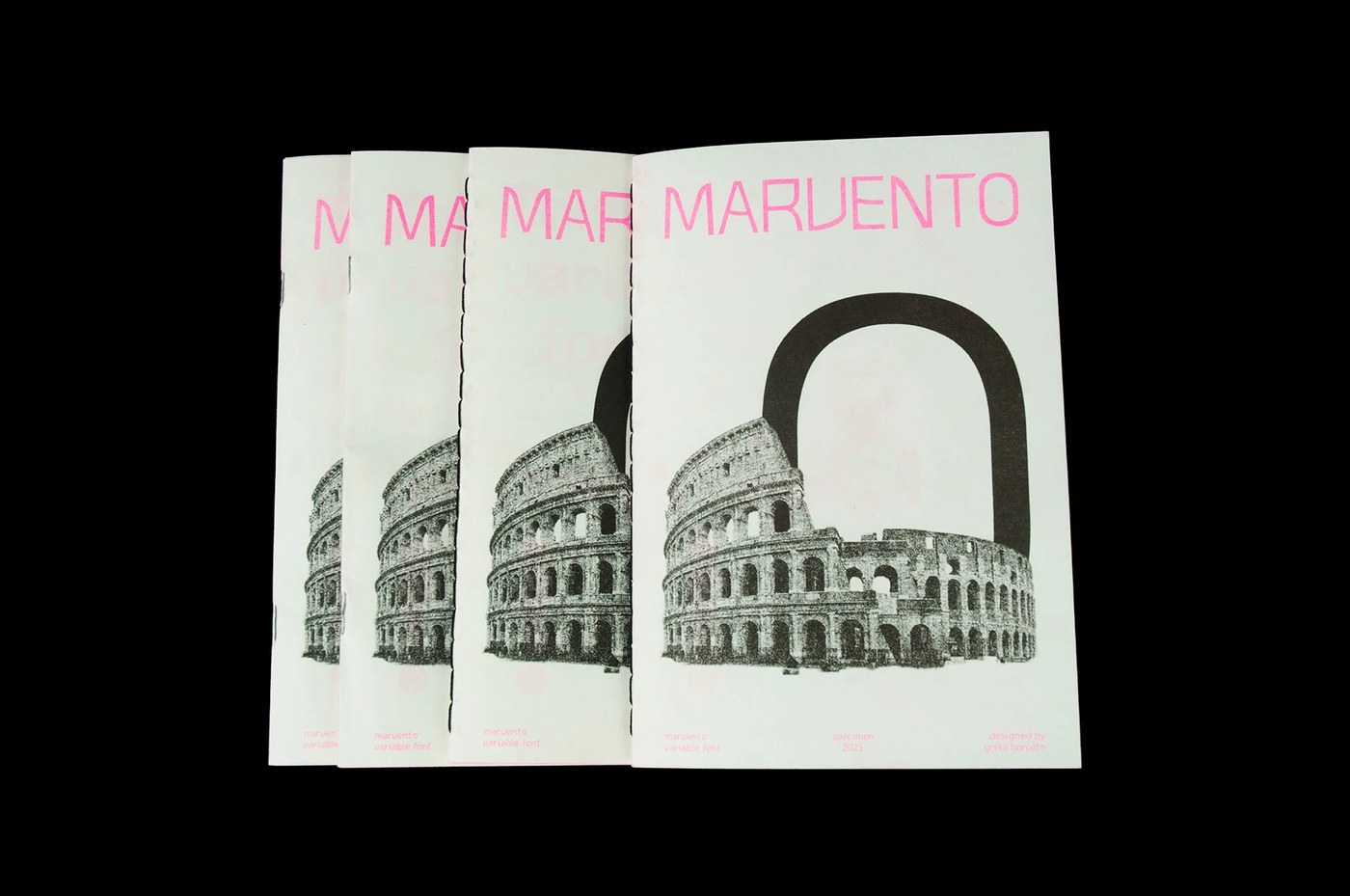
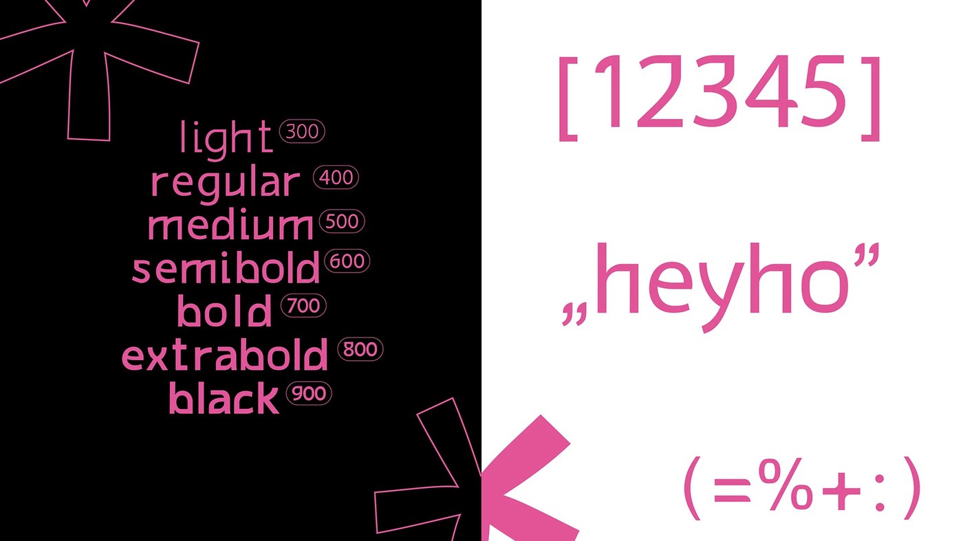
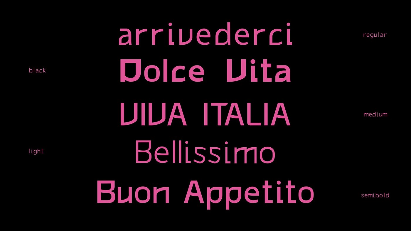
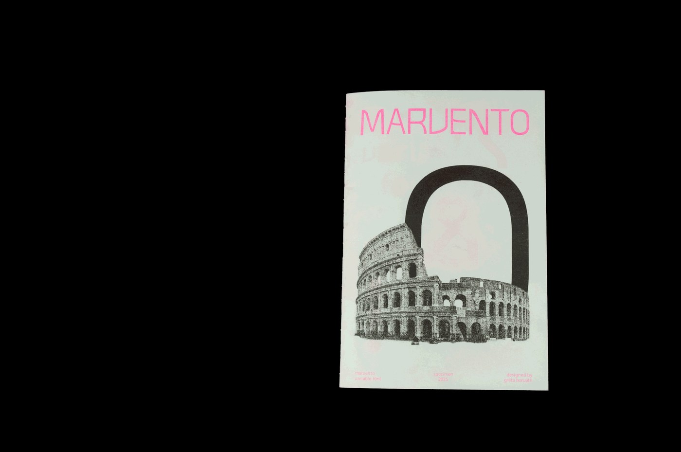
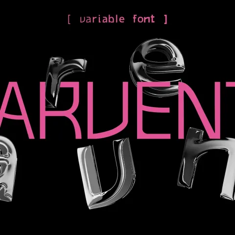
Cuốn booklet in Risograph này là nơi trình diễn bộ font Marvento xịn sò với 7 độ dày khác nhau (weights), một sản phẩm đầy tâm huyết từ nhà thiết kế người Hungary – Gréti Horváth.
Dự án này không chỉ đơn thuần là trình diễn font trên màn hình máy tính, mà là một thử nghiệm thú vị khi đưa các thông số digital vào thế giới vật liệu thực tế. Từ những nét chữ thanh mảnh, tinh tế cho đến các khối chữ đậm đặc, mọi thứ đều hiện lên sống động qua kỹ thuật in ấn thủ công trên nền giấy mỹ thuật có vân. Cách tiếp cận này giúp kết nối hoàn hảo giữa layout thiết kế hiện đại và quy trình sản xuất analog truyền thống.
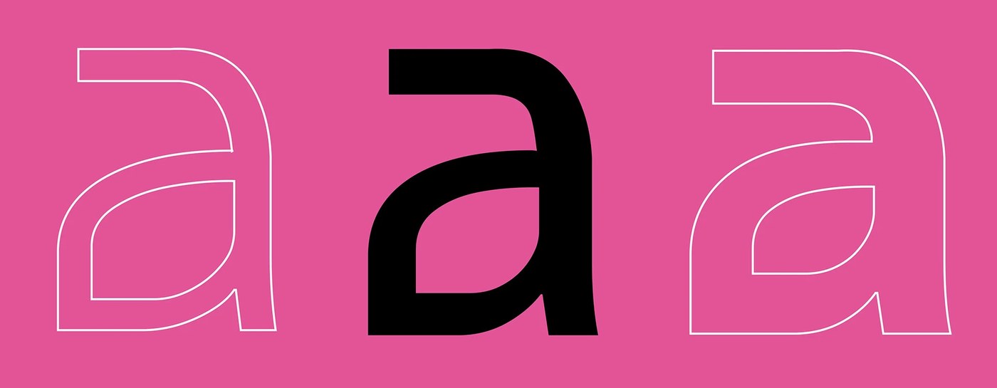
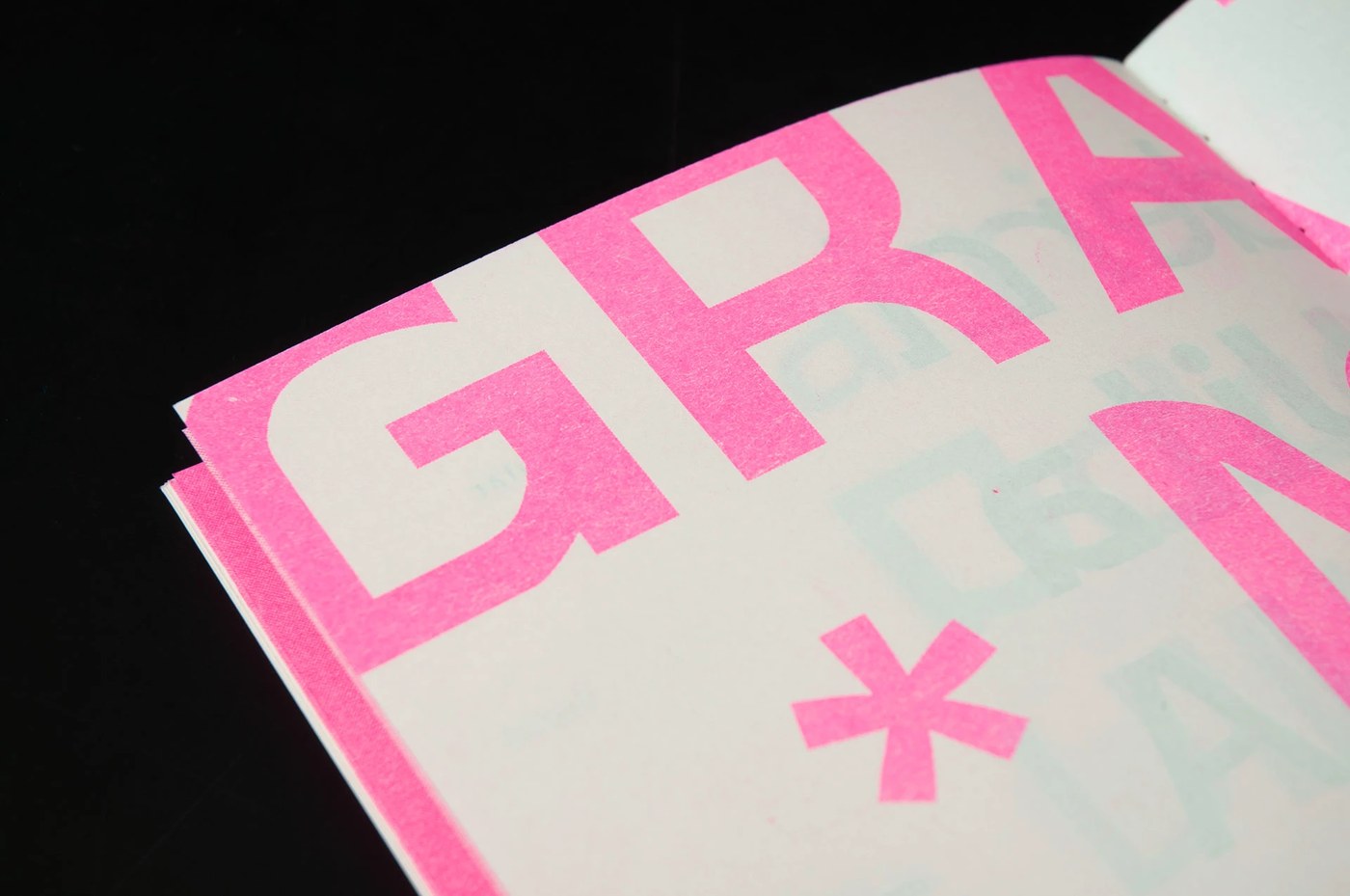
Điểm nhấn ấn tượng nhất chính là sự kết hợp của các lớp mực overlay giữa màu hồng huỳnh quang (fluorescent pink) và xanh teal. Những mảng màu chồng lên nhau tạo ra các dải màu phụ cực kỳ bắt mắt, làm nổi bật từng chi tiết giải phẫu của font chữ (type anatomy). Từng trang giấy được sắp xếp cân đối giữa hệ thống lưới (editorial grids) và các ký tự (glyph) phóng to, biến chữ cái từ những văn bản khô khan thành những yếu tố đồ họa có khối và chiều sâu.
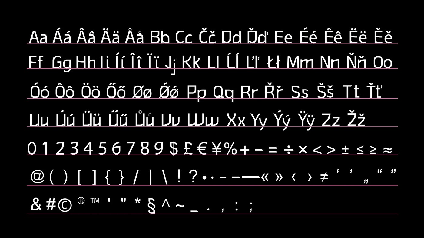
Vừa là một bản catalog tra cứu font đầy đủ chức năng, vừa là một tác phẩm in ấn nghệ thuật, cuốn booklet này cho thấy sự giao thoa đầy cảm hứng giữa những đường nét digital sắc sảo và chất liệu giấy mực mộc mạc. Sự tương phản giữa các đường outline sạch sẽ và độ hạt của giấy in Risograph mang đến một trải nghiệm thị giác vô cùng thú vị.
Mọi người có thể khám phá toàn bộ dự án và các bản in specimen cực chất này ngay tại behance.net/gallery/216029729/MARVENTO-Variable-Typeface-Specimen
This Risograph-printed booklet showcases the sleek Marvento typeface across seven different weights, a passion project by Hungarian designer Gréti Horváth.
This project goes beyond the screen, experimenting with how digital specs translate into the tactile world. From delicate, thin strokes to heavy blocks, every character pops on textured fine art paper through manual printing techniques. It’s a perfect bridge between modern layout design and traditional analog production.
The real highlight is the ink overlay effect, blending fluorescent pink and teal. These overlapping layers create secondary colors that make the type anatomy stand out. Each page is a balance of editorial grids and enlarged glyphs, turning letters from simple text into graphic elements with depth and volume.
Functioning as both a practical font catalog and a piece of print art, this booklet demonstrates the inspiring intersection of sharp digital lines and raw, grainy paper. The contrast between the clean outlines and the signature Risograph texture creates a visually captivating experience.
The full project and these stunning specimen prints are available for a closer look here: behance.net/gallery/216029729/MARVENTO-Variable-Typeface-Specimen