Studio Principal’s Impressive Identity for Semaine Design de Montréal 2026 Whenever a new design festival launches, the visual identity is always the most anticipated highlight. Making its debut in late April 2026 across more than 50 locations alongside talks at the Grand Quai du Port de Montréal, Semaine Design de Montréal 2026 delivered an absolute feast for the eyes. Montréal-based Studio Principal teamed up closely with organizer Index-Design to build the complete brand identity, promotional campaign, and digital platform for the event.
The backbone of the entire identity system relies on a seamless pairing of two contrasting sans-serif typefaces:
- James (by Ornamental & Title Type): A sharp monoline typeface with crisp angles and wide, sweeping curves that takes center stage across the wordmark, headlines, and signage system.
- Office Sans (by Riptype): A clean neo-grotesque font tasked with keeping dense, bilingual schedule details clear, organized, and effortlessly readable.
Dynamic Lines Bring the Festival to Life Far from being confined to neat margins, this identity system bursts with energy across every single application:
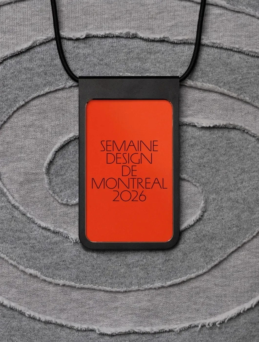
- Event Badges: Striking vermilion red cards showcase five stacked lines of slender, black uppercase typography reading SEMAINE DESIGN DE MONTRÉAL 2026, tucked neatly into matte-black sleeves paired with raw-edge gray jersey lanyards.
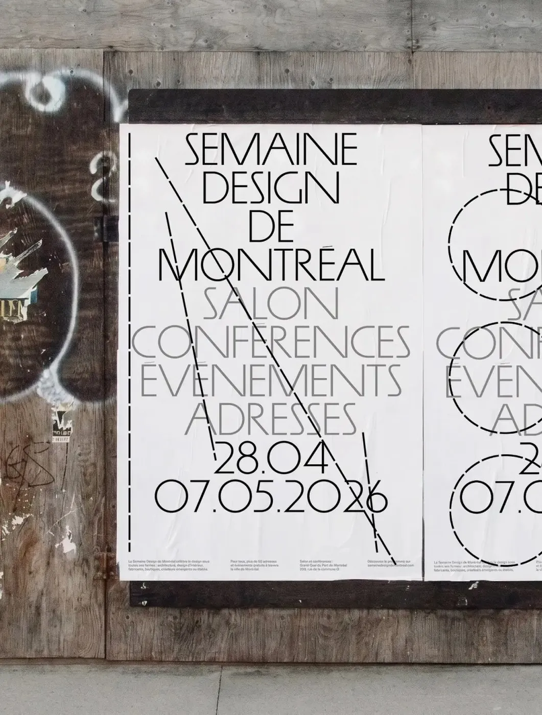
- Street Posters: Right below the black wordmark, event categories appear in neutral gray uppercase letters, anchored by four sleek columns of Office Sans at the bottom margin. Bold dashed black lines slash through text, while overlapping dashed circles evoke dynamic architectural sketches.
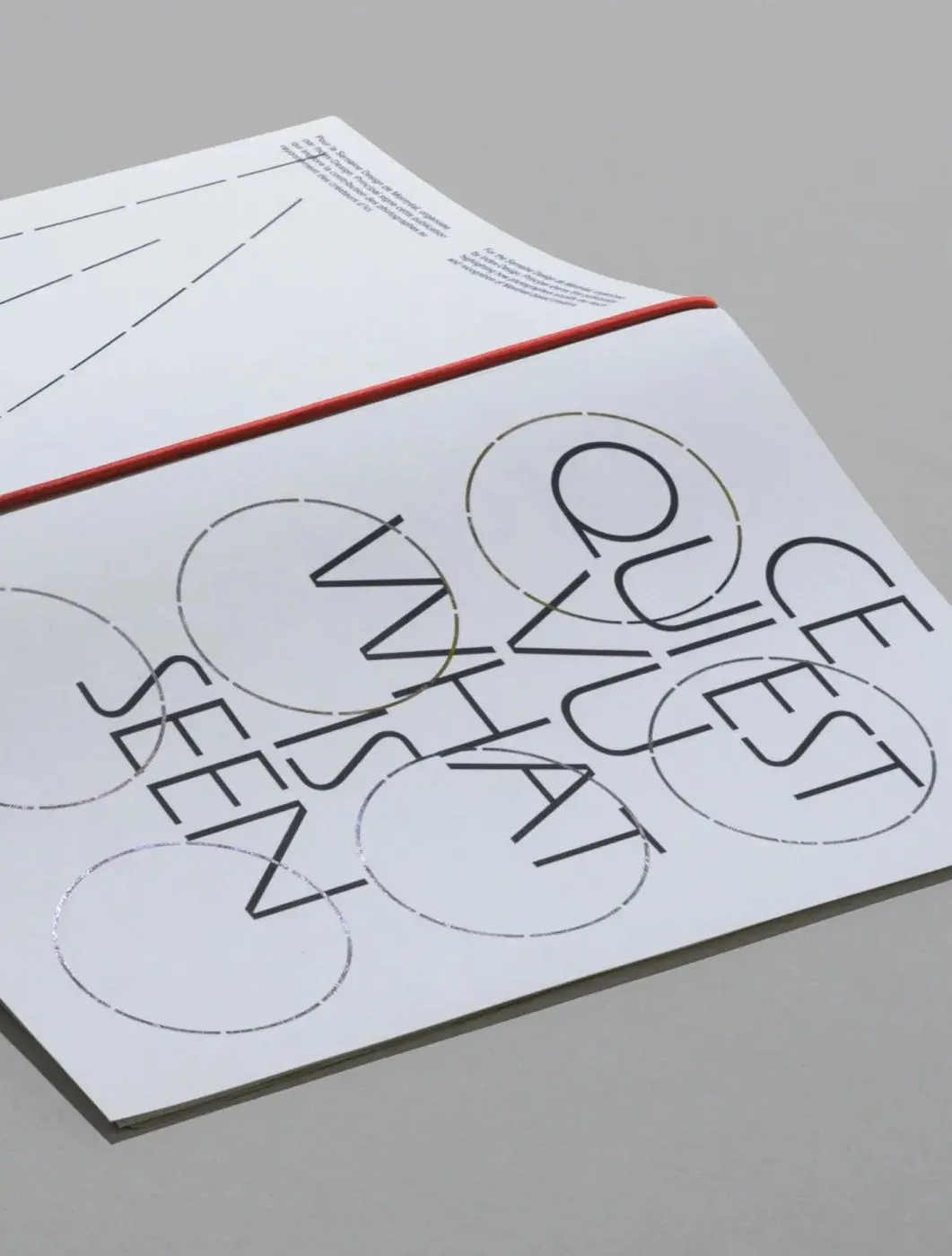
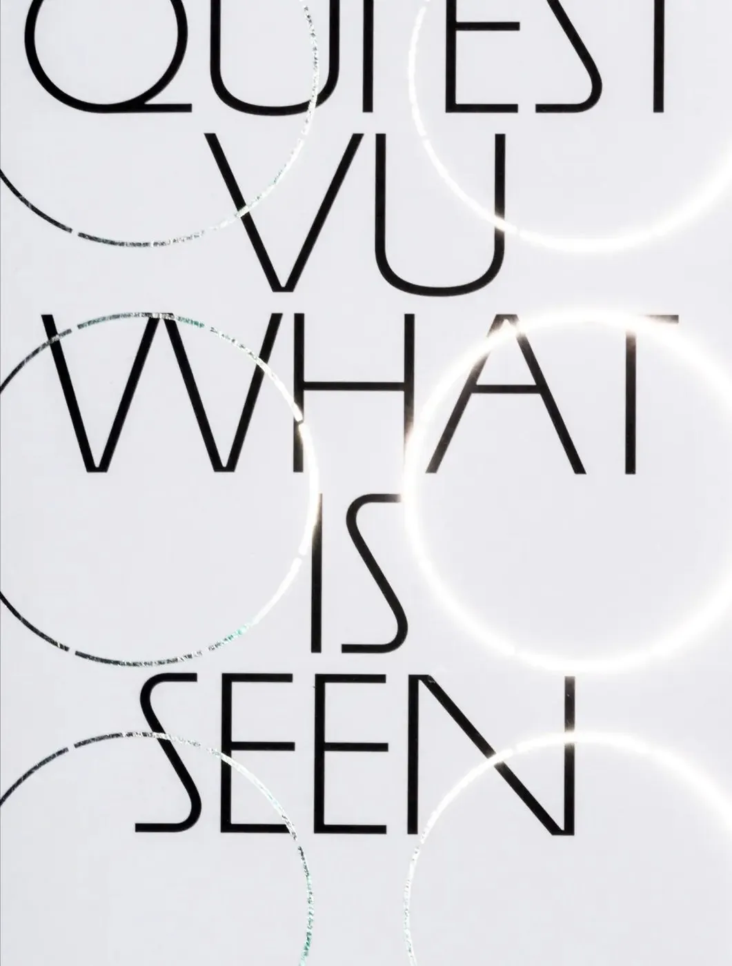
- “Ce qui est vu / What Is Seen” Photo Book: Featuring a vibrant red spine and crisp white cover, this publication shines with six interlocking foil-stamped silver dashed circles that catch the light beautifully against bold black uppercase lettering.
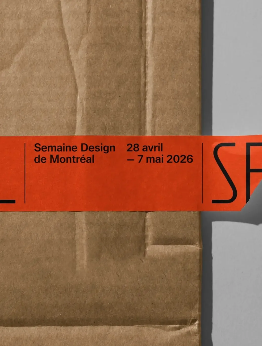
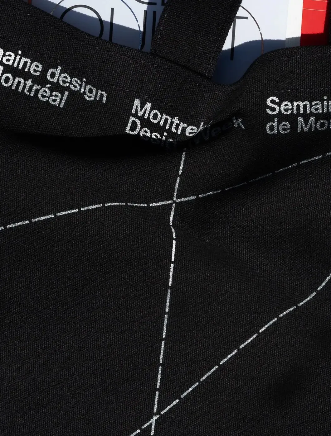
- Packaging Tape & Tote Bags: Printed tape on kraft cardboard boxes uses fine vertical black hairlines to separate dates and enlarged characters from the James typeface. Black canvas tote bags feature woven bilingual straps and shimmering silver dashed arcs.
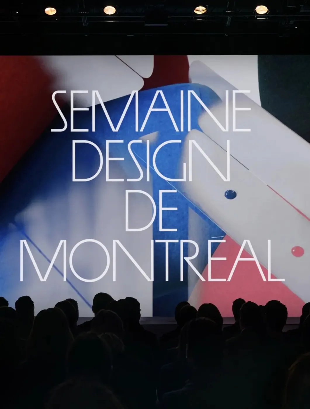
- Main Stage Scenography: On the oversized screen of the dimmed auditorium, the five-line white wordmark retains its slim geometric proportions, popping dramatically against an abstract backdrop of rich cobalt blue and deep crimson red.
For more details on this project, check out fontsinuse.com/uses/80527/semaine-design-de-montreal-2026.
Bộ nhận diện ấn tượng của Semaine Design de Montréal 2026 do Principal thực hiện
Khi một lễ hội thiết kế ra mắt, hệ thống nhận diện thị giác luôn là yếu tố được mong đợi hàng đầu. Được tổ chức lần đầu vào cuối tháng 4/2026 với hơn 50 địa điểm cùng các buổi tọa đàm tại Grand Quai du Port de Montréal, lễ hội Semaine Design de Montréal 2026 đã mang đến một diện mạo thị giác vô cùng mãn nhãn. Studio Principal tại Montréal đã phối hợp chặt chẽ cùng ban tổ chức Index-Design để xây dựng toàn bộ bộ nhận diện thương hiệu, chiến dịch truyền thông và nền tảng số cho sự kiện này.
Điểm tựa của toàn bộ hệ thống nằm ở sự kết hợp ăn ý giữa hai bộ phông chữ sans-serif tương phản:
- James (phát hành bởi Ornamental & Title Type): Phông chữ monoline với các góc nhọn sắc nét và đường cong tròn rộng, đảm nhận vai trò tạo điểm nhấn cho wordmark, tiêu đề và hệ thống biển chỉ dẫn.
- Office Sans (phát hành bởi Riptype): Phông chữ dạng neo-grotesque đảm nhận nhiệm vụ xử lý các thông tin lịch trình song ngữ dày đặc một cách rõ ràng, gọn gàng.
Sự linh hoạt của đường nét trong thiết kế lễ hội
Hệ thống nhận diện không hề bó hẹp trong những khung lề ngăn nắp mà tràn đầy sức sống trên từng ấn phẩm ứng dụng:
- Thẻ tham dự (Badges): Tấm thẻ màu đỏ vermilion nổi bật được xếp 5 hàng chữ in hoa đen mảnh SEMAINE DESIGN DE MONTRÉAL 2026, lồng gọn gàng trong bao thẻ màu đen mờ (matte-black) kết hợp dây đeo vải jersey xám viền thô.
- Poster dán đường phố (Street posters): Phía dưới wordmark màu đen, các danh mục thông tin được liệt kê bằng chữ in hoa màu xám trung tính, cùng bốn cột nhỏ font Office Sans ở mép dưới. Các đường nét đứt đen đậm cắt ngang qua chữ, hoặc các hình tròn nét đứt xếp chồng lên nhau tạo cảm giác như những đường phác thảo kiến trúc sống động.
- Ấn phẩm nhiếp ảnh Ce qui est vu / What Is Seen: Quyển sách sở hữu phần gáy đỏ và bìa trắng, nổi bật với 6 hình tròn nét đứt ép kim bạc đan xen nhau, bắt sáng đẹp mắt trên nền chữ in hoa màu đen.
- Băng keo đóng gói & Túi vải (Collateral): Băng keo dán trên thùng carton kraft dùng các đường hairlines đen thẳng đứng để phân tách ngày tháng và các ký tự chữ James phóng to. Túi tote vải đen đi kèm quai đeo dệt song ngữ và các đường cung nét đứt in màu bạc.
- Sân khấu hội trường: Trên màn hình lớn của sân khấu tối đèn, wordmark màu trắng 5 hàng giữ nguyên tỷ lệ hình học thanh mảnh, nổi bật trên phông nền trừu tượng kết hợp hai sắc màu cobalt và crimson.
Bạn có thể tham khảo thêm chi tiết về dự án này trên fontsinuse.com/uses/80527/semaine-design-de-montreal-2026.