The New York Times 175th Anniversary Identity: When History Becomes the Design Material To mark a massive 175-year milestone, The New York Times teamed up with studio XYZ Type to craft a custom “175” mark. The design brings together a refined blackletter style with stunning historical collages across their publications. Interestingly, early tests setting the “175” in Ed Benguiat’s NYT Fraktur font felt a little flat right next to the main newspaper logo. Under the direction of Creative Director Jessi Brattengeier and the Culture & Comms Design team, the project brought on XYZ Type and motion designer Kiffer Keegan to build out both static visuals and dynamic motion for a New Year’s Eve reveal.
XYZ Type co-founder Jesse Ragan cleverly tweaked the blackletter curves: the stem of the ‘1’ echoes the serif of the ‘h,’ the ‘7’ gets a subtle calligraphic flick mirroring the leg of the ‘k,’ and the ‘5’ tapers down like the arc of the ‘s’. When set alongside Cheltenham Light and Franklin typefaces, the identity makes 175 years of journalism history feel vivid and tangible—acting as real evidence of character rather than just pure nostalgia.
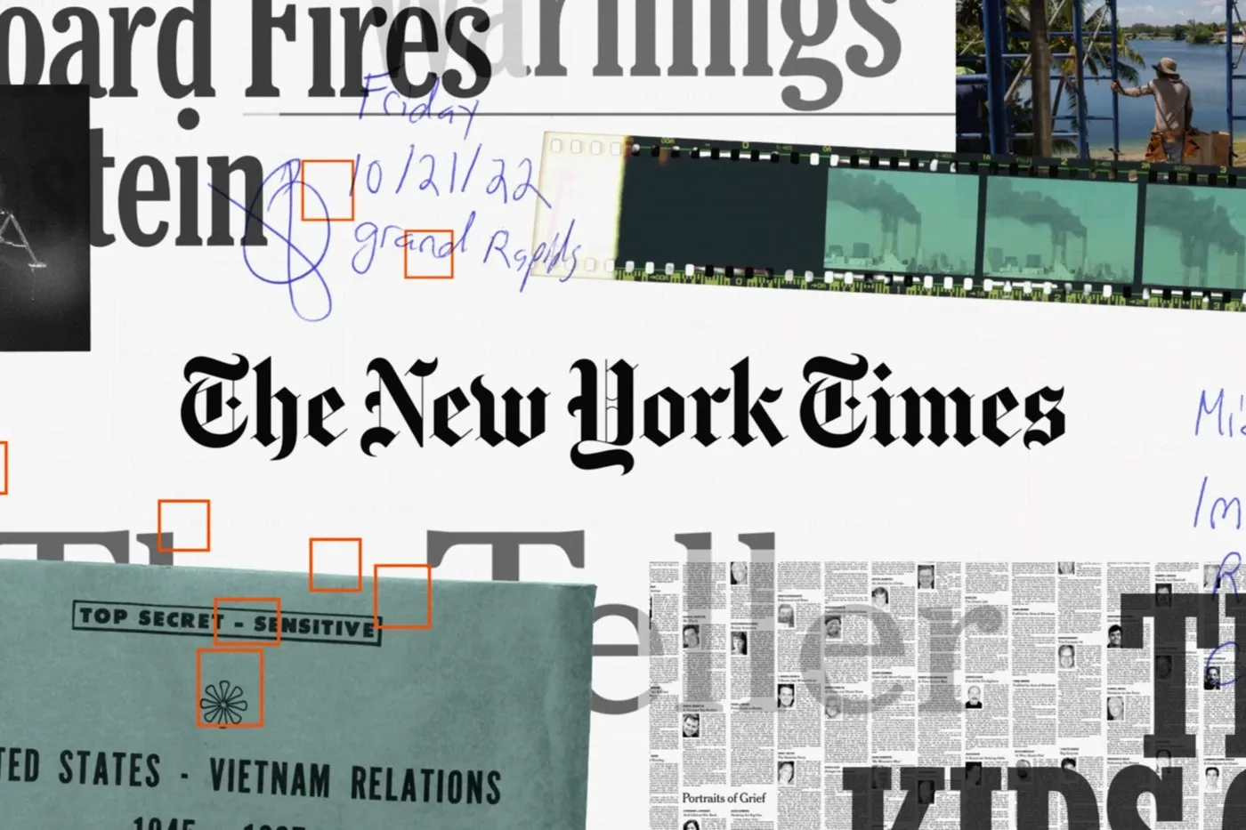
For the hero visuals in the Reporters Follow the Facts campaign created by Studio Dumbar, the blackletter mark sits right at the center atop real news artifacts. Vibrant orange photo loupes pop against a teal Pentagon Papers folder stamped “TOP SECRET – SENSITIVE,” alongside blue ballpoint notes from October 2022, 35mm Fuji film rolls, and newspaper columns from Portraits of Grief after 9/11. Every single detail keeps its raw, tactile grit without any slick retouching or gloss.
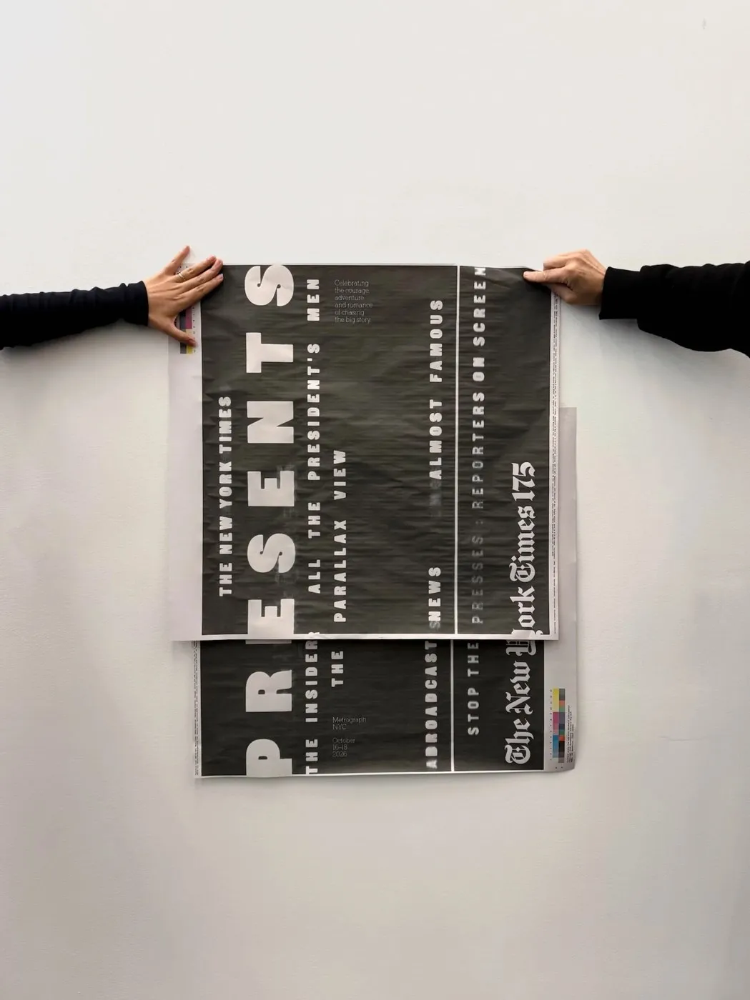
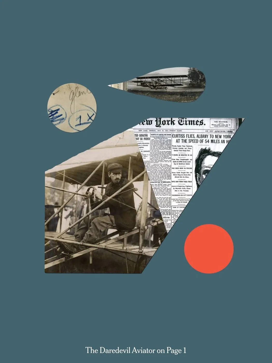
On the editorial side, the anniversary mark takes a more understated role. For the 15-part Eyewitness series, illustrator Matt Dorfman paired a torn newspaper page from May 30, 1910—covering aviator Glenn Curtiss—with a sepia biplane cutout and a bold vermilion red accent dot. Meanwhile, Matt Willey’s Stop the Presses broadsheet pages for Metrograph rotated white caps 90 degrees next to a vertical The New York Times 175 blackletter lockup.
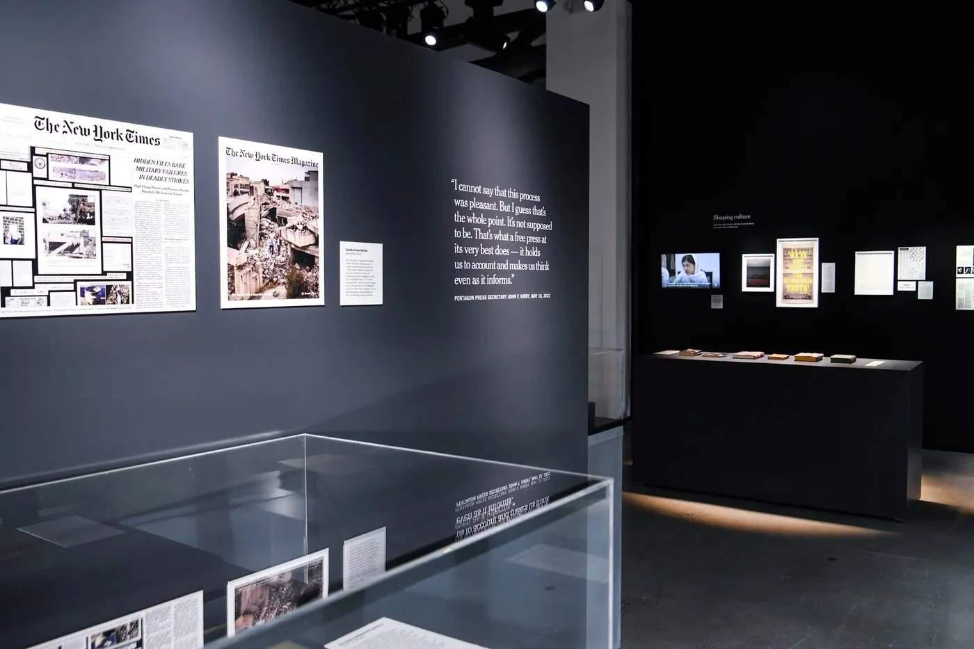
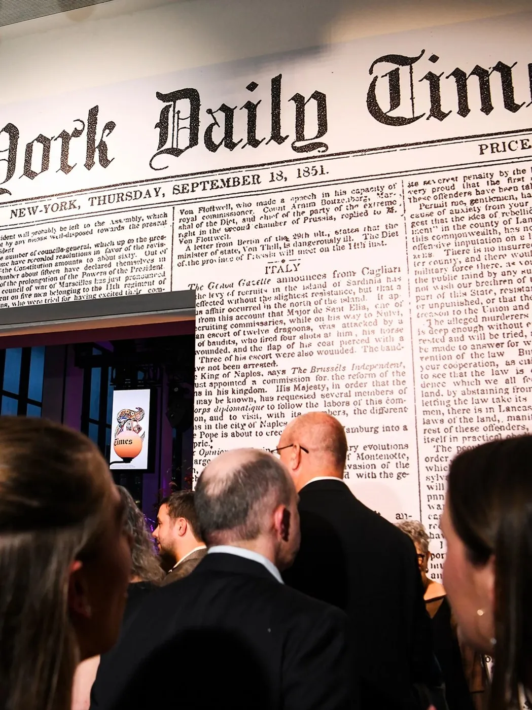
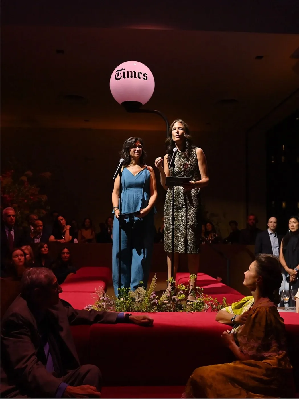
The identity system was built for maximum flexibility, letting partners easily adapt it across different spaces without getting trapped in a rigid rulebook. Over at Spring Studios, spatial designer Ingrid Schmaedecke constructed layered charcoal walls with glass vitrines displaying press freedom quotes in crisp white Cheltenham Light. Right behind them, a floor-to-ceiling print of the original 1851 New-York Daily Times front page sets the backdrop, complemented by a Times globe light inspired by the old Annex building facade.
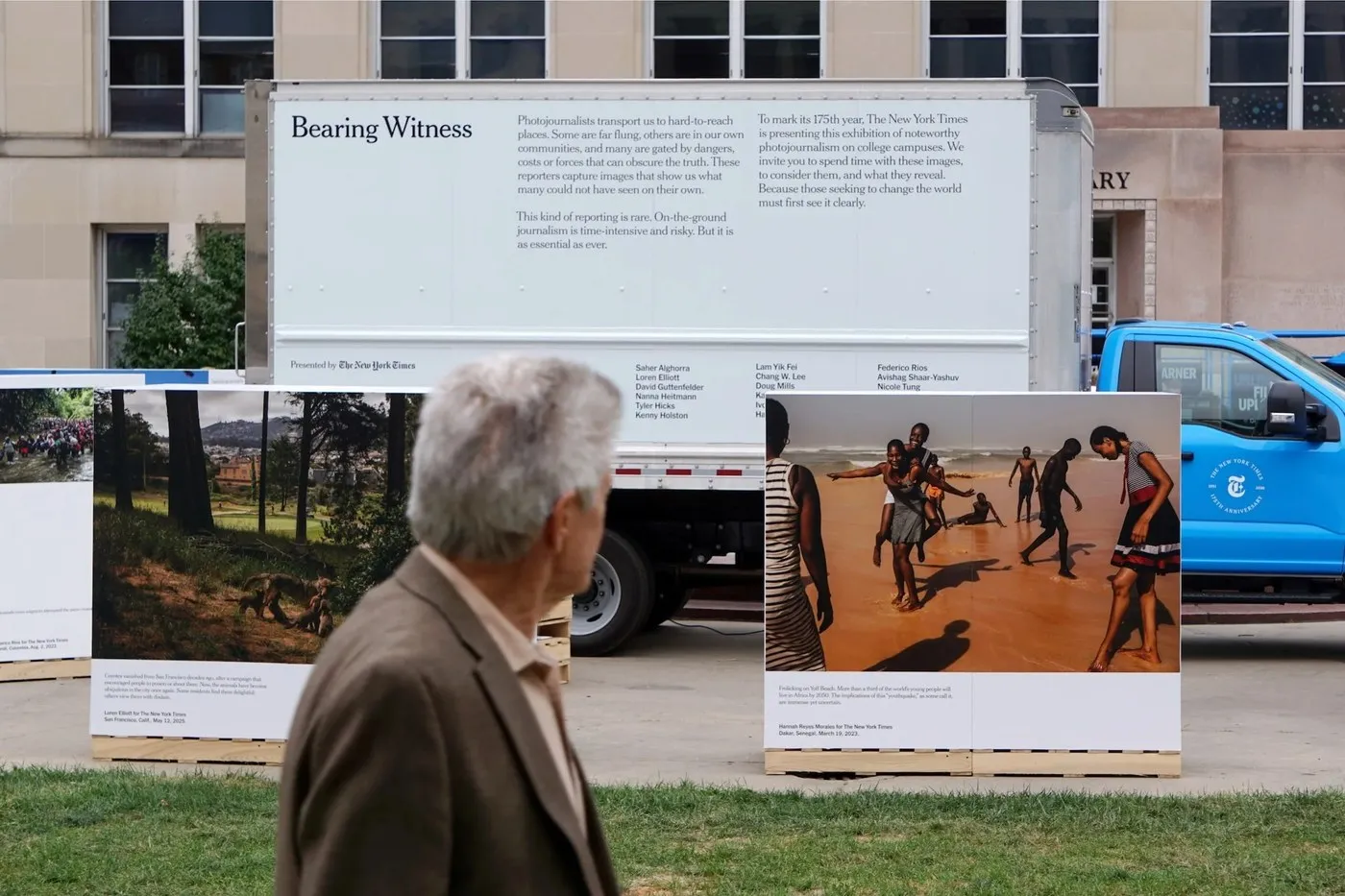
On top of that, the mobile Bearing Witness project—co-created with Other Means—transformed a delivery truck into a living, moving newspaper. Two columns of Cheltenham Light body text were laid out directly onto the white truck bed, paired with a bright cyan cab sporting the 175th anniversary seal.
To dive deeper into the project details, explore the-brandidentity.com/project/the-new-york-times-turns-175-with-an-identity-events-and-a-campaign, or watch short motion clips fls-a308a4a0-40a0-4df8-8dbb-117b4b947e86.laravel.cloud/articles/2026/10/the-new-york-times-turns-175-with-an-identity-events-and-a-campaign/NYT-TBI-Horizontal-Hero-2.mp4 and fls-a308a4a0-40a0-4df8-8dbb-117b4b947e86.laravel.cloud/articles/2026/10/the-new-york-times-turns-175-with-an-identity-events-and-a-campaign/The-New-York-Times-175-The-New-York-Times-04.mp4.
Bộ Nhận Diện Kỷ Niệm 175 Năm Của The New York Times: Khi Lịch Sử Trở Thành Chất Liệu Thiết Kế
Đánh dấu cột mốc 175 năm thành lập, The New York Times đã bắt tay cùng studio XYZ Type để tạo nên một biểu tượng số 175 mang phong cách chữ blackletter tinh tế, kết hợp hài hòa với nghệ thuật cắt dán (collage) tư liệu lịch sử trên các ấn phẩm. Ban đầu, khi sắp đặt thử số 175 bằng phông NYT Fraktur của Ed Benguiat, kết quả nhận được khá mờ nhạt khi nằm cạnh phần logo chính của tờ báo. Dưới sự định hướng của Giám đốc Sáng tạo Jessi Brattengeier cùng đội ngũ Thiết kế Văn hóa & Truyền thông, dự án đã quy tụ thêm XYZ Type và nhà thiết kế chuyển động Kiffer Keegan để phát triển đồng thời cả hình ảnh tĩnh lẫn hiệu ứng chuyển động cho sự kiện đêm Giao thừa.
Nhà sáng lập Jesse Ragan đã khéo léo biến tấu các nét uốn blackletter: đường nét của số 1 tương đồng với chân chữ h, số 7 có nét vát nhẹ như chân chữ k, còn số 5 thu nhỏ dần tương tự chữ s. Khi đặt cạnh hai phông chữ Cheltenham Light và Franklin, bộ nhận diện giúp 175 năm lịch sử làm báo hiện lên sống động như những bằng chứng thực tế chứ không sa vào cảm giác hoài niệm thuần túy.
Trong hình ảnh chủ đạo thuộc chiến dịch Reporters Follow the Facts do Studio Dumbar thực hiện, biểu tượng blackletter nằm ngay trung tâm trên nền các hiện vật tin tức. Những ô vuông soi ảnh màu cam nổi bật trên thư mục Pentagon Papers màu xanh ngọc mang dòng chữ TOP SECRET – SENSITIVE, các ghi chép bằng mực bóng xanh từ tháng 10 năm 2022, cuộn phim 35mm Fuji cùng các cột báo Portraits of Grief sau sự kiện 11/9. Mọi chi tiết đều được giữ nguyên nét thô mộc mạc chứ không xử lý chốt bóng chỉnh sửa.
Ở mảng nội dung báo chí, hình ảnh biểu tượng được tiết chế lại. Với chuỗi 15 phần Eyewitness, họa sĩ minh họa Matt Dorfman đã kết hợp trang báo rách ngày 30/05/1910 về phi công Glenn Curtiss cùng hình cắt máy bay hai cánh màu nâu sepia và một điểm nhấn hình tròn màu đỏ son. Trong khi đó, các tờ báo khổ lớn Stop the Presses của Matt Willey dành cho Metrograph lại xoay ngang các chữ in hoa màu trắng 90 độ bên cạnh cụm chữ blackletter The New York Times 175 đặt dọc.
Hệ thống nhận diện này được thiết kế linh hoạt để các đối tác dễ dàng ứng dụng vào nhiều không gian khác nhau mà không bị bó hẹp trong một quy chuẩn cứng nhắc. Tại Spring Studios, nhà thiết kế kiến trúc Ingrid Schmaedecke đã dựng các bức tường màu than xếp lớp cùng tủ kính phản chiếu các câu trích dẫn về tự do báo chí bằng phông Cheltenham Light màu trắng. Ngay phía sau là trang nhất tờ New-York Daily Times năm 1851 phủ từ sàn đến trần và chiếc đèn hình địa cầu Times mô phỏng theo mặt tiền tòa nhà Annex cũ.
Bên cạnh đó, dự án lưu động Bearing Witness phối hợp cùng Other Means đã biến chiếc xe tải giao hàng thành một tờ báo di động. Hai cột nội dung phông Cheltenham Light được dàn trang trực tiếp trên thùng xe màu trắng, kết hợp cùng phần cabin màu xanh cyan mang con dấu kỷ niệm 175 năm.
Bạn có thể tìm hiểu thêm thông tin chi tiết về dự án tại the-brandidentity.com/project/the-new-york-times-turns-175-with-an-identity-events-and-a-campaign hoặc xem qua các đoạn phim ngắn tại fls-a308a4a0-40a0-4df8-8dbb-117b4b947e86.laravel.cloud/articles/2026/10/the-new-york-times-turns-175-with-an-identity-events-and-a-campaign/NYT-TBI-Horizontal-Hero-2.mp4 và fls-a308a4a0-40a0-4df8-8dbb-117b4b947e86.laravel.cloud/articles/2026/10/the-new-york-times-turns-175-with-an-identity-events-and-a-campaign/The-New-York-Times-175-The-New-York-Times-04.mp4.