NM Art & Design: A Sophisticated Yet Ultra-Functional Digital Platform by ESH Gruppa NM Art & Design wears two hats: it’s a contemporary art gallery and an interior design studio all in one. That meant their website had to seamlessly cater to two completely opposite audiences—art collectors taking their sweet time soaking in the artwork, and busy interior designers racing against tight project deadlines. Guided by Brand Art Director Stefan Lashko and Web Creative Director Violetta Postnova, the team at ESH Gruppa nailed this design challenge. They effortlessly blended serene, gallery-like vibes with a dedicated PRO account feature built specifically for managing project collections.
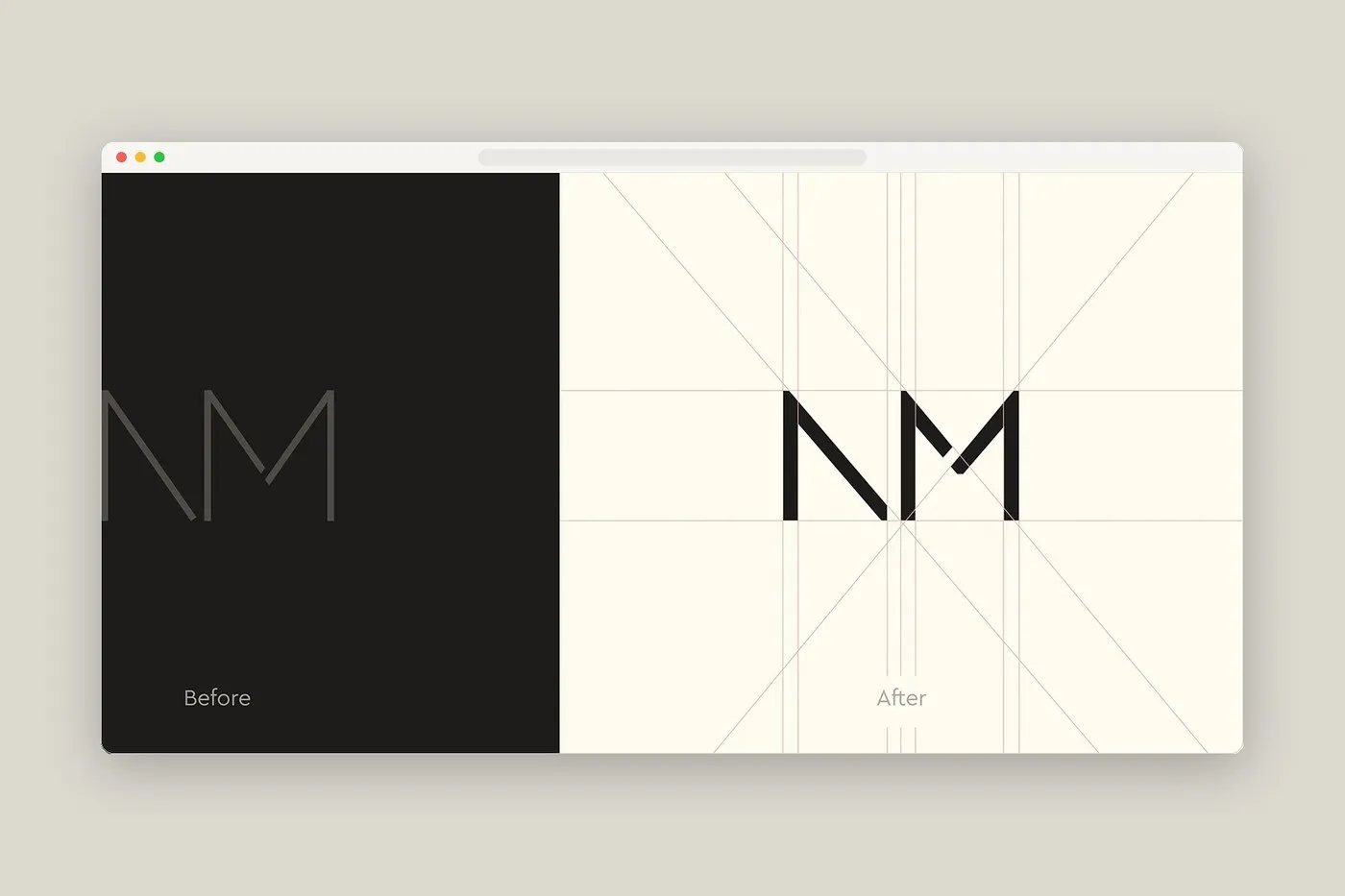
The craft shows up right away in the refined monogram tweaked by designer Kirill Turygin. By thickening the delicate gray strokes and adding subtle diagonal notches to the stem of the “N” and the peak of the “M,” the updated mark stays crisp and sharp, even at super tiny sizes up in the site header.
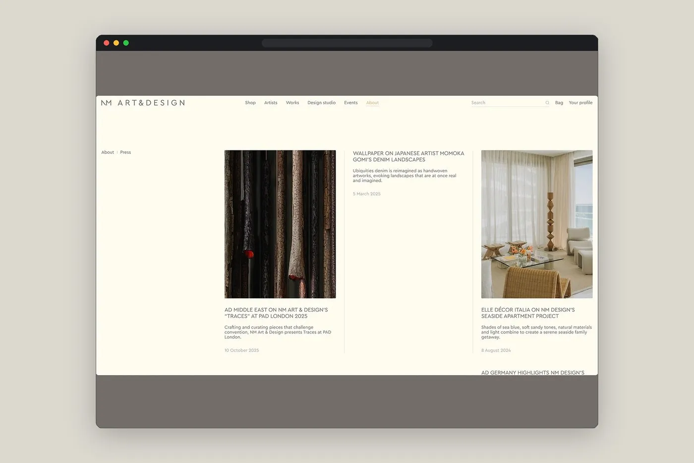
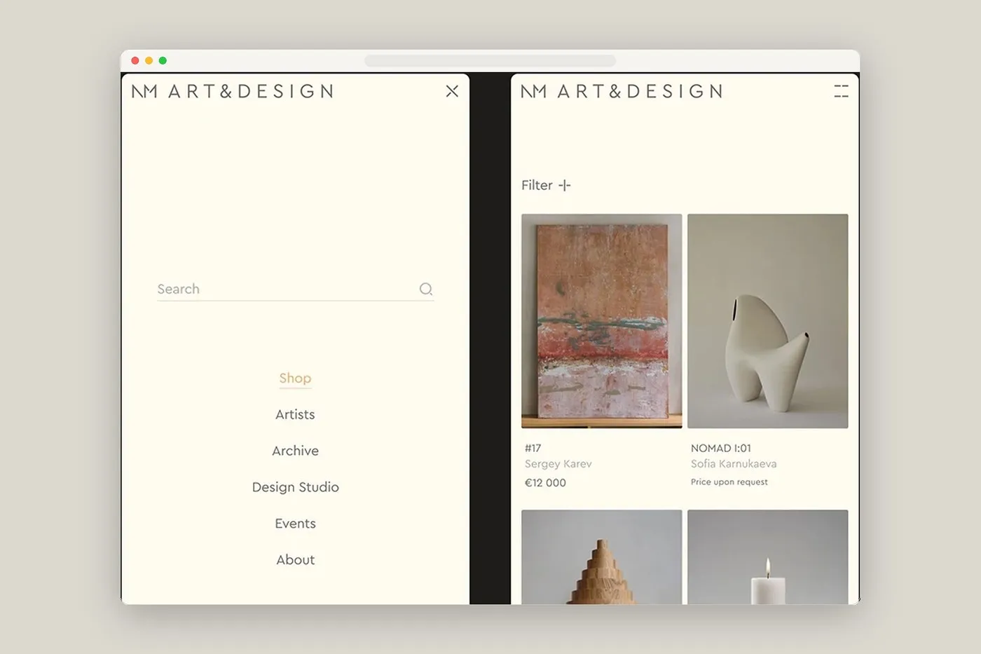
Jumping over to the desktop interface for the About | Press page, designers Danil Matlakhov and Aleona Melnikova kept things sleek with a minimalist line navigation set against a cozy warm cream background. A pop of ochre yellow underlines the active section, while subtle vertical lines split the page into asymmetrical columns featuring press highlights from major mags like AD Middle East on PAD London, Wallpaper*, and Elle Décor Italia. Everything feels breezy and spacious—zero clutter, zero clickbait. That same calm energy carries right over to the mobile experience, where artworks like Sergey Karev’s paintings or Zlata Kornilova’s wooden sculptures rest directly on the warm cream backdrop, free from tacky price tags or distracting borders.
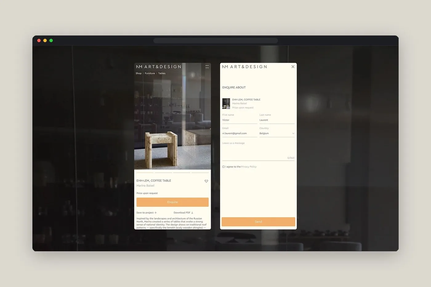
For pros hunting down technical specs, every helpful tool is placed right at their fingertips. Take Marina Baisel’s Ehh-Lem coffee table page: the product visual takes up a solid two-thirds of the mobile screen, sitting right above a bright ochre yellow “Enquire” bar. Clean, handy buttons like “Save to project +” and “Download PDF” sit just underneath, sliding open a slick request panel. It’s a super smooth transition straight from casual browsing to picking pieces for actual projects.
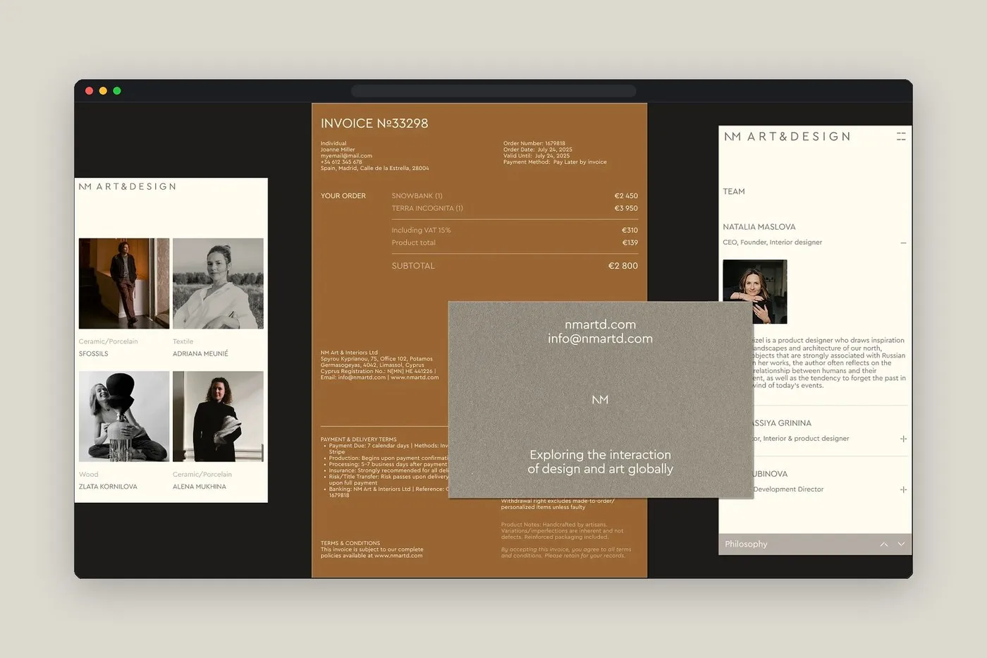
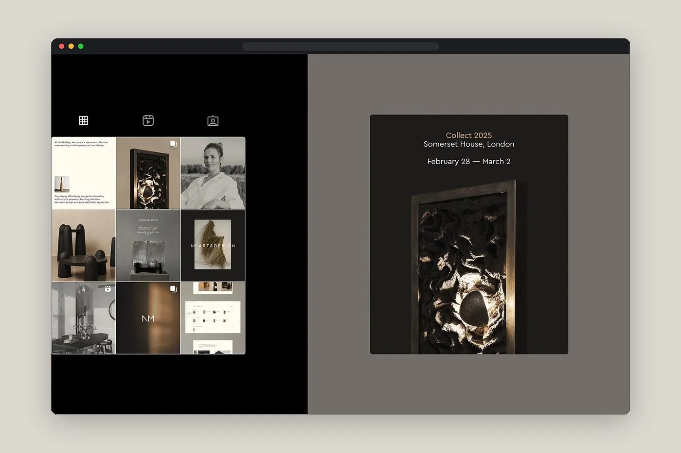
Beyond the digital realm, the UI/UX design language ties directly into the studio’s print collaterals—from rich ochre-toned order forms and stone-gray business cards to dark charcoal invitations for the Collect 2025 event at Somerset House, framing relief sculptures in all their glory.
NM Art & Design: Thiết kế nền tảng số tinh tế và tiện dụng từ ESH Gruppa
NM Art & Design là một thương hiệu hoạt động song song trong hai lĩnh vực: không gian trưng bày nghệ thuật đương đại và studio thiết kế nội thất. Chính vì vậy, trang web của họ cần phải phục vụ mượt mà hai nhóm người dùng có nhu cầu hoàn toàn trái ngược: các nhà sưu tầm thích thong thả thưởng thức tác phẩm và các nhà thiết kế nội thất luôn cần làm việc gấp rút theo tiến độ dự án. Đội ngũ ESH Gruppa, dưới sự chỉ đạo của giám đốc nghệ thuật thương hiệu Stefan Lashko và giám đốc sáng tạo web Violetta Postnova, đã giải quyết bài toán này bằng cách kết hợp không khí yên bình của triển lãm với tính năng tài khoản PRO chuyên biệt để quản lý bộ sưu tập dự án.
Sự tinh tế thể hiện ngay từ chi tiết monogram do nhà thiết kế Kirill Turygin tinh chỉnh. Bằng cách làm dày các nét chữ màu xám vốn mỏng mảnh và tạo các khe hở chéo nhỏ ở thân chữ N cũng như đỉnh chữ M, biểu tượng mới giữ được độ rõ nét, không bị nhòe ngay cả khi hiển thị ở kích thước rất nhỏ trên header.
Bước vào giao diện máy tính ở trang About | Press, hai nhà thiết kế Danil Matlakhov và Aleona Melnikova duy trì thanh điều hướng tối giản dạng đường kẻ mảnh trên nền màu kem ấm áp. Một đường gạch chân màu vàng ochre đánh dấu phần nội dung đang xem, trong khi các đường kẻ dọc mảnh chia trang thành các cột bất đối xứng để trưng bày bài viết từ các tạp chí như AD Middle East trên PAD London, Wallpaper*, hay Elle Décor Italia. Mọi chi tiết đều nhẹ nhàng, không hề chen chúc hay cố tình giật gân để kéo click. Tinh thần thiết kế này tiếp tục xuất hiện ở bản di động, nơi các tác phẩm như tranh vẽ của Sergey Karev hay tượng gỗ của Zlata Kornilova được đặt trực tiếp trên nền kem mà không bị ảnh hưởng bởi đường viền hay thẻ rác giá tiền.
Đối với những chuyên gia cần tra cứu thông số kỹ thuật, các công cụ hỗ trợ được đặt ở những vị trí vô cùng thuận tay. Chẳng hạn trên màn hình chiếc bàn cà phê Ehh-Lem của Marina Baisel, hình ảnh sản phẩm chiếm trọn 2/3 khung hình di động, ngay phía trên thanh Enquire màu vàng ochre. Các nút bấm gọn gàng như “Save to project +” và “Download PDF” nằm ngay bên dưới, mở ra một bảng trượt gửi yêu cầu rất tinh gọn. Đây là một bước chuyển tiếp trực tiếp và liền mạch từ việc ngắm nghía sang bước lựa chọn sản phẩm cho công trình.
Bên cạnh giao diện số, ngôn ngữ thiết kế UI/UX còn kết nối chặt chẽ với các ấn phẩm vật lý của studio — bao gồm hóa đơn đặt hàng sắc nâu ochre, danh thiếp màu xám đá và bộ thiệp mời sự kiện Collect 2025 tại Somerset House với tông màu than đậm tôn lên vẻ đẹp của các tác phẩm điêu khắc nổi.