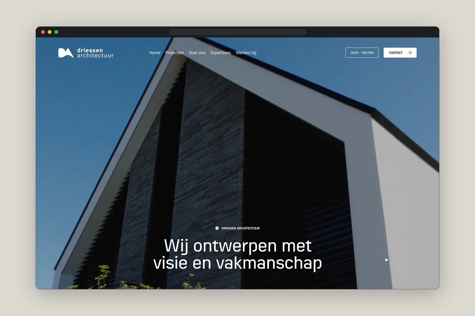

Driessen Architectuur: Where Architectural Thinking Meets Swiss Grid Design Instead of going crazy with complex WebGL effects or heavy scroll-jacking like so many other architecture sites, Netherlands-based studio Driessen Architectuur takes a delightfully minimal and authentic approach. Featured on Minimal Gallery, this project hits all the right notes with a calm, meticulous design that steps back to let space and light take center stage.
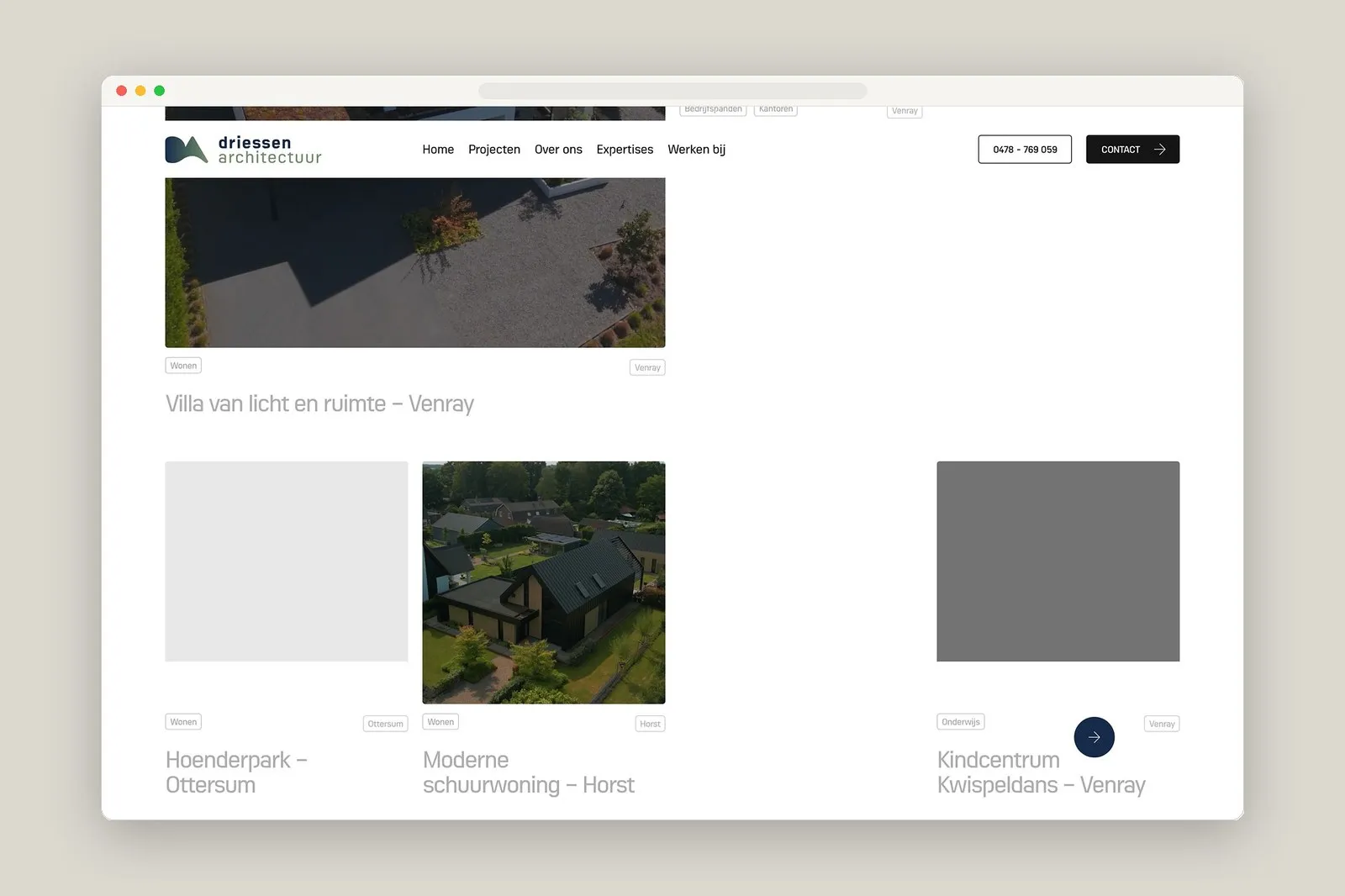
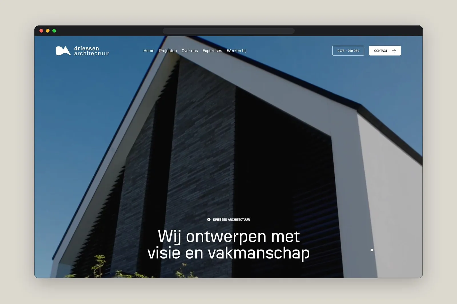
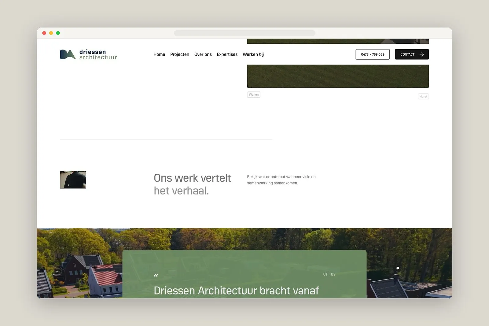
The grid system is the absolute backbone of the whole layout. Delicate hairline borders and generous margins divide the browser window into clean, distinct columns, echoing classic architectural floor plans and elevations. Up top, a minimalist grotesk typeface stays pinned in the navigation bar, keeping the header wonderfully airy so project imagery can shine the second the page loads.
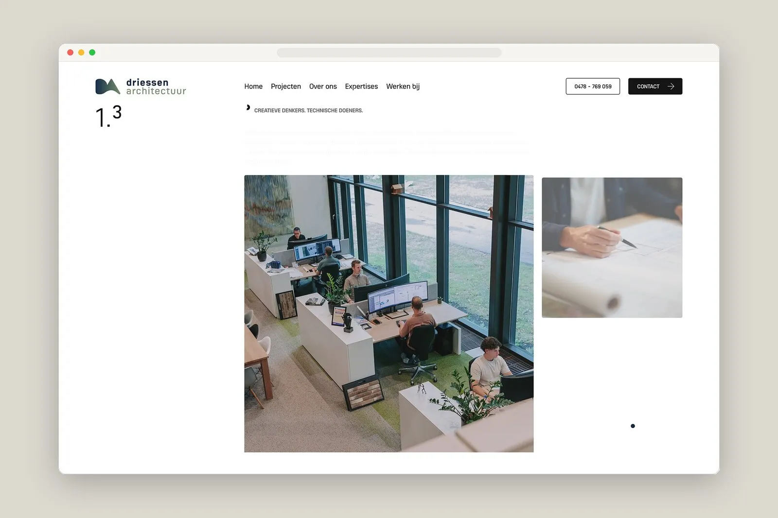
Browsing through the project catalog and info tables reveals a super restrained, tasteful aesthetic. Tiny sans-serif labels with tight tracking sit neatly aligned on a baseline grid, giving off serious high-end Swiss monograph vibes. Hover effects transition seamlessly, shifting focus smoothly without any distracting flicker or jitter. Plus, large-scale architectural photography set against warm stone and crisp off-white backgrounds beautifully preserves the full depth and shadows of natural materials like brick, wood, and concrete.
This obsessive attention to detail carries right over to mobile. Even when scaled down to a compact phone screen, the typographic hierarchy and spatial proportions stay rock solid. Vertical image frames stack neatly along the left margin while technical specs remain effortlessly readable, even at tiny font sizes. That kind of flawless responsiveness speaks to a tight, disciplined design system built right from the Figma stage. Proof that a stunning architecture site doesn’t need wild animations—column ratios, negative space, and visual rhythm do all the heavy lifting.
Driessen Architectuur: Khi tư duy kiến trúc và hệ lưới Swiss gặp nhau trên website
Thay vì gây chú ý bằng hiệu ứng WebGL phức tạp hay scroll-jacking nặng nề như nhiều trang web kiến trúc khác, studio Driessen Architectuur tại Hà Lan lại chọn một hướng đi tối giản và nguyên bản hơn. Dự án xuất hiện trên Minimal Gallery này ghi điểm nhờ lối thiết kế điềm tĩnh, chỉn chu, nhường lại toàn bộ điểm nhìn cho không gian và ánh sáng.
Hệ thống lưới (grid) chính là xương sống của toàn bộ giao diện. Những đường hairline mảnh cùng khoảng chừa lề (margin) rộng rãi chia khung hình trình duyệt thành các cột phân định rõ ràng, gợi liên tưởng đến cấu trúc mặt bằng và mặt đứng trong kiến trúc. Font chữ grotesk tối giản được đính cố định ở thanh điều hướng phía trên, giữ cho phần header luôn thoáng đãng và giúp hình ảnh dự án tỏa sáng ngay từ khi tải trang.
Nhìn vào phần danh mục dự án và bảng thông tin, phong cách thể hiện rất tiết chế. Các nhãn chữ sans-serif nhỏ với tracking hẹp nằm gọn gàng trên hệ đường gióng (baseline grid), tạo cảm giác chỉn chu hệt như một cuốn sách monograph chuẩn Thụy Sĩ. Hiệu ứng hover khi di chuyển qua các mục diễn ra mượt mà, chuyển đổi trọng tâm mà không tạo cảm giác giật hay nhấp nháy. Bên cạnh đó, các bức ảnh chụp kiến trúc khổ lớn đặt trên nền đá ấm và trắng xám giúp giữ trọn vẹn độ sâu bóng đổ của các chất liệu tự nhiên như gạch, gỗ và bê tông.
Sự tỉ mỉ này còn thể hiện rõ ở khả năng hiển thị linh hoạt trên thiết bị di động. Dù giao diện thu về màn hình điện thoại nhỏ hẹp, thứ bậc thị giác (typographic hierarchy) và tỷ lệ khoảng cách vẫn giữ nguyên vẹn như bản máy tính. Các khung ảnh xếp dọc căn thẳng theo lề trái, trong khi phần thông số kỹ thuật vẫn dễ đọc ở cỡ chữ nhỏ. Cách vận hành chuẩn xác này chứng tỏ một tư duy thiết kế hệ thống chặt chẽ ngay từ bước dựng file trên Figma. Một website kiến trúc ấn tượng không nhất thiết phải cần đến những chuyển động cầu kỳ, bởi chính tỷ lệ cột, khoảng trống và nhịp điệu hình ảnh đã đủ sức tạo nên điểm tựa cho giao diện.