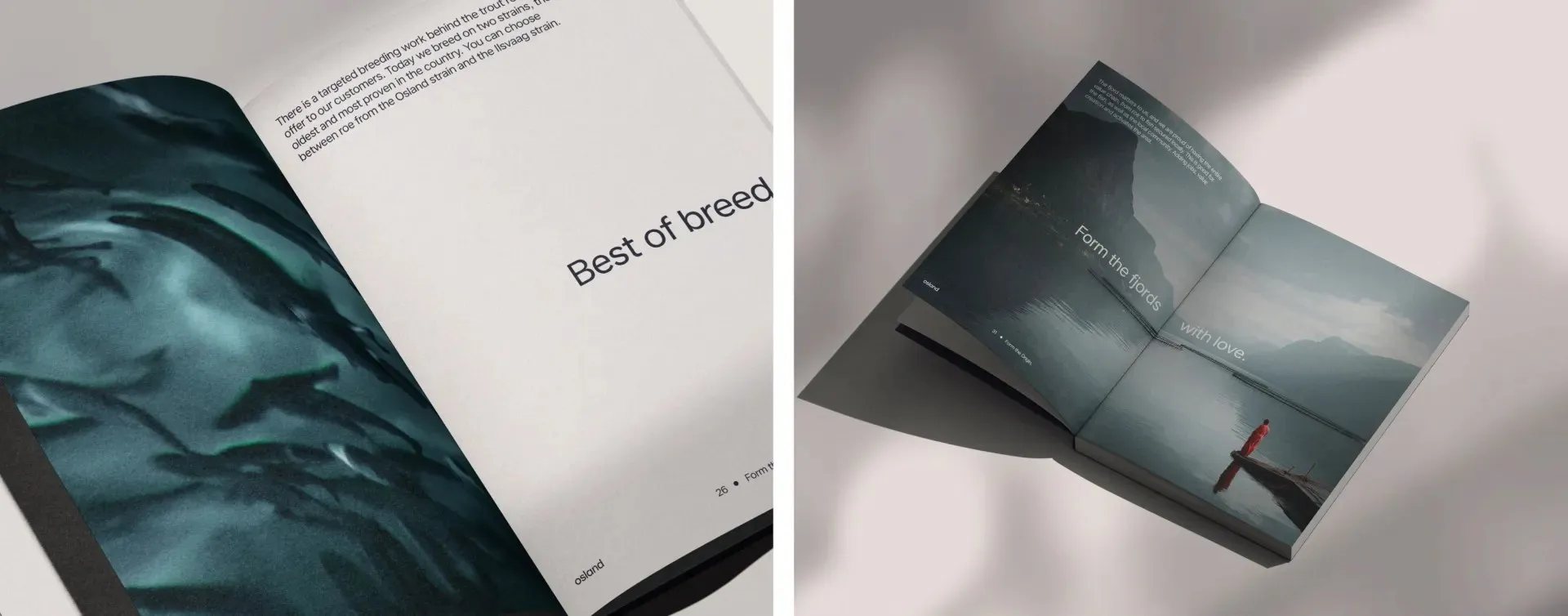
Osland Rebrand: How Biology Became the Language of Brand Design Founded back in 1963, Osland holds the title of Norway’s oldest broodstock salmon producer. To capture both their massive industry heritage and their scientific rigor, design agency KIND crafted a standout brand identity that snagged a Gold award at the 2026 European Design Awards.
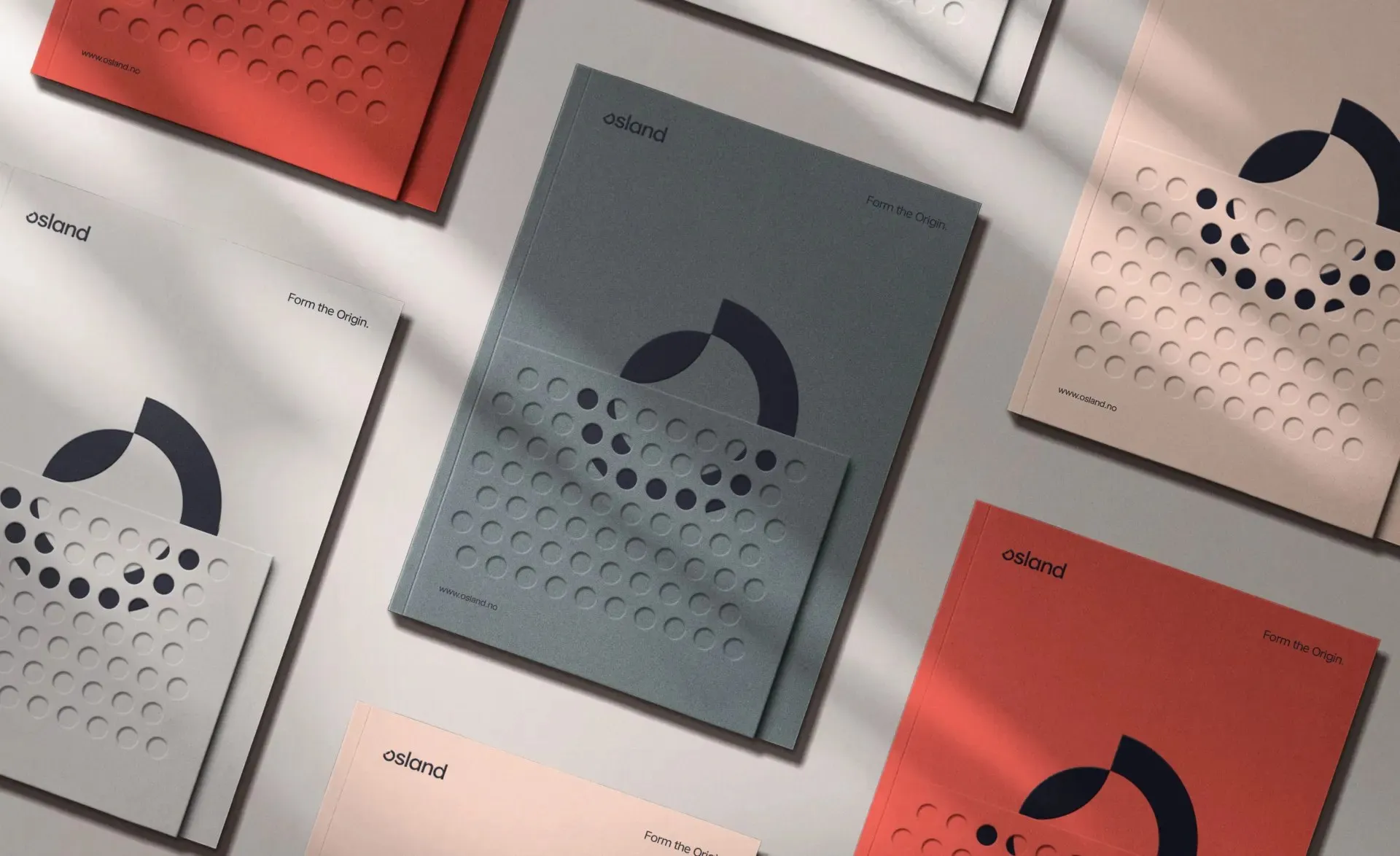
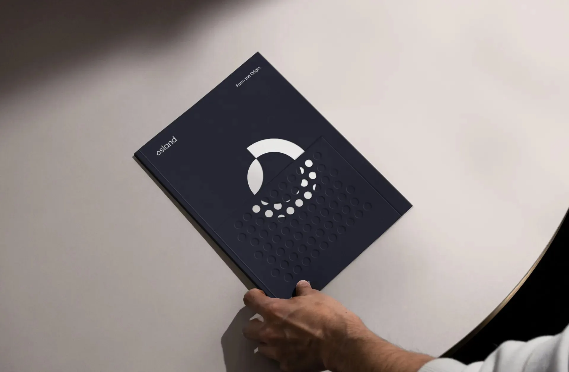
The core concept dives straight into biology: smooth circular forms inspired by salmon eggs, DNA strands, and the natural silhouette of a fish. The main icon features a dynamic, fluid ring with an open arc intersecting a second curve, paired with a subtle trail of floating dots mimicking salmon eggs. This circular motif translates seamlessly at every scale—from the main logo and debossed folder covers all the way to the sweeping architectural layout of their fjord-side facility seen from the sky.
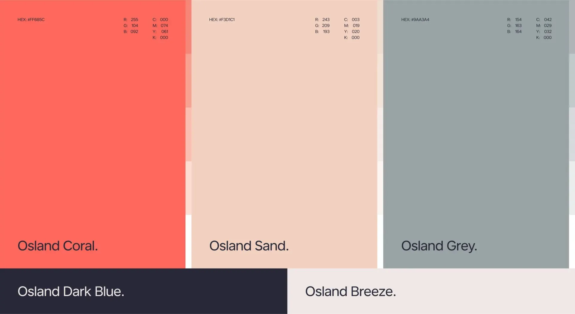
The color palette pairs a vivid coral red (representing biology) with deep ocean blue (symbolizing water), grounded by warm sand and cool grey tones to keep the overall look precise, sharp, and scientific.
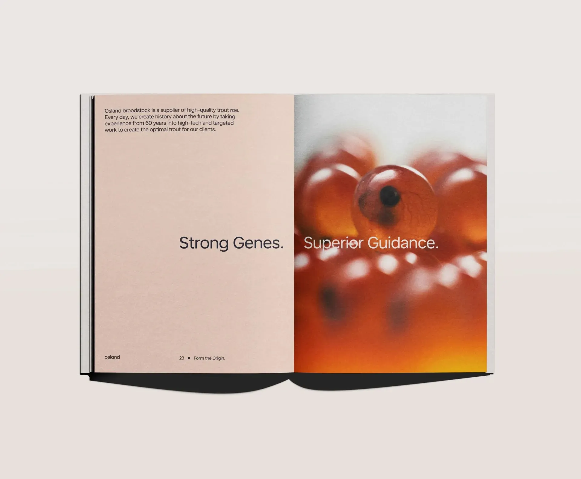
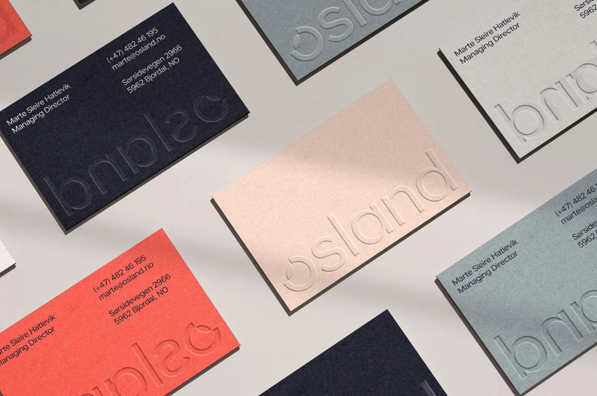
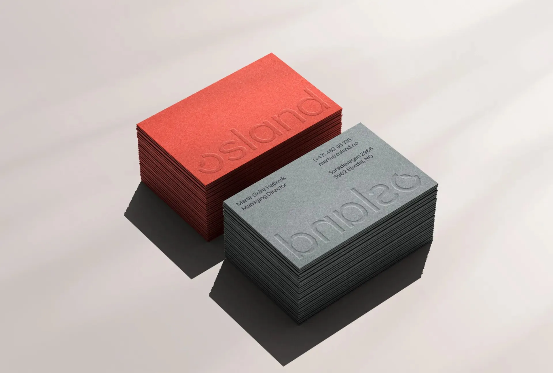
For the wordmark, a clean, understated lowercase grotesque typeface keeps things modest, letting the logomark take center stage. On business cards, the text is blind-embossed to let the luxurious paper texture take the spotlight. The brand voice stays punchy and direct with confident taglines like Strong Genes. and Superior Guidance., anchored by the overarching narrative From becomes Form—turning decades of expertise into future-focused value.
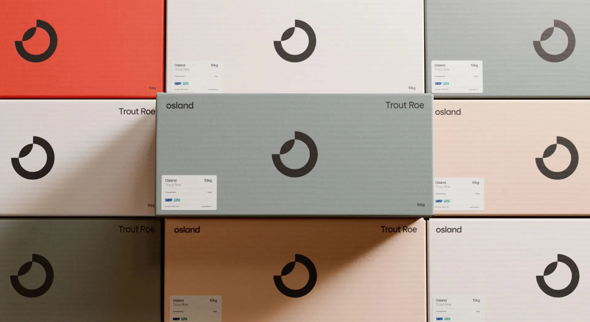
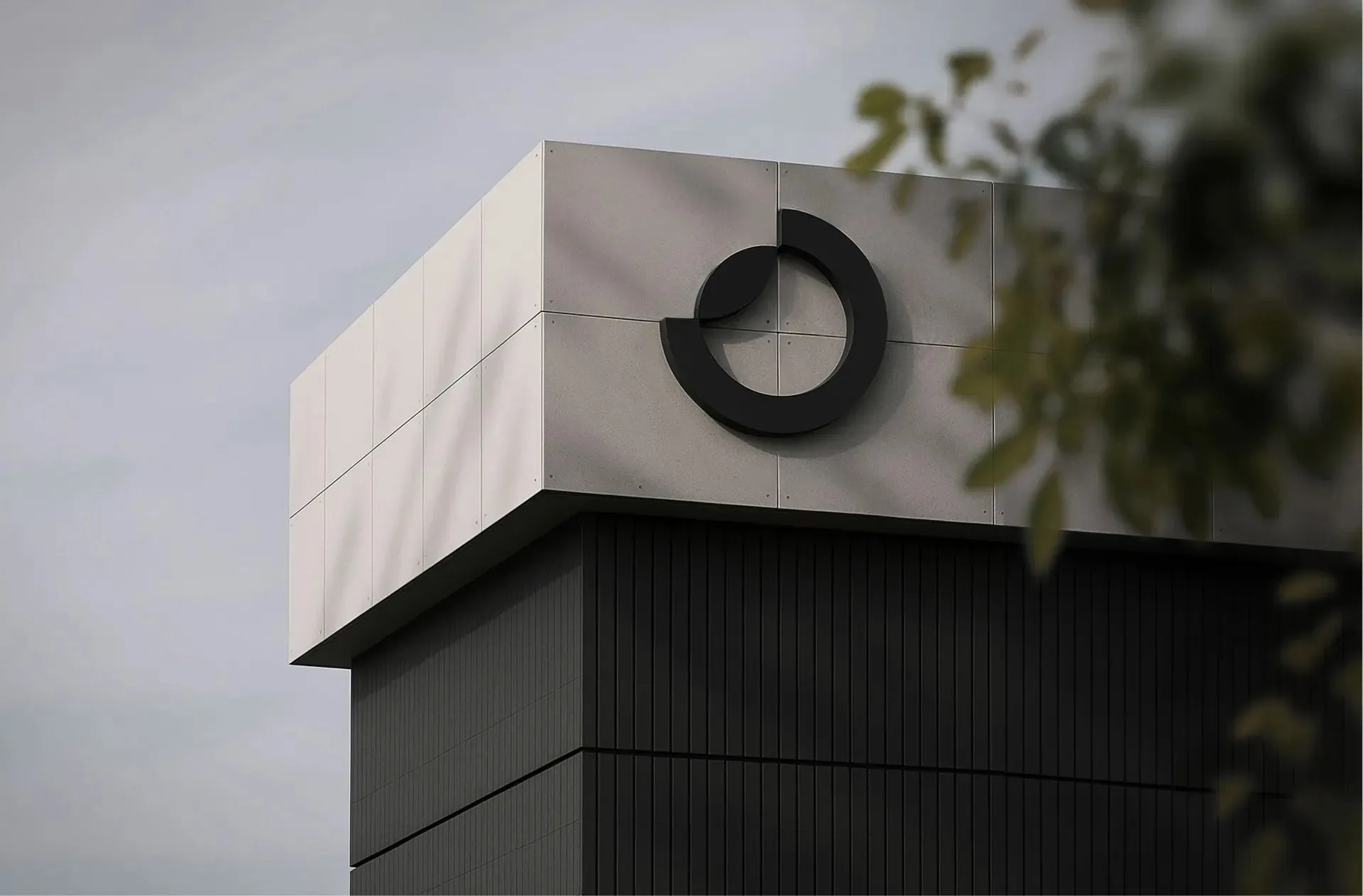
Production execution is top-notch across every touchpoint: business cards are printed in Osland Coral, Sand, Grey, Dark Blue, and Breeze; salmon egg boxes utilize a structured grid layout; concrete signage scales the emblem up to impressive architectural proportions; and the website turns heads with stunning macro photography of coral-hued salmon eggs.
Check out full project details at kindworldwide.com/work/osland/.
Osland Rebrand: Khi Sinh Học Trở Thành Ngôn Ngữ Thiết Kế Thương Hiệu
Thành lập từ năm 1963, Osland là đơn vị sở hữu đàn cá hồi giống lâu đời nhất tại Na Uy. Để thể hiện được cả tầm vóc doanh nghiệp lẫn yếu tố khoa học, studio KIND đã tạo nên một bộ nhận diện thương hiệu vừa giành giải Vàng tại European Design Awards 2026.
Ý tưởng cốt lõi của thiết kế xuất phát từ chính sinh học: các hình khối tròn lấy cảm hứng từ trứng cá hồi, chuỗi DNA và vóc dáng của con cá. Biểu tượng chính là một vòng tròn mang tính chuyển động với một cung tròn mở giao với nét cong thứ hai, đi kèm chuỗi chấm nhỏ tựa như những hạt trứng cá đang trôi. Hình tròn này xuất hiện nhất quán ở mọi quy mô, từ logo, họa tiết dập trên bìa tài liệu, cho đến đường cong kiến trúc của khu nhà xưởng ven vịnh nhìn từ trên cao.
Bảng màu của dự án sử dụng sắc đỏ san hô đại diện cho sinh học, xanh biển sâu tượng trưng cho nước, cùng các tông màu cát và xám giúp tổng thể giữ được nét chuẩn xác, rõ ràng thay vì quá mơ mộng.
Phần wordmark sử dụng kiểu chữ grotesque viết thường osland với nét chữ nhẹ nhàng, đặt khiêm tốn để nhường điểm nhấn cho biểu tượng. Trên danh thiếp, chữ được dập nổi không dùng mực (blind-embossed) để tôn lên chất liệu giấy. Ngôn ngữ truyền thông đi theo hướng ngắn gọn với các câu dứt khoát như Strong Genes. hay Superior Guidance., cùng thông điệp From becomes Form chuyển hóa kinh nghiệm lâu năm thành giá trị tương lai.
Khâu sản xuất được hoàn thiện tỉ mỉ trên từng điểm chạm: các mẫu danh thiếp dùng các màu Osland Coral, Sand, Grey, Dark Blue và Breeze; vỏ hộp đựng trứng cá bố trí logo theo dạng lưới cứng cáp; bảng hiệu bê tông phóng đại biểu tượng theo quy mô kiến trúc; trong khi giao diện website gây ấn tượng với hình ảnh chụp macro cận cảnh trứng cá hồi màu san hô.
Xem thêm chi tiết dự án từ kindworldwide.com/work/osland/.