Studio Marcus Kraft’s Unique Visual Identity for Klangwelt Toggenburg When sound comes to mind, eardrums or audio waves usually spring up first, but Studio Marcus Kraft reimagined the concept of resonance into a remarkably intuitive brand identity system for Klangwelt Toggenburg. At the heart of the project sits a dynamic typeface where letters shift, drift, and ripple like sound bouncing across the Swiss Alps.
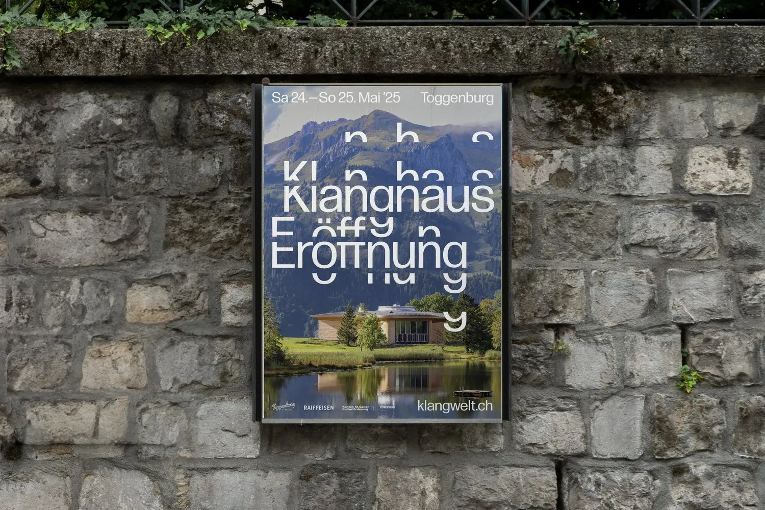
The key visual makes a dramatic statement with an oversized white wordmark floating across the backdrop of the Toggenburg valley. Letterforms break into repeating modular fragments, echoing harmonics, audio frequencies, and the natural contour lines of the mountainous terrain. Keeping things super sleek, the color palette stays intentionally minimal with black typography on crisp white paper, giving center stage to full-spectrum photography filled with deep valley blues and alpine stone grays. This clever concept earned the studio a Silver at the European Design Awards 2026, a Silver at ADC Switzerland, and a Certificate of Typographic Excellence from TDC Tokyo.
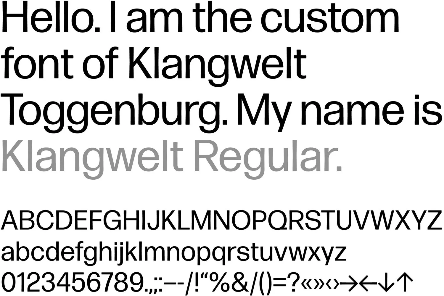
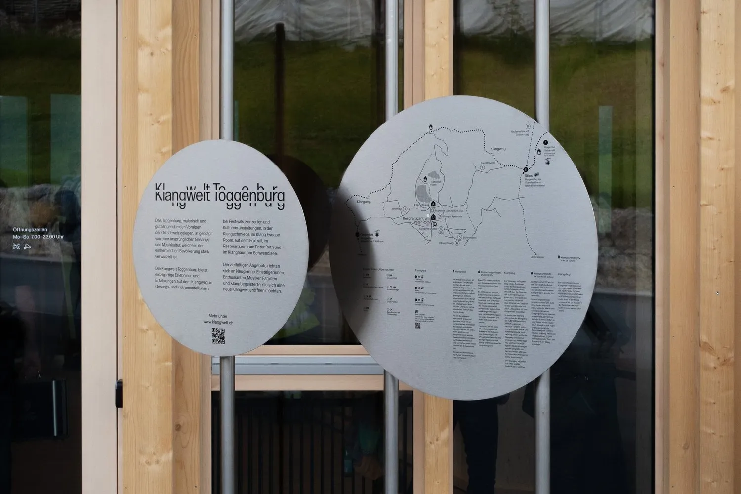
The custom headline font developed for this brand is Klangwelt Regular, beautifully engineered by David Jonathan Ross. It is a neat, tightly closed grotesque typeface that feels wonderfully grounded. By pulling apart structural fragments from letters like K, g, and y, headlines can stretch, expand, or scatter with total flexibility while remaining crystal clear to read. This design language flows smoothly across every touchpoint—from the primary wordmark and circular steel trail signage along the Klangweg experience path to video trailers.
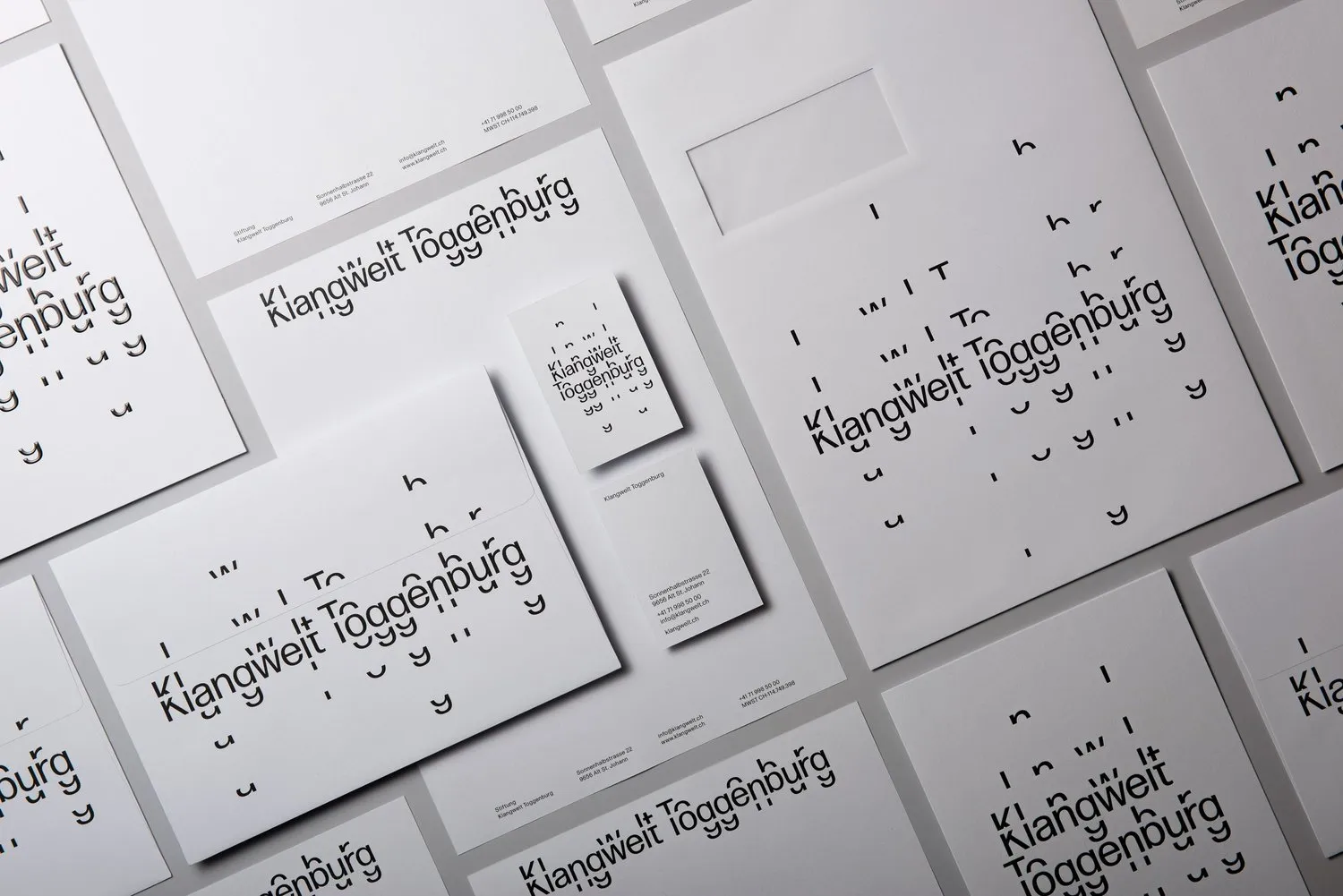
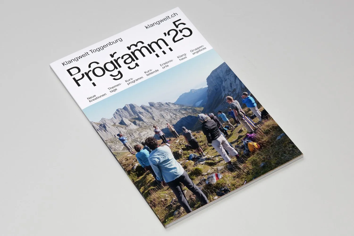
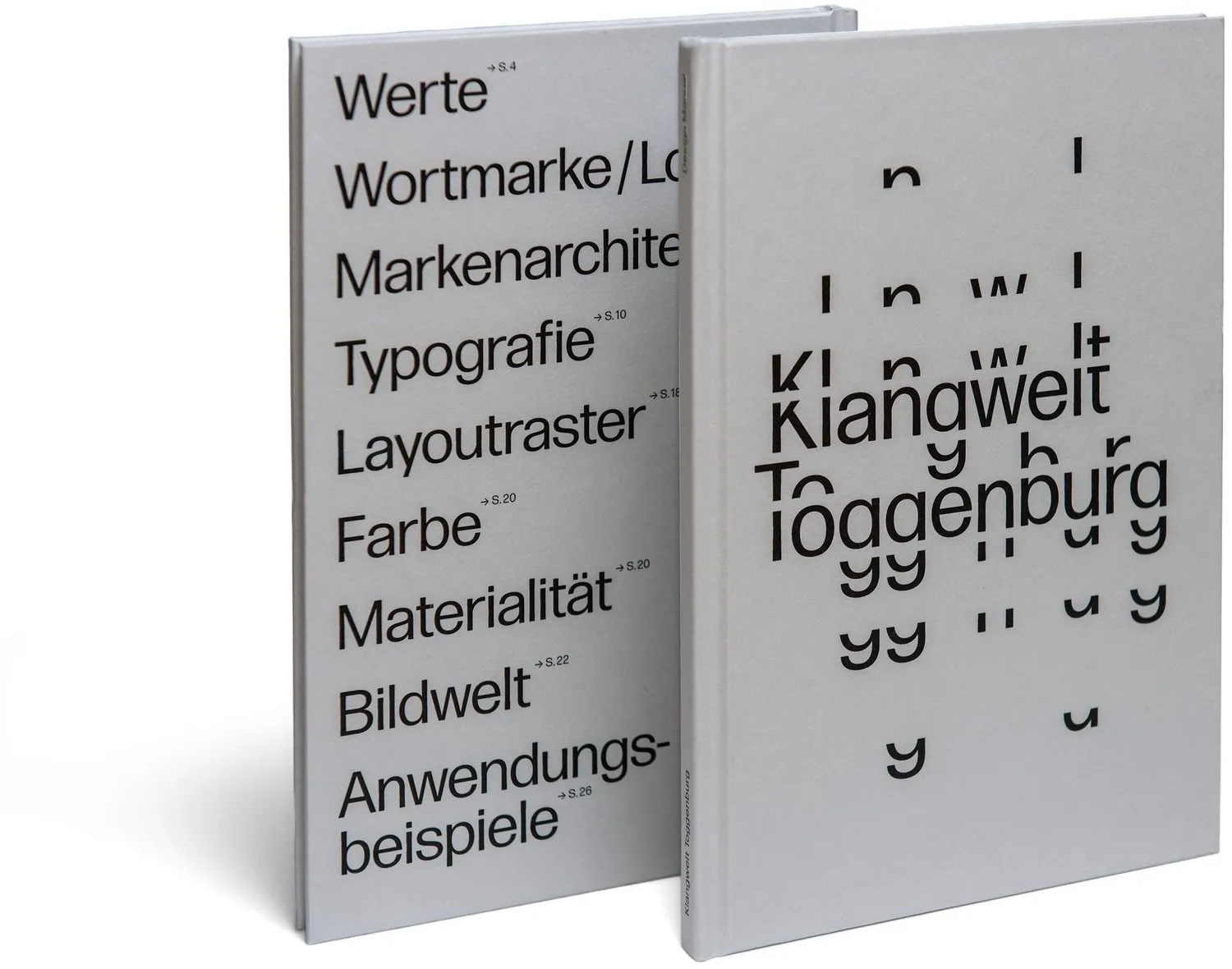
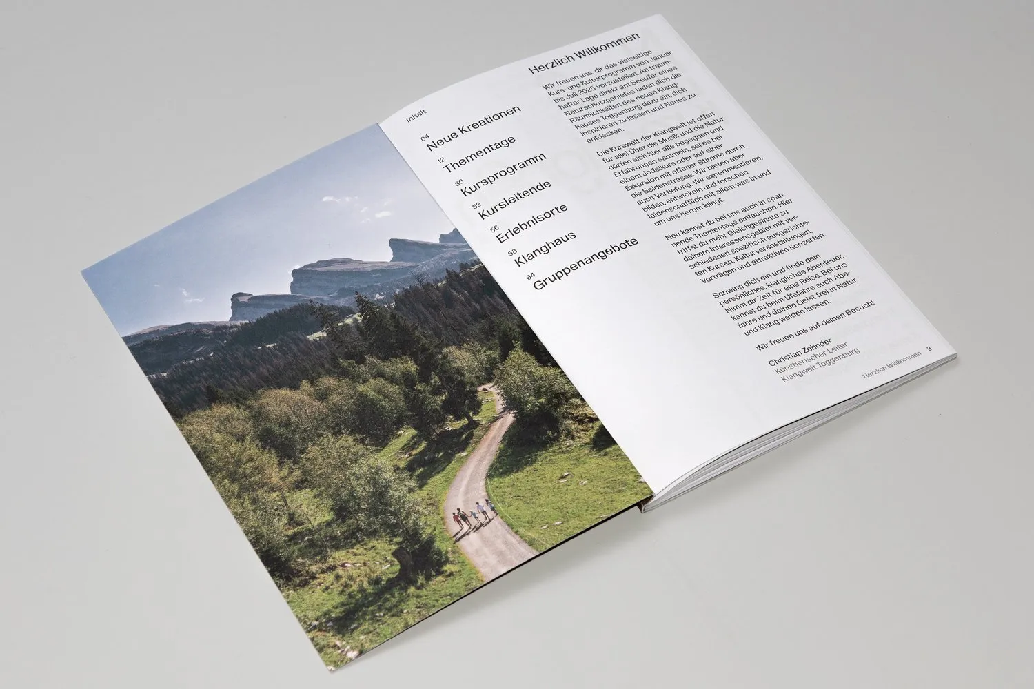
On the print side, all materials rely on clean, uncoated white paper stock. The office stationery suite—featuring business cards, letterheads, and envelopes—incorporates subtly scattered typographic accents. The comprehensive brand manual comes beautifully bound in two volumes, meticulously spelling out guidelines for brand values, typography, grid layouts, color palettes, and paper textures. Meanwhile, the “Programm ’25” brochure brings extra flair by pairing playful headline variations with immersive, full-bleed imagery of the valley.
Rounding out the visual system is a fresh website crafted by vitamin 2, energetic motion design by Miriam Palopoli, and a custom audio logo by Christian Zehnder. The rollout kicked off when the Klangweg trail reopened in 2024 and officially reached full realization with the grand opening of the Klanghaus space in 2025.
More details and high-resolution visuals are available at www.marcuskraft.com/projects/klangwelt.
Studio Marcus Kraft và bộ nhận diện độc đáo cho Klangwelt Toggenburg
Nói đến âm thanh thì nhiều người thường nghĩ tới màng nhĩ hay sóng nhạc, nhưng Studio Marcus Kraft lại biến khái niệm tiếng vang thành một hệ thống nhận diện thương hiệu vô cùng trực quan cho Klangwelt Toggenburg. Trọng tâm của dự án nằm ở một bộ chữ động, nơi các ký tự có thể dịch chuyển và lan tỏa tựa như âm thanh giữa những dãy núi Alps.
Hình ảnh chủ đạo của dự án gây ấn tượng với phần wordmark màu trắng kích thước lớn phủ trên thung lũng Toggenburg. Các chữ cái bị tách thành nhiều mảnh lặp lại, tái hiện hình ảnh họa âm, tần số sóng âm và cả đường đồng mức của địa hình núi đồi. Bảng màu được chủ đích giữ ở mức tối giản với chữ đen trên nền giấy trắng, nhường sân diễn cho những bức ảnh thiên nhiên mang tông xanh và xám đá của thung lũng. Thiết kế này đã mang về cho studio giải Bạc tại European Design Awards 2026, giải Bạc ADC Switzerland và Bằng chứng nhận từ TDC Tokyo.
Bộ chữ custom dùng trong dự án có tên là Klangwelt Regular, được kỹ thuật hóa bởi David Jonathan Ross. Đây là kiểu chữ grotesque gọn gàng với nét khép chặt, tạo cảm giác chắc chắn. Bằng cách tách các mảnh yếu tố từ những chữ cái như K, g hay y, phần tiêu đề có thể co giãn hay phân tán linh hoạt mà vẫn giữ nguyên độ dễ đọc. Ngôn ngữ thiết kế này xuất hiện xuyên suốt từ wordmark, đĩa thép chỉ đường trên tuyến đường trải nghiệm Klangweg cho tới các video trailer.
Mọi ấn phẩm in ấn đều sử dụng giấy uncoated màu trắng. Bộ văn phòng phẩm bao gồm danh thiếp, tiêu đề thư và phong bì đều mang nét chữ phân tán nhẹ nhàng. Cẩm nang thiết kế được đóng thành 2 tập chỉn chu, liệt kê rõ ràng các quy chuẩn từ giá trị thương hiệu, bộ chữ, hệ thống lưới cho tới màu sắc và chất liệu. Trong khi đó, cuốn brochure “Programm ’25” lại tạo điểm nhấn bằng cách kết hợp các tiêu đề biến tấu cùng hình ảnh thung lũng chụp tràn viền.
Hệ thống nhận diện được hoàn thiện nhờ trang web mới do vitamin 2 phát triển, các hiệu ứng chuyển động do Miriam Palopoli thực hiện và logo âm thanh từ Christian Zehnder. Quá trình triển khai bắt đầu khi tuyến đường Klangweg mở cửa lại vào năm 2024 và chính thức ra mắt trọn vẹn cùng sự kiện khai trương không gian Klanghaus vào năm 2025.
Bạn có thể xem thêm các hình ảnh chi tiết từ www.marcuskraft.com/projects/klangwelt.