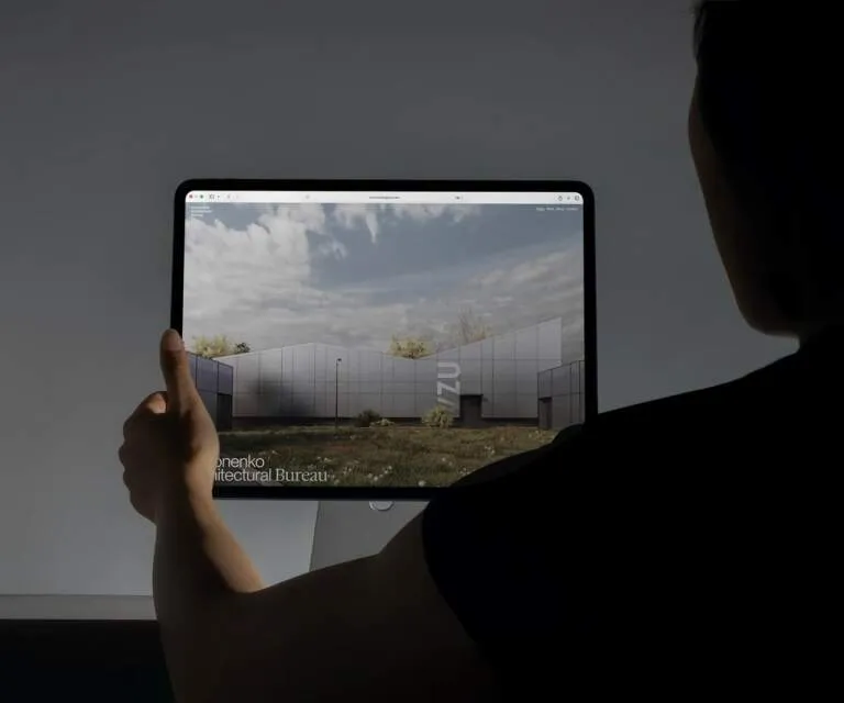
Auren: When Architectural Thinking Meets Web Design by Tubik Studio Auren specializes in minimalist residential and workspace design, putting natural materials and spatial balance front and center. To bring that calm, grounded vibe into the digital world, Artem Meshkov and the team at Tubik Studio created a beautifully serene web interface that prioritizes overall architectural structure over flashy decorative clutter.
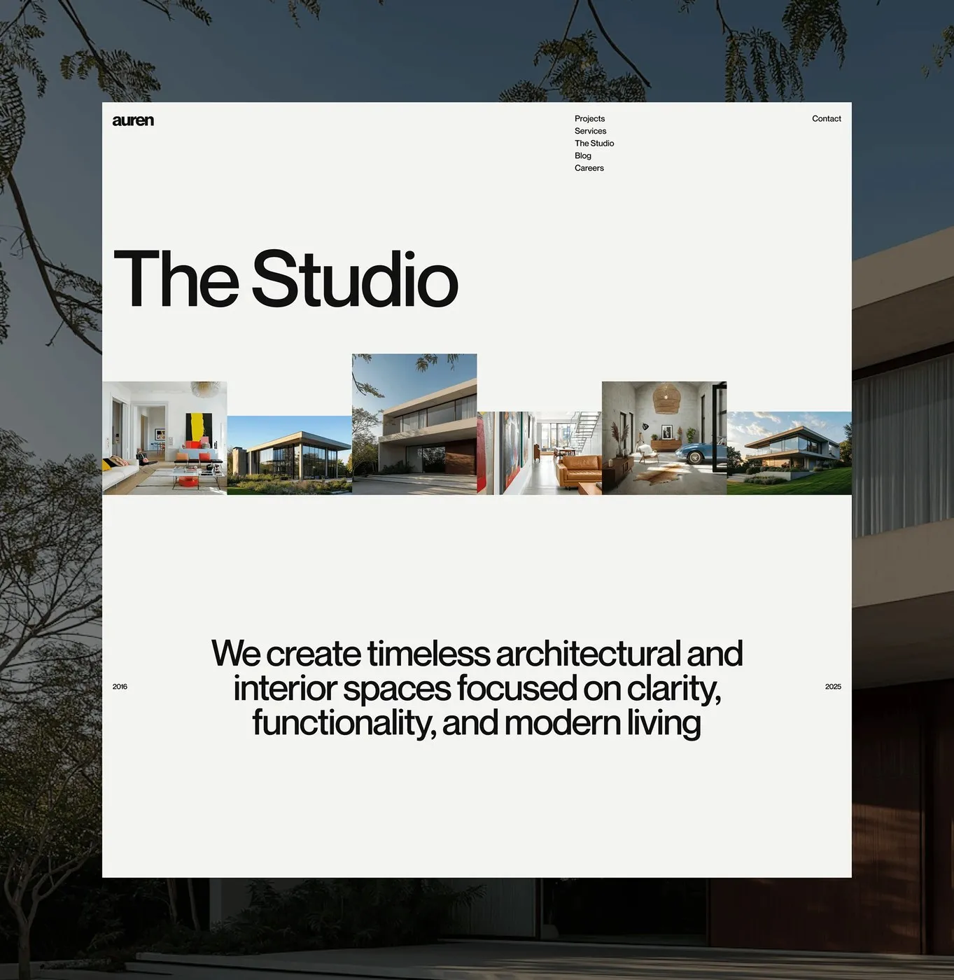
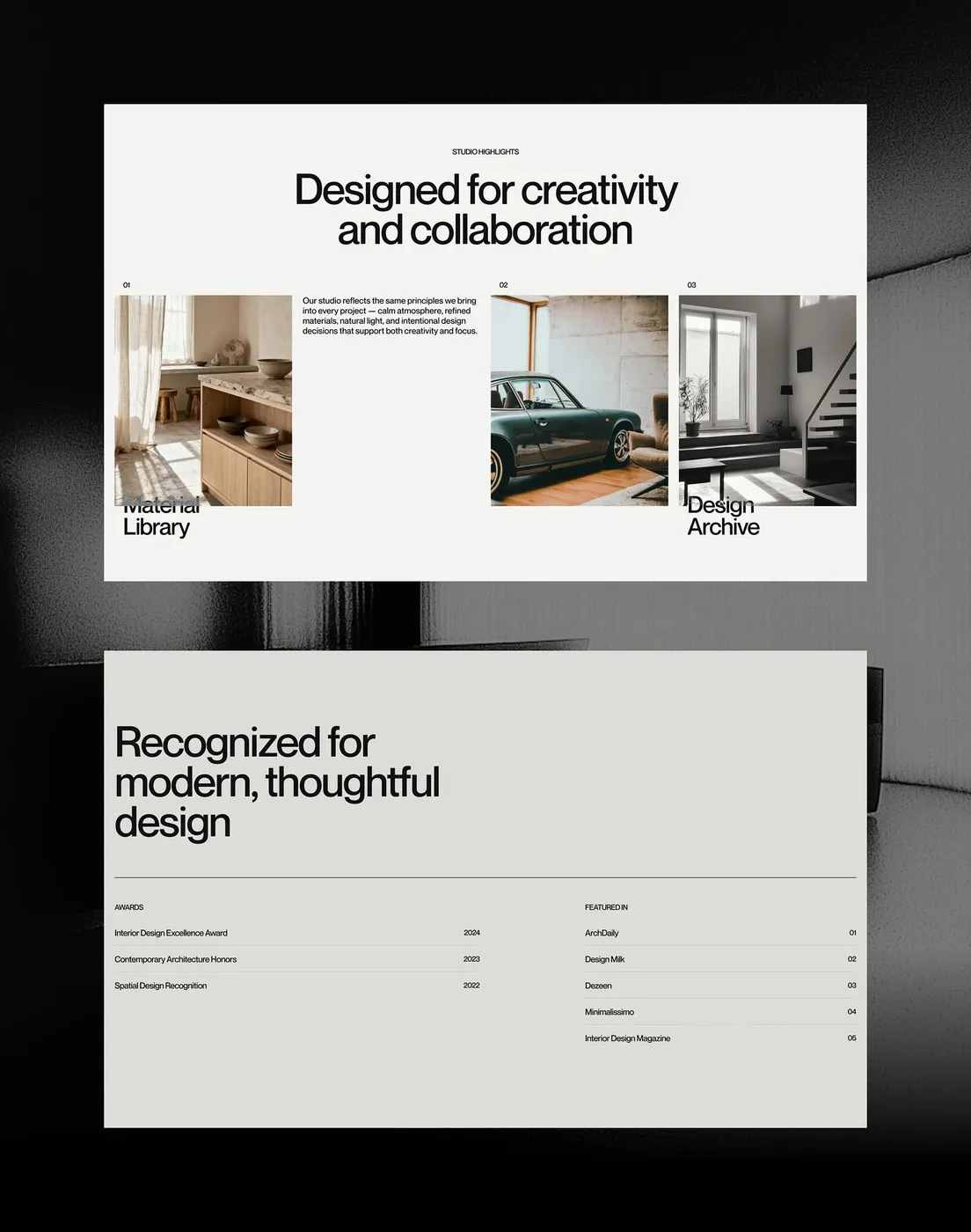
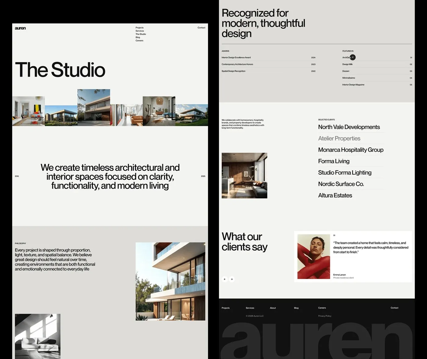
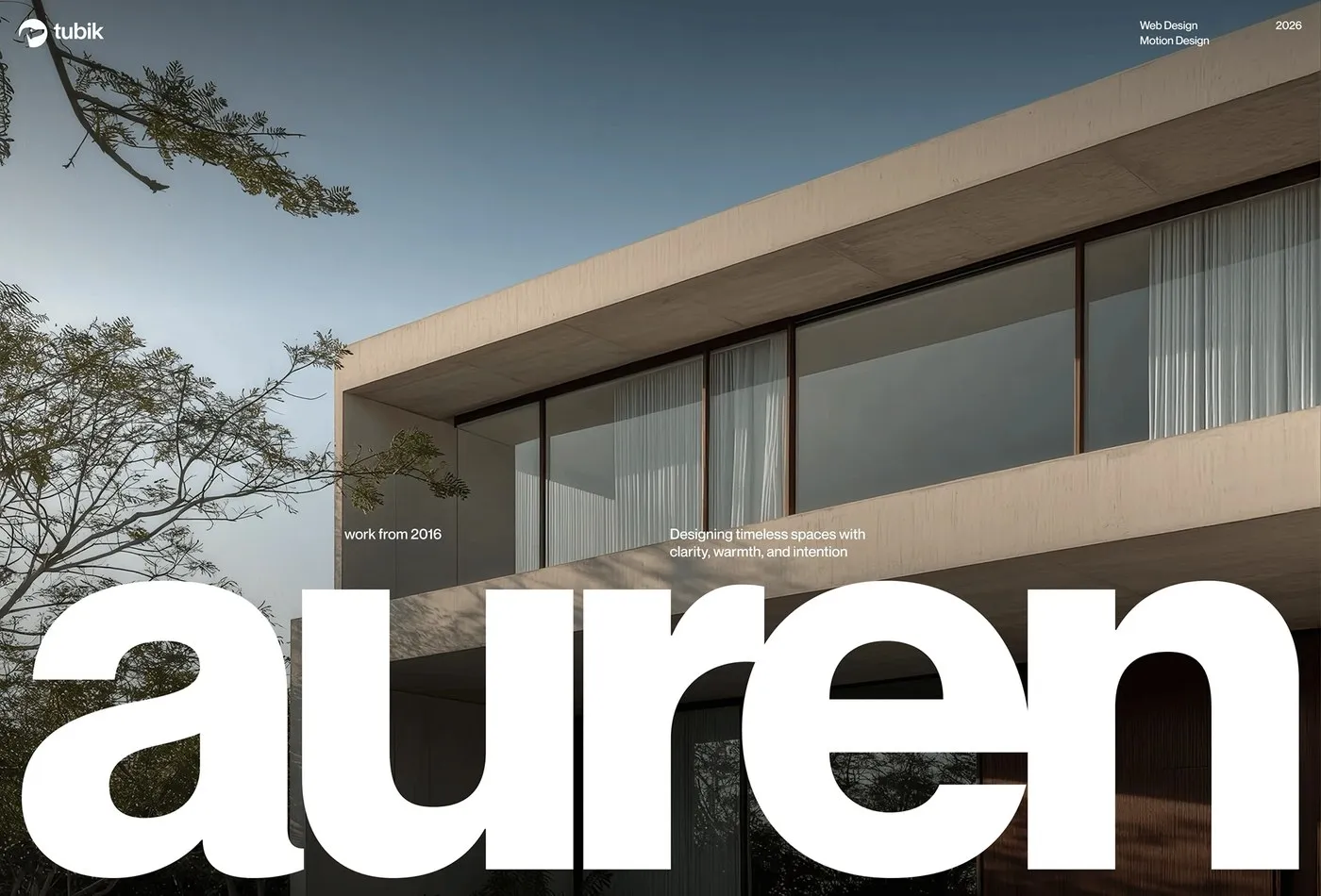
The layout creates a dynamic visual rhythm through a playful interplay of large-scale imagery and open white space. Crisp photography of modern concrete villas sits effortlessly against warm bone and light gray backdrops. Rather than overcrowding the screen with elements, the interface offers just the right amount of breathing room. Anchoring the design is a bold, lowercase wordmark resting right along the bottom edge, serving as a solid foundation that effortlessly guides the viewer’s eye.
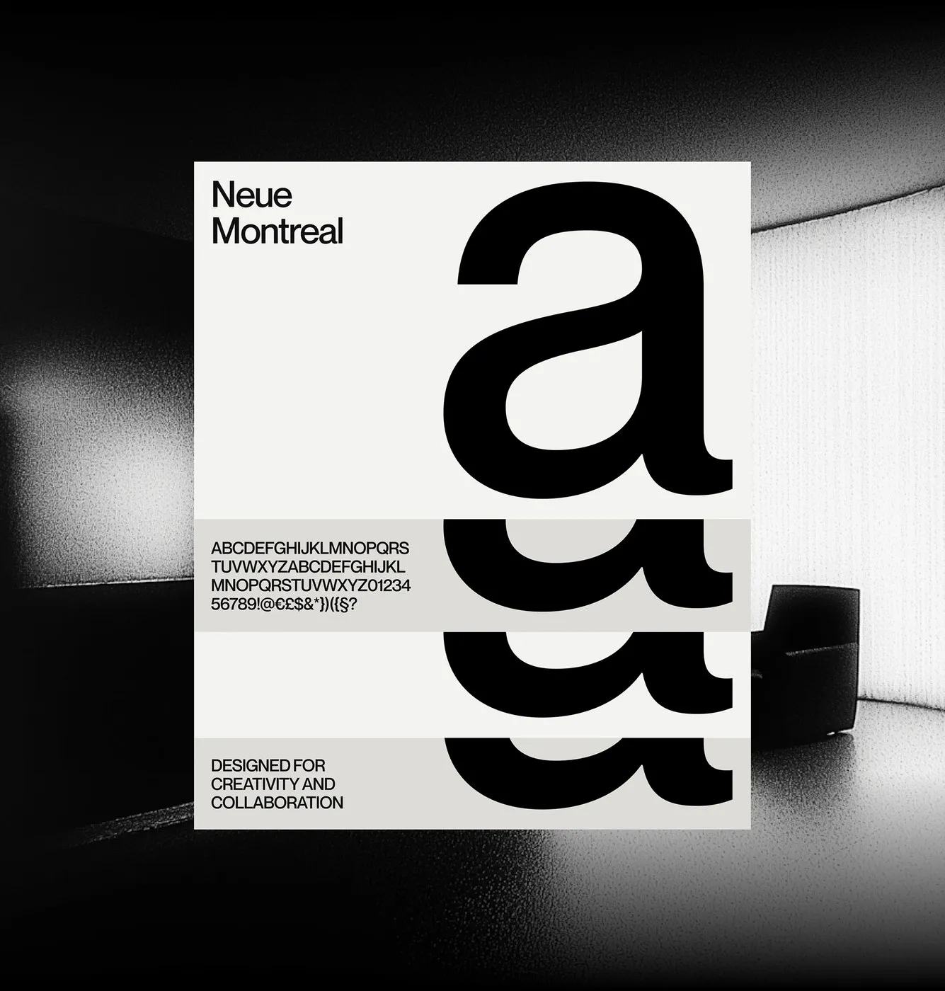
For typography, the project rocks Pangram Pangram’s grotesque typeface, Neue Montreal. Main headings like “The Studio” command attention with tight letter spacing paired with generous line height. Dynamic weight contrasts throughout the type specimens show off incredible versatility when shifting between punchy headers and body text. Right below the hero image, featured projects flow like a smooth image ribbon, gliding seamlessly between serene living rooms and outdoor natural landscapes. Ultra-fine hairline dividers cleanly separate awards, client rosters, and quotes, giving the entire layout the crisp, organized feel of a premium print publication.
The slick motion design by Valeriia Naumova and Kyrylo Yerokhin keeps page transitions perfectly paced, making navigation feel just like strolling through an architectural landmark.
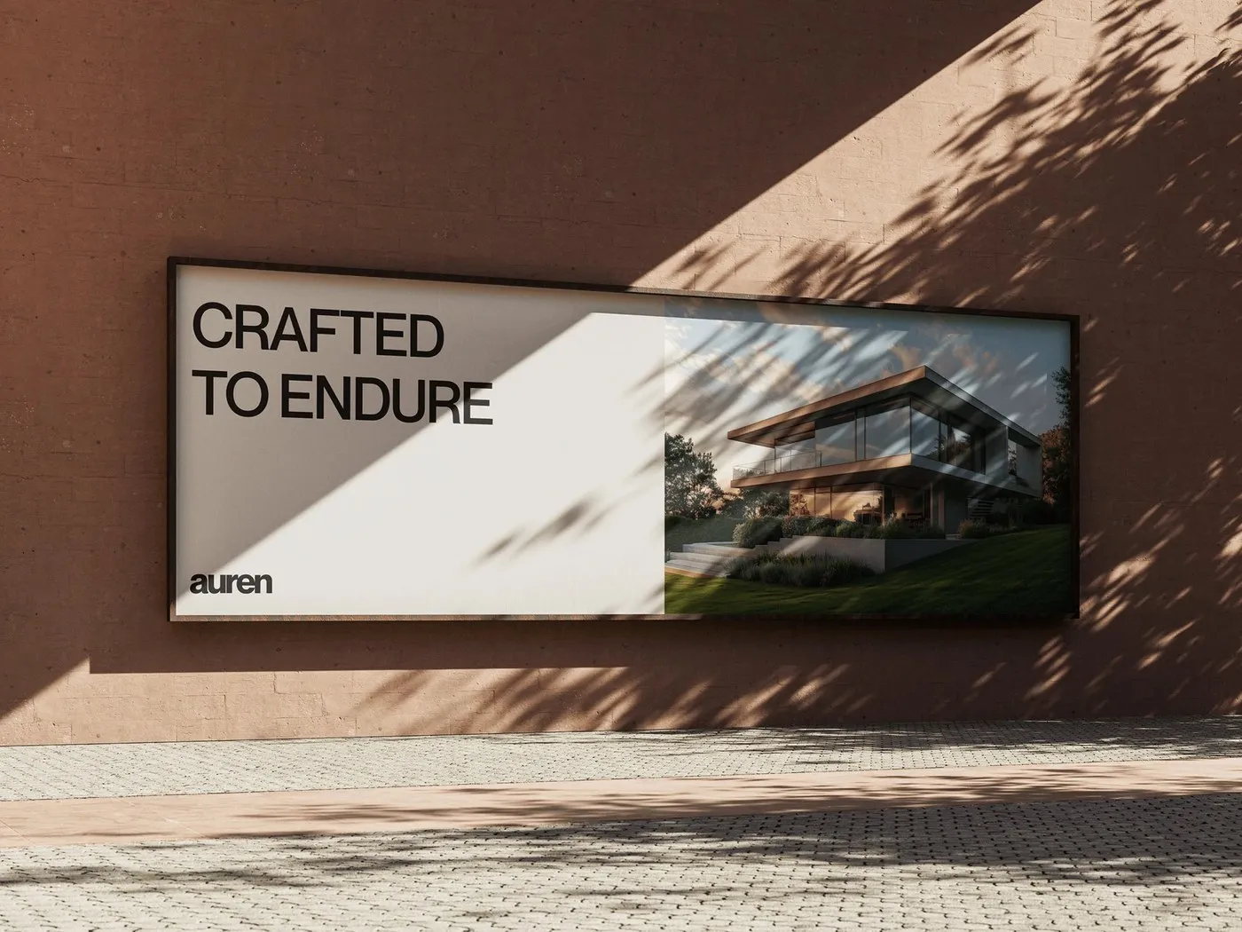
This digital design system also syncs up with real-world touchpoints, like an outdoor billboard mounted on a limestone wall featuring the slogan “CRAFTED TO ENDURE”. Textures throughout the UI draw inspiration from limestone, oak, and clear glass, bringing authentic architectural elements straight into the digital space. The full brand identity design is showcased on www.behance.net/gallery/254455255/Auren.
Auren: Khi tư duy kiến trúc đi vào thiết kế web của Tubik Studio
Auren là thương hiệu chuyên thiết kế nhà ở và không gian làm việc hướng đến sự tối giản, tập trung vào vật liệu tự nhiên và sự cân bằng không gian. Để đưa tinh thần này lên nền tảng số, Artem Meshkov cùng đội ngũ tại Tubik Studio đã xây dựng một giao diện website tĩnh lặng, nơi cấu trúc tổng thể được ưu tiên hơn là các chi tiết trang trí rườm rà.
Bố cục website tạo nên nhịp điệu thị giác nhờ sự tương phản giữa hình ảnh quy mô và những khoảng trống. Những bức ảnh chụp biệt thự bê tông hiện đại nằm gọn gàng trên nền màu xương ấm (warm bone) và xám nhạt. Thay vì nhồi nhét quá nhiều thành phần, giao diện giữ lại các khoảng thở vừa đủ. Điểm nhấn nằm ở phần wordmark viết thường in đậm đặt sát cạnh dưới màn hình, đóng vai trò như một chân đế vững chắc định hình hướng mắt của người xem.
Về typography, dự án sử dụng typeface Neue Montreal (dạng grotesque) từ Pangram Pangram. Các tiêu đề chính như “The Studio” gây chú ý nhờ khoảng cách chữ (tracking) hẹp và chiều cao dòng (line height) lớn. Trong bản giới thiệu phông chữ, sự thay đổi giữa các độ dày chữ (weight) cho thấy tính linh hoạt khi chuyển đổi từ tiêu đề lớn sang văn bản nội dung. Ngay bên dưới ảnh hero, các dự án được xếp theo dạng dải ruy-băng hình ảnh, di chuyển mượt mà giữa không gian phòng khách và cảnh quan tự nhiên. Những đường kẻ chia mảnh (hairline dividers) giúp phân tách phần giải thưởng, danh sách khách hàng và trích dẫn một cách gọn gàng, mang lại cảm giác ngăn nắp như một ấn phẩm in ấn.
Phần chuyển động (motion design) do Valeriia Naumova và Kyrylo Yerokhin thực hiện giúp các thao tác chuyển trang diễn ra với nhịp độ nhịp nhàng, tạo cảm giác như đang dạo bước qua từng căn phòng trong một công trình kiến trúc.
Hệ thống thiết kế số này còn đồng bộ với các điểm chạm thực tế, điển hình là biển quảng cáo ngoài trời đặt trên nền tường đá vôi cùng slogan “CRAFTED TO ENDURE”. Các bề mặt thiết kế gợi liên tưởng đến chất liệu đá vôi, gỗ sồi và kính trong suốt, phản ánh đúng tinh thần của kiến trúc đời thực vào không gian số. Chi tiết bộ nhận diện này hiện đã có trên www.behance.net/gallery/254455255/Auren.