
Voluta: Where Architecture and Brazilian Heritage Meet in Tiago Araujo’s Brand Identity Voluta is a Brazilian studio dedicated to restoring mid-century modern furniture and curating artisanal ceramics. To capture that rich spirit, designer Tiago Araujo crafted a brand identity deeply rooted in architectural heritage, seamlessly weaving historical memory right into contemporary living spaces.
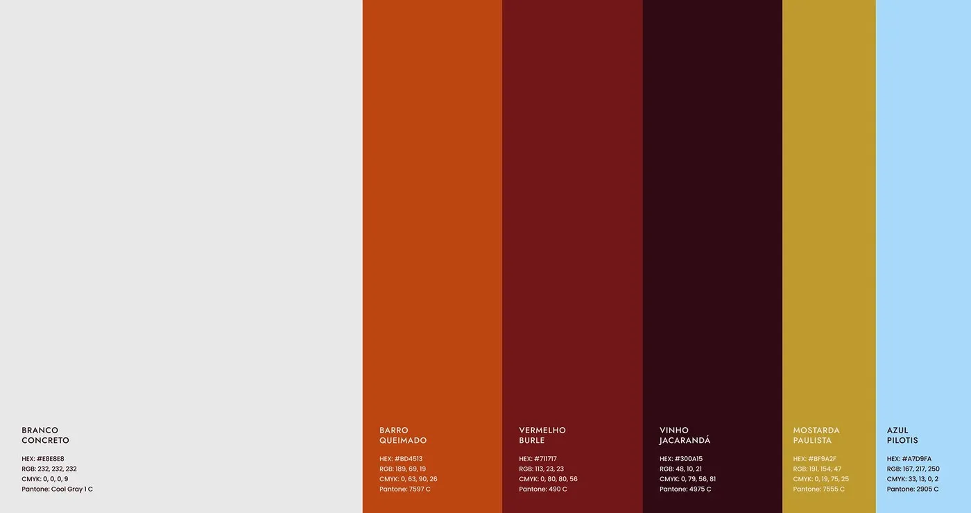
What makes this project so compelling is the clever play between raw concrete forms and warm organic textures. Rather than leaning into a cold, minimalist gallery aesthetic, Tiago chose a vibrant color palette celebrating Brazil’s rich design history. The color story features Branco Concreto (Concrete White), Barro Queimado (Baked Clay), Vermelho Burle (Burle Red, named after legendary landscape architect Roberto Burle Marx), Vinho Jacarandá (Rosewood Wine), Mostarda Paulista (Paulista Mustard), and Azul Pilotis (Pilotis Blue-Gray).
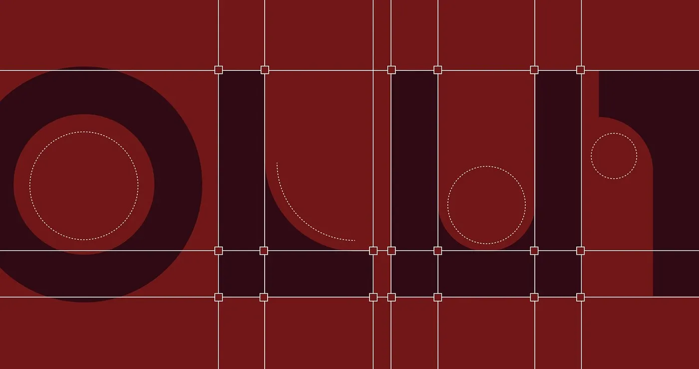
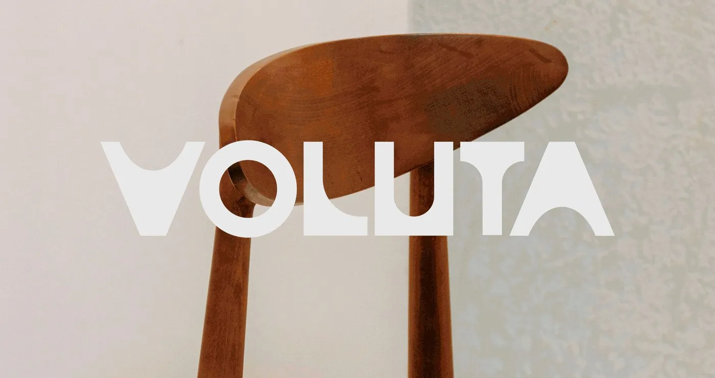
Architectural Lines and Geometric Precision The Voluta logo immediately stands out with its structural symmetry and solid, grounded presence. Taking inspiration from Oscar Niemeyer’s iconic architectural pillars and the geometric discipline of the Futura typeface, Tiago Araujo custom-designed letterforms using razor-sharp Bézier curves. The initial letter “V” feels like a sculpted architectural column, balancing uniform line weight with smooth, rounded geometry.
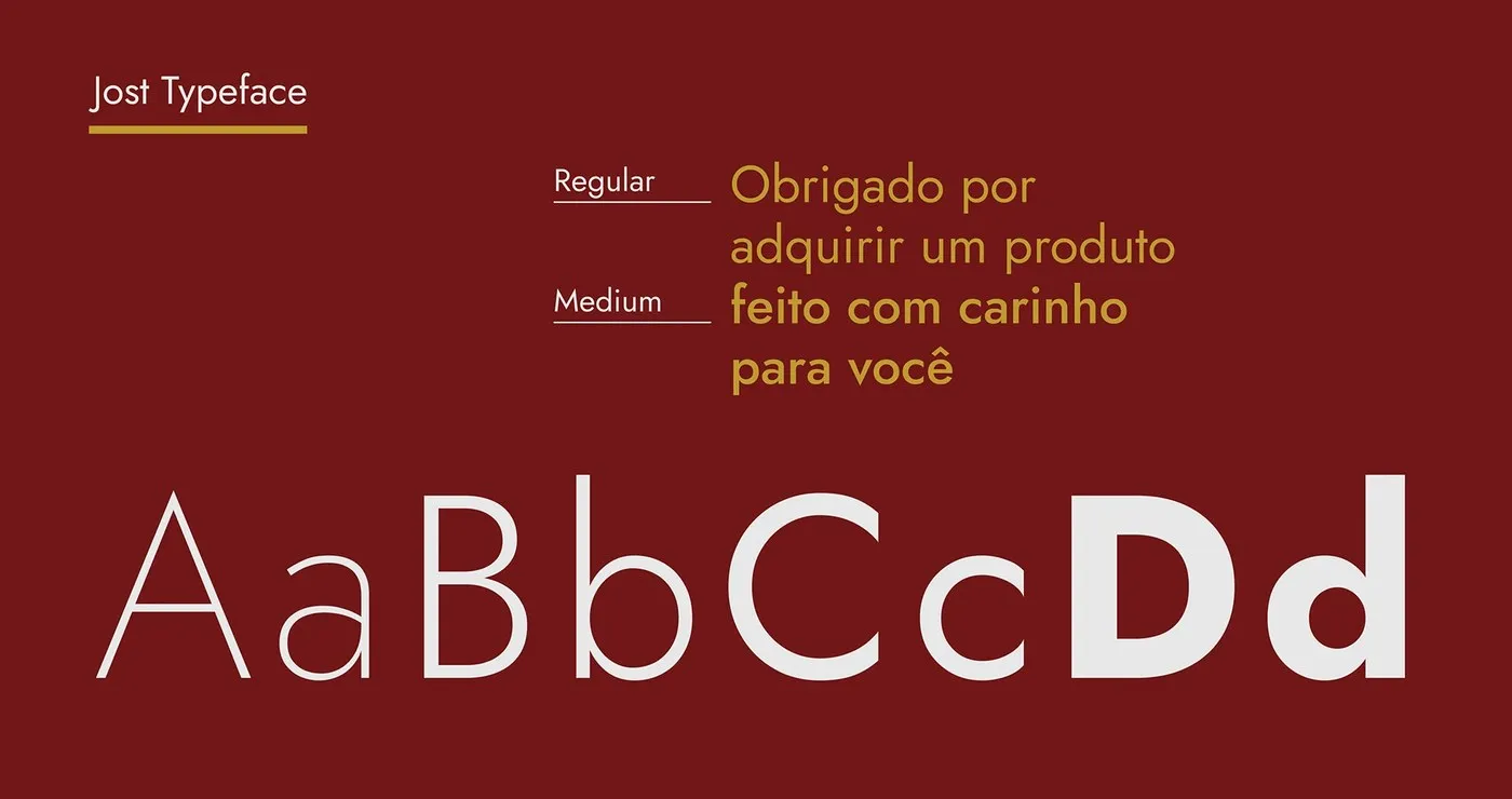
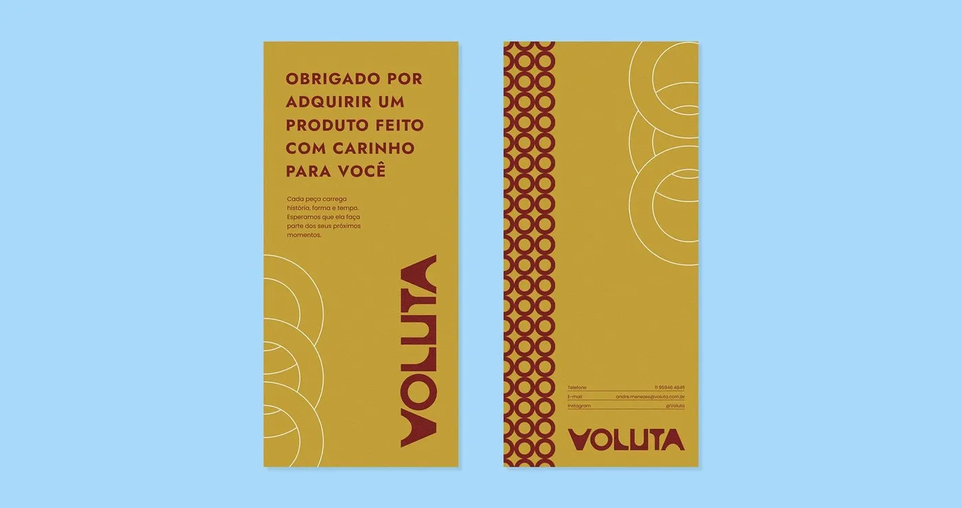
Moving beyond typography, the designer expanded the letters into a modular graphic system. This visual language pays homage to Brazil’s traditional cobogó breeze blocks, creating a playful rhythm of light and shadow, solid and void. These dynamic patterns adapt effortlessly as borders or accent details across various touchpoints. For body copy, the brand pairs nicely with the Jost typeface (in Regular and Medium weights) to keep printed materials crisp and readable.
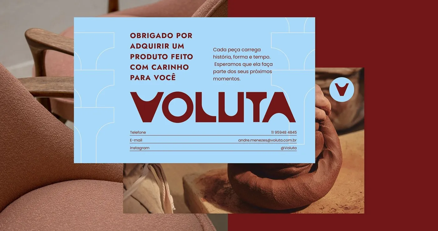
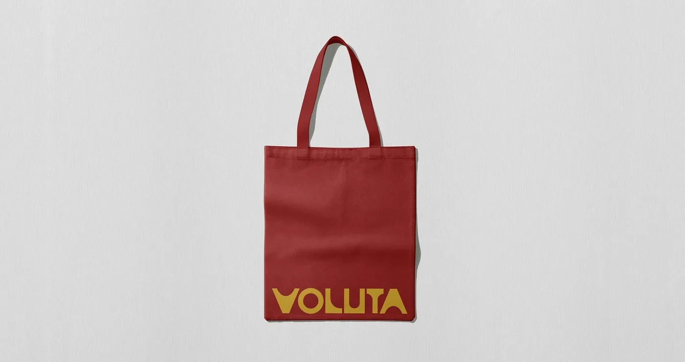
A Tactile Visual Experience Across Physical Touchpoints Voluta’s printed collateral beautifully bridges digital precision with rustic craftsmanship. Slim business cards in Mostarda Paulista pop with cobogó motifs. Client postcards feature Azul Pilotis paired with a Vermelho Burle logo alongside candid shots straight from the workshop. Everything is pressed onto heavy uncoated paper stock, offering a tactile feel akin to weathered rosewood grain. Rounding out the identity, a red cotton tote bag featuring a golden logo, ceramic hangtags, and restoration certificates create a beautifully cohesive, culturally rich branding system.
Check out full project visuals over on www.behance.net/gallery/251151145/Voluta-Branding-Visual-Identity.
Voluta: Khi kiến trúc và di sản Brazil gói gọn trong bộ nhận diện thương hiệu của Tiago Araujo
Voluta là một xưởng chuyên phục chế nội thất phong cách hiện đại giữa thế kỷ 20 (mid-century) và tuyển chọn đồ gốm thủ công tại Brazil. Để truyền tải trọn vẹn tinh thần này, designer Tiago Araujo đã xây dựng một bộ nhận diện thương hiệu đậm chất di sản kiến trúc, kết nối ký ức lịch sử trực tiếp vào không gian sống hiện đại.
Sự thú vị của dự án nằm ở sự tương phản giữa nét cứng cáp của hình khối bê tông và sự ấm áp của các chất liệu hữu cơ. Thay vì chọn phong cách phòng trưng bày tối giản có phần lạnh lẽo, Tiago sử dụng bảng màu tôn vinh lịch sử thiết kế quốc gia. Bảng màu gồm Branco Concreto (Trắng bê tông), Barro Queimado (Đất nướng), Vermelho Burle (Đỏ Burle – đặt theo tên kiến trúc sư cảnh quan Roberto Burle Marx), Vinho Jacarandá (Tím rượu gỗ gụ), Mostarda Paulista (Vàng mù tạt) và Azul Pilotis (Xanh xám).
Đường nét kiến trúc và hình học trong thiết kế
Logo của Voluta gây ấn tượng với tính đối xứng cấu trúc và khối dáng vững chãi. Lấy cảm hứng từ những cột trụ đặc trưng của kiến trúc sư Oscar Niemeyer cùng sự kỷ luật hình học của phông chữ Futura, Tiago Araujo đã vẽ nên các ký tự tùy chỉnh với đường cong bezier chuẩn xác. Chữ V đầu tiên tạo cảm giác như một cột trụ kiến trúc được điêu khắc, với nét bút đồng đều và hình học tròn trịa cân bằng.
Không dừng lại ở typography, designer còn phát triển các chữ cái thành một hệ thống đồ họa dạng modular. Ngôn ngữ thị giác này gợi nhớ đến những bức gạch thông gió cobogó truyền thống của Brazil, tạo ra sự nhịp nhàng giữa khoảng đặc và khoảng rỗng. Các họa tiết này biến chuyển linh hoạt làm đường viền hay điểm nhấn trên nhiều ứng dụng. Đối với phần văn bản, thương hiệu kết hợp cùng font chữ Jost (định dạng Regular và Medium) để đảm bảo độ sắc nét trên các ấn phẩm.
Trải nghiệm thị giác qua các ấn phẩm thực tế
Các ấn phẩm in ấn của Voluta là sự giao thoa giữa độ chính xác kỹ thuật số và tính thủ công mộc mạc. Danh thiếp dáng mảnh dùng màu Mostarda Paulista nổi bật với họa tiết cobogó. Postcard gửi khách hàng mang màu Azul Pilotis kết hợp với logo Vermelho Burle bên cạnh hình ảnh thực tế từ xưởng sản xuất. Tất cả được in trên giấy uncoated định lượng dày, tạo độ nhám tương đồng với thớ gỗ jacarandá nhuốm màu thời gian. Bên cạnh đó, chiếc túi tote vải cotton đỏ với logo màu vàng kim cùng các thẻ tag gốm hay giấy chứng nhận phục chế đã tạo nên một hệ thống branding chỉn chu và giàu chất liệu văn hóa.
Xem thêm các hình ảnh chi tiết của dự án từ www.behance.net/gallery/251151145/Voluta-Branding-Visual-Identity trên Behance.