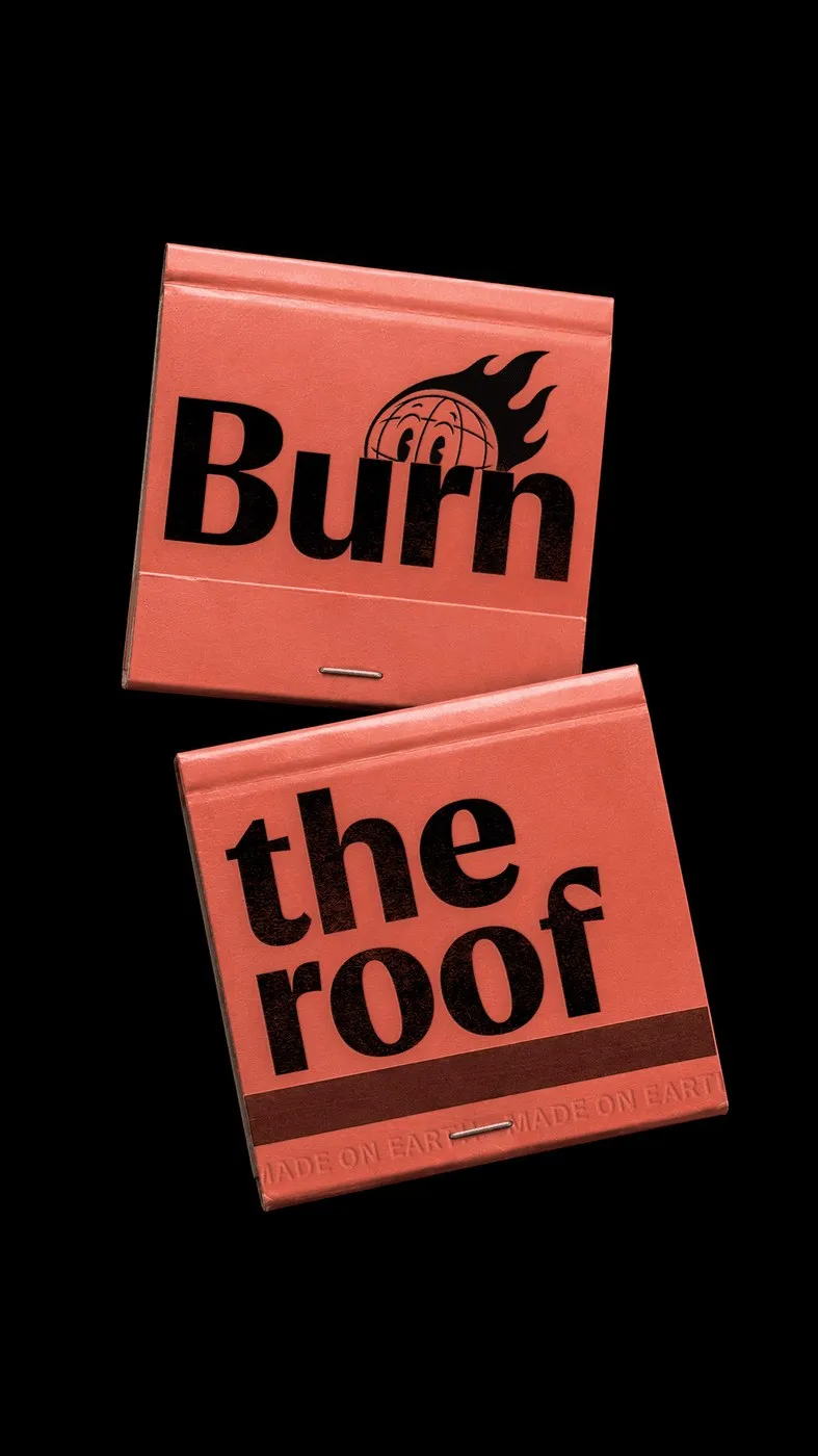

Blending the crisp structure of a humanist sans with the classic proportions of a serifless roman takes some serious craft. Type designer Nikita Kanarev created Fluxetype to tackle this challenge head-on, delivering a unified visual system built for digital screens, motion graphics, and large-format print alike. With support for over 300 Latin and Cyrillic languages, the family packs 84 pre-built static styles alongside all the custom flexibility of a variable font. Instead of juggling completely different font families across brand touchpoints, this typographic powerhouse easily scales from tiny footnotes to massive exhibition headlines.
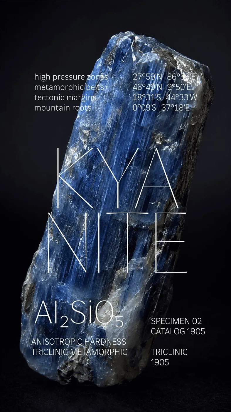
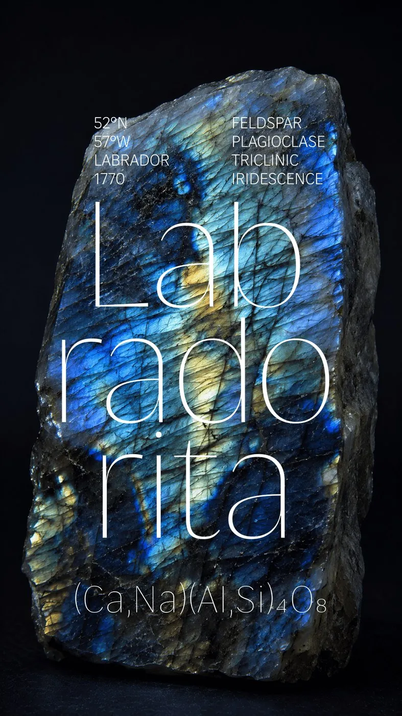
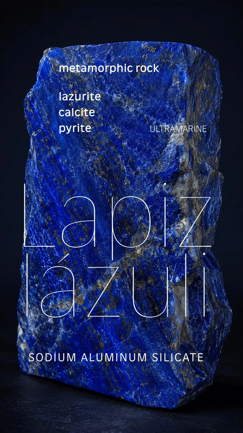
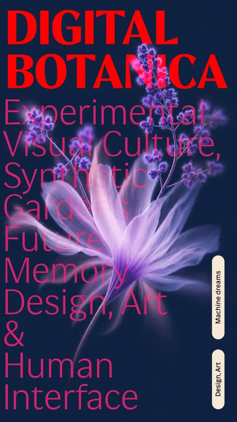
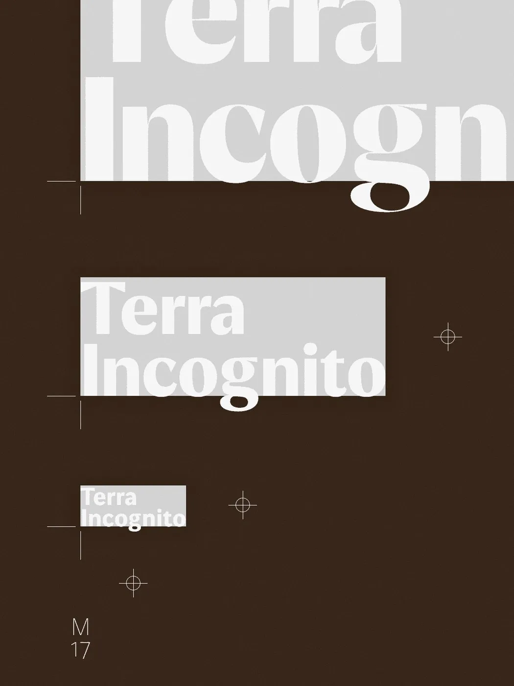
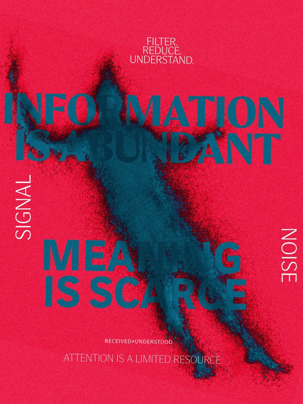
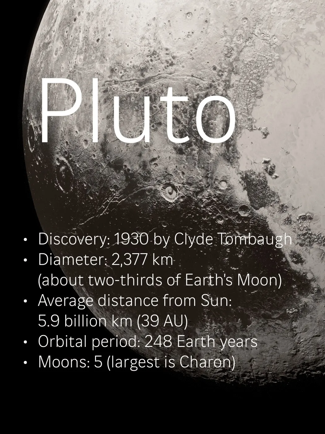
The project’s specimen posters showcase this impressive range by pairing sleek typography with heavily textured macro photography and technical callouts. In a mineral-focused series, ultra-delicate display weights overlay raw surfaces of kyanite, labradorite, and lapis lazuli, surrounded by chemical formulas and coordinates. Other prints feature optical scaling tests and registration crosshairs, showing how precise stroke adjustments preserve crisp legibility even against intricate background textures. Diagrams of planets and botanical illustrations further highlight the fascinating interplay between high-contrast letterforms and natural materials.
Beyond its display-ready looks, Fluxetype puts heavy emphasis on real-world UI design. The typeface includes three distinct x-height options: Petite (70%), Normal (74%), and Grande (78%). Switching to Grande mode automatically trims the ascenders and descenders, giving lowercase letters much greater visual presence in tight screen layouts while keeping line spacing open and readable. Sweeping all the way from zero-contrast text settings to dramatic display contrast, Fluxetype stands out as a complete, all-in-one solution to font-pairing headaches across editorial design, digital products, and physical print.
Fluxetype: Bộ font biến đổi đa năng của Nikita Kanarev cho màn hình và in ấn
Việc kết hợp giữa cấu trúc rõ ràng của một bộ chữ humanist sans với tỷ lệ cổ điển của serifless roman đòi hỏi sự tỉ mỉ rất cao về mặt tạo hình. Bộ font Fluxetype do type designer Nikita Kanarev thực hiện được thiết kế để giải quyết bài toán này, mang đến một ngôn ngữ thị giác đồng nhất cho cả màn hình kỹ thuật số, chuyển động động (motion) lẫn các ấn phẩm in ấn khổ lớn. Dự án hỗ trợ hơn 300 ngôn ngữ thuộc hệ chữ Latin và Cyrillic, cung cấp 84 kiểu static dựng sẵn cùng khả năng tùy biến linh hoạt của một variable font. Thay vì phải kết hợp nhiều họ font riêng biệt cho từng kênh thương hiệu, hệ thống typographic này đáp ứng trọn vẹn từ các dòng chú thích nhỏ (caption) cho tới tiêu đề triển lãm cỡ lớn.
Các poster specimen của dự án thể hiện rõ dải biểu đạt rộng mở khi đặt chữ viết bên cạnh hình ảnh nhiếp ảnh vĩ mô (macro) giàu chất liệu và các thông số kỹ thuật. Trong chuỗi poster về khoáng vật, các nét chữ mảnh thuộc nhóm display weight được đặt đè lên bề mặt đá kyanite, labradorite hay lapis lazuli, xung quanh là công thức hóa học và tọa độ địa lý. Một số poster khác tập trung vào bài kiểm tra tỷ lệ quang học (optical scaling) và tâm căn chỉnh (registration crosshairs), chứng minh việc điều chỉnh nét chữ giúp duy trì độ rõ ràng ngay cả trên nền họa tiết phức tạp. Sơ đồ hành tinh hay hình vẽ thực vật cũng làm nổi bật tương tác giữa bộ chữ tương phản cao với các chất liệu tự nhiên.
Bên cạnh tính thẩm mỹ dùng cho trưng bày, Fluxetype còn chú trọng đến tính ứng dụng trong thiết kế giao diện. Bộ font thiết lập 3 chế độ x-height riêng biệt: Petite (70%), Normal (74%) và Grande (78%). Ở chế độ Grande, phần ascender và descender tự động thu ngắn lại. Nhờ đó, chữ thường (lowercase) đạt được thị giác tối ưu hơn trong không gian UI chật hẹp mà vẫn giữ khoảng cách dòng thoải mái. Khả năng chuyển đổi từ độ tương phản bằng 0 (dành cho văn bản) đến độ tương phản cao (dành cho tiêu đề) giúp Fluxetype trở thành một công cụ toàn diện, giải quyết vấn đề phối font trong thiết kế xuất bản, sản phẩm số và poster thực tế.