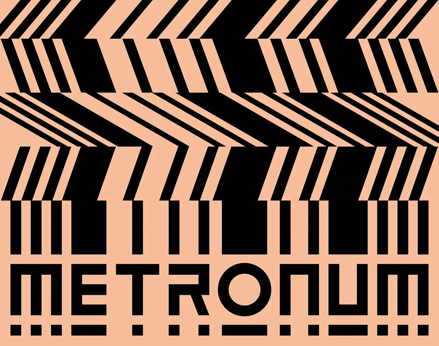
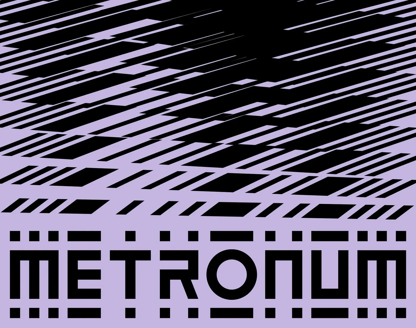
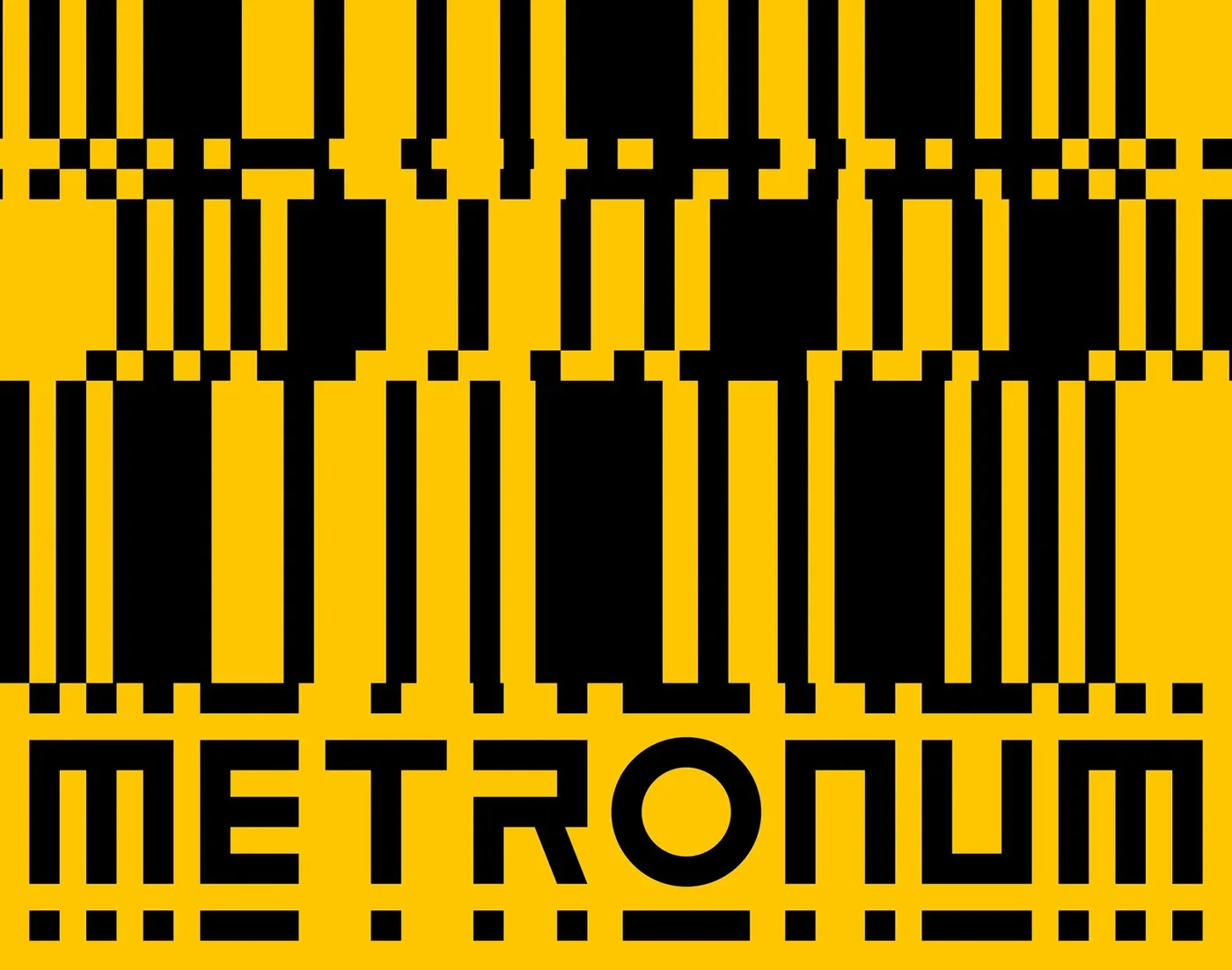
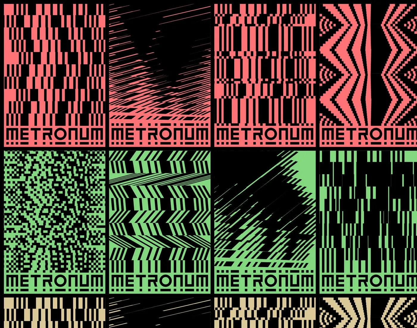
An Energetic Visual Identity System for Le Metronum Le Metronum is a bustling hotspot for contemporary music lovers in Toulouse, France. The venue packs in a 600-plus seat concert hall, state-of-the-art recording and rehearsal studios, and an action-packed schedule of over 100 concerts each year. In 2022, a major brand refresh brought together Barcelona’s Hey Studio for the logo design and Brand Brothers for the overarching graphic system.
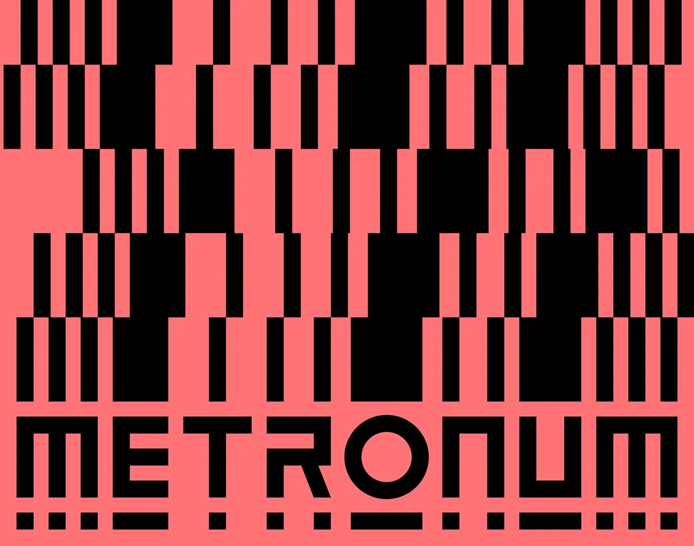
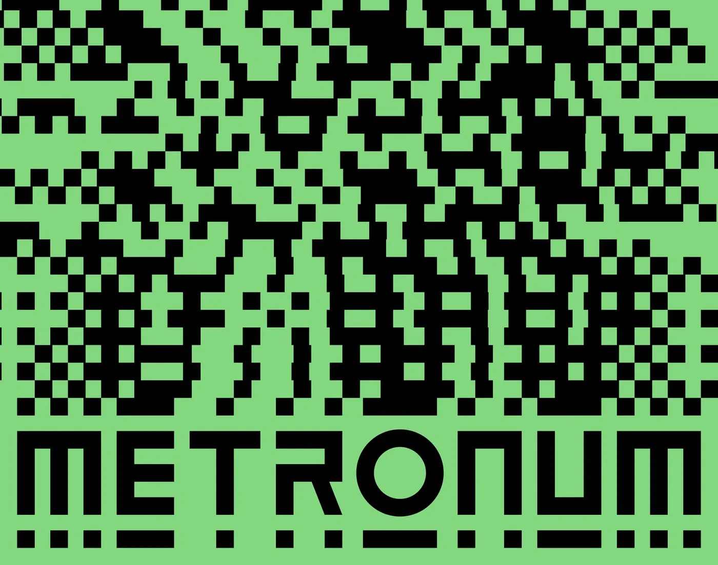
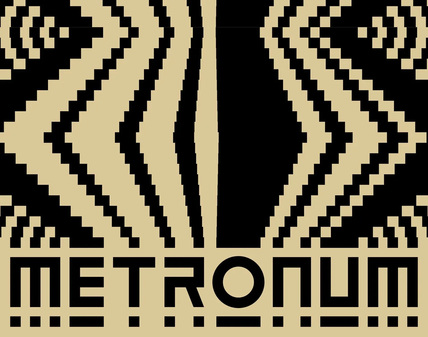
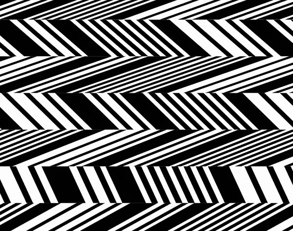
Geometric Language and Dynamic Motion Taking inspiration from the custom lettering created by Hey Studio, Brand Brothers built a super dynamic visual system around the dashed line sitting beneath the logo. Those dashed elements transform into generative geometric patterns that evoke soundwaves and the acoustic geometry of live performance spaces. Bright cobalt blue, zesty lemon yellow, and deep crimson bring high-impact visual contrast to the color palette.
Typography gets an exciting double-act with two wildly contrasting typefaces: Benoit Bodhuin’s playful, rounded BallPill and Formagari’s sleek, condensed Malamocco. This unexpected pairing adds rhythmic energy, striking a neat balance between whimsical charm and clean readability.
Bold Applications From Event Posters to Physical Spaces Event posters feature modular text blocks anchored to a tight grid system, allowing venue staff to swap out artist details and show dates effortlessly while maintaining a crisp visual structure. High-contrast geometric shapes grab immediate attention on street posts, while essential info stays neatly organized along the bottom edge.
The fresh identity doesn’t stop at digital feeds and paper prints—it moves right into the physical space itself. Tactile silkscreen printing brings a cool, textured finish to event schedules and folded brochures. Inside the building, dashed line patterns serve as custom wayfinding graphics, guiding fans down corridors, around backstage areas, and across membership cards. When showtime hits, these dynamic geometric shapes transform into animated stage projections, moving in sync with the live performances.
Check out the full project on www.behance.net/gallery/155697983/Le-Metronum-Visual-system.
Hệ thống nhận diện thị giác đầy năng lượng cho trung tâm âm nhạc Le Metronum
Le Metronum là điểm hẹn quen thuộc của tín đồ âm nhạc đương đại tại thành phố Toulouse, Pháp. Nơi đây sở hữu khán phòng 600 chỗ ngồi, hệ thống phòng thu lẫn phòng tập hiện đại, cùng lịch trình sôi động với hơn 100 buổi biểu diễn mỗi năm. Vào năm 2022, dự án tái định vị thương hiệu cho Le Metronum được ra mắt với sự hợp tác giữa Hey Studio đảm nhận phần logo và Brand Brothers phát triển toàn bộ hệ thống đồ họa.
Ngôn ngữ hình học và tính chuyển động linh hoạt
Dựa trên phần chữ logotype do Hey Studio thực hiện, Brand Brothers đã khai thác chi tiết đường gạch nét đứt ngay bên dưới logo để phát triển thành một hệ thống đồ họa vô cùng linh hoạt. Những đường nét đứt này biến hóa thành chuỗi họa tiết hình học gợi liên tưởng trực tiếp đến tần số âm thanh và kiến trúc âm học của không gian biểu diễn. Bảng màu chủ đạo kết hợp các tông rực rỡ như xanh cobalt, vàng chanh và đỏ thẫm để tạo nên sự tương phản thị giác cực kỳ mạnh mẽ.
Về mặt typography, hệ thống sử dụng hai bộ font đối lập: BallPill bo tròn đầy cá tính của Benoit Bodhuin và Malamocco dạng nén (condensed) của Formagari. Sự kết hợp này tạo nên sự nhịp nhàng, giúp tổng thể thiết kế vừa mang nét phá cách nghịch ngợm, vừa đảm bảo tính rõ ràng khi truyền tải thông tin cho người xem.
Ứng dụng ấn tượng từ poster đến không gian thực tế
Thiết kế poster sự kiện được chia thành các dải chữ dạng modular trên layout grid chặt chẽ, giúp đội ngũ vận hành dễ dàng thay đổi thông tin nghệ sĩ và thời gian diễn ra show mà vẫn giữ được cấu trúc trực quan. Các khối hình học có độ tương phản cao tạo nên hiệu ứng thị giác bùng nổ khi xuất hiện trên đường phố, trong khi các thông tin chi tiết được sắp xếp gọn gàng ở mép dưới poster.
Không chỉ dừng lại trên bản in hay môi trường kỹ thuật số, nhận diện mới của Le Metronum còn lan tỏa vào không gian thực tế. Kỹ thuật in lụa (silkscreen) với bề mặt mực thô ráp được áp dụng cho ấn phẩm lịch trình và brochure gấp. Bên trong tòa nhà, họa tiết đường nét đứt đóng vai trò chỉ dẫn du khách qua các hành lang, khu vực backstage và thẻ hội viên. Khi đêm diễn bắt đầu, các khối hình học này tiếp tục biến chuyển thành hiệu ứng trình chiếu chuyển động trên sân khấu, hòa quyện hoàn hảo cùng âm nhạc.
Xem chi tiết dự án tại trang Behance của www.behance.net/gallery/155697983/Le-Metronum-Visual-system.