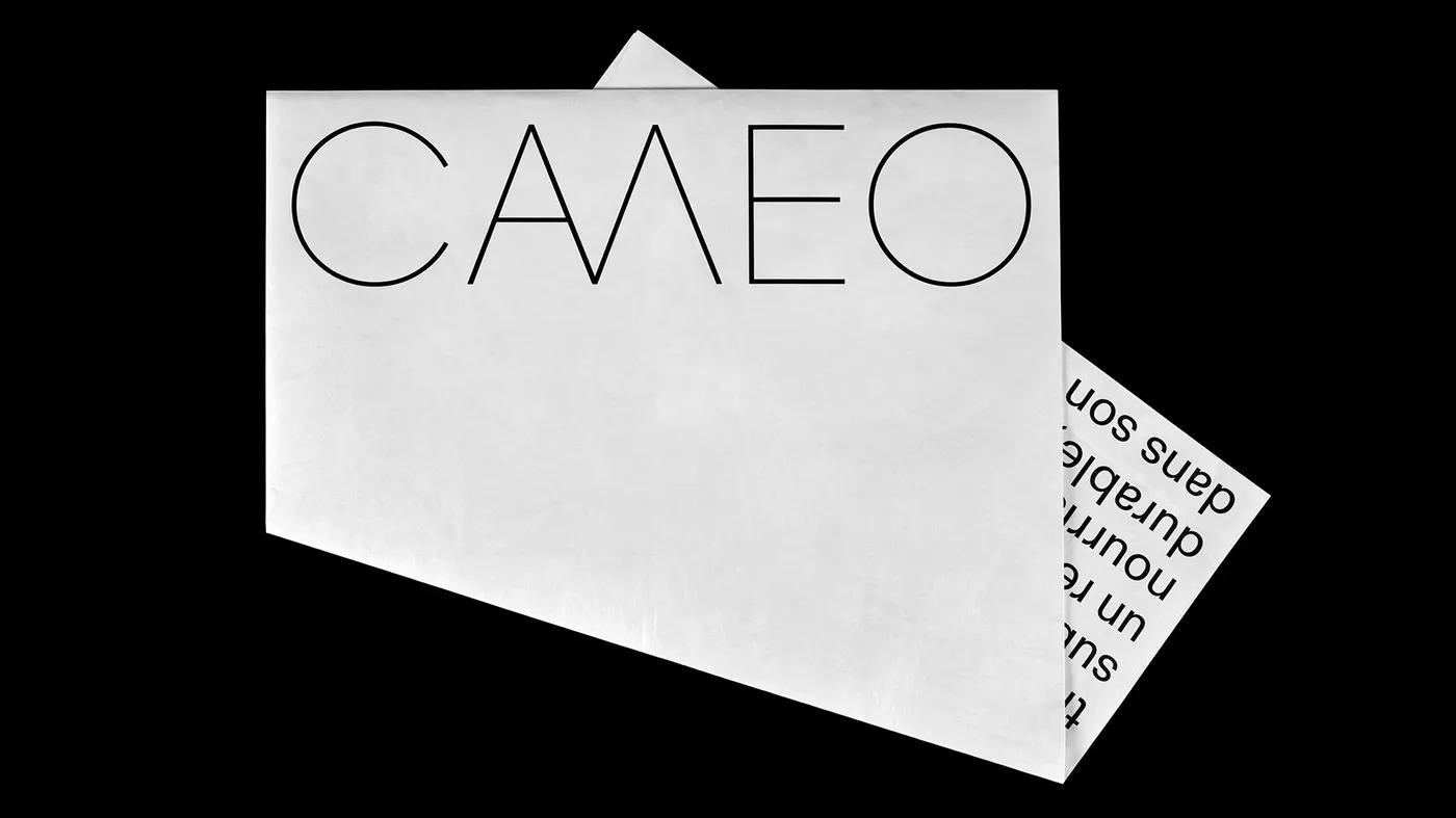
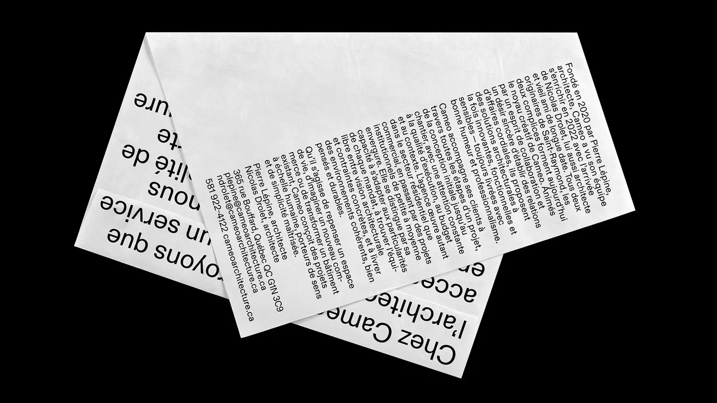
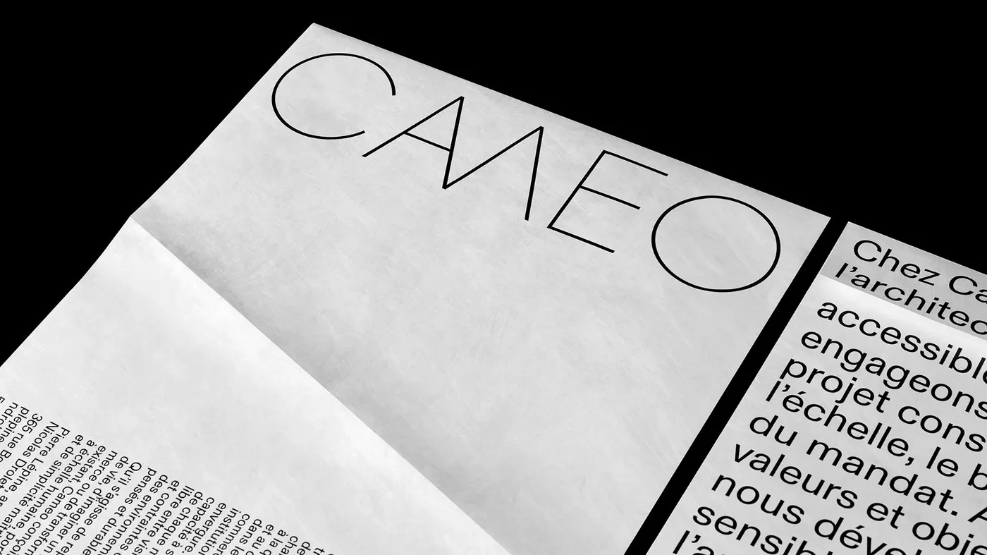
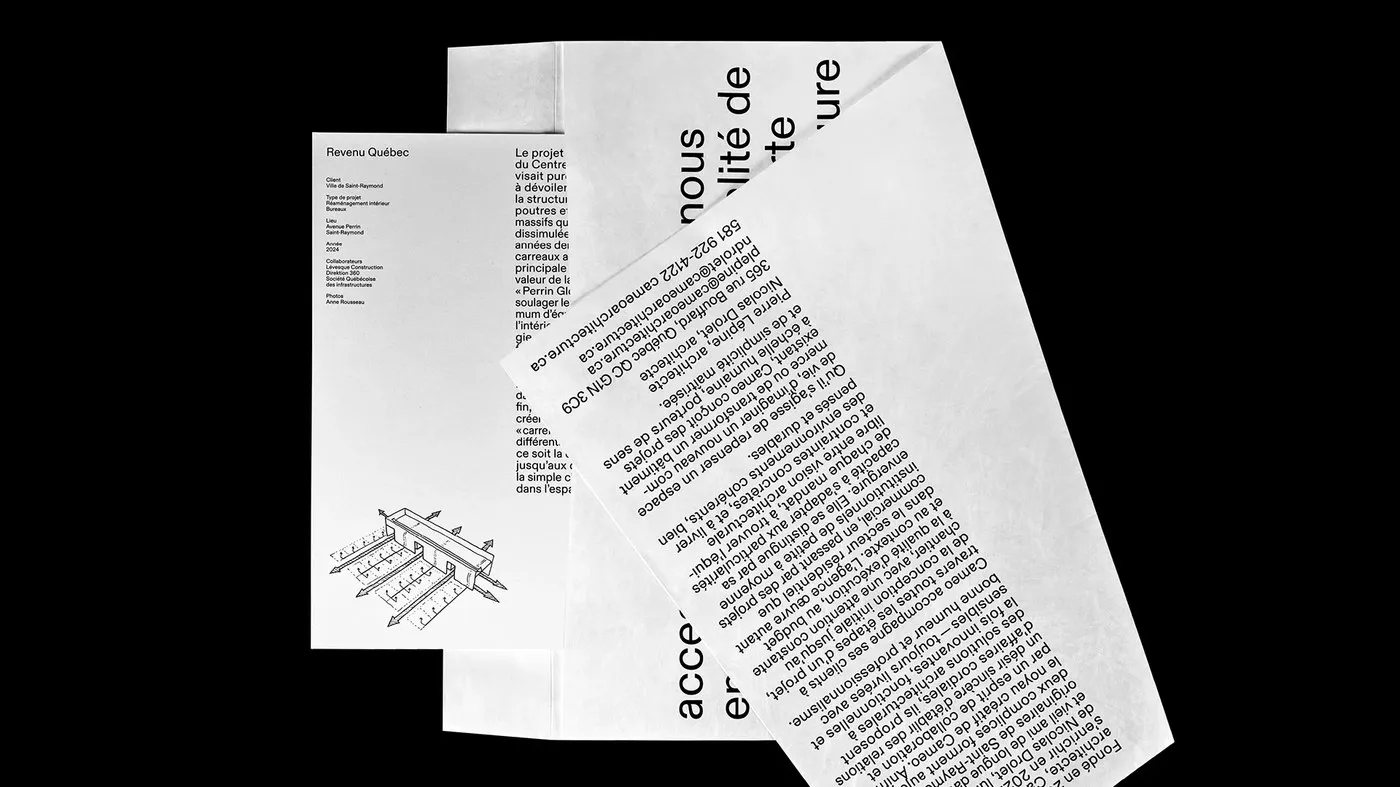
A Construction-Material-Inspired Brand Identity for CAMEO Architecture Instead of putting together a typical company brochure, Montreal-based studio Paprika Design took a delightfully creative path for Caméo’s architectural practice. Creative Director Louis Gagnon and Lead Designer Daniel Robitaille packed the firm’s entire portfolio inside an oversized Tyvek envelope. By repurposing Tyvek—that super-durable synthetic material constantly used on construction sites—the design forms a direct, tactile connection to Caméo’s architectural ethos. The semi-translucent sleeve offers a teasing glimpse of the project sheets tucked inside before it is even opened, while high-contrast black typography and an oversized “CAMEO” wordmark stretch boldly across the main flap.
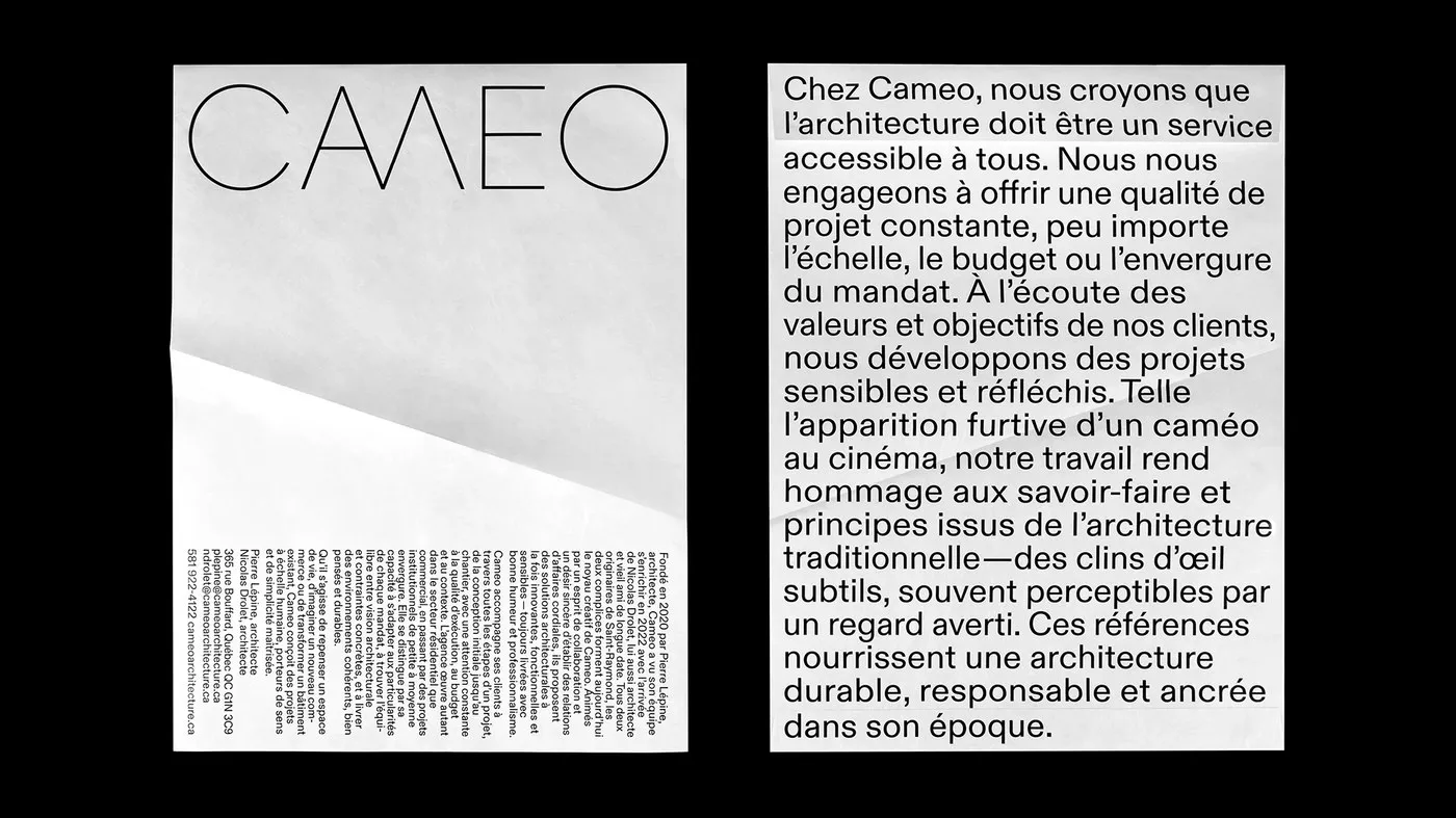
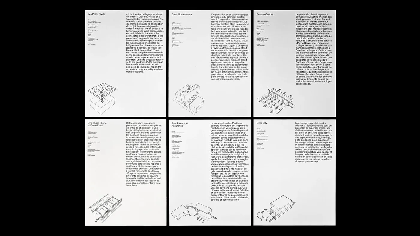
Inside, projects are presented as flexible, loose-leaf sheets rather than a traditional bound book. This modular structure lets Caméo effortlessly customize tailored presentations for public, commercial, or residential clients. Paprika Design organized the information using a sleek architectural grid, striking a sweet balance between precise technical drawings and full-bleed monochrome photography. A tight-tracked sans-serif typeface lends a sturdy, grounded aesthetic, complemented by generous margins that keep technical specs clean and easy to read.
Materiality sits at the very heart of this concept. Pairing tear-proof, water-resistant Tyvek with heavy uncoated interior paper creates a beautiful dialogue between raw industrial utility and editorial sophistication. The physical layering creates natural visual depth as light catches and filters through the Tyvek sleeve. Through meticulous material choices and top-notch print finishing by LG Chabot, the project shows how an architectural brand identity can evoke spatial texture purely through tactile touch points—no digital gimmicks needed.
Check out the full project on www.behance.net/gallery/249799985/CAMEO-Prospective-piece.
Bộ nhận diện thương hiệu từ vật liệu công trình của công ty kiến trúc CAMEO
Thay vì làm một cuốn brochure giới thiệu thông thường, studio Paprika Design đến từ Montreal đã chọn một hướng đi độc đáo cho thực hành kiến trúc Caméo. Giám đốc sáng tạo Louis Gagnon và designer chính Daniel Robitaille đã gói gọn toàn bộ portfolio của công ty trong một chiếc phong bì Tyvek cỡ lớn. Việc tái sử dụng Tyvek — loại vật liệu sợi tổng hợp siêu bền thường thấy ở các công trình xây dựng — giúp thiết kế kết nối trực tiếp với tinh thần kiến trúc của Caméo. Lớp vỏ bán trong suốt hé lộ mờ ảo các tờ dự án bên trong trước khi phong bì được mở ra. Mặt ngoài nổi bật với typography màu đen tương phản cao, cùng logo “CAMEO” dạng wordmark khổ lớn trải dài trên phần nắp gập.
Bên trong phong bì, các dự án được trình bày dưới dạng các tờ rời (loose-leaf) thay vì đóng quyển cố định. Cấu trúc linh hoạt này giúp Caméo dễ dàng tùy chỉnh nội dung gửi tới từng nhóm khách hàng thuộc mảng công cộng, thương mại hay nhà ở. Paprika Design sắp xếp thông tin theo một hệ thống grid kiến trúc chỉn chu, cân bằng giữa bản vẽ kỹ thuật chính xác và ảnh chụp đơn sắc tràn viền. Font chữ sans-serif với khoảng cách chữ (tracking) hẹp tạo vẻ cứng cáp, kết hợp cùng phần lề rộng rãi giúp các thông số kỹ thuật luôn rõ ràng, dễ đọc.
Chất liệu chính là điểm tựa ý niệm cho toàn bộ dự án. Việc kết hợp giữa vỏ bao Tyvek không xé rách, chống nước cùng chất giấy uncoated định lượng dày bên trong tạo nên cuộc đối thoại giữa nét thô ráp công nghiệp và sự tinh tế của một ấn phẩm editorial. Sự chồng đè chất liệu tạo nên độ sâu thị giác tự nhiên khi ánh sáng xuyên qua lớp vỏ Tyvek. Thông qua việc chọn lọc chất liệu kỹ lưỡng và khâu in ấn hoàn thiện từ LG Chabot, dự án cho thấy một bộ nhận diện kiến trúc hoàn toàn có thể truyền tải cảm giác không gian qua trải nghiệm xúc giác mà không cần dựa vào các hiệu ứng kỹ thuật số.
Xem toàn bộ dự án của www.behance.net/gallery/249799985/CAMEO-Prospective-piece trên Behance.