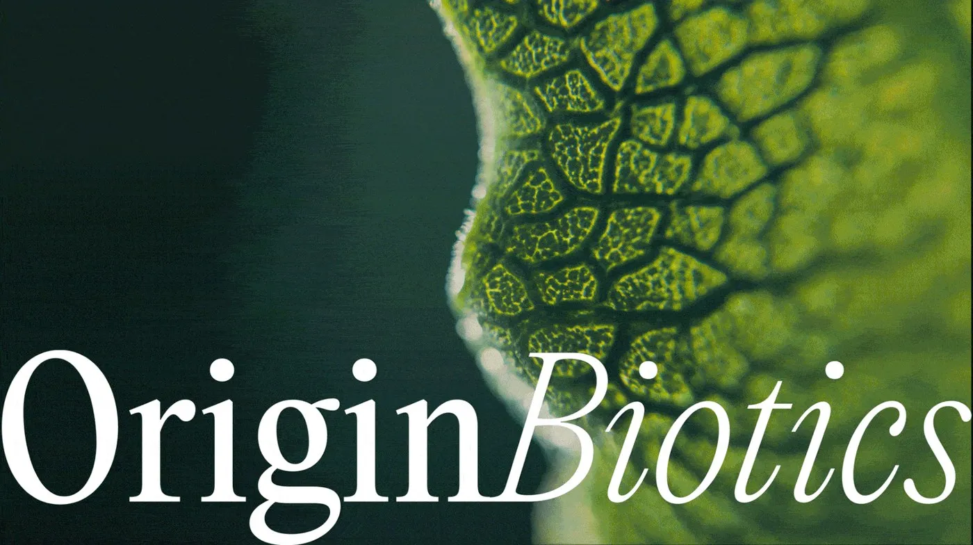



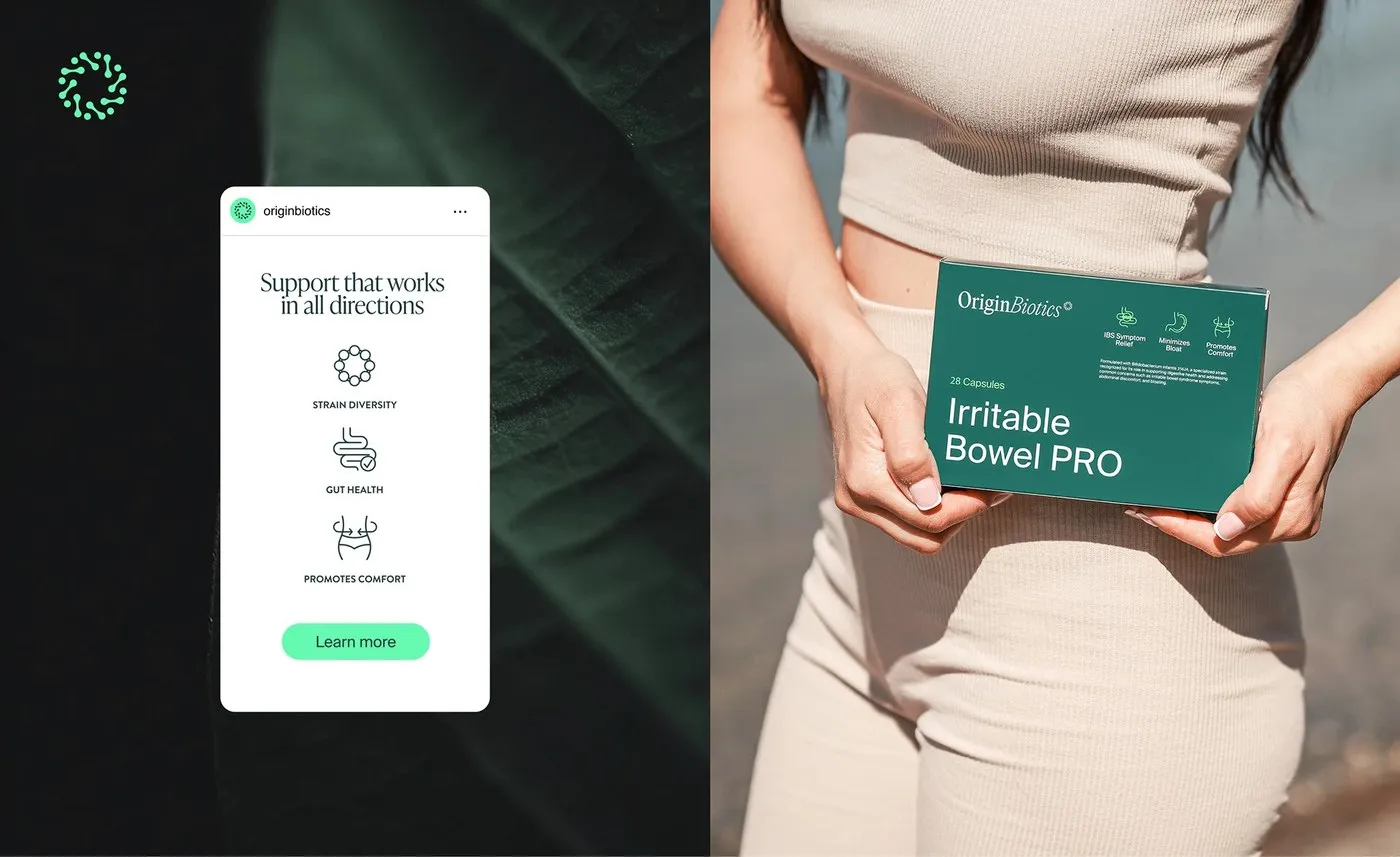
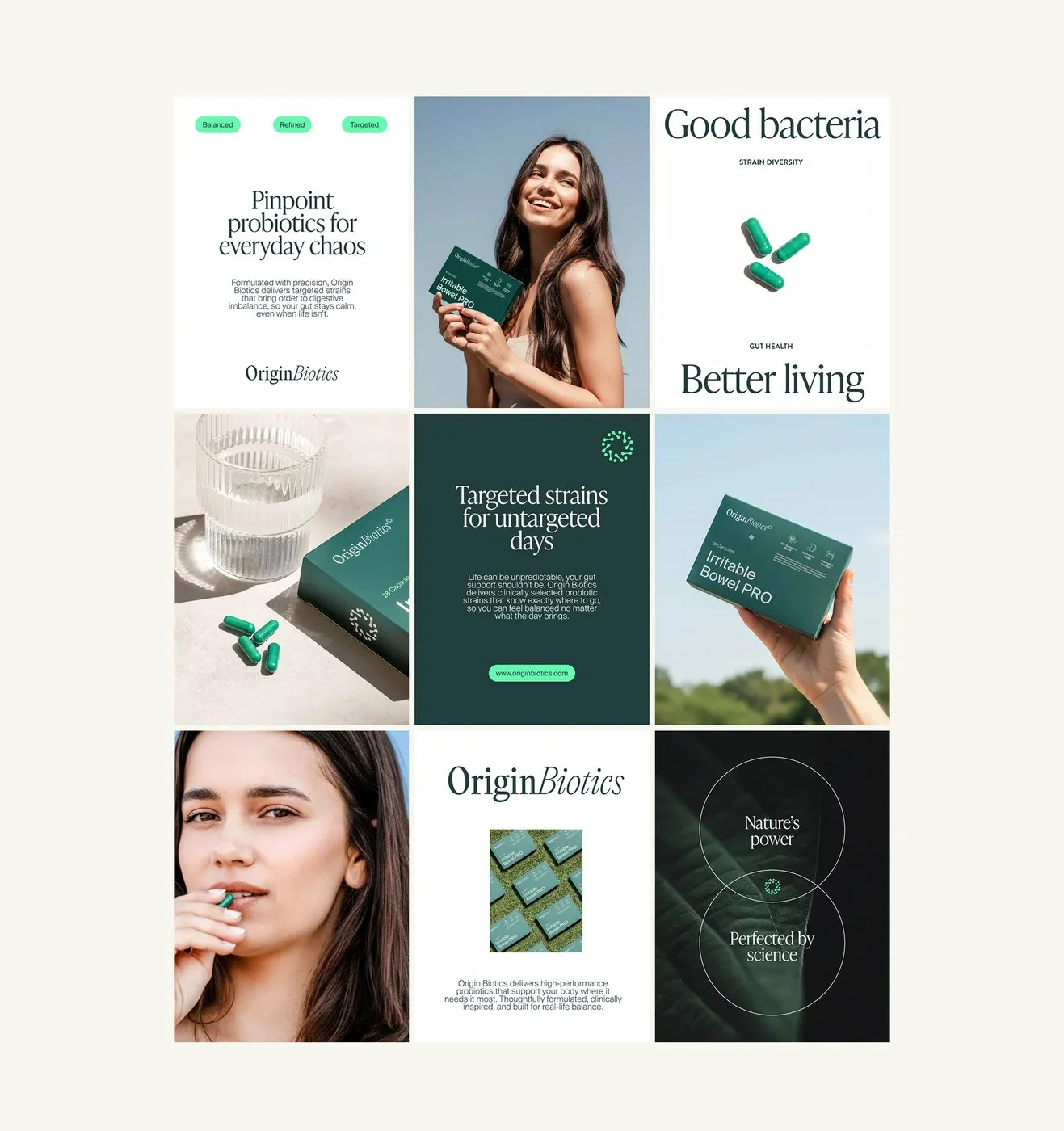
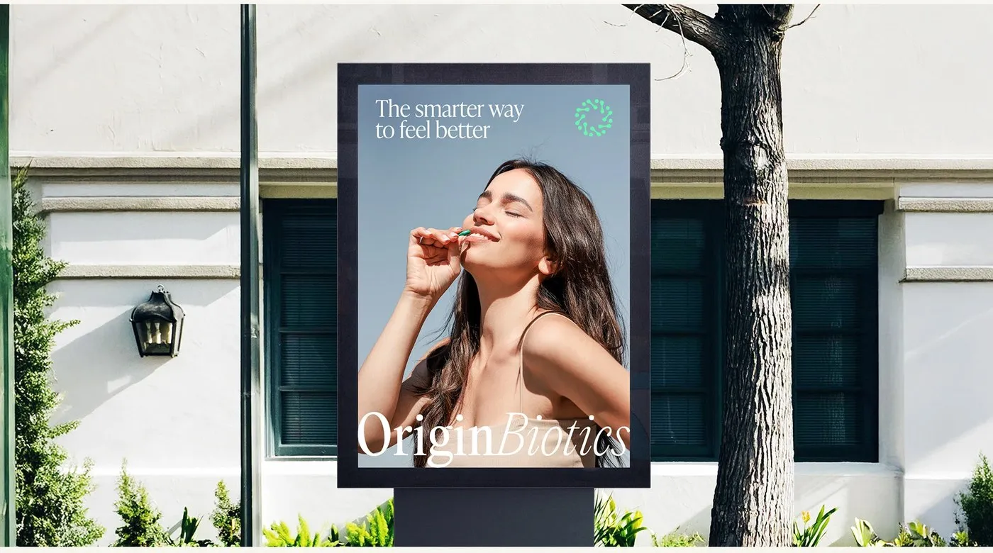

OriginBiotics Packaging Design by Maja Regula: Precise Grids and Deep Forest Greens OriginBiotics is a probiotic supplement brand built around clarity and precision. Designed by Maja Regula, this packaging identity rocks a deep forest green palette that feels super natural yet ultra-professional. The minimalist bottle labels use a tight vertical grid to keep technical details organized and easy to scan. Crisp white and black text popped against the dark green background hits that perfect sweet spot between scientific rigor and approachable warmth. Rather than sticking to standard wellness decor, this concept zeroes in on structural minimalism and clean materials.
The secret sauce of this packaging lies in its strict layout grid and sharp typographic hierarchy. Well-defined sections let the layout make great use of negative space, guiding the viewer’s eye completely naturally. Clear sans-serif type is scaled intentionally to make a crisp distinction between active ingredients and daily instructions. Extra details—like net weight and clinical notes—stay neatly tucked along the margins, leaving plenty of breathing room on the front label.
Beyond the layout, tactile choices bring tons of personality to the project. The touch experience flows effortlessly from the matte paper outer box to the silky-smooth glass bottle, delivering a subtle contrast that feels great in hand. This cohesive treatment across every component transforms simple retail packaging into a full-on sensory experience.
Check out the complete project on www.behance.net/gallery/236164523/OriginBiotics-supplement-branding-and-packaging.
Thiết Kế Bao Bì OriginBiotics Của Maja Regula: Grid Chuẩn Xác Và Tông Xanh Trầm
OriginBiotics là thương hiệu thực phẩm bổ sung men vi sinh chú trọng vào tính rõ ràng và sự chính xác. Bộ nhận diện bao bì do Maja Regula thực hiện lấy tông màu xanh lá rừng thẫm làm chủ đạo, mang lại cảm giác vừa tự nhiên vừa chuyên nghiệp. Nhãn chai được thiết kế tối giản với hệ thống lưới dọc (vertical grid) chặt chẽ để tổ chức các thông tin kỹ thuật. Sự kết hợp giữa sắc trắng, đen trên nền xanh đậm tạo nên độ tương phản rõ ràng, giúp tổng thể đạt được sự cân bằng giữa nét khoa học và sự thân thiện. Thay vì đi theo phong cách trang trí quen thuộc của các dòng sản phẩm wellness, thiết kế tập trung vào sự tối giản trong cấu trúc và tinh giản vật liệu.
Yếu tố cốt lõi của bao bì OriginBiotics nằm ở hệ thống phân cấp typographic và lưới phân bố nghiêm ngặt. Việc thiết lập ranh giới rõ ràng giúp layout tận dụng tốt các khoảng trống, hướng mắt người xem một cách tự nhiên. Font chữ sans-serif dễ đọc được chia theo nhóm kích thước hợp lý, phân định rõ ràng giữa thành phần và hướng dẫn sử dụng. Các thông tin phụ như khối lượng hay ghi chú lâm sàng được đặt gọn ở phần mép viền, nhường khoảng thở cho mặt trước của chai.
Bên cạnh bố cục, quyết định về chất liệu cũng mang lại giá trị lớn cho dự án. Trải nghiệm chạm mở rộng từ lớp giấy mờ (matte paper) của vỏ hộp đến bề mặt thủy tinh nhẵn mịn của chai tạo nên sự tương phản xúc giác tinh tế. Việc xử lý đồng bộ từng thành phần giúp bộ sản phẩm nâng tầm từ một nhãn mán thương mại đơn thuần thành một trải nghiệm thẩm mỹ trọn vẹn.
Xem trọn vẹn dự án của www.behance.net/gallery/236164523/OriginBiotics-supplement-branding-and-packaging trên Behance.