Bringing the Craft of Hand-Pressed Print into Veronika Kuziakina’s OLLIN Wine Branding Veronika Kuziakina just brought a breath of fresh air to the brand identity for OLLIN, a wine from the Rioja region, by cleverly incorporating hand-pressed ink textures right onto the bottle labels.
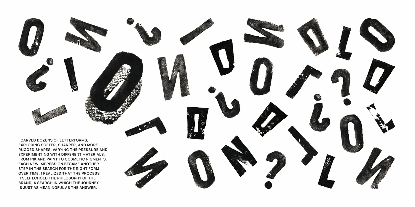
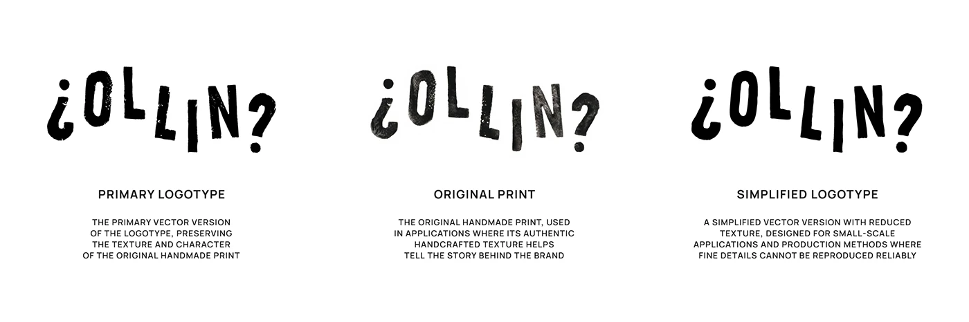
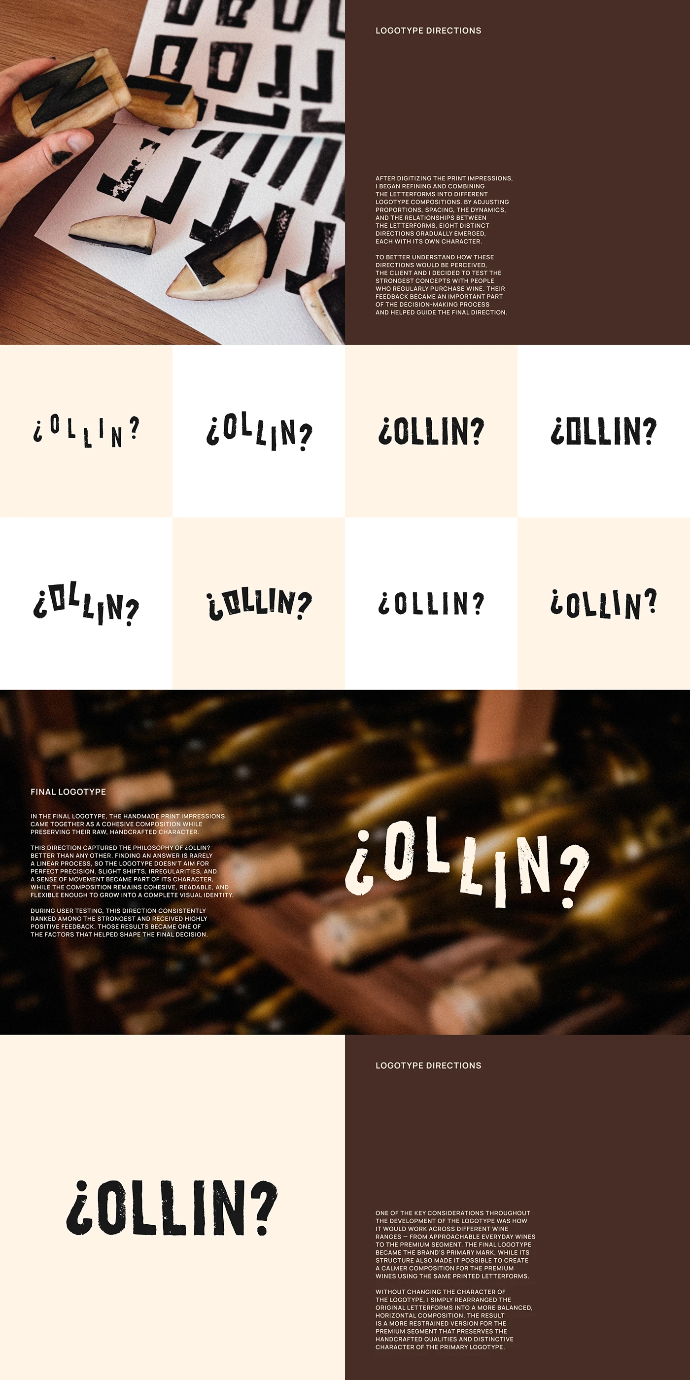
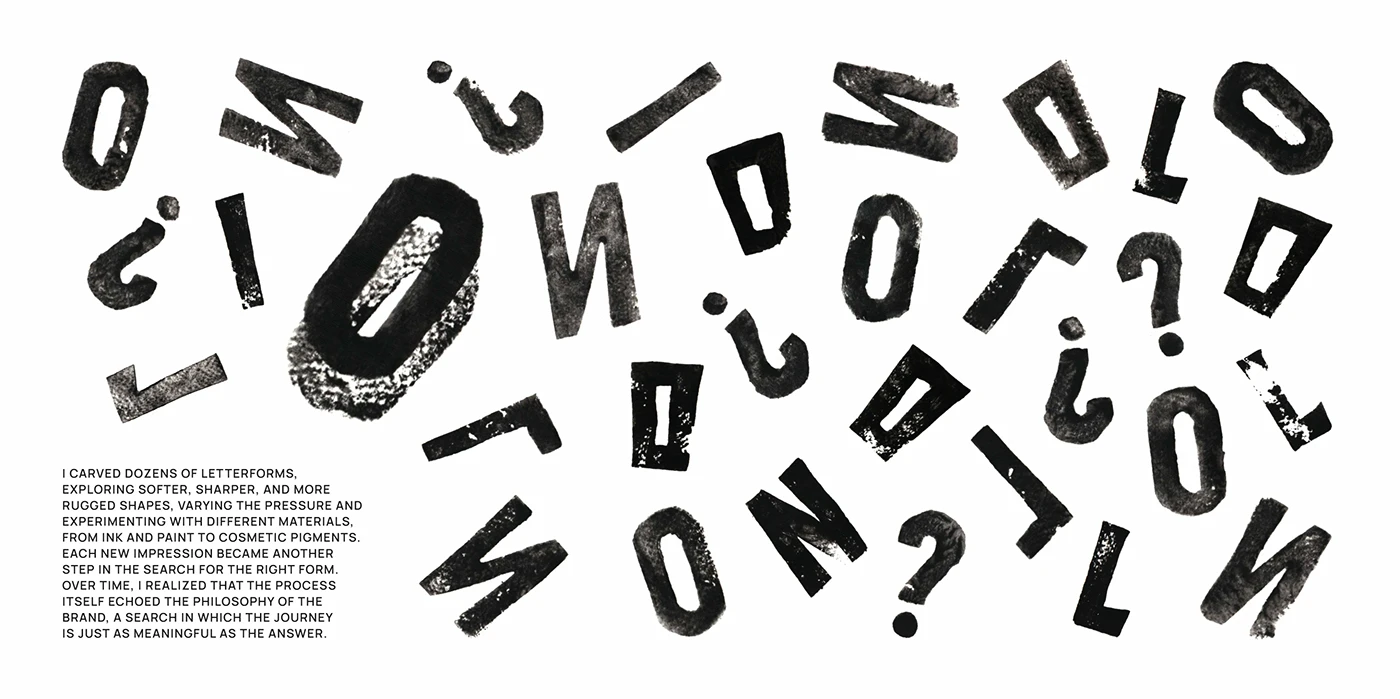
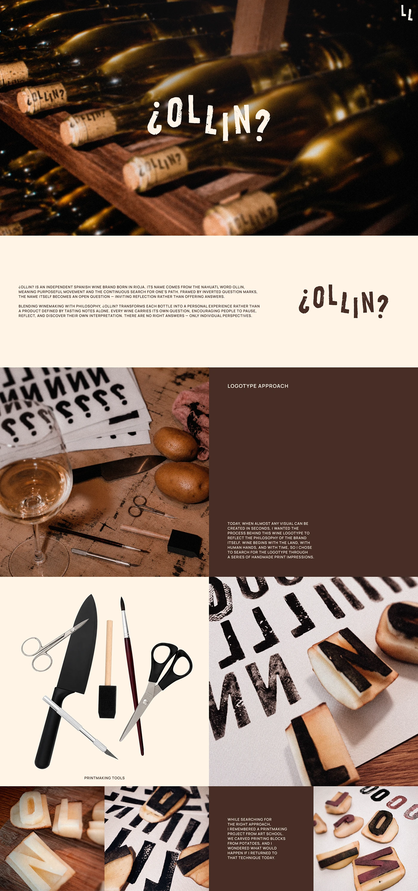
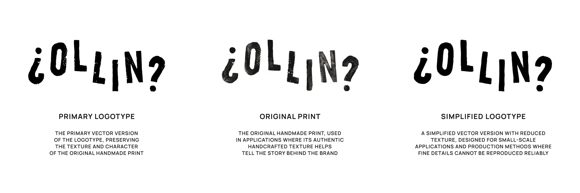
Instead of jumping straight into vector lines on a screen, the type design for this project actually started with real ink hand-pressed onto textured paper. Every little organic imperfection along the edges, the bleeding of the ink, and the raw paper grain were beautifully preserved. The designer then digitized and refined everything to create a crisp wordmark and monogram. Mixing those organic, fluid lines with a structured grid system on the glass bottles makes the whole thing look absolutely stunning and highly visible from a distance.
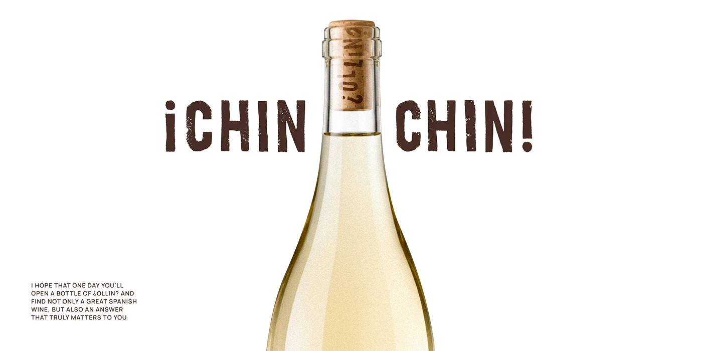
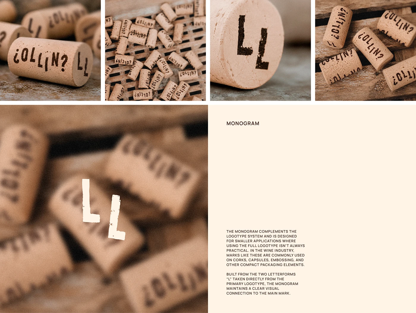
This visual identity flows flawlessly across everything from the labels to the shipping crates and wrapping paper. Each label uses heavy, textured stock with debossed details that feel incredibly premium and tactile. The monogram makes a subtle appearance like a wax seal on the cork and neck of the bottle. Bringing traditional print techniques into the design gives the product a serious edge on the shelves. The color palette is super minimal, featuring natural paper tones, deep grape hues, and rich black typography, letting the beautiful paper texture steal the spotlight.
This project is a masterclass in balancing rustic artistry with the clean commercial structure expected from Rioja wines. A tidy grid system beautifully handles all the technical details like harvest dates, origin, and volume without cluttering the design. The typography is clean and incredibly legible against the dark glass. It’s the raw, authentic texture of the print that builds the brand’s credibility, completely bypassing the need for flashy, unnecessary decorations.
To check out the full scope of this inspiring design project, head over to the www.behance.net/gallery/253560411/OLLIN-Wine-Brand-Identity.
Thổi hồn nghệ thuật in ấn thủ công vào bộ nhận diện rượu vang OLLIN của Veronika Kuziakina
Veronika Kuziakina vừa mang đến một làn gió mới cho bộ nhận diện thương hiệu rượu vang OLLIN tại vùng Rioja bằng cách đưa các vệt in thủ công lên nhãn chai một cách cực kỳ khéo léo.
Thay vì bắt đầu bằng các đường vector trên màn hình máy tính như thông thường, quy trình thiết kế chữ (type design) của dự án này lại khởi nguồn từ những vệt mực thật được ấn bằng tay lên các tờ giấy thô ráp. Từng tì vết tự nhiên ở cạnh nét chữ, sự dịch chuyển của mực và vân giấy thô đều được lưu giữ trọn vẹn. Nhà thiết kế sau đó đã số hóa và tinh chỉnh lại để tạo nên một wordmark và monogram sắc nét. Sự kết hợp giữa các đường nét organic tự nhiên với hệ thống lưới (grid) chuẩn chỉnh trên chai thủy tinh tạo nên một tổng thể vô cùng hút mắt, giúp sản phẩm nổi bật ngay cả khi nhìn từ xa.
Hệ thống hình ảnh này được phát triển đồng bộ từ nhãn chai, thùng vận chuyển cho đến giấy gói. Mỗi chiếc nhãn đều sử dụng chất liệu giấy dày dặn với các chi tiết dập chìm (debossed) mang lại cảm giác cực kỳ cao cấp và đã tay khi chạm vào. Phần chữ lồng (monogram) xuất hiện tinh tế như một chiếc con dấu niêm phong trên nắp bần và cổ chai. Việc đưa kỹ nghệ in ấn truyền thống vào thiết kế đã giúp sản phẩm sở hữu một diện mạo đầy ấn tượng trên kệ hàng. Bảng màu cũng được tối giản với tông giấy tự nhiên, sắc nho chín mọng và chữ màu đen sẫm, nhường trọn vẹn sân khấu cho chất liệu bề mặt giấy tỏa sáng.
Dự án này là minh chứng cho việc cân bằng giữa tính nghệ thuật mộc mạc và cấu trúc thương mại rõ ràng của dòng rượu vang vùng Rioja. Các đường lưới gọn gàng giúp hiển thị đầy đủ thông tin về ngày thu hoạch, xuất xứ và thể tích mà không hề gây rối mắt. Typography sạch sẽ, dễ đọc ngay cả trên nền thủy tinh tối màu. Chính chất liệu in ấn nguyên bản đã tạo nên tính xác thực cho thương hiệu mà không cần đến những chi tiết trang trí rườm rà.
Để xem trọn vẹn dự án thiết kế đầy cảm hứng này, hãy ghé thăm www.behance.net/gallery/253560411/OLLIN-Wine-Brand-Identity.