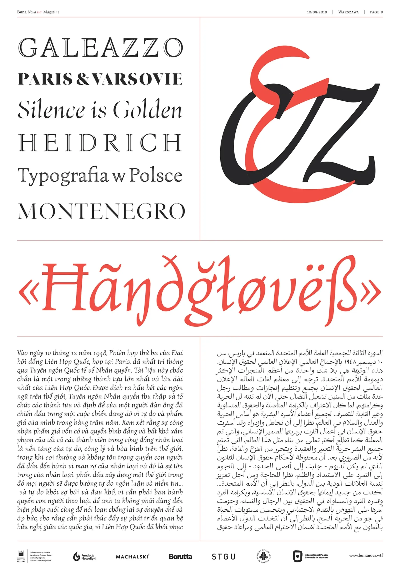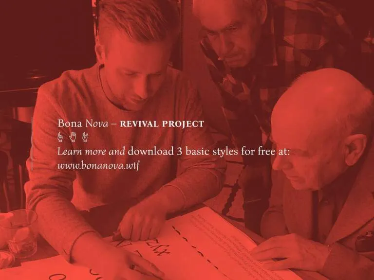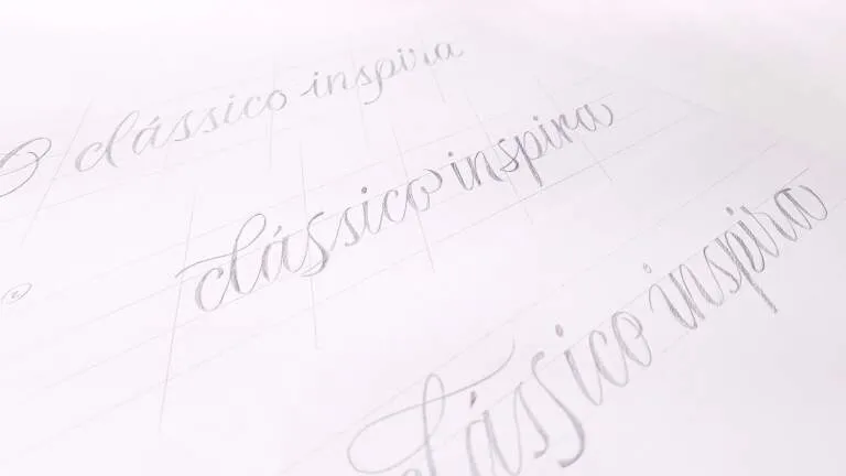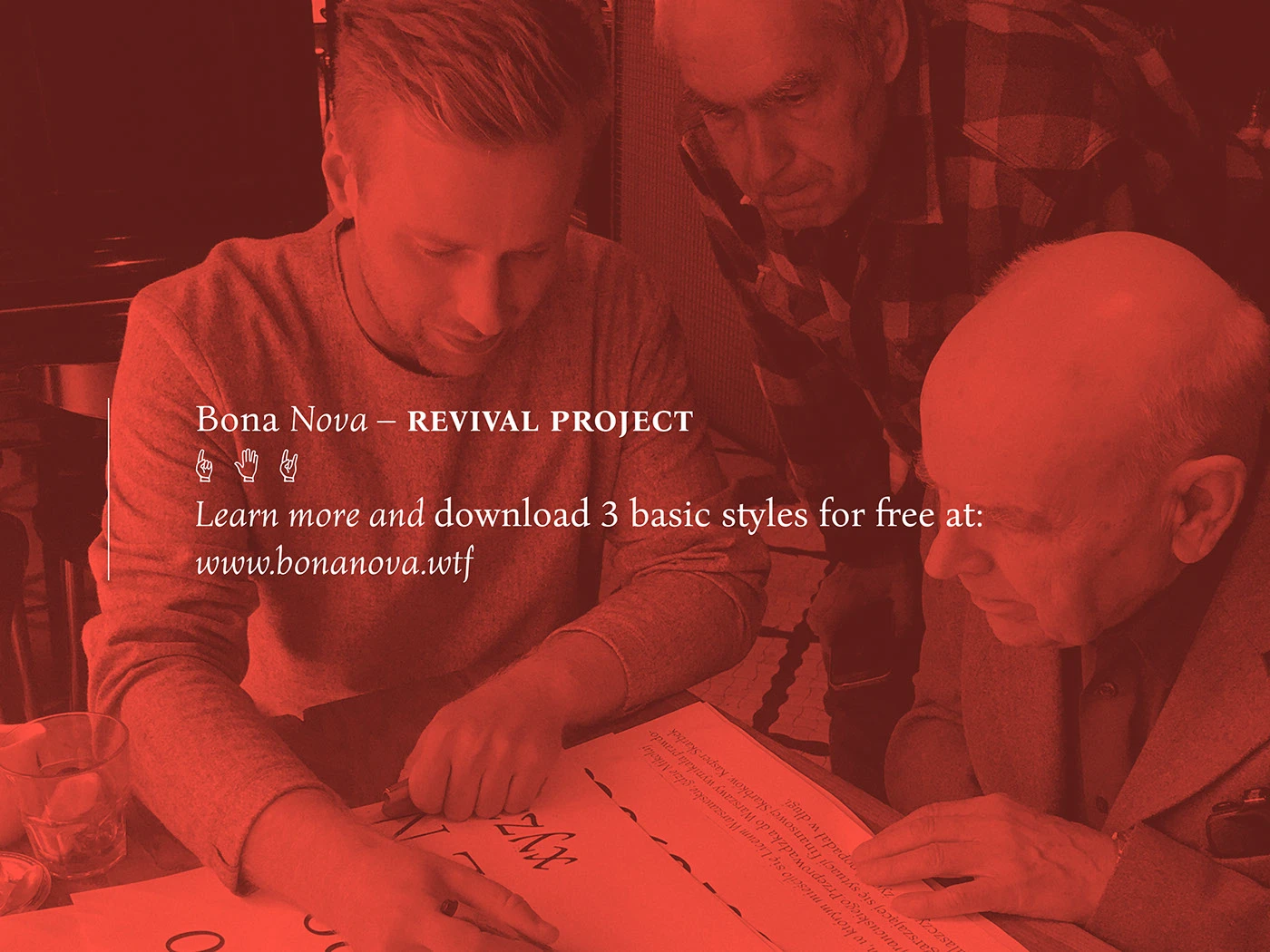

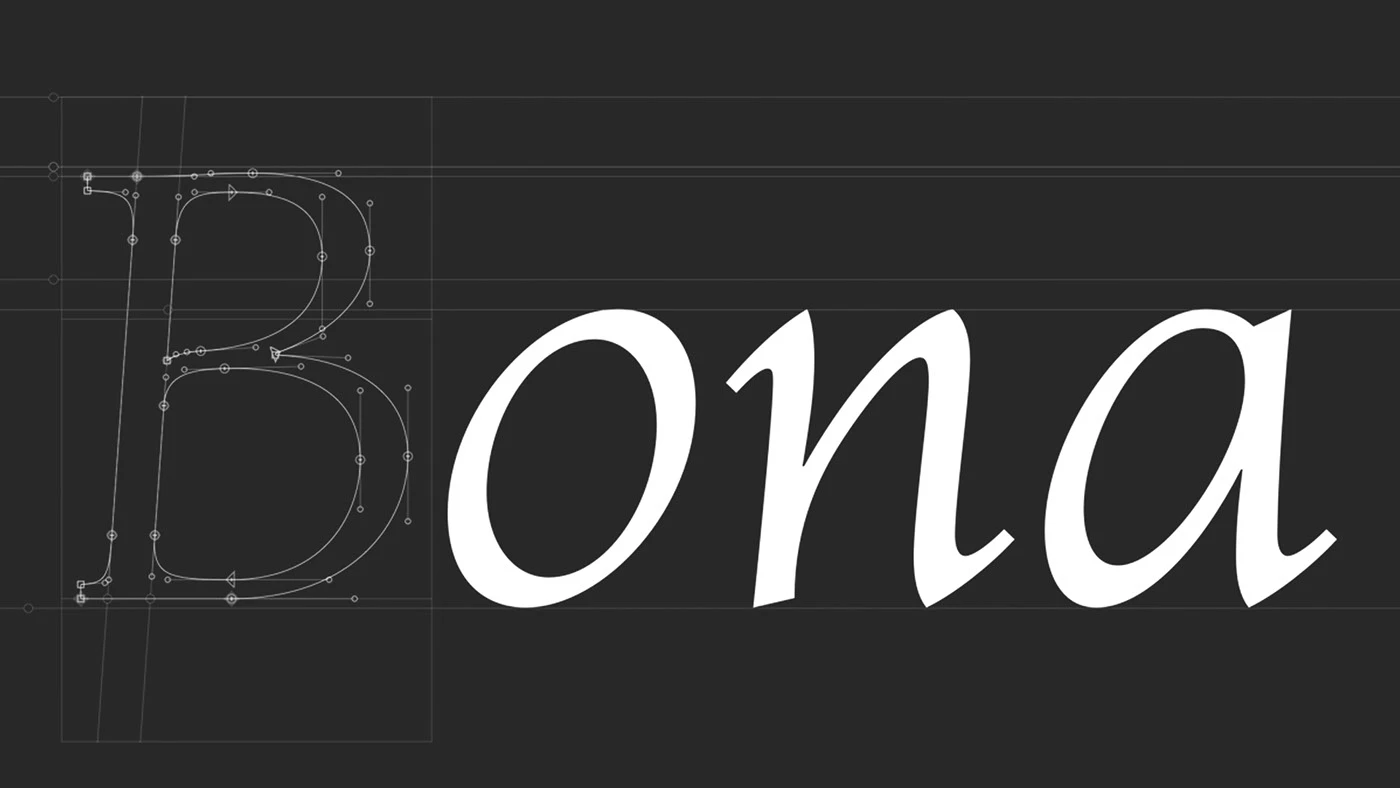
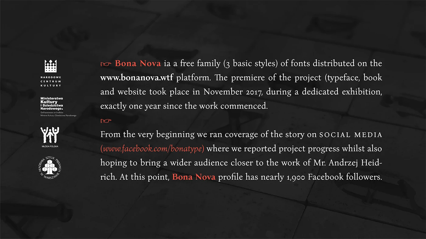

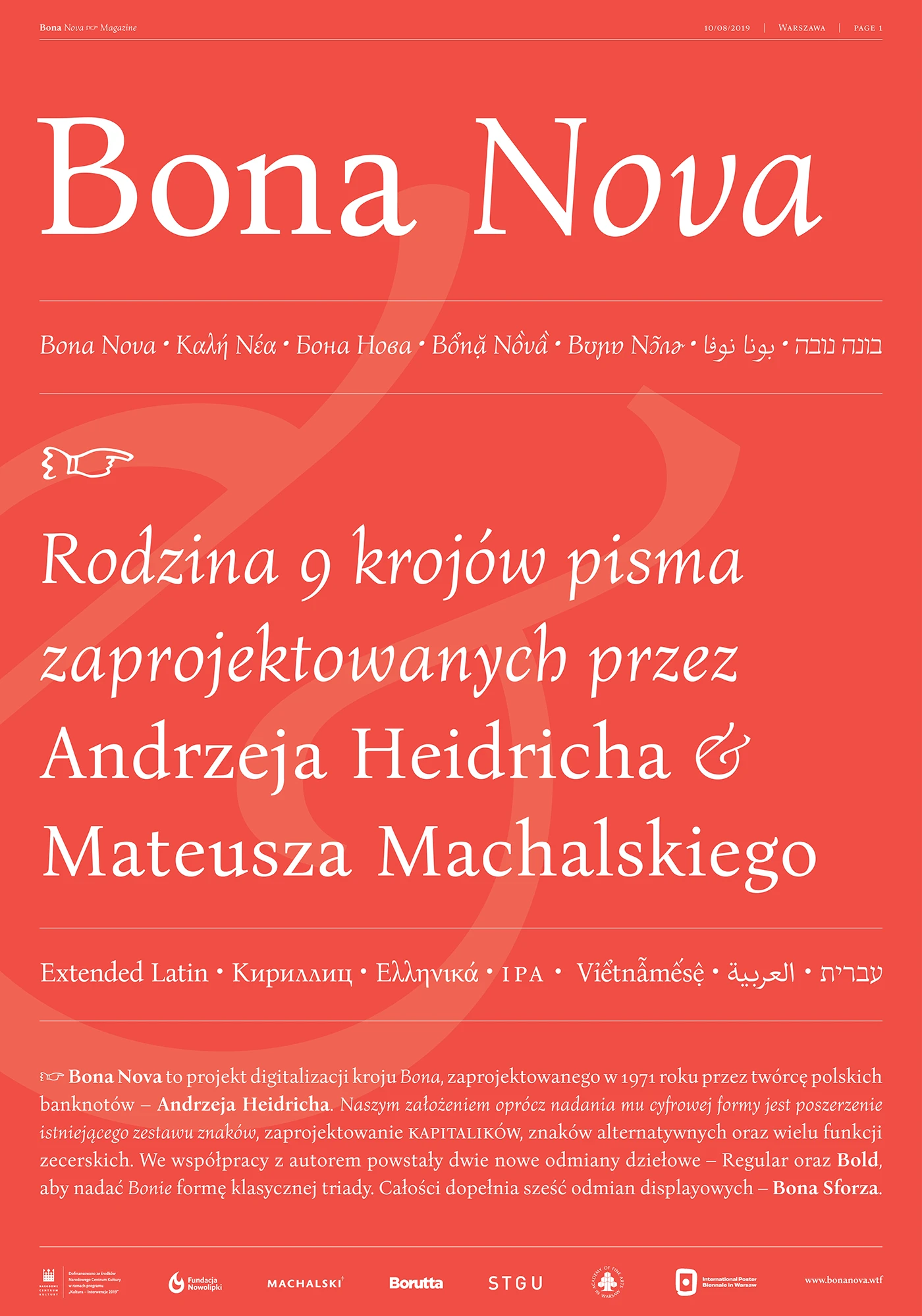
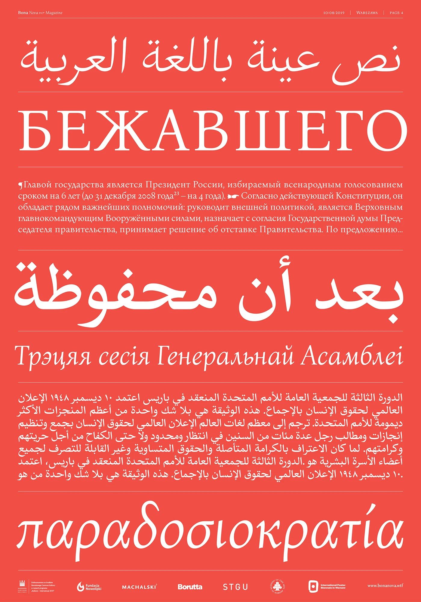
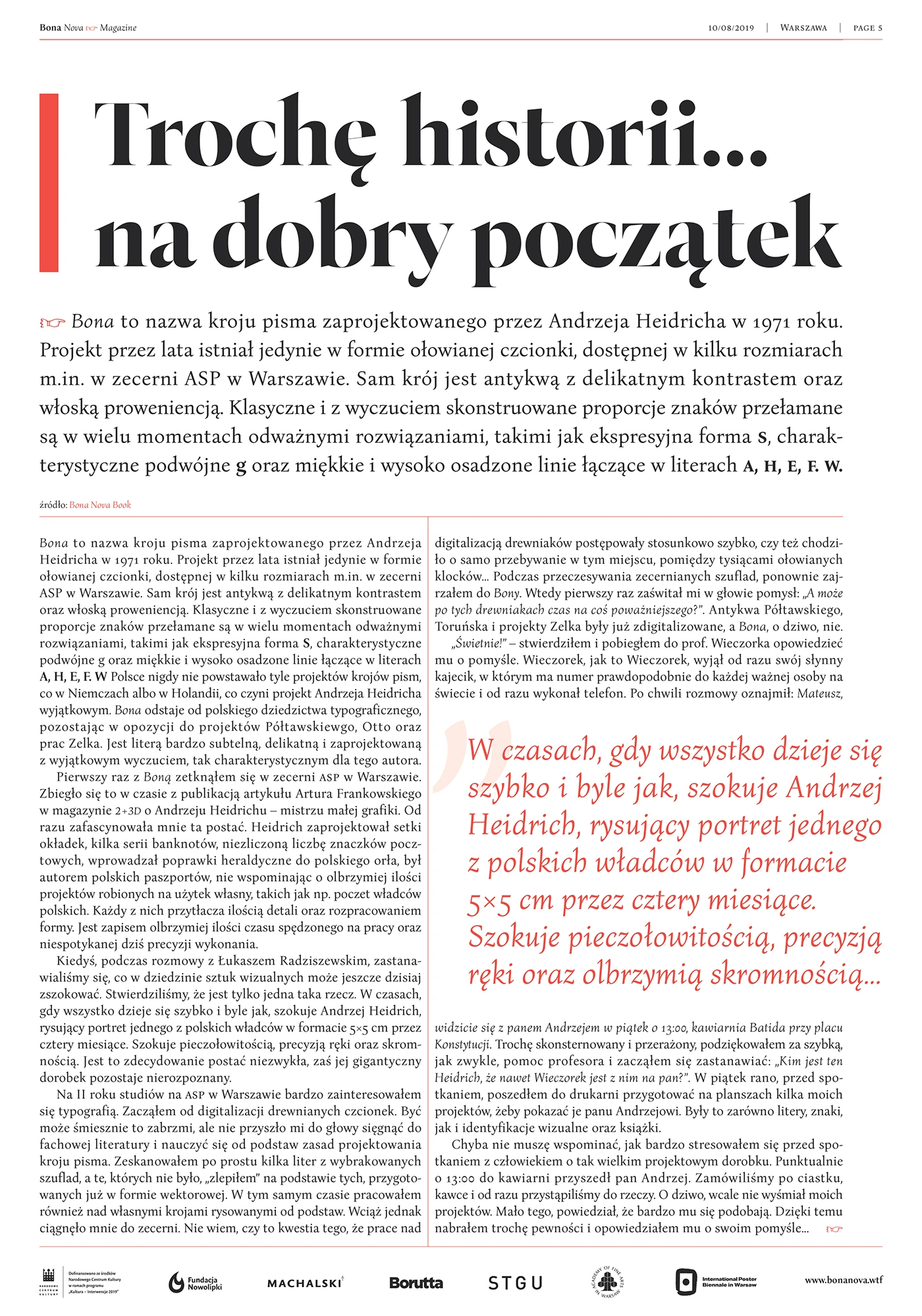

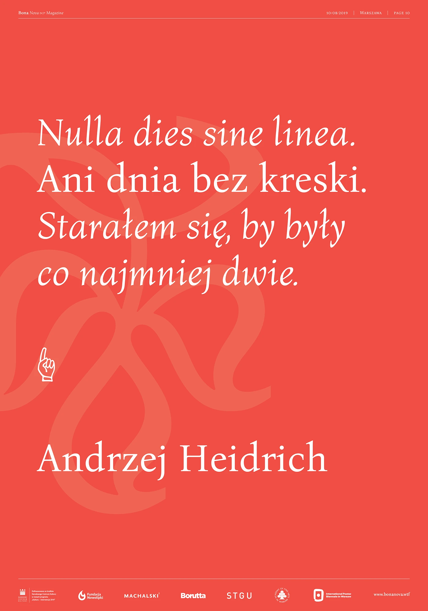
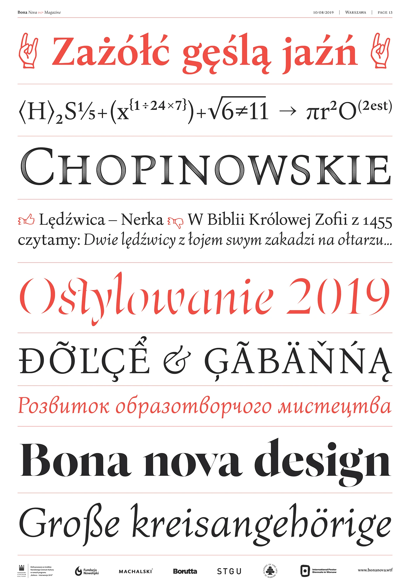
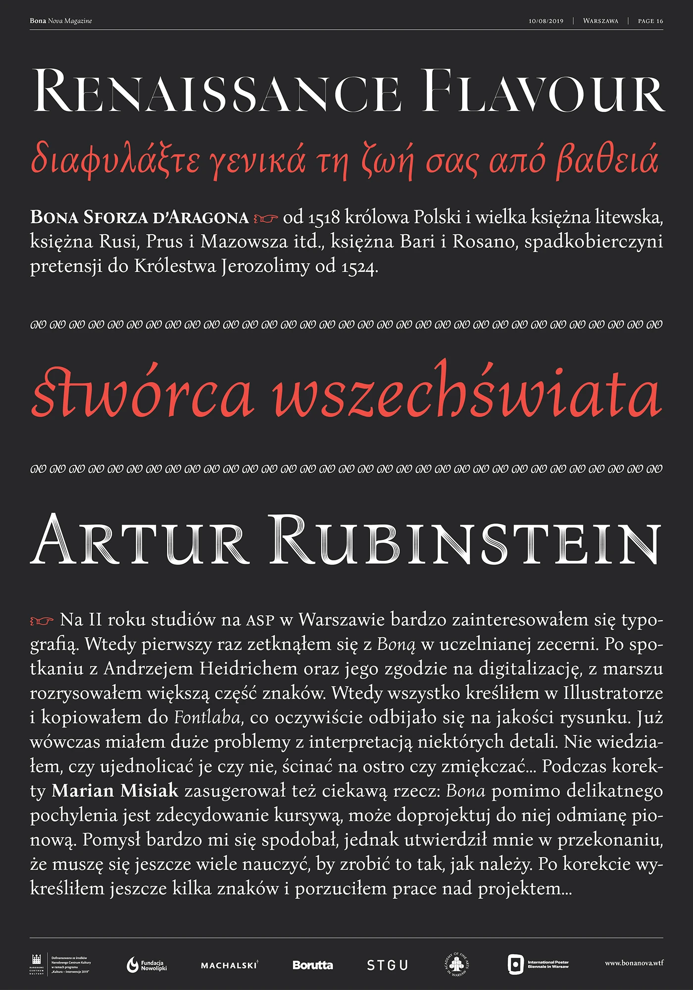
Bona Nova is a super cool digitization project based on Bona—a unique cursive typeface designed back in 1971 by Andrzej Heidrich, the mastermind behind Poland’s banknotes. Initiated by Mateusz Machalski, the project came to life with total support from the original creator himself, alongside a talented team of experts including Leszek Bielski, Ania Wieluńska, and Michał Jarociński.
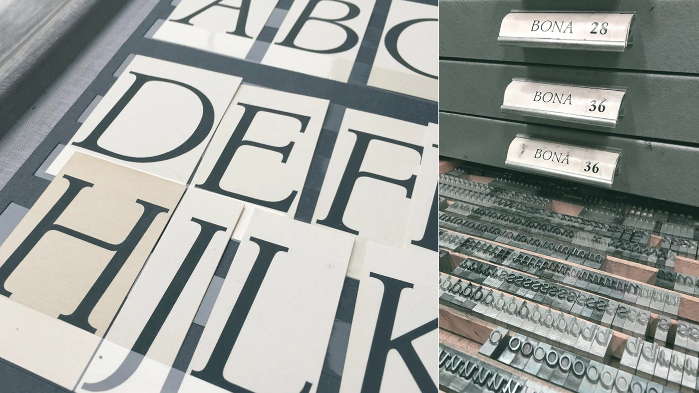
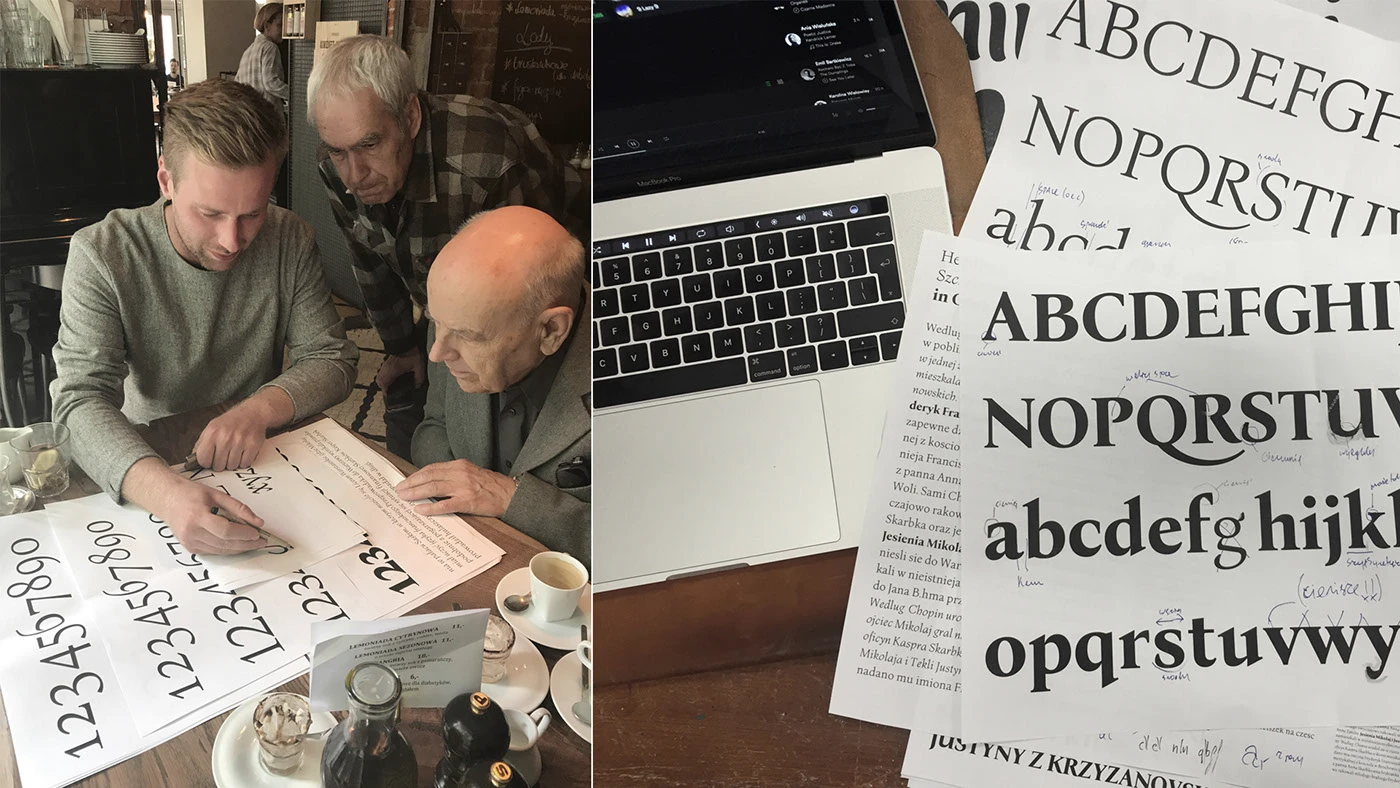
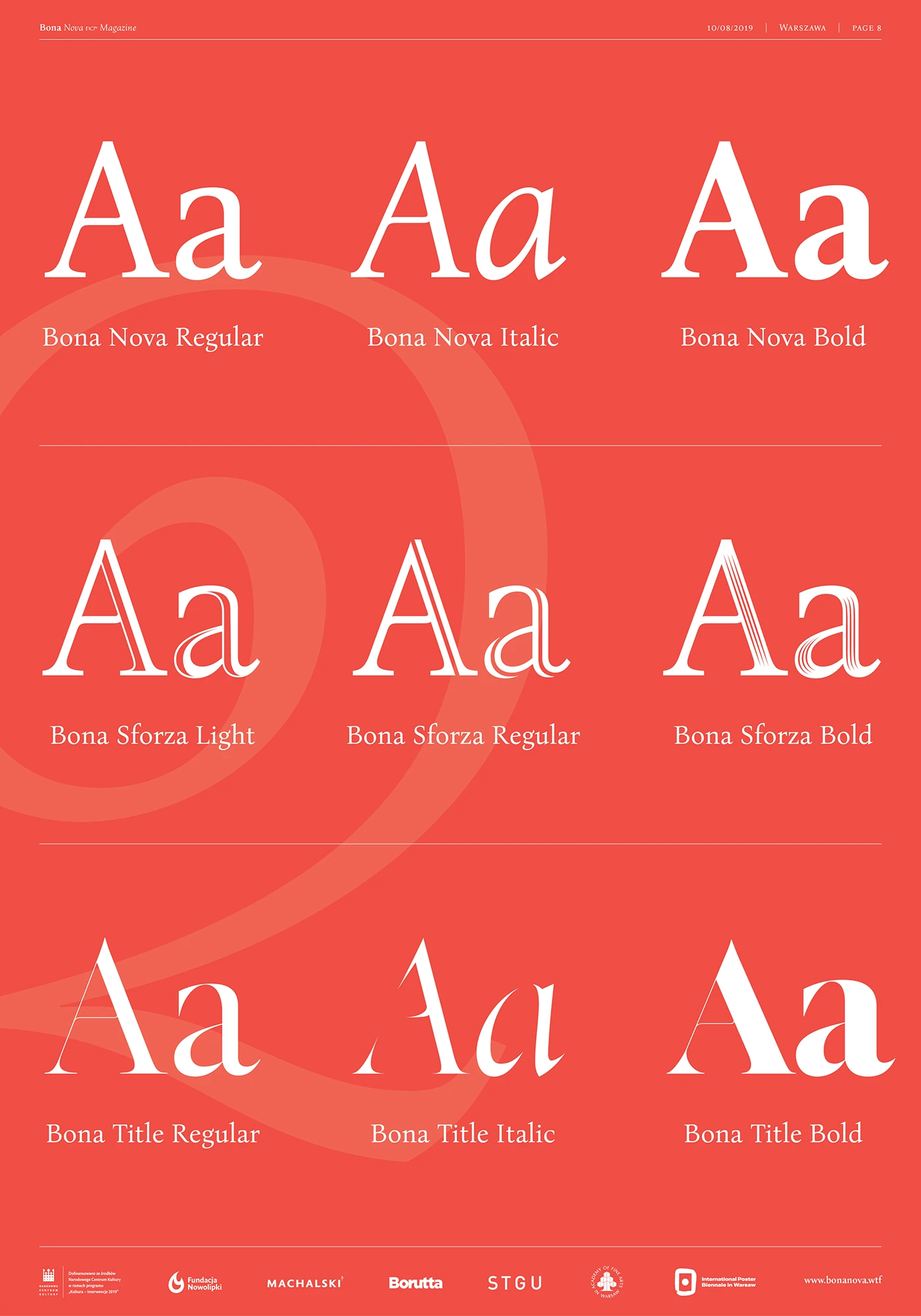
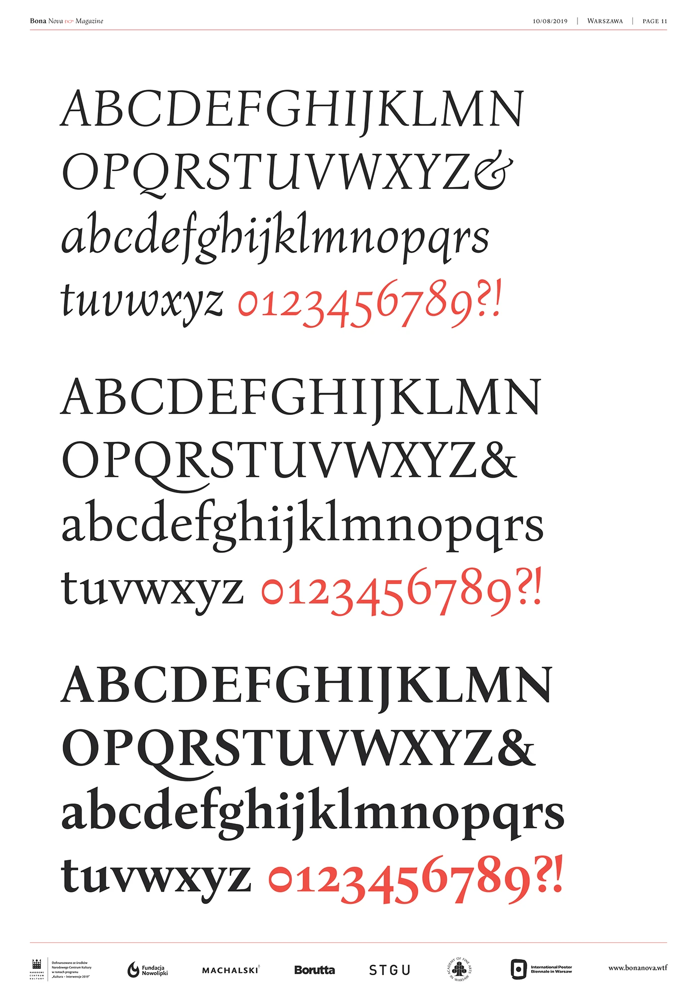
The original Bona font only existed in a single italic style. To make it way more practical for modern designs, the team dug into Heidrich’s lettering archives to develop an upright version. This gave birth to two brand-new styles—Regular and Bold—forming a classic design triad heavily inspired by Italian Renaissance Antiqua.
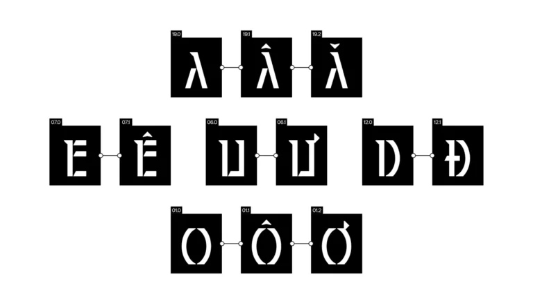
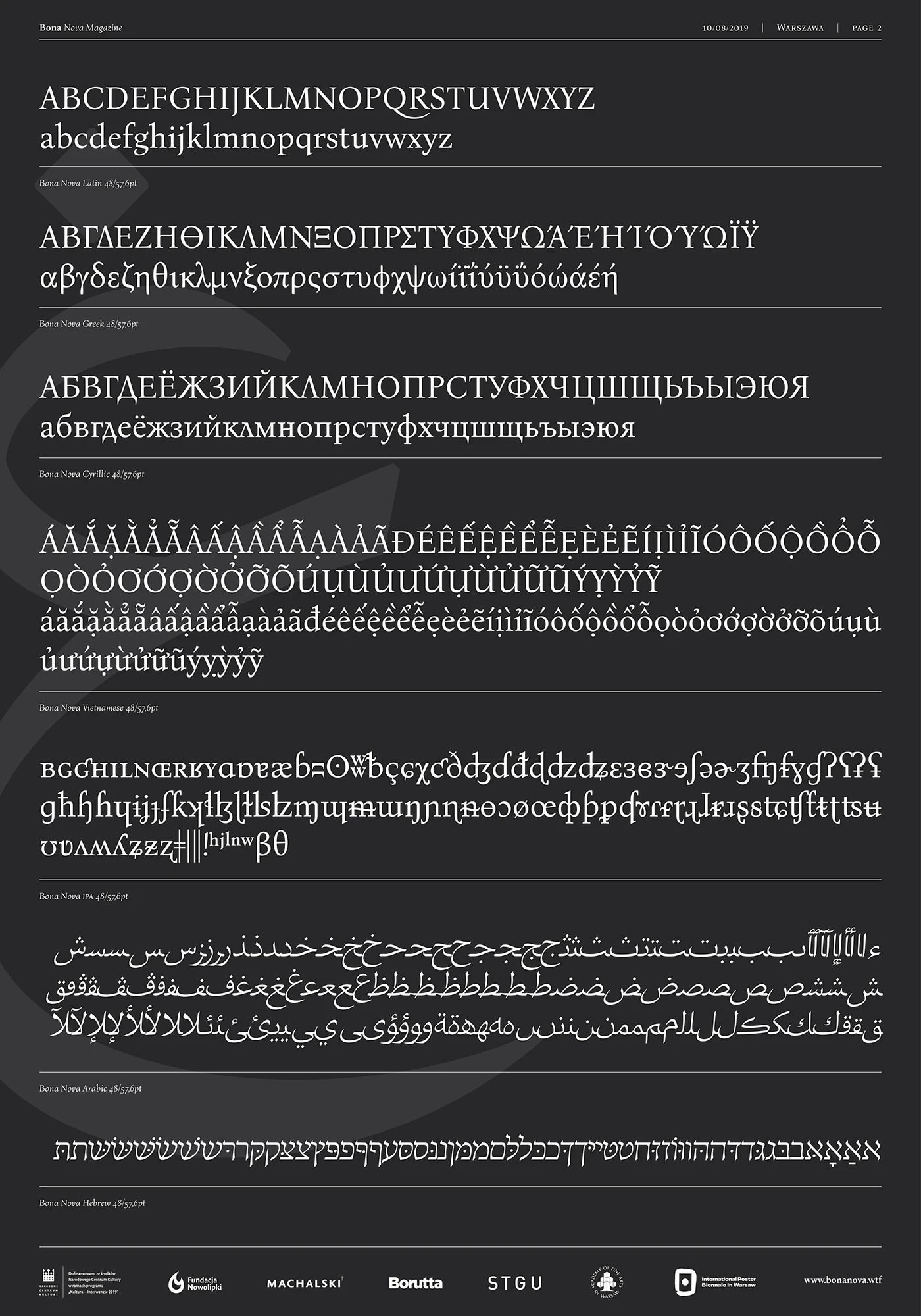
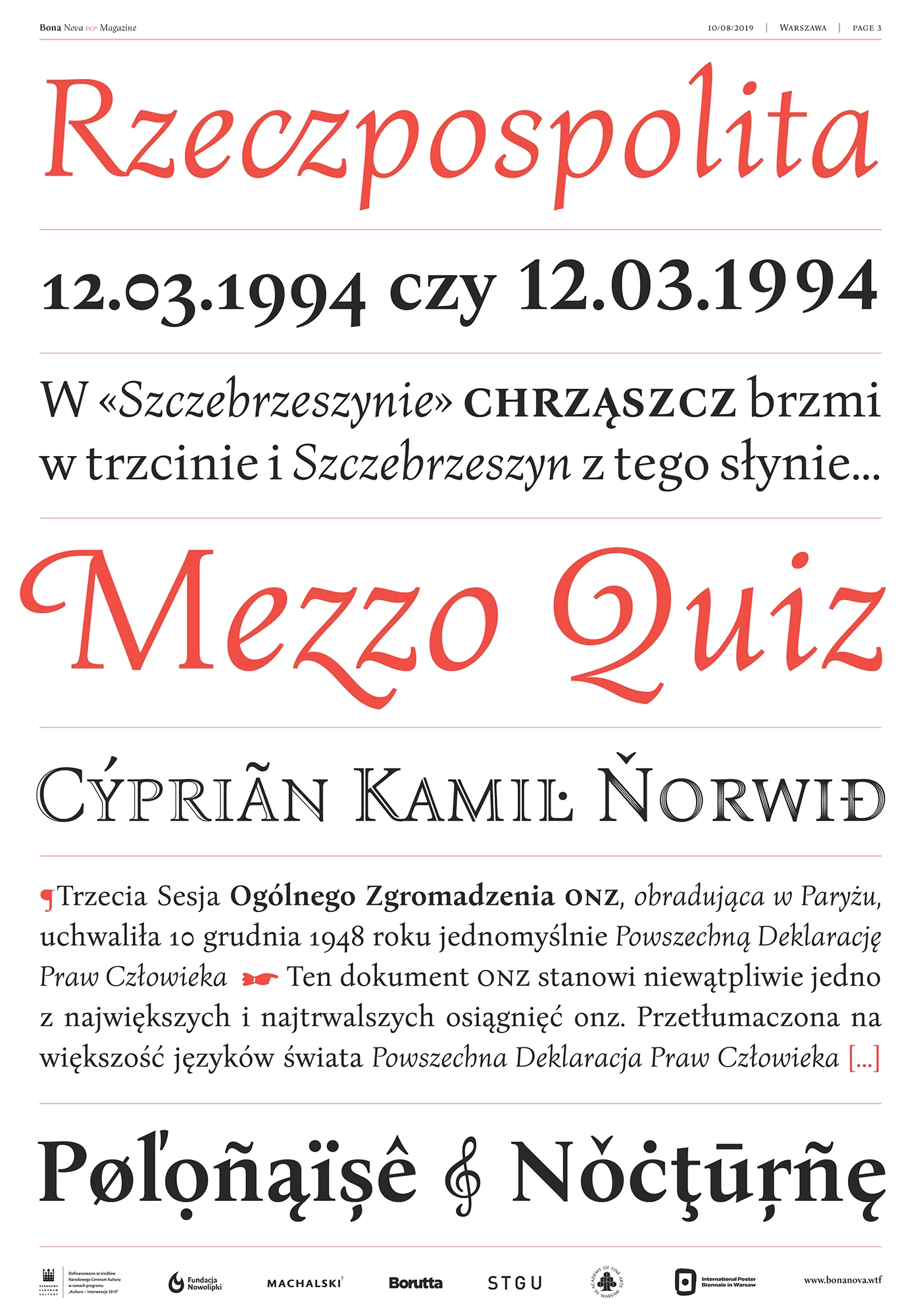
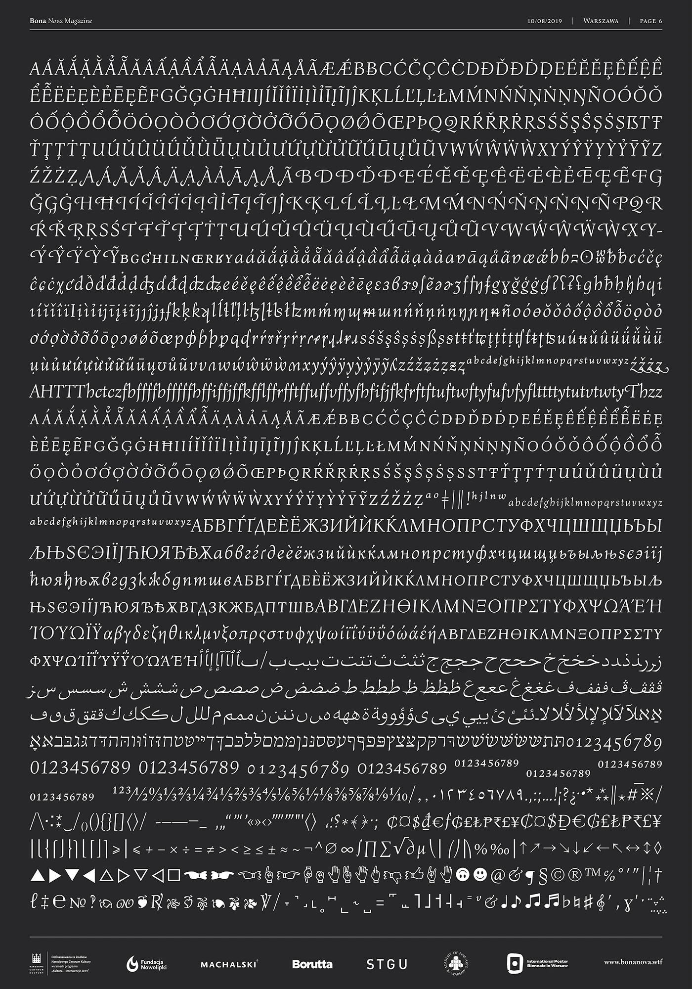
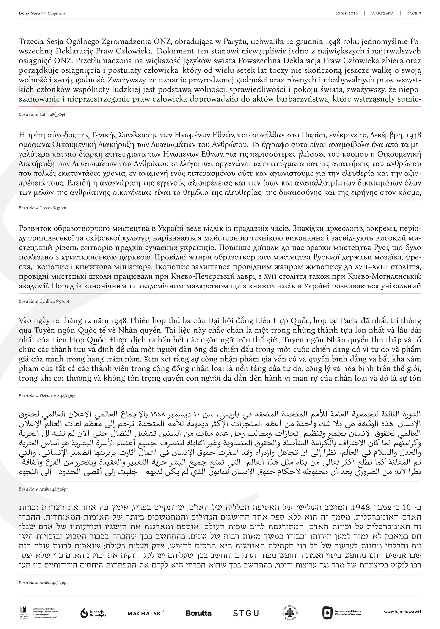
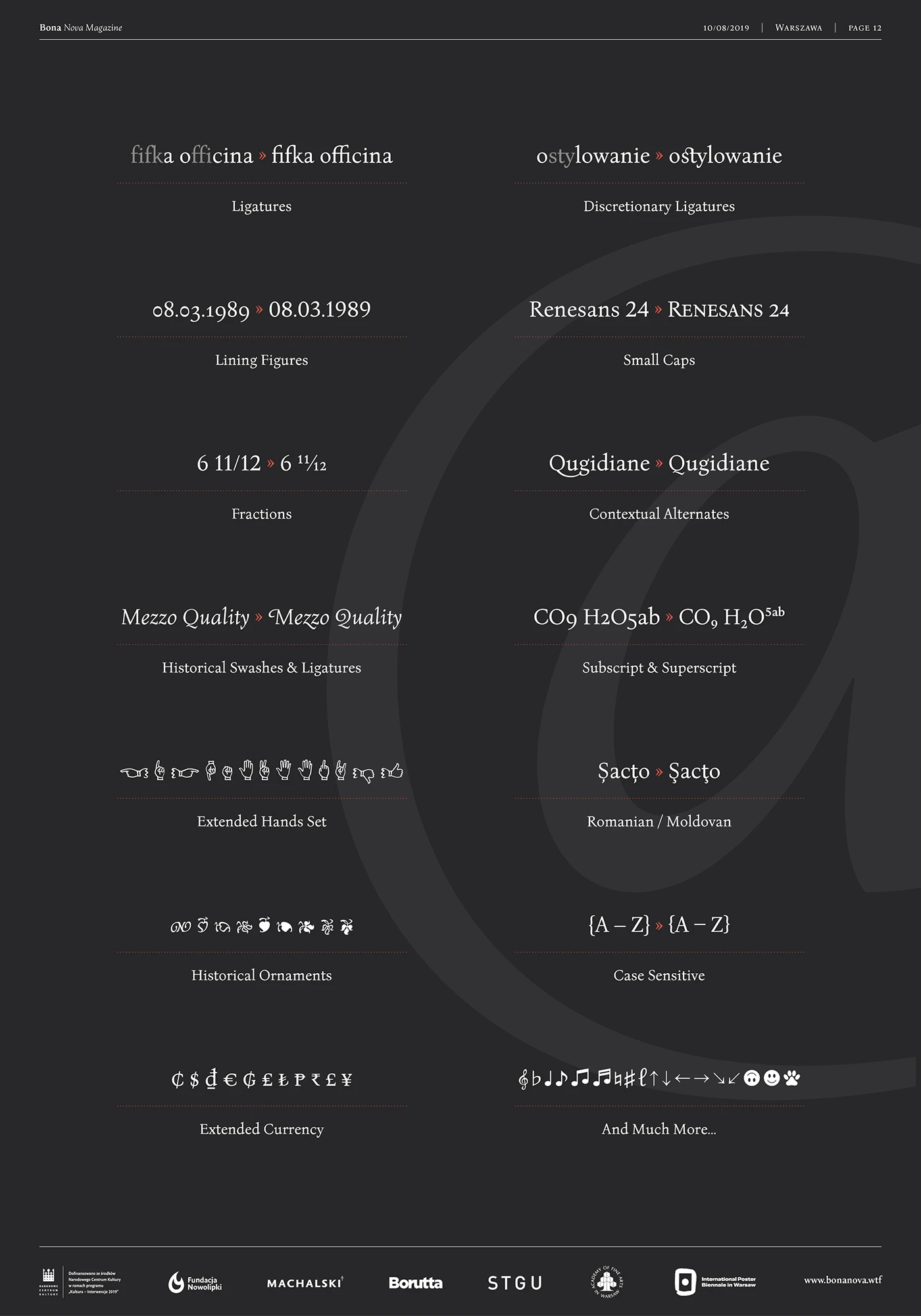
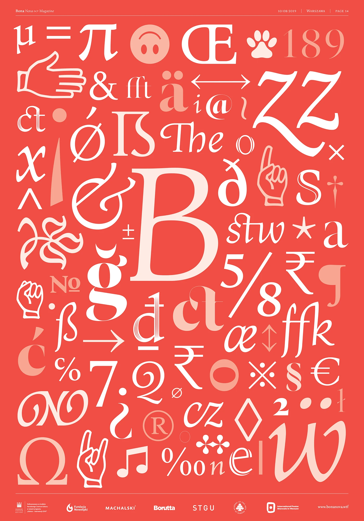
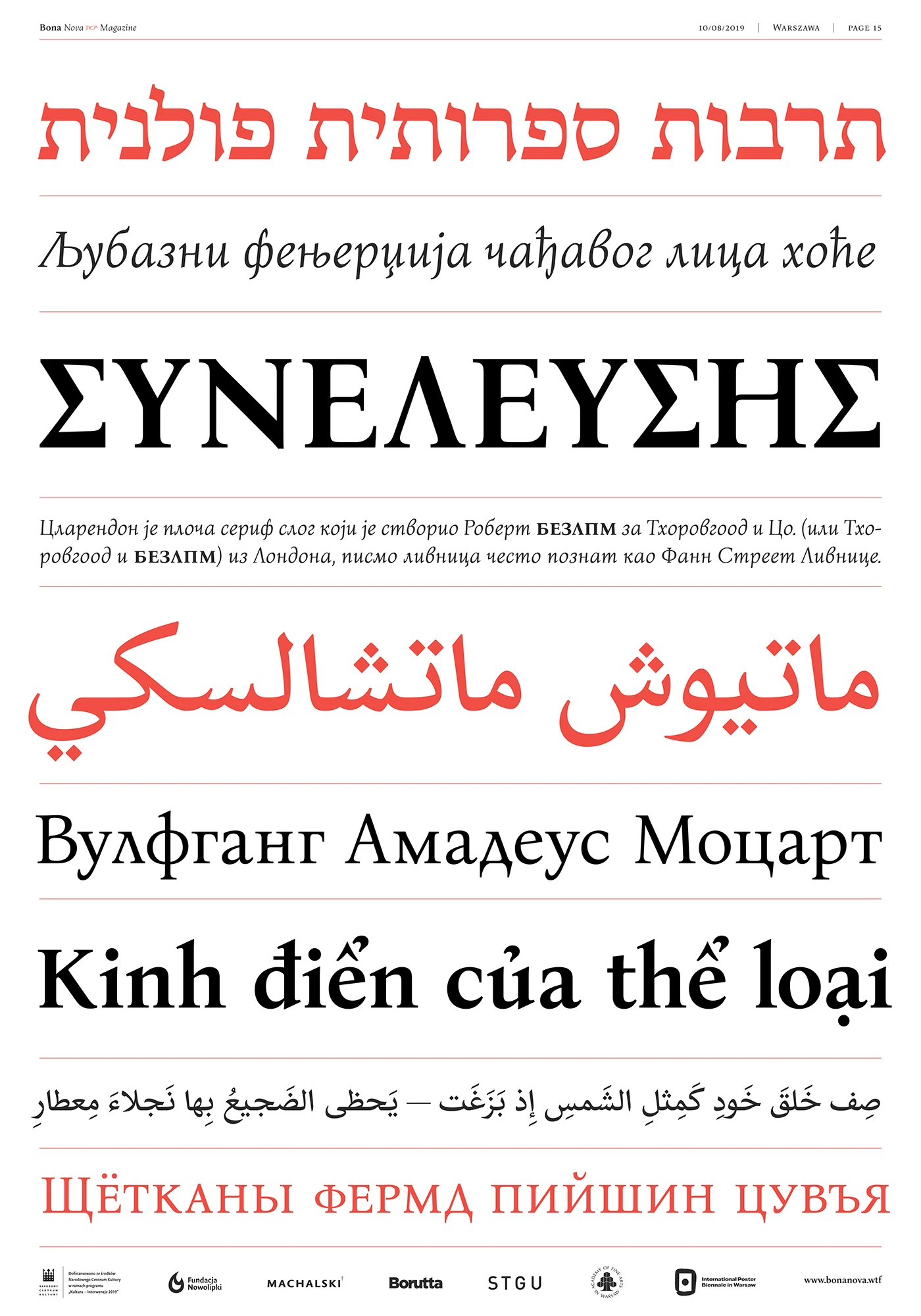
But the creators didn’t just stop at digital conversion! Bona Nova got a massive upgrade with an expanded character set and tons of OpenType features like small caps, alternates, ligatures, various numeral styles, and even some unique hand-shaped ornaments. Between 2019 and 2020, the font family expanded even further to support multiple scripts, including Cyrillic, IPA, Greek, Arabic, Hebrew, and Vietnamese. Plus, thanks to a partnership with Google, it now includes highly flexible Variable font technology.
The complete family is released totally free under the SIL Open Font License, making it perfect for both personal and commercial projects. The project also treats users to extra display variants, including the Bona Sforza and Bona Title collections, giving designers plenty of options to play with. Check out all the details on the bonanova.wtf.
Bona Nova là một dự án số hóa đầy thú vị từ Bona – kiểu chữ chữ cursive độc đáo được thiết kế vào năm 1971 bởi Andrzej Heidrich, người tạo nên các mẫu tiền giấy của Ba Lan. Dự án này do Mateusz Machalski khởi xướng và hoàn thiện cùng sự hỗ trợ sát sao của chính tác giả gốc cùng các cộng sự chuyên môn bao gồm Leszek Bielski, Ania Wieluńska và Michał Jarociński.
Bản gốc của Bona ban đầu chỉ sở hữu một định dạng chữ nghiêng duy nhất. Để tăng tính ứng dụng cho các thiết kế hiện đại, đội ngũ thực hiện đã nghiên cứu các mẫu chữ tay của Andrzej Heidrich để xây dựng thêm dáng đứng thẳng. Sự kết hợp này mang đến hai định dạng mới là Regular và Bold, tạo nên một bộ ba thiết kế kinh điển mang hơi hướng phong cách Antiqua thời Phục hưng Ý.
Không chỉ dừng lại ở việc chuyển đổi sang môi trường kỹ thuật số, Bona Nova được mở rộng mạnh mẽ về hệ thống ký tự lẫn các tính năng OpenType như small caps, ký tự thay thế, ligatures, nhiều kiểu hiển thị số và các họa tiết trang trí hình bàn tay độc đáo. Từ giai đoạn 2019-2020, bộ font tiếp tục đón nhận các bản cập nhật hỗ trợ nhiều hệ chữ thảo mở rộng như Cyrillic, IPA, Hy Lạp, Ả Rập, Do Thái và cả tiếng Việt. Nhờ sự đồng hành từ Google, bộ chữ này cũng tích hợp công nghệ Variable font cực kỳ linh hoạt.
Bộ sản phẩm hoàn chỉnh được phát hành hoàn toàn miễn phí theo giấy phép SIL Open Font License, phục vụ tối đa cho cả các dự án thương mại. Dự án còn mang đến các biến thể thiết kế hiển thị đi kèm gồm bộ Bona Sforza và Bona Title để tối ưu hóa lựa chọn cho người dùng. Thông tin chi tiết có thể tham khảo tại trang bonanova.wtf.
Nguồn: behance.net